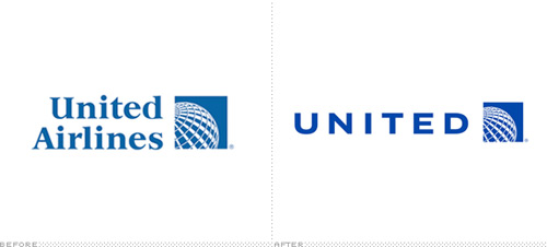
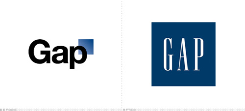
This is a guest post by Alisa Gilbert* exploring the recent United Airlines & GAP rebrandings and how consumer emotional attachment played its part.

These days, fashion brands tend to have a tough time adapting to the changes in their industry. Customers want to engage themselves only with the brands that do well in the market or ones that make them feel good. Customers also evaluate a brand based on their personal experience.
When there is an emotional connection built with a brand, customers are less likely to switch to another competing brand. When an emotional connection is built, the brand solidifies consumer loyalty and can expect customer retention.
Emotional attachment to a brand is more commonplace than you would think. In fact, this type of consumer attachment accounts for a large bulk of the people who remain fiercely loyal to a certain brand, even if there are alternate equally viable options available. Consumer attachment to a brand in some cases also extends to an emotional attachment to the brand’s logo, which means that graphic and logo designers can be creating not only the face of a particular brand, but also something that consumers will cherish and fiercely protect. These days, fashion brands struggle to adapt themselves to constant change and needs. Although brand values, features, and facts might be unmemorable. Personal feelings and experiences shape the consumers’ evaluation of brands.
Editor’s note: See article ‘Branding, Identity & Logo Design Explained‘
Even though it may seem unlikely, research published in the Gallup Management Journal suggests that almost any industry can lure in fiercely devoted customers (Customers’ Emotional Attachment Extends to More Products and Services Marketers Thinks). A whopping 27% of customers were found to have emotional bonds with mass retailers, and 37% were connected to their banks, the research stated. Even electronics consumers and online retail customers had distinct brand loyalty. The benefit of brand loyalty for businesses is that these customers can be counted upon to provide a constant stream of revenue. They are also more willing to sample anything new that the business may release and can be a good indicator of whether or not the new product will be profitable to the general population. This type of devotion does not just stop with the brand’s name and products in many cases, it also includes the brand’s logo. For this reason, it is important that businesses consider the importance of something like their logo.
Logos act as the face and identifying marker for a company, which can somewhat explain why customers can be so fiercely protective of them. In September, United Airlines and Continental Airlines were in talks of a merger that would result in United Airlines getting rid of their iconic U-shaped blue and red tulip logo, designed by Saul Bass. In replacement, the United Airlines jets would immediately have the Continental Airlines globe logo placed on them. This announcement sparked a storm of protest on social networking websites like Twitter and Facebook. On Facebook, a protest group was created to implore the company to save the current tulip logo, mainly because to consumers, that logo signified the entire rich history of United Airlines as well as all of the memories and good feelings associated with the company (An Emotional Attachment to a Brand). The new logo, on the other hand, was empty of history. Though the jets essentially remain the same, the new logo signified a new brand management strategy, alienating United Airlines’ previously devoted customers. And so it stays.
A similar outcry surrounded clothing retailer Gap, when it decided to change its own logo in early October. This simple move, which came relatively unannounced, caused a stir in the graphic design as well as consumer communities. Even the retailer’s attempt to disguise the change as a crowd sourcing experiment did not silence detractors of the new logo. In the end, Gap’s customers remained fiercely protective of the company’s classic logo and many found the retailer’s sudden switch to the new logo albeit a brief one as a betrayal of consumer trust. Gap has since reinstated its old logo, a move that showed how powerful consumer attachment to a logo can be.
Consumer attachment to a brand and logo only emphasizes how important the work of a logo designer is, especially in light of the two fairly recent examples of outcry over proposed logo changes for United Airlines and Gap.
Image sources: Underconsideration & Shutterstock
*Alisa Gilbert writes on the topics of bachelor degrees and welcomes your comments at her email: alisagilbert599 AT gmail.com.


Great points made here.
BTW; have you been to Gap’s website? It’s kinda cool to interact with.
Just sayin’ =)
As entertaining as the Gap episode was (glad they went back), the United story might be more compelling. United, as you stated, surrendered its visual identity (and with it its history) by assimilating Continental’s icon, which had less historical value in the marketplace, AND topped it off by using a wordmark that more resembles Delta Airlines, in style and color. United was formed in 1926 and has been a leader in US transport ever since. Nobody is saying that it’s the same company now as then, but it cashed in a large chunk of that history in a flash. I might understand the move if they went in a whole new, progressive direction; but they essentially repurposed the remnants of a brand that didn’t have equal gravitas. Just my two (or twenty-two) cents worth. –JB
I believe the two GAP logos are in the wrong order.
The reason behind so many protests against new gap logo was because of its terrible design.
i meant “the other reason behind so many protests against the new gap logo was because of its terrible design”
I definitely think the “new” GAP logo was absolutely terrible. It was just too plain and simple, and didn’t convey anything about their brand. You couldn’t even tell it was for a clothing store. Did anyone else notice that both of the re-brands above not only did not go over too well with consumers, but also both logos contain a blue square? Coincidence?
Great post Jacob. I really like the advices noted here which are very true & helpful to me. It seems to be notified by all the people who were the professionals in designing. Thx for your ideas mentioned in this post.
Well, good article, but the header image is really freaking me out.
leave this
deleted it
uploading in the web site
Great post Jacob. I really like the advices noted here which are very true & helpful to me. It seems to be notified by all the people who were the professionals in designing. Thx for your ideas mentioned in this post.