Enjoy this forecast of the top logo design & branding trends of 2017. Click here for the updated 2017 logo trends report.
It’s also important to remember, that despite the fact that design trends vary from year to year (see our 2016 forecast), the underlining philosophy behind logo design never changes, as they are created to leave not only an everlasting impression on customers but also to convey the message of the brand.

Well, if you are here you might be looking back at logo design trends right? So have a look at these years’ trends as well – 2018, 2019, 2020, 2021, and 2022.
Click to tweet these 2017 Logo Trends.
As 2017 begins, we look forward to the new year and hope that it brings with it a new direction for logo design. In collaboration with Designhill, and research conducted with top logo designers around the world, these are the most likely logo design trends forecast for 2017, which include a few new trends, and some that will become more popular.
From vintage to line art and hand-drawn to minimalistic, these are our predictions for the top logo design trends in 2017.
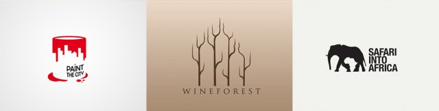
1. Literal Minimalism
")
In an industry where logos are becoming bold, piled, and more complex in an attempt to distinguish itself, it is often the simplest of designs that catch the eye, most notably the “flat design” trend dominating the market.
For this “literal minimalism” evolution, it is important to ensure that the minimalist design is both practical and purpose-driven; the purpose of a logo is to tell your customers what you do immediately and with absolute clarity. eg. the meaning is within the logo itself.
These logos are well received by potential clients because they are more easily understood, although this does not necessarily mean they are better.
2. Hand-Drawn

Hand-drawn graphics were popular in 2016 and this trend is set to gain even more ground in 2017, as it conveys authenticity.
Particularly popular in the food and drink industry, where business owners are determined to project a business that is both self-governing and exclusive from the competition but also off-the-wall and chic.
Hand-drawn logos emanate warmth, credibility, and charisma; three attributes that are more difficult to capture using computer-aided design. The major advantage of this approach is it will be unique and gets wide brand recognition
Looking to 2017, increased use of color and tone are likely developments of this trend.
3. Negative Space
Negative space logos will be 2017’s break-out trend, peaking from the rise of 2016.
This style of logo is based on dual-imagery, where positive and negative spaces each compete for the viewer’s attention. Think of the NBC logo, where the negative space is used to create the iconic peacock image. People get amazed by this type of logo because it is of its negative space and requires a deeper understanding of the technique used to convey the motto.
4. Line Art
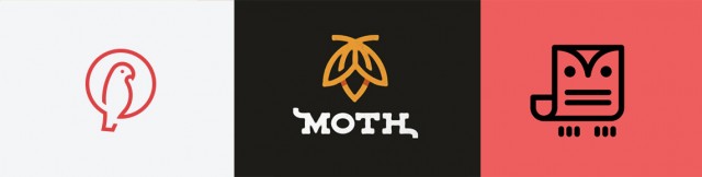
First picking up pace in 2015, the line art logo trend has sustained its position in the industry and is likely to still be on top in 2017.
This trend uses a steady thickness of lines with only one solid color integrated. It can be seen being used by brands who wish to set themselves as fun, modern, and laid back. It is a great way to design a logo with text and an image. Moving forward, there will be outstanding opportunities for designers to find creative ways to utilize negative spacing in their line art designs.
5. Vintage

Customers have strong emotions and memories connected with the past, and a vintage logo will often speak to them in a way that a modern one will not, playing on nostalgia.
A vintage logo can often convey a sense of credibility as well as a sense of connectivity with the user or brand.
This is something many designers and customers are settling on today, and this will grow in 2017. A word of warning, a vintage logo can often recklessly portray a brand as being outdated or “stuck in the past”. This is something you must consider very attentively when creating a company logo design as this approach is extremely destructive..
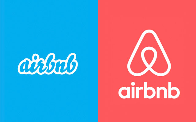
6. Form simplification
There are sloppy people, and there are neat people. We love both, but if logo and branding trends are any indication, it’s time to make room for cleanliness.
In the recent Mastercard and Airbnb rebrands, visually busy logos were exchanged for streamlined, simple designs.
7. Moving parts
We’ve saved the best for last! One of the most exciting trends on our radar is branding that introduces both logo design variation in printed materials and web-based animated GIFs, such as those below for Ta La Wa, Open View and Giant Owl Productions.

Logo Design Trends 2017 Infographic
Feel free to click on the logo trends infographic to view it larger.
Share this Image On Your Site
Do you have any further top best logo design trends to add?
More Notable Logo & Branding Trend Articles
—
This article and infographic were contributed by DesignHill, a graphic design marketplace that offers logo design services.
Of these trends, I like From simplification and Hand drawn trends. In my opinion, these two gives more natural look. Thanks a lot for sharing it.
Featured on A Huge Idea:
http://www.ahugeidea.com/pin/2017-logo-design-trends-inspiration/
Great article, quite an accurate picture of 2017 logo trends!
Wow so cool, I need this post for my logo project in 2017!
Usually drawn to line art design I will try to include negative space techniques into it as well for my next freelancing projects in 2017. Cheers idb.
Some facts I didn’t know, surprise how search engines (Goggle) work. thanks for sharing.
Great read! Of these, I feel Line art and negative space logos create a great impact. Here is an article about the UI trends in 2017. http://colorwhistle.com/graphic-design-trends-in-2017/
Hello Designhill Team,.
Thanks for this article.It’s really worth to read it.Specially I like vintage and moving part trends.
Great read! This was very informative and enlightening, can’t wait to read the next one!
The design is nice and simple, i like’t.. 🙂
Amazing trends and forecasts related to 2017, there are also same from 2016 and they will rule 2017 also, You have given a clear cut idea about branding, identity and logo. Thank you very much for sharing this great information.
Your logo is a visual cornerstone of a company’s brand. Your company’s identity is visually expressed through its logo, which, along your company’s name’, is one of the main things that makes your business memorable…nice post thanks for sharing info
The Line Art, Hand-Drawn and Negative Space are existing design styles since 2015, however, it’s pretty much exciting how would it evolve this year, because what I’ve noticed every year there are some twist puts into existing styles.
Simply WOW. We like these great looking logos.
Simple and beautifull design,,, High creativity 🙂
yes, it is 2017 Trends collection, thanks for sharing Jacob.
Minimalism isn’t a trend. It’s a lifestyle.
Thanks for this article.It’s really worth to read it.Specially I like vintage and moving part trends.
Great logos, looks promising and creative.Great share.
AWESOME POST!
It’s really helpful for newbies.You describe most of the logo category by part to part. So it very simple for understanding. I love minimalism.