Often as designers we are faced with the challenge of selecting fonts that work well together.
Which is why we’ve compiled this list of the top 30 best font combinations utilizing Google Fonts (which are free) as well as a list of more premium font combinations.

Want to see these combinations in use? Check out the Font Combination Tool which utilizes 170 main Google fonts with multiple matching font combinations, displayed in a neat “web-page” format. TypeWolf is another great site when it comes to typeface combinations.
15 Best Professional Google Font Combinations
What fonts all work well together? We’ve taken the guess work out for you, with these tried & true font pairs.
Get inspired with these free Google font pairings!
- Playfair Display with Source Sans Pro
- Merriweather with Oswald
- Montserrat with Merriweather
- Raleway with Lato
- Elsie with Roboto
- Dancing Script with Josefin Sans
- Abril Fatface with Roboto
- Corben with Nobile
- Spirax with Open Sans
- Wendy One with Lato
- Baloo with Montserrat
- Cherry Cream Soda with Raleway
- Amaranth with Open Sans
- Palanquin with Roboto
- Sansita with Open Sans
Top 15 Best Professional Font Combinations
Below we share some professional font combinations that are not Google fonts. Enjoy these top font pairings.
- Super Grotesk & Minion Pro
- Montserrat & Courier New
- Rockwell Standard & Lora
- Copernicus & Proxima Nova
- Century Gothic & PT Serif
- Kaufmann & NeutraDemi
- Brandon Grotesque & Minion Pro
- Playfair Display & Museo Sans
- Raleway & Lusitana
- Alternate Gothic & Helvetica & Garamond
- Source Sans Pro & Times New Roman
- Cubano & Nunito
- Proxima Nova & Georgia
- Nimbus Sans Condensed & Athelas
Related Font Posts
- 10 Best Pro Fonts for Clean and Minimalist Logo Design
- The Top 100 Best Fonts Of All Time
- 30 Fonts That All Designers Must Know & Should Own
- The Top 100 Best Fonts Of All Time
- 20 Best Modern Fonts
- 10 Most Iconic Fonts
- 27 Classic & Elegant Fonts
- Illustrator & Type Tips Worth Knowing
- Best Script Fonts
- How to Use Custom Fonts with @font-face on WordPress
- Classic Fonts For Contemporary Design
- 20 Typefaces To Start A Designer’s Career
UNLIMITED DOWNLOADS: 400,000+ Fonts & Design Assets

All the Fonts you need and many other design elements, are available for a monthly subscription by subscribing to Envato Elements. The subscription costs $29 per month and gives you unlimited access to a massive and growing library of 400,000+ items that can be downloaded as often as you need (stock photos too)!

The Top 15 Best Google Font Combinations & Font Pairings
1. Playfair Display with Source Sans Pro Font Combination
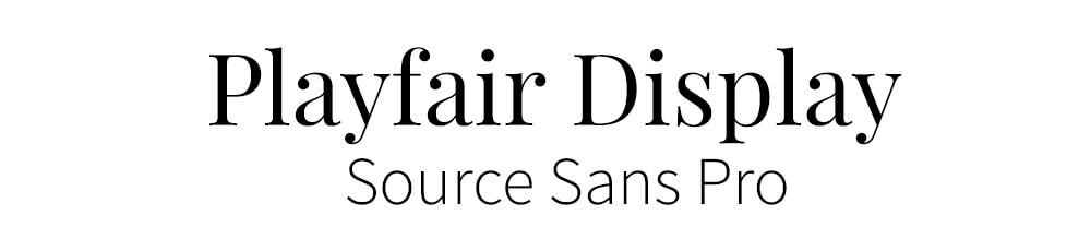
Playfair Display was designed by Claus Eggers Sorense, and is a Traditional Style font. We believe that it works very well with Source Sans Pro, a simpler font style. People are going back to the more traditional styles of fonts, because they look elegant and give a feeling of excellence.
2. Merriweather with Oswald Font Pairing

This font is very easy to read, and can be altered easily for width and height. With the use of its serifs and legible text, it’s sure to be a top font for the new year. Complemented with Oswald, a Sans Serif font.
3. Montserrat with Merriweather Font Pairing

Designed by Julieta Ulanovsky, Montserrat is a modern, streamlined and legible font, because it’s a Sans Serif it’s good to pair with a serif font like Merriweather.
4. Raleway with Lato Font Pairing

A simple yet stylish sans-serif font, Raleway can be used for many different design styles, making it a versatile font to select. We have chosen to pair it with Lato, which is also a sans-serif font, however, by using it as smaller and thinner text it compliments the header text perfectly.
5. Elsie with Roboto Font Combination

This is a beautiful font, it was created to celebrate the world of women and with it’s flowing edges and serifs it is very elegant. It’s such a detailed font it needs to be paired with something very simple. This is why a font such as Roboto is perfect, it doesn’t detract away from the style of the header font.
6. Dancing Script with Josefin Sans Font Combo

Just as the name suggests, this script font is flowing and creative. Most script fonts really need to be paired with a simple font, so they don’t overrun the seed font.
7. Abril Fatface with Roboto Font Pairings
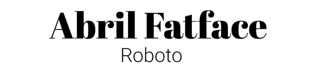
A very unique and interesting font style, with its Didone style serifs and bold lettering, Abril FatFace really grabs your attention. When pairing it, you must have something subtle and clean like Roboto, which is a sans serif style font.
8. Corben with Nobile Font Pair

A modern and stylish font, with many curves, Corben is a bold stand out from the crowd, reminiscent of Cooper Black. Due to its heavy font-weight, it must be paired with a simple font, such as Nobile.
9. Spirax with Open Sans Font Combination

A unique font that gives the sense of whimsical mystery and storytelling. Designed by Branda Gallo, it works beautifully well with a simple san serif font, like Open Sans.
10. Wendy One with Lato Font Combination

A bold, quirky, eye-catching font, designed by Alejandro Inler. It is modern in appearance and needs to be paired with a slim font, like Lato.
11. Baloo with Montserrat Font Pairings

Designed by Ek Type, Baloo is a bubbly, rounded font, and works well with a simple font like Montserrat, due to it’s lighter weight.
12. Cherry Cream Soda with Raleway Font Pair
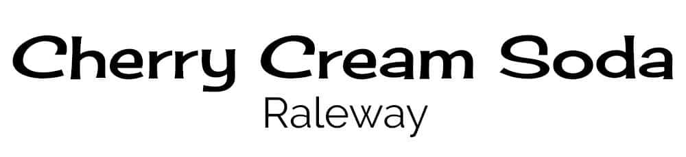
A creative font, designed by Font Diner, it inspires memories of the 1950’s soda craze. It’s a unique style, that must be paired with a simple font like Raleway, with it’s clear straight lines.
13. Amaranth with Open Sans Font Combination

This font creates interest because it’s not just a simple straight font. It has slight curves that make the lettering eye-catching. It could be used for many different applications in design and should be paired with a sans serif font, like Open Sans.
14. Palanquin with Roboto Font Combo

A very versatile font, it can be used with many different weights and heights, and still looks amazing. Designed by Pria Ravichandran, it can be paired with something similar, like Roboto.
15. Sansita with Open Sans Font Pair

A wavy, stylish font, created by Omnibus-Type, with a variety of sizing options available. It is easily paired with a sans serif font, like Open Sans.
How to Combine Fonts, How Not To, and the Best Font Combinations
UNLIMITED DOWNLOADS: 400,000+ Fonts & Design Assets
All the Fonts you need and many other design elements, are available for a monthly subscription by subscribing to Envato Elements. The subscription costs $29 per month and gives you unlimited access to a massive and growing library of 400,000+ items that can be downloaded as often as you need (stock photos too)!
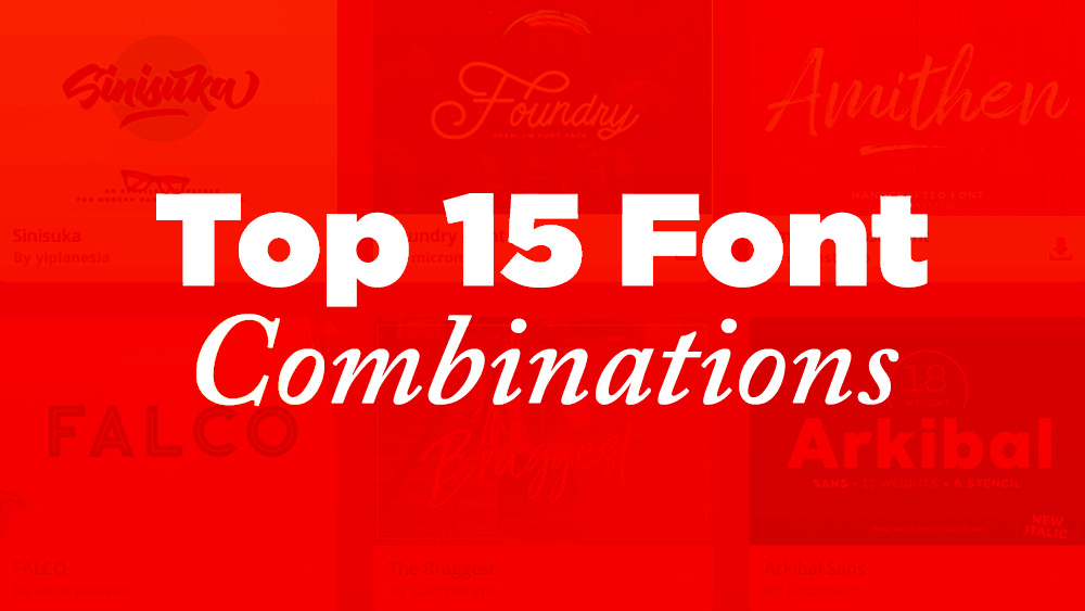
Top 15 Font Combinations
Typography pairing: perhaps the single most frustrating and time-consuming task you’ll face as a designer when starting any new graphic design project.
For many reasons, it’s something that’s extremely hard to get right, and despite the fact that there are literally thousands of typefaces to choose from, it’ll probably always seem as though the typeface you actually want simply doesn’t exist.
Even if you do manage to pick a winning primary typeface for your design, you’ll then need to begin the painstaking process all over again in order to find yet another typeface to compliment your original choice (help!).
Despite the fact that so many people struggle with this, there isn’t much help out there. Sure, you can use a typographic cheat sheet (such as this one for Google Fonts), but that doesn’t always get the job done.
So, we thought we’d scour the web for some stunning font combinations, with the aim of giving you some inspiration when it comes to combining type. Enjoy these top font pairings!
1. Super Grotesk & Minion Pro

Usually, when combining typefaces, it pays to keep things simple and follow well-established rules (such as combining a sans serif typeface with a serif one), and this is exactly what this site has opted to do.
For the large type, Minion Pro has been used. Minion Pro is a beautiful serif typeface that has an air of luxury about it. For smaller type, you can see Super Grotesk, a sans-serif typeface that appears quite thin, light, and extremely modern.
It’s a perfect match that creates a luxurious yet minimalistic brand.
2. Montserrat & Courier New

Claire Marion has opted for a very minimalistic look here by making use of Montserrat and Courier New.
Montserrat is a widely used typeface these days (you’ll see it all across the web) and the reason for that is simple: it’s an elegant, modern, sans-serif typeface that is perfect for a variety of uses.
Courier New on the other hand is used less on the web, and as you can see, the styling is somewhat reminiscent of the sort of type that a typewriter might produce.
3. Rockwell Standard & Lora

Politicians for Change has made use of two great fonts here that aren’t all too different in their appearance.
Rockwell Standard (which has been used for main headings) is classified as a slab-serif typeface, whereas Lora (which is used for subheadings) is classified as a serif typeface.
They’re by no means the same, but when using a slab-serif/serif combination, the similarities are more pronounced than say a serif/sans-serif combo.
Still, it’s a great combination.
4. Copernicus & Proxima Nova

Copernicus isn’t typically a typeface that you see too often, which is a shame, as it’s a stunningly well-crafted typeface that deserves more attention.
In this design, it has been used primarily for headings and titles, with Proxima Nova being featured alongside it as the main body font.
The two typefaces compliment each other wonderfully (it’s a classic serif + sans serif combination). Copernicus ensures that the titles are eye-catching, while Proxima Nova does a great job of displaying paragraph text in a readable manner, even at small font sizes.
5. Century Gothic & PT Serif

Here, we have another great sans serif + serif typeface combination, but this time we’ve got Century Gothic and PT Serif.
Clearly, PT Serif is the serif typeface, and it has been used primarily for the paragraph text. It’s a stylish typeface that is elegantly crafted, making it perfect for this brand.
The same goes for Century Gothic; it has a certain style to it that, for whatever reason, just seems to compliment PT Serif perfectly. It’s not all that dissimilar from Source Sans or even Proxima Nova.
6. Kaufmann & NeutraDemi

Kaufmann and NeutriDemi might not be a combination you’ve necessarily seen before, but as you can see from the example above, it’s a combination that works extremely well.
NeutraDemi is a perfect example of a modern sans-serif typeface that oozes style and elegance, while Kaufmann adds flair to the design with it’s handwritten nature.
You probably wouldn’t automatically think of putting these two together as they’re just so different, but for the right project, it’s the perfect combo.
7. Brandon Grotesque & Minion Pro

We’ve seen Minion Pro featured already in this post (the first example) alongside Super Grotesk. Here though, it features alongside Brandon Grotesque and plays a slightly different role.
Whereas in the first example, Minion Pro was used for the large headings, here it is used predominantly as a body typeface. The great thing about Minion Pro is that it’s a classic, highly readable serif typeface, making it the perfect choice for smaller text.
Brandon Grotesque is used for the headings; it’s thick, bold, and grabs your attention.
8. Playfair Display & Museo Sans

It’s often difficult to find a typeface that offers elegance, class, and style without being too overly flamboyant and unreadable. Luckily, Playfair Display matches that brief perfectly.
Playfair Display is a classic serif typeface, but as you can see from the image above, it’s much more than that. It has a sense of class and elegance (just look at the styling of the “&” above, for example), while still coming across as a relatively simple font that isn’t too “in-your-face”.
Museo Sans – a sans-serif typeface – is the perfect partner, as its simplicity helps to counteract some of Playfair Displays flair.
9. Raleway & Lusitana

If you’ve ever visited the website of any freelance SEO specialists before, you’ll no doubt have come across something poorly designed that holds very little regard for typographic beauty.
Obviously, this is a bit of a generalization, and while it’s true for most of these kinds of sites, there are outliers, such as this site.
Mary has used Raleway (a free font from Google Fonts) and Lusiana to create a warm, welcoming, and down-to-earth brand for herself. Again, it’s a serif + sans-serif combination that hasn’t been overthought.
10. Alternate Gothic & Georgia

Simplicity is the name of the game here, as you can tell from the minimalistic and relatively flat design of the site.
There’s a reason for this simplicity too: it keeps the product center stage and makes sure not to detract your attention with unnecessarily flamboyant design elements.
The typography used throughout the site also adheres to this design philosophy. It’s yet another class sans-serif + serif combination making use of Georgia and Alternative Gothic.
Alternate Gothic is a simple sans-serif typeface, and Georgia is perhaps one of the most elegant, yet understated, serif typefaces out there. Perfect.
11. Helvetica & Garamond Font Combination

Here’s another site that keeps things relatively simple, with the use of Helvetica and Garamond.
Helvetica is the primary typeface used throughout the site, which helps to keep things as simple as possible. It’s a portfolio site, so it’s important that nothing detracts from the content, which is what makes Helvetica the perfect choice.
Garamond is used sparingly and quite rightly so too, as in its italic form, it can become overbearing when used in large quantities.
12. Cubano & Nunito

Cubano and Nunito isn’t the most common typographic combination out there, and it’s not hard to see why: it combines to create quite a unique design that would only be appropriate for certain brands.
Despite this though, it’s still a stunning combination. It would work particularly well for a non-profit organisation, a charity, or perhaps a business with sustainability at its heart.
You’ll notice that both of these typefaces are sans serif; this can often cause a clash of styles due to typeface similarity, but in this instance, the two fonts are so different that there’s no fear of this.
13. Source Sans Pro & Times New Roman Font Combination

Times New Roman is seldom used on the web these days, primarily because most designers opt for newer and seemingly more modern typefaces in their designs.
However, it’s important to remember that Times New Roman is a great typeface, especially if you’re looking for a highly readable serif typeface that will no doubt bring a sense of familiarity to your design.
Source Sans Pro is a slightly more common typography choice, which works beautifully alongside Times New Roman, especially if you’re looking to create a simple and elegant brand.
14. Proxima Nova & Georgia Font Combination

Proxima Nova and Georgia is becoming a classic typographic combination, especially on the web.
In fact, you’ve probably seen the combination across numerous websites, and there are a couple of perfectly valid reasons for this. Firstly, it’s a stunning combination and secondly, it’s perfectly suited to a variety of different brands and styles.
Unsurprisingly, it’s a sans serif + serif combination, with Georgia being used for smaller body text, and Proxima Nova being used for headings/subheadings.
15. Nimbus Sans Condensed & Athelas Type Combination

Nimbus Sans Condensed & Athelas Type Combination.
If you want to create a brand that oozes elegance and luxuriousness, there aren’t many typographic combinations more suitable than Nimbus Sans Condensed and Athelas.
Athelas is a stunning serif typeface that isn’t all too dissimilar from Georgia, albeit with a little more class and personality to it. Nimbus Sans Condensed, on the other hand, is the complete opposite: a chunky, condensed sans-serif typeface.
As per usual in the world of typography, opposites attract, and that’s certainly the case here.
Frequently Asked Questions
What are font combinations?
Font combinations or font pairings that compliment or balance each other. Although the general feel of these fonts should be cohesive, they can also add contrast or accent to help the overall typographic theme stand out.
What are some good Google font combinations?
Playfair Display with Source Sans Pro Font Combination, Playfair Display with Source Sans Pro Font Combination and Abril Fatface with Roboto Font Pairings are great Google font combinations to opt for as they are great pairings to use for several unique requirements.
What are the best professional font combinations?
Some good professional font combinations include Raleway & Lusitana and Century Gothic & PT Serif are some great professional font combinations as they are more modern fonts that are great for almost all professional settings.
What are good serif and sans serif font combinations?
Copernicus & Proxima Nova, Rockwell Standard & Lora, and Raleway & Lusitana are some good serif / sans-serif font combinations as they do a great job of balancing each of their counterparts well.
What is a great script and serif font combination?
The Dancing Script with Josefin Sans Font Combo is a great script and serif font combo, this combo is perfect for more decorative and classy designs.
What are some elegant font combinations?
Century Gothic & PT Serif, Alternate Gothic & Georgia, and Elsie with Roboto Font Combination are some great elegant font combinations as they do a good job combining the old world with the new.
What is a good luxury font that pairs well with others?
Super Grotesk & Minion Pro and Nimbus Sans Condensed & Athelas Type Combination are good luxury font combinations for more luxurious branding and design.
Best Google Font Combinations & Typeface Combinations
Check out this infographic that shows the art of mixing typefaces using Google fonts.

—
Bio: Josh loves typography; he spends much of his spare time sifting through Google Fonts, searching for the perfect combo for his clients. He also loves working out, keeping fit, and cooking.
One thing I really struggle with is deciding on a font. Like you say, despite the vast numbers out there I can never seem to find one that looks exactly the way I want it to. Thanks for inspirations, I’ll check them out.
Nice showcase! There are lot of inspiring and creative things for the graphic designers especially for the web designers.. Thanks for featuring this inspiring list..
http://www.hacknearn.in
Most inspiring post for web designers.
Good work!
Great article and thanks for the insight on each! I get so overwhelmed with the sheer magnitude of what’s available and give myself headaches second guessing each decision. Poor Times New Roman though, will try to show some more love for that guy
Great post, Thanks , Keep sharing inspiring posts.
Really, really like Century Gothic & PT Serif packaged together like that … very nicely done.
I lost count of how many times I ooh-ed and aah-ed at the combinations. 🙂 If I had to pick a favorite though, that’ll be Playfair Display & Museo Sans. It just looks so elegant and sophisticated! I would definitely save the combination for my next formal house dinner for friends.
Most Expensive High Priced Things in the World
http://www.hacknearn.in/2015/05/most-expensive-high-priced-things-in.html
simple trick to improve alexa rank,adsence earnings,traffic,all the blog needs juct click the link to know more
http://www.hacknearn.in/2015/05/latest-high-pagerank-blogs-for-blog.html
This font is also very beautiful,http://graphicriver.net/item/fontmagic-square/11631074
In my opinion, the easiest way to achieve ‘concord’ is by using different fonts within the same overarching typeface family. Find a so-called ‘superfamily’ and you’ll have a ready-made range of weights, styles and classifications that are specifically designed to work together.
This article is fantastic! Thank you for creating this little list of font pairings… we took advantage of Open Sans with a project of ours and we are experimenting with subsequent pairings for headers and body fonts… we’ll keep everybody posted with our revisions!
Good graphic design doesn’t happen by mistake, and neither does clever font marriage.
Thanks for sharing this!
Some inspiring ideas in this article, thanks. I’ve never really put too much thought into which fonts I use before, to be honest. I will now!