
This article was contributed by Kevin George.
Dark mode has been one of the fastest-growing design trends in recent years. Now, it’s not just a trend – it’s best practice.

Nowadays, people prefer to access WhatsApp, Instagram, Facebook, Twitter, Slack, and emails in dark mode. Apple and Google have taken the lead and made dark themes fundamental parts of their user interfaces. They have integrated dark mode into their latest operating systems updates of iOS 13 andvgt Android 10 respectively.
The adoption rate of this trend is very high. In November 2019, Polar reported that 95% of people prefer to use dark mode.
In March 2020, Android Authority revealed that 91.8% of users favor dark mode wherever it is available.
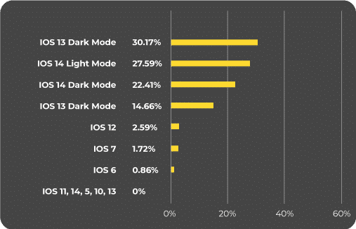
Looking at Apple users, 7.5% of people use dark mode on Apple Mail.
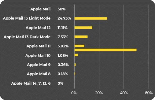
37% have switched to dark mode on iOS.
What is Dark Mode?
Essentially, dark mode is an inversion of colors that makes the background darker and the fonts, visual elements, and icons lighter.
The inception of dark mode can be attributed to the increasing screen time of people. Developers came up with this theme to mitigate the risk of spending too much time in front of digital devices.
Advantages of Dark Mode
Dark mode has several advantages for the average user:
- Easier to read in the dark. While working in a room with low ambient light, it is easier to read lighter text on a dark gray background.
- Reduces eye strain. Dark mode helps to alleviate the strain to the eyes that is caused by bright white light.
- In most cases, dark mode makes content more accessible for readers with vision impairments. No wonder programmers prefer to type out their codes in a dark background.
- Battery advantage. Dark mode helps to save the battery life of devices.
- Less disturbing for others. If you are burning the midnight oil and someone is sleeping next to you, dark mode can be less disturbing for that person.
- Prevents migraines. Patients with photophobia must switch to dark mode as it will help to prevent migraine.
- Better entertainment UX. Dark themes work particularly well for entertainment-related UIs such as Smart TVs, game consoles, and TV ad mobile apps. These themes take the user experience to the next level with a profound visual effect of promos, trailers, or movie screenings.
See how Netflix has harnessed the power of dark mode on their website.

Disadvantages of Dark Mode
With the good comes the bad, so it can get quite messy if you have designed your visual elements without dark mode compatibility in mind.
Here are some other drawbacks of using dark mode:
- Dark mode slows down rendering. If you don’t design a compatible version of your website, email, or app, it will lead to a broken layout and an overall unpleasant UX when your audience uses dark mode on their device.
- Dark mode can reduce emotional connection. If you are a brand aiming to evoke specific emotions, dark mode may be a problem for you. The darker colors can make it difficult for visitors to establish a personal connection with the content. Health and wellness companies, for instance, will not be compatible with dark themes.
- Dark mode creates a sense of space reduction. Just like dark walls in rooms can invoke a feeling of claustrophobia, using dark mode on devices can elicit a similar sense.
Dos and Don’ts of Designing to Ensure Dark Mode Compatibility
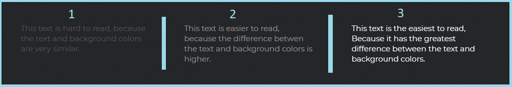
1. Do Abide by Color Contrast Standards
Your text should be comfortably legible for people using dark mode. According to Google Material Design, dark surfaces and 100% white body text must have a minimum contrast level of 15.8:1.
Take a look at the image below. The third section is far more readable than the first and second one. This demonstrates how color contrast becomes all the more important when you are designing for dark mode.
Tools to Check Color Contrast
- WebAIM Color Contrast Checker
- Contrast Ratio
- Tanaguru Contrast Finder
- A11y Color Palette
- ColorBox
- Contrast: a macOS app
- Accessible Brand Colors
- Color Review
- Colorblindly
- Colorable
- Button Contrast Checker
Besides these, there are tools like Sim Daltonism and NoCoffee Visual Simulator that help designers visualize colors as they would be seen by people with different types of vision problems, including color blindness.
2. Do Create Depth in Images
It’s important to understand that while you can easily use shadow effects in light mode, this concept does not apply to dark mode. Users will not be able to see shadows against dark backgrounds.
Here’s an image to demonstrate:

To avoid such blunders, designers should instead illuminate the surface of each level. Use overlays to represent elevated surfaces and components. As the surface elevation becomes higher, the surface becomes lighter.
3. Don’t Use Pure Black in the Background
Dark mode does not necessarily mean that a pure black background must be used behind pure white text or icons. Such a high contrast could be exhausting for the eyes.
Therefore, use dark gray (Hex code 121212) instead of true black. Besides being less fatiguing for the eyes, dark gray surfaces make it easier to discern shadows and represent a wide range of elevation, depth, and color.
4. Don’t Use Saturated Colors on Dark Backgrounds
Saturated colors impart a greater visual appeal when used on light backgrounds. However, the same colors cause a vibration effect on dark surfaces which renders them difficult to read. Use desaturated primary colors that will deepen the contrast against dark surfaces.

Image source: roadwarriorcreative.com
As a best practice, it is advisable to use colors in the range of 200-50 as they will enhance readability in dark mode.
Have a look at the screenshot below to get an idea of the kind of pastel colors you can use for dark mode compatibility.
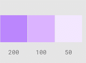
Image source: material.io
5. Do Use “On” Colors for Text
Colors that are displayed on the top of components and key surfaces are referred to as “on” colors. Generally, these colors are used for text. Pure white is the default “on” color used for a dark theme. However, as discussed in the previous point, these colors lead to visual vibration against dark backgrounds. Hence, it is recommended to use a darker white.
Also, remember that when you use light text on a dark background, it will appear bolder when compared to dark text on lighter backgrounds. Owing to this, use lighter font weights for dark mode.
6. Do Consider Your Brand’s Personality and Emotional Appeal
Many designers overlook this aspect as far as dark mode compatibility is concerned. They try to recreate the same emotional appeal through a dark theme. This is not advisable because people will perceive colors differently according to the background.
Therefore, you won’t be able to evoke the same emotions in dark mode settings as in light mode. What you can do instead is make use of this opportunity to create your product’s identity.
7. Do Add a White Outline Around Logos and Icons
To make sure that your logo stands out on the dark background, make sure you add a white outline around the logo outline.

The same trick applies to icons as well.

8. Do Use Transparent Images in PNG Format
To ensure dark mode compatibility, always use transparent images in PNG format. The reason being that these images will take up the background colors on reversal. As a result, your image will look good in dark mode as well as light mode.

9. Do Crop Images Well
If you aren’t able to use transparent images, make sure you crop your images properly. Take a look at the image below.

If the image is cropped too close to the logo or image, it will not look good in dark mode.
10. Don’t Combine Background Colors and Images
Background colors will change when you switch from light to dark mode, but images will not change. Therefore, designers must not combine background colors and images if they want their design to be dark mode compatible.
Designing Emails for Dark Mode
We’ve covered 10 general dos and don’ts for designing for dark mode compatibility. But what about specifically designing emails that users view in dark mode?
Dark mode was first introduced to email in September 2018 when Apple revamped its 15th release of desktop Operating System, macOS Mojave. A year later, Gmail launched dark mode for Android and iOS devices, as well as iOS Mail.
Apple Mail is generous enough to allow designers and developers to build emails for light as well as dark modes by using CSS. Developers can change font colors, visual elements, icons, and backgrounds with the help of HTML meta tags, CSS target, and updated properties.
Email enthusiasts are hoping that such customization will be supported by all the popular email clients really soon.
As we can see in the table below, each email client treats emails differently when in dark mode.
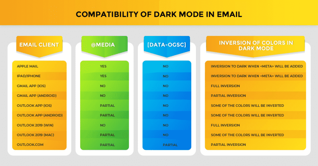
Email Rendering in Dark Mode
Email rendering becomes all the more challenging with dark mode.
Here’s how a well-designed email will look in dark mode.

Here are three ways in which a dark mode email will render across different email clients.
Traditional Email Clients
Subscribers who are accessing your email on desktop, web, or traditionally used mobile email clients will not see any change in the email even if the dark mode setting is on.
For example, this email by Grammarly will be displayed exactly like this even in dark mode.

Outlook
Emails viewed using Outlook will have a partial color inversion when the email is opened in dark mode. Light backgrounds will become dark and dark text will appear lighter. The remaining email elements will not show any change.
Here’s how an email will look in dark mode setting in Outlook.
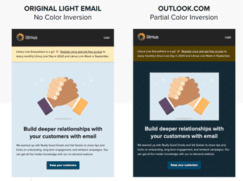
Image source: litmus.com
Windows
In Windows, all the colors are inverted when an email is viewed in dark mode. This can be a problem if you have sent a dark theme email. The email will become light-themed when accessed in dark mode for Windows.
Here’s how an email will look in dark mode in Windows.
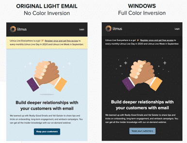
Image source: litmus.com
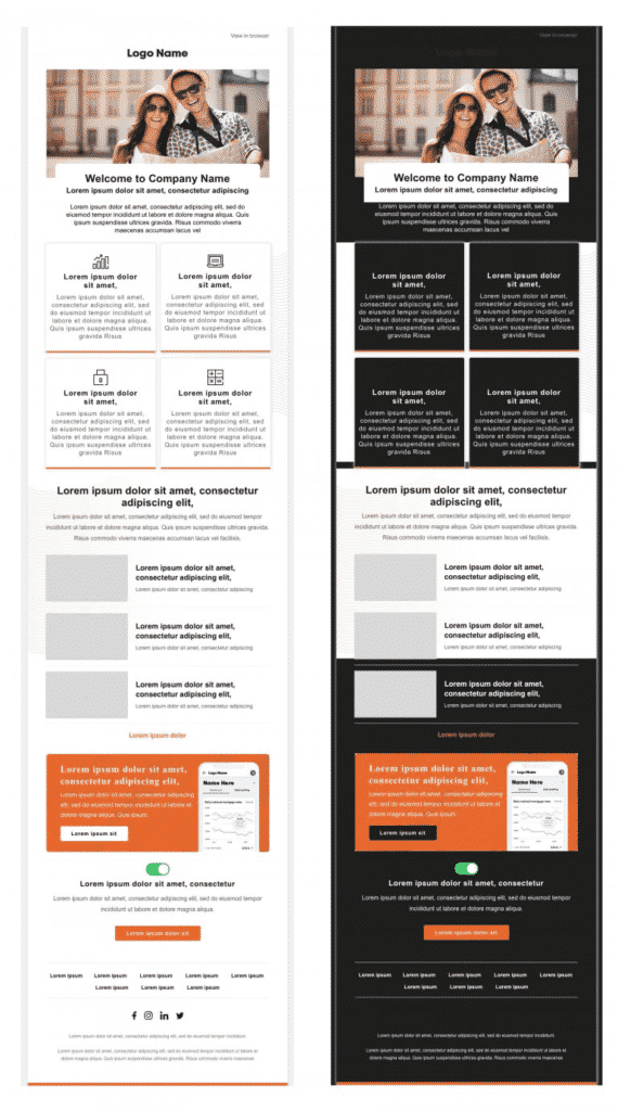
These color inversions do not create any rendering issues as such because the design elements are pretty much in sync with dark mode.
However, if you miss out on adhering to the dark mode best practices we discussed above, your email will appear with a broken layout, as shown below.
Email Deliverability in Dark Mode
If an email is not designed to render well in dark mode, it will trigger spam filters and have a negative impact on your reputation as a sender.
At the subscriber’s end, an email with a poor appearance will disengage subscribers. They might avoid opening your emails or even unsubscribe and mark your email as spam.
As a result, emails not designed with dark mode in mind will affect your email deliverability rate and you will not be able to successfully reach to your target audience.
ALWAYS Test Your Emails
With every passing day, there are new advancements coming up in the world of email clients. Therefore, you must always test your emails to be completely sure that your emails are rendering well across different email clients, devices, and display settings as well.
Litmus and Email on Acid are two of the most popular tools to help you with testing your emails for dark mode compatibility as well as overall rendering. Other than that, you can also use real devices to test the emails.
The Bottom Line
Dark mode is all set to gain immense momentum in the days to come. If you are a graphic designer who wants to stay abreast with the latest trends, designing for dark mode is the way forward.
These tips will surely allow you to design your next website, mobile app, or email for best dark mode experience.
Image source: What is dark mode in email & how to enable in email clients
_
About the author: Kevin George is Head of Marketing at Email Uplers, one of the fastest growing custom email design and coding companies. He enjoys sharing his insights and thoughts on email marketing best practices on his blog.