
This article has been contributed by Ronita Mohan.
Data is everywhere. It’s the backbone of political and medical decisions in the wake of the pandemic. Data is also at the core of effective data storytelling in marketing.

Stories have long been a powerful tool in the marketing arsenal. Human beings are accustomed to engaging with stories – that’s why they’re such an effective marketing tool.
Imagine a campaign focused on the specifications of a product versus one highlighting how a customer’s life has improved due to a product. The latter is an easy winner.
Where does data come in? Data helps marketers determine which stories will be relevant to the audience. It also helps tailor more accurate campaigns that yield results.
For more on the definition of data storytelling and its importance in marketing, read on.
Data Storytelling Definition
Data visualization expert, Lydia Hooper, defines storytelling with data as a combination of visuals and narrative that helps audiences understand data analysis.
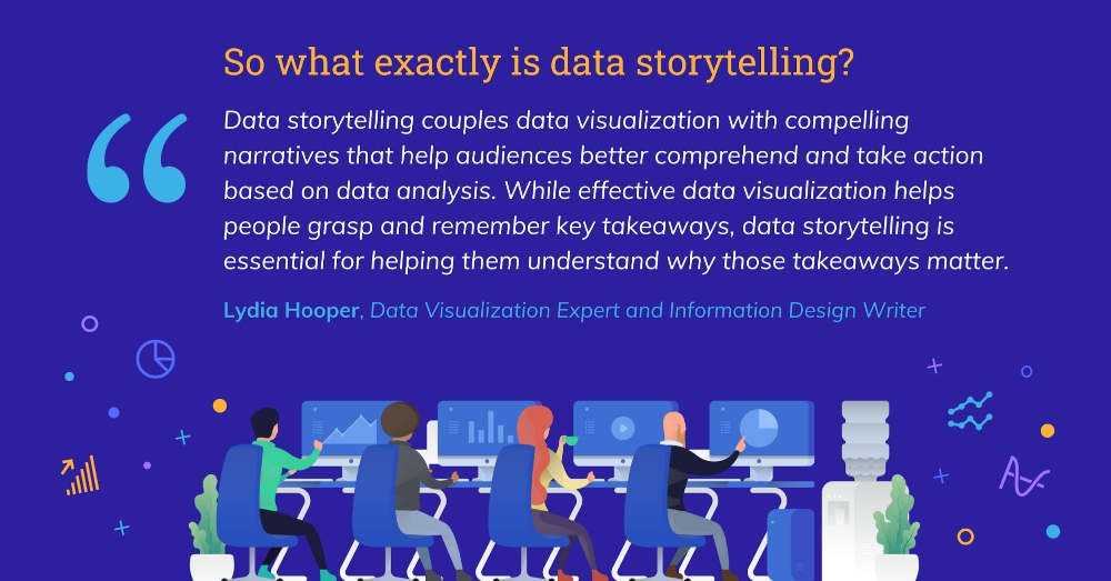
According to Hooper, data is involved in three areas:
- Analysis
- Design
- Communication.
While data visualizations cover the first two areas, data storytelling takes it further by making the visuals easy to communicate and comprehend.
There are numerous data analysis tools available to marketers now. The quantity of data that businesses can use to reach audiences has grown exponentially.
But are the people interacting with this data able to understand what it’s telling them? More importantly, do they know what action the data requires them to take?
This is where the importance of data driven storytelling in marketing lies.
What Makes Storytelling with Data Important?
Data can display patterns and insights that would otherwise have been impossible to comprehend. It can also influence how people react to a topic.
But data can also be confusing for anyone who isn’t collecting it. Presenting data on its own doesn’t have the same effect as telling a story with it.
For example, what does this pie chart tell you? Not much.

Image source: Venngage
So, how are consumers meant to understand what the data means to them without context? Using data driven storytelling methods is key in this case.
76% could mean anything. Even if the pie chart is included in a longer document that explains its meaning, that’s still additional effort being asked of consumers.
On the other hand, the below data visualization that includes icons, text, and the data point of 76% is much easier to understand.

Image source: Venngage
Marketers should collect and share data in the context of a story. It makes it easier to define what they are sharing with audiences. And consumers will be able to understand the data better.
We have seen how data storytelling and data driven marketing go hand in hand. But what does a good data story look like?
5 Examples of Excellent Data Storytelling
The best way to explain what makes a great story is by sharing data storytelling examples. Here are five great examples.
1. Highest Jobs Data Storytelling Infographic
One of the best ways to tell a story is by designing an infographic, like the example below.

Image source: Venngage
What makes this a good infographic? Despite conveying a great deal of information, this graphic is concise and accessible.
There are distinct sections marked by changes in color and layout. Instead of an over-reliance on text, icons and illustrations are used to depict facts.
Visuals like charts, diagrams, icons, illustrations, and photos make infographics like the above engaging. But it’s important to remember that not every data story needs all these elements.
Note how much space there is around each element. This makes it much easier to see and understand the information presented.
The sign of good data visualization storytelling is using each graphic element with purpose.
2. Changing Face of America Data Graph
Showing data over time can be one of the most complex kinds of information to share. Despite the plethora of graph options available, this is one data visualization that people get wrong.
Pew Research charted the racial diversity of America’s population from 1960 onwards. They also estimated the makeup of the country up to 2060. Both sets of data were woven into the graph below.

Image source: pewresearch.org
The simplicity of the graph belies the length and breadth of data included, which is why it’s a great data storytelling example. One only needs the heading and the legend to understand the story being told here.
3. Meet the Freelancers Infographic
The more data sets you have, the harder it is to present them cohesively. The next data storytelling example shows how you can effectively design one graphic for multiple stories.
LinkedIn researched the five types of freelancers in the gig economy. They summed up their findings in this colorful infographic.
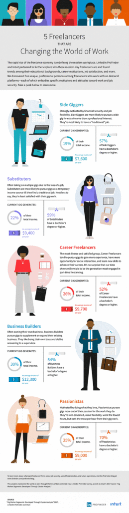
Image source: linkedin.com
The graphic includes both quantitative data research—how much income the freelancers generate—and category-based data—how the freelancers are differentiated from each other.
Each category of freelancers is distinguished by a header and a color theme. The use of icons helps define the personalities and their work.
Charts are used to denote the quantitative data—their income and education levels. These are the reasons why this infographic works.
4. Live Wind Map
The live wind map from Hint FM is a great data storytelling example. The graphic is simple but intuitive, as you can see below.
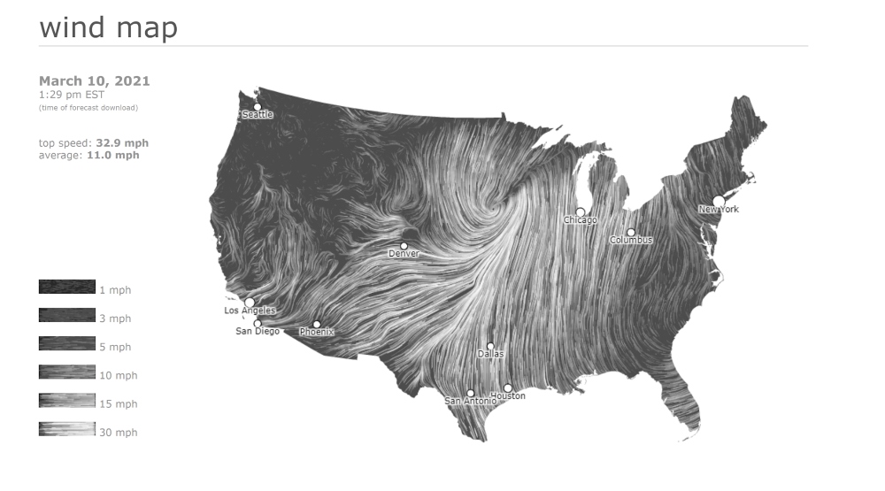
Image source: hint.fm
The legend displays the speeds, which makes it easier to understand where the strongest winds are on the map. One doesn’t need concrete numbers to get the picture.
By hovering over the map, one can see the exact wind speeds for an area. There’s also an element of interactivity involved. Users can zoom in on the map to see more locations.
5. Do You Have the Flu Infographic
The last of our data storytelling examples is a simple process infographic from the American Public Health Association.
Designed for their Get Ready campaign, the graphic tells people what to do if someone is experiencing flu-like symptoms, and when to get the flu shot.

Image source: getreadyforflu.org
The graphic is easy to understand, no matter who the audience is. That’s what makes a great data story—it should be accessible to everyone.
Note how the graphic is branded according to the Get Ready campaign colors. This creates an association between the brand and the audience that lasts long after viewing the visual.
5 Types of Charts and Graphs for Storytelling Through Data
There is one commonality in all the examples we shared above—great charts and graphs. Storytelling through data can only be effective if you choose the right visualizations.
But how does one choose the right ones? You first need to know what kinds of charts and graphs are available to use.
When designing data visualizations, decide what the goal is for your graphic. This infographic below divides common charts and graphs by what they communicate, aka the ICCOR method.

Image source: Venngage
Depending on the message you want to share, you can choose the right visualization from the ICCOR method. You can also use a chart maker resource online to help you choose.
1. Charts to Inform
When you have a single data point to share with your audience, you can use information charts such as:
- A single number
- Donut chart
- Pictograph
For example, the below donut chart tells one data story—that 89% of content marketers are dedicated to their craft.
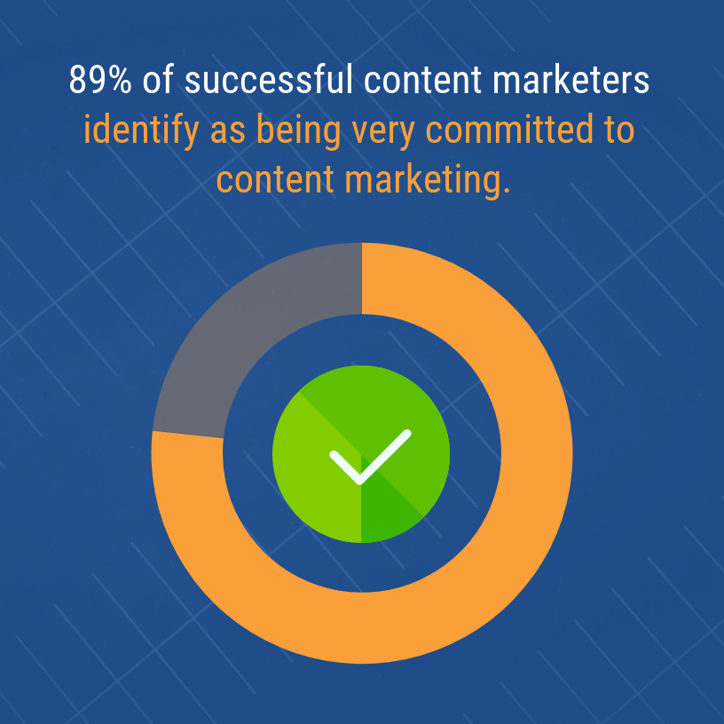
Image source: Venngage
This chart works as a data storytelling device because it’s simple. One glance tells the audience everything they need to know. And the addition of the text gives the chart context.
The same data point could also have been shared as a single number with a text header.
When you don’t have much data to share but still want to make it visually appealing, use information charts to convey your message.
2. Charts to Compare
Comparison charts are some of the most popular data storytelling tools. Here are the types of charts that can be used for comparisons:
- Bar charts and stacked bar charts
- Bubble charts and bubble clouds
- Pie charts
- Treemaps
- Word clouds
Everyone’s seen bar and pie charts. All business reports include these types of charts. That’s because they compare multiple data points, like the below example.

Image source: Venngage
However, another unique way to show comparisons is by using bubble charts. These types of charts make data-driven storytelling more visually appealing, like this example.
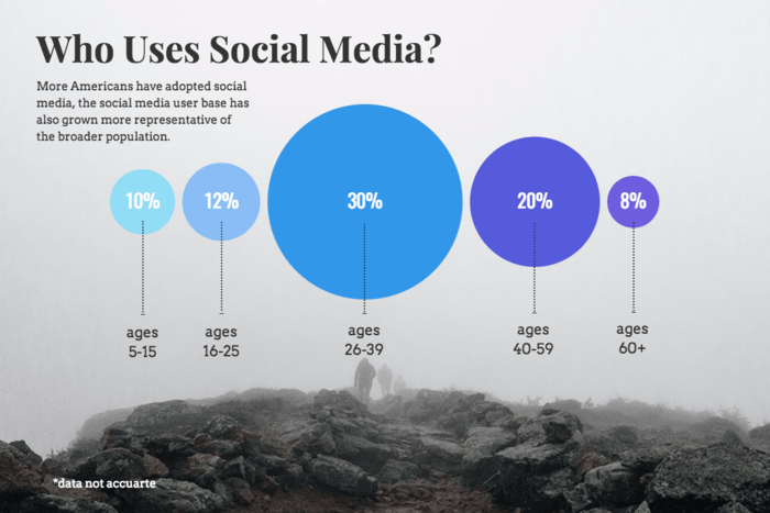
Image source: Venngage
One doesn’t need to examine the percentages to know which point is overwhelmingly larger than the others. The size of the bubbles conveys the comparison easily.
The word cloud is another attractive data visualization to show a comparison between multiple data points. The example below shows the words most associated with business success.

Image source: Venngage
The word cloud is largely text-based but its unusual design makes it stand out from the crowd of visual content online. These also make for attractive social media posts.
3. Charts to Show Change
Showing change is one of the biggest challenges in data storytelling. Choose the wrong chart, and it can become confusing for the audience.
Here are the best charts for showing change over time or location:
- Area chart
- Line chart
- Map chart
- Timeline
Area and line charts are the easiest way to depict changes. This simple line chart shows how response time has been reduced over six months.
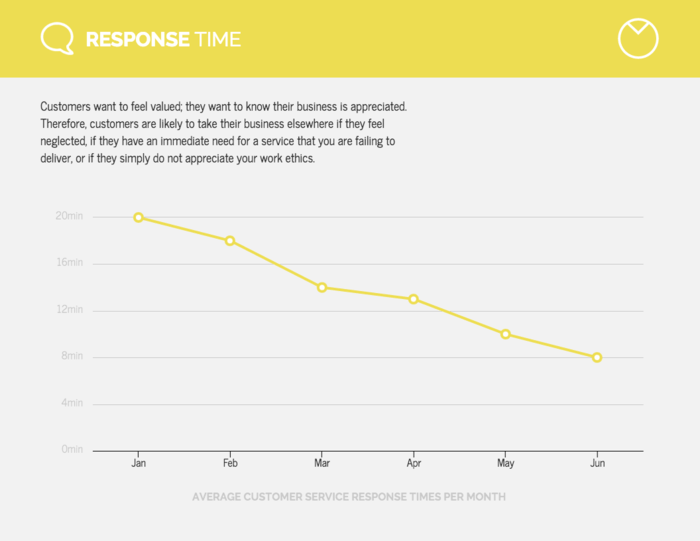
Image source: Venngage
An area chart is similar to a line chart except that it is filled in with color. They’re more aesthetically pleasing than line charts, as one can see from the below example.
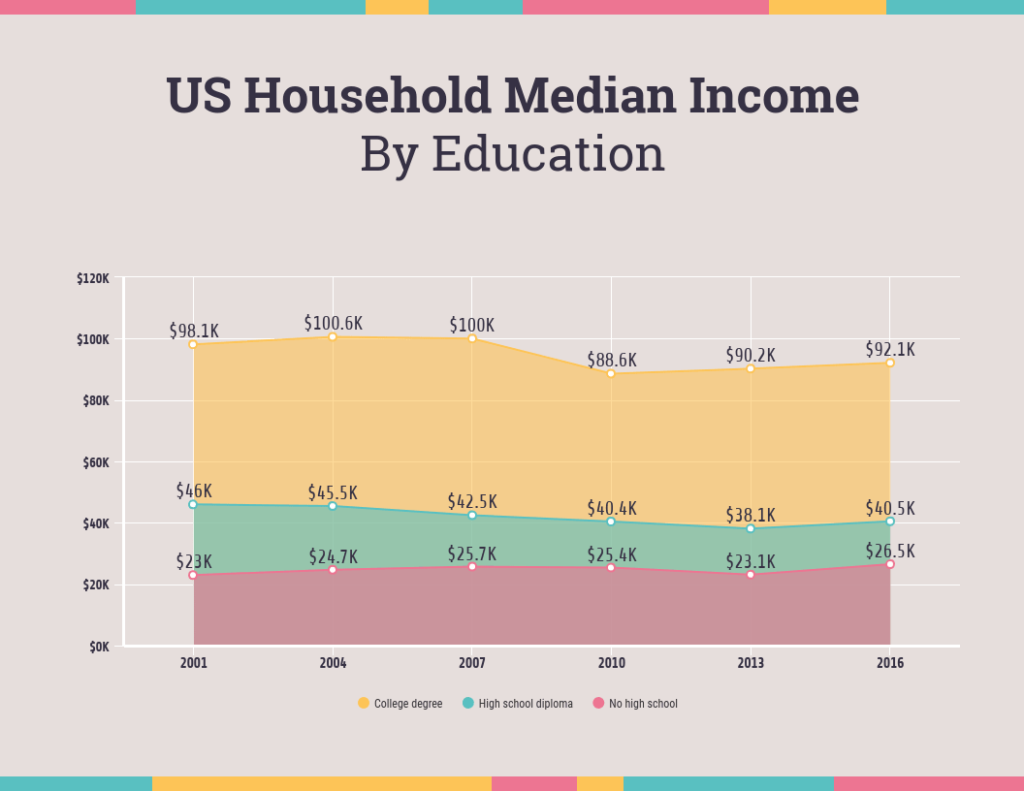
Image source: Venngage
But despite being more attractive, area charts can become confusing if they include more than four data points.
The wind map from the previous section is a good example of how a map chart can tell a story with data.
4. Charts for Showing Organization
When it comes to showing organization, there are numerous charts that marketers can use, including:
- Lists
- Flow charts
- Mind maps
- Pyramid diagrams
- Ordered bar charts
- Tables
- Venn diagrams
Have a ranking or want to show items in order? A list infographic template, like the below, is a great type of chart to use.

Image source: Venngage
A list chart is easy to understand. The numbers and arrows create a natural flow for the eye. The neat squares and distinct colors divide the information up.
A table is another way to show an ordered list of data. Especially when one has multiple datasets that need to be conveyed through concrete numbers, like the below.

Image source: Venngage
Note how the table only uses a few highlight colors—teal and salmon against a white and grey background.
When there is so much data in a visualization, reduce the number of elements that can distract from the central message.
Mind maps, pyramid diagrams, and Venn diagrams help to create groups and indicate how data points flow from each other.
5. Charts to Show Relationships
In our final category, we have charts that show relationships between data points. Three types of relationship charts can be used for this data storytelling technique:
- Histogram
- Multi-series chart
- Scatter plot
When you have multiple variables and want to show a correlation or connection, a scatter plot, like the one below, is perfect for the job.

Image source: Venngage
One can see how easily scatter plots visualize so much data. But it’s important to include a legend for context. Additionally, scatter plots work better with numbers than other data.
Histograms can also be used to show distributions, such as demographics or market segmentations, like in this example.

Image source: Venngage
There are numerous chart options available. To avoid confusion, use the ICCOR method to choose the right charts for your data-driven storytelling.
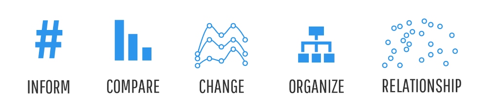
Image source: Venngage
Best Practices for Using Charts in Data Visualization Storytelling
We have outlined how to choose the right charts to make your data visualization storytelling effective. Here are five best practices that will make creating charts easier for marketers.
1. Create Axes
When designing charts, both axes must be included. And the axes should begin at zero. This helps to avoid data distortion.
2. Stay Minimalist
Edward Tufte coined the term ‘data-ink ratio’. It refers to the amount of ink used to print out a data visualization. More ink should be used to print the data-information rather than the visuals.
In other words, graphs shouldn’t be decorative. Keep it minimalist and to the point, as the GIF below shows.
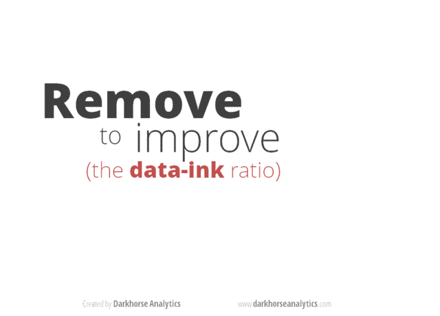
Image source: darkhorseanalytics.com
Remove any extraneous visuals that would detract from the data-information at the heart of the message.
3. Add Context
Most of the data visualizations in this post have one thing in common—they all provide some context for the data.
This can come in the form of labels, legends, or annotations on the visual. All these elements are necessary to make storytelling with data effective.
Always add data sources—again, this helps build trust but it also shows that the data is accurate.
4. Color Use
The color spectrum is massive. But that doesn’t mean that data visuals need to incorporate all the colors. Look at how few colors this map chart uses to display its data.
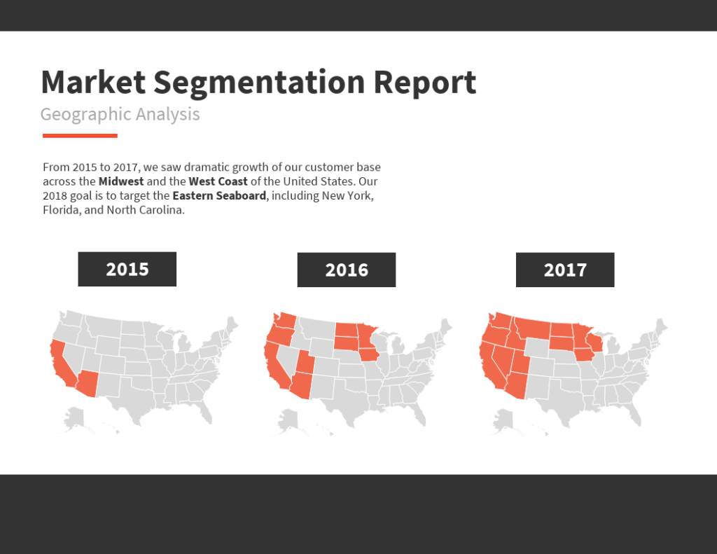
Image source: Venngage
Colors should be used to distinguish data points or highlight the more important information. Use no more than six colors in a data visualization.
Also, remember not to rely entirely on color to convey the data-information. The aim is to create visuals that are accessible to all audiences.
5. Maintain Order
No matter what data is being conveyed in a chart, there should be a clear order to the information.
For instance, to show changes in time, use a pie chart and order the date according to a clock face. Rank items or lists from largest to smallest, or the other way around.
Conclusion: The Right Chart Can Make Data Storytelling More Effective
Great data storytelling may seem challenging. With the right charts, marketers can share compelling narratives with their audience.
This guide has detailed why storytelling with data is so important in the current environment. We have also shared the ICCOR method for choosing the right visualizations for data.
Finally, use the best practices listed above to create charts that will attract and retain audiences.
_
About the author: Ronita Mohan is a content marketer at Venngage, the infographic and design platform. Ronita regularly writes about digital marketing, data visualization, design, and small businesses.