
This article has been contributed by Thomas Glare.
Today, blogging is incredibly competitive. As creating a website becomes simpler and more affordable, both individual bloggers and businesses must struggle with ever-growing competition for eyeballs on their content.

As a result, promoting a new blog can become a challenging undertaking. The good news is that designing a compelling blog layout can seriously simplify this task.
This article will focus on the overall logic of blogs, layout design tips, and functional features that make a website stand. Analyzing how a blog should work will help you come up with impressive, memorable layout design. Let’s get started!
1. Consider Content Placement
Carefully positioning your most informative elements is one of the most crucial stages of any blog layout design. To do so, you need to keep in mind the overall purpose of running your blog and the purpose of each page. For instance, designated landing pages should aim to convert.
Usually, centering the most important elements is the most eye-catching layout design approach. But certain webpages may have a purpose that means it could benefit from a different layout design logic.
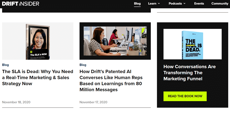
For instance, the main blog index page is a totally different story to blog post pages. With main pages, the goal is to highlight several important sections instead of just one. Depending on your web design blog specifics, you can draw attention to the sidebar, particar elements or to the center of the screen.
When highlighting visuals, central layout design is a better call. When emphasizing text, most users will appreciate a neat arrangement to the left or right side of the screen.
2. Reflect Your Main Vision
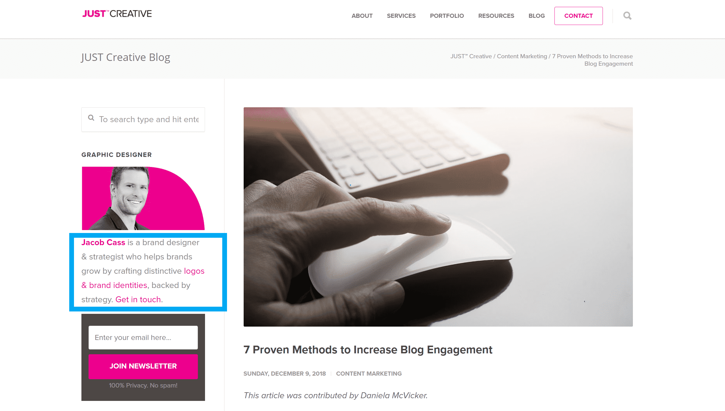
The success of any business depends on its vision and overall mission. Whatever those are, both must be clearly highlighted in your website layout design — literally on every page you feature. You can see how Jacob does this on the JUST Creative website, highlighted in blue below.
This rule of thumb works the same for big corporations and individual bloggers. Regardless of the niche you occupy, products or services you promote, or the informative angle you plan to cover, your vision should be carefully reflected in your layout design, color theme and overall element placement.
No doubt, this stage could be tricky because not all readers will necessarily appreciate blunt promotion of your thoughts and ideas. So, most new bloggers will have to be subtle in their approach. Color combinations, background images, and even overall navigation logic can become subtle hints that can convey your business vision.
Here’s a simple example — most eco-friendly businesses make use of green shades and elements to convey their message. Sea-blue shades can become excellent color choices for a seaside resort, etc. Color is an essential element in any design, and using associations is a great way to convey your ideas.
3. Be Consistent
Once you’ve chosen a layout for each type of page on your site – blog posts, portfolio pages and main index pages for example – stick to it on every page of that type on your website. A blog with different layouts and themes for each page is like a small studio apartment with different doors in each area. Some tenants may like it, but most will get a cognitive dissonance from such an abundance of shapes and colors in single layout design.
Another way to create a positive feeling of structure is to use similar graphics sizes across all blog pages — especially if you feature several visual elements on every page. Ideally, set a standard layout for all your images — this should help create a neat, logical flow on every page, resulting in clean, easy-to-follow visuals for the whole website.
Finally, don’t forget to adjust your content and graphics for various operational systems and devices. Mentioning responsive web design in 2020 may seem unnecessary, but you’d be surprised to know just how many new bloggers ignore this vital layout design step. Don’t make the same mistake – make sure your website looks equally great not just on desktop and mobile; it should also adjust to different screens and devices.
4. Never Sacrifice Loading Speed For Visuals
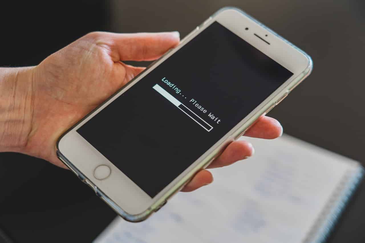
Clean, eye-catching visuals in website design are the best way to catch your reader’s eye. But, no matter how stunning your graphics are, they should never affect website loading speed.
Most users today quickly scroll through web pages before even trying to focus their attention on a specific design element. If the site does not load fast, there is no way you’ll impress your visitors. Sure, this is more of a technical tip than a creative one, but optimizing for speed (once again, across all devices) is one of the most important stages in any website design.
5. Speak To Your Target Audience
The success of a blog rests not on its design, but on how it resonates with its target audience.
Clearly, if you have already started working on your website design, you have some idea about your target audience. But now might be the right time to re-evaluate it or fill in some missing gaps. At this point, it’s not your business specifics that matters but the people you are trying to attract.
Blogs with text, video or graphic content have different subscribers not just because text is for writers and graphics are for designers. Regardless of a particular business niche, it’s the target audience that defines your communication logic.
Consider a blog about cooking as an example. Both written text and video are excellent means for showcasing recipes. But people looking for recipes won’t want to watch a 15-minute recipe video – they would rather quickly skip to a list of ingredients and an overview of the main steps. Only then will they spend more time looking at sections they find more interesting (or less obvious). More experienced cooks also happen to be in their thirties and older, and this demographic also responds better to text recipes. So, choose your communication means and design logic based on your target audience’s preferences.
6. Minimize Distractions, Especially Ads
Monetizing a blog without running a single ad is not always possible, especially on small blogs. Still, any promotional links and third-party content you feature in your blog design should not be distracting.
Everyone understands that many businesses run on ads, and most users today are ok with that. What people are not OK with is those ads interfering with their user experience. Even if you monetize your blog with affiliate links, make sure they don’t interfere with your design and main content.
If you can avoid using ads altogether, do so. For example, large and mid-size businesses that run informative blogs about their products can do just fine without advertising third parties. The cleaner your layout design is, the better.
7. Leverage Negative Space and Color
Another way to minimize distractions is to make the most of your negative space. A quality design for any blog uses a layout that minimizes clutter. Sometimes, website owners try to squeeze as much info onto every page as they possibly can. This is definitely one of the worst website layout ideas, that can spoil even the best impression.
If you need to make your pages informative, play around with placement and scrolling. Give your users’ eye a chance to roam and leave sidebars blank whenever possible. Carefully separate text and visual elements, making sure your content is easy to spot. Highlight important sections with colors, but try not to overdo it. A two-color main theme with a third shade as a contrasting element is a classic design that works for most businesses.
8. Highlight Social Media & Encourage Sharing
Both social media and sharing – having your readers share your content with their networks – are effective means for growing your audience. Therefore, they are important parts of webpage design.
However, depending on your business specifics, you may need to choose whether it’s more important to encourage sharing or draw extra attention to your social media accounts. Businesses offering services and products should start with the latter. The logic here is simple — when people come across your site and like what they see, most users will want to explore your social media for more info and user feedback. Choose just two or three channels you can easily maintain and make sure this info is easily available in your website header or footer (or even both if your website layout design allows it).
Encouraging sharing is equally important for growing your blog audiences and overall client base. Make sure your users can share content directly from your landing page. When designing social share buttons, you can have as many channels as you like — as long as icons do not overlap or create clutter, quite a lot of those can become an integral part of your layout. Once again, considering your target audience is very important when picking social share buttons. Clearly, you should choose networks your clients actually use.
9. Simplify Navigation
A clean and comprehensive navigation bar is absolutely vital for a successful blog. As with the rest of the page design, it’s important to eliminate clutter. Sure, not every website can have a short menu with just 4 or 5 tabs and several sub-tabs (or no sub-tabs at all). Still, for most blogs, such a design is more than possible. Whenever you can, go for simplicity and make your website navigation concise.
If you need multiple tabs, it’s better to stick to the basic structure in the navigation header and add more informative blocks to every page of your website. Or, you can add page numeration to your blog section. Anything works as long as you keep your main blog navigation simple and uncluttered.
Such an approach is beneficial not only for your layout design but also for SEO. As people navigate from one page to another, your bounce rate decreases, and your SEO stats improve.
10. Make Content Easy To Skim
Finally, remember that no webpage design will help if your content is hard to skim through. This goes for each individual blog post as well as the overall blog design. Even the most loyal visitors will scan your blog before paying closer attention to certain parts.
Making the most of blank space, getting creative with headers, highlighting all informative elements and including eye-catching visuals can make your content and overall design appealing. But essentially, it all comes down to proper layout.
Time is money, and if your visitors can find the information they need without wasting a single second on navigation, most people will appreciate such respect for their time. And that’s the main thing that makes a blog valuable — earning your visitors’ trust and respect.
Bottom line, there is no universal design that will work for all businesses. It all depends on your blog’s purpose, your target audience’s needs, and — of course — your creativity when it comes to structuring the best design for your blog. Our final word of advice is to carefully analyze and monitor user activity a few months after launching a new blog. Usually, creating a compelling website that attracts readers is about trial and error. So, get ready to take your time and keep polishing your web design in the first few months. Track your bounce rate, analyze exit pages and make design adjustments on the go.
_
About the author: Thomas Glare is a passionate freelance content writer, always striving to inspire others and bring insight into the endless possibilities of the modern times we are currently living in.