This article has been contributed by Tiffany Porter.
Online forms can have different purposes – collecting contact information, finalizing a purchase and payment, or gathering customer feedback.

Most often though, brands use online forms to convert new website visitors to leads that can later be nurtured through to purchase. But given the average landing page conversion rate is only 2.35%, it’s clear that there’s huge scope for improvement when it comes to online forms.
Hence, here are twenty tips to optimize your online forms and start using them more effectively.
1. Get Your Priorities Straight
Before you even think about what to ask in your form or how to structure it, define the purpose of the form and its place in your overall objectives. It may be to collect feedback, or to get newsletter subscriptions, but you should also understand that there are other priorities and goals you should set.
Are you trying to guide your potential customer to make a purchase once they get to the end of the form? Or do you know that getting them to sign up for a free trial is a necessary middle step towards purchase? Or perhaps you are simply looking to collect feedback on the effectiveness of your marketing campaigns? If this is a survey, is there a timeframe or a minimum number of responses you are aiming for?
2. Ask for The Right Information
Not everything should be asked in online forms. Some customer information can be asked directly via email or phone call. Some of it doesn’t even need to be asked because you will probably end up discarding it.
This is why, when creating your forms, you need to avoid any unnecessary questions that make your forms cluttered. Every time you want to add a question, ask yourself, “Is this information important for achieving the goals I have set?”
This multi-step form from Toptal gets straight to the important questions. They ask “How soon do you need the designer?” and “When should we call?” to get the user’s needs and goals right away.


3. Use CTAs That Clearly Communicate Value
It only makes sense that users will be more likely to complete and submit a form if they’re getting something out of it – something they want, that is.
So, make sure you clearly convey the benefit they will receive from filling out the form, not what they need to do or what they’re giving up to get it.
Unbounce specifically says what users will gain from clicking the CTA in the image below, rather than using a generic “Learn more”.

Image source: impactplus.com
In terms of other typical CTA button text, research has shown that the word “Submit” may not be descriptive enough, reducing conversion rates from 17% to below 15%. Using simpler, active words like “Go” and “Click here” can increase conversion rates by up to 10 percentage points, showing the value in placing particular care in every word on your form.
4. Experiment with Form Length
Believe it or not, a short form is not always the best option – but neither is a long one. It really does just depend on the situation. Either way, it’s definitely necessary to keep in mind that experimenting is the best approach.
Quicksprout reduced the number of fields in a contact form from four to three and saw a 50% increase in conversions. Meanwhile, Hubspot looked at different types of form fields and how changing the quantity of each affected form completion rates. For simple single-line text fields, increasing the number of fields does reduce conversions, but only slightly. However, increasing multi-line text fields dramatically lowers conversion rates, Likewise with drop-down selection fields.
Using multi-step forms, where the survey is broken into pages that are submitted one-by-one, can increase completion rates and get you more information that a single-page form.
Moral of the story – always test different versions of each form to see which one generates the best conversion rate.
5. Implement Different Form Types
As mentioned earlier, online forms can be used in different situations which means they can come in different types. It is crucial that you understand how to create them and when to use them.
For example, a tool like Woorise can help you create different types of online forms. Subscription forms are used for newsletters, feedback forms are used for collecting feedback about your brand or your products, transactional forms are used to collect additional customer information after they’ve made a purchase, and so on.
This Form Conversion Report from Formstack illustrates the performance of different types of online forms.

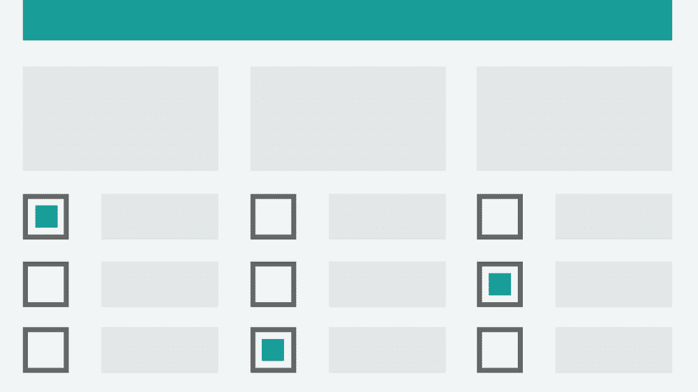
6. Customize Question and Answer Formats
Like your form length, your question and answer formats can also benefit from experimentation. The two most common question types are probably the multiple-choice question and the open-ended question. These should comprise the bulk of your form questions.
Other types you could try are Likert scales and rank orders. These types can be used more or less often based on the type of online form you are making. Some question types require more time to answer, so try to use these sparingly because they can make your audience impatient.
Answer formats include simple one-line text fields, multi-line text boxes, drop-down menus sliding scales and radio buttons. You’re likely to find that one or some of these work extremely well for your audience, whilst others result in sudden user drop-offs.
7. Stop Using Placeholder Text
Placeholder text is the grey text that sometimes is used in fields themselves to show an example of what the user would type in the field, like “John Smith” or “[email protected]”.

Worse still, sometimes it’s used as the label for the field itself.

Contrary to popular belief, placeholder text doesn’t make it easier for users to fill out your forms – it actually decreases usability. Once the user starts typing, they can no longer see the placeholder text, causing confusion as well as accessibility problems.
8. Allow Autofill
Whether your form is short or long, there is nothing more annoying for users than filling out basic information they’ve already filled out countless times before in forms similar to yours.
This is when autofill can be particularly useful. By allowing your audience to use the autofill option, you help them complete a part of your online form making the rest less stressful to finish. Besides, autofill can also help them fill out the information they might have forgotten and can even reduce data errors.
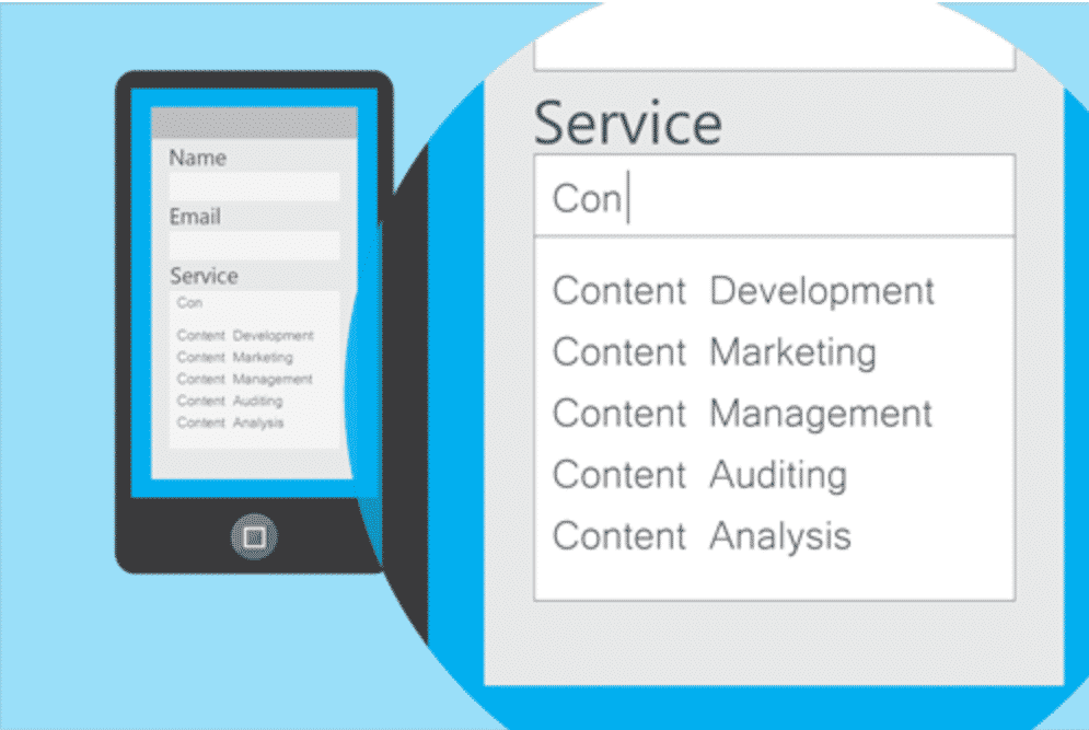
Image source: ventureharbour.com
9. Consider Conditional Logic
Using conditional logic for creating your forms can be a great idea if you want to personalize your forms and collect highly specific information. Basically, this is when every question in the form (except the first) is determined by the answer the respondent gives to the previous question.
Of course, the determining questions can only be multiple choice, but it does help you get more nuanced results. If you want to ask different types of questions, you could always use conditional logic for just part of the form, and free text fields for instance for other parts of the form.
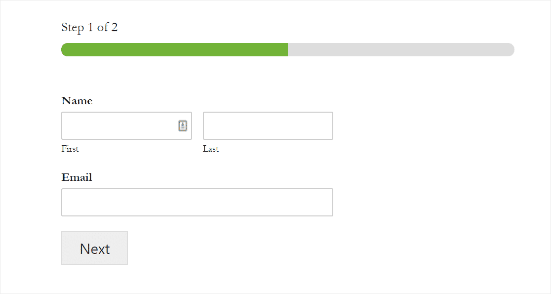
10. Include A Progress Bar
A progress bar shows your respondents how many questions there are in your form, how many of them they have already completed and how many are left.
They can be quite motivating, depending on the length of the form and the way the progress bar is designed. The person filling out the form sees how much is left and they may feel that the process is going quickly. You can include a progress bar either at the top or at the bottom of the form if the questions pop up one after the other as new slides. Alternatively, you can include a vertical progress bar that will move along the page when the respondent scrolls down to the next question.
This is a good example of how you can place a progress bar at the top of your form and split the form into multiple steps to make the fill-out process more dynamic.
11. Use Visuals
When creating online forms, one of your top priorities should be the engagement factor. If your audience isn’t engaged when filling out your forms, you will likely be losing many potential respondents. Some people simply get bored and quit before they get to the end. Others get frustrated with the length of forms, or bugs or niggles in the process. This is common with transactional forms, known as cart abandonment.
Using visuals can help you engage your audience, especially if they’re part of the questions. For example, you can use images to show what each of the possible answers looks like.
This form from Compare the Market uses visuals to help fill out the form. The icons for different topics are simple and easy to understand.

12. Create Mobile Versions
Nowadays, mobile devices are so widespread that almost everyone carries a smartphone or a tablet. Consequently, many website viewings are done from mobile devices. Most sites already have mobile versions, but not all elements are considered during the process of creating these mobile versions.
Don’t forget to create mobile versions of your online forms, so that they can be filled out from any device. If you fail to do so, your online forms might appear poorly formatted when viewed on mobile devices like smartphones and tablets.
Also consider the answer input types available to your users. Things like ensuring the numeric keypad appears rather than the regular keyboard when asked for a telephone number can really improve the user experience.

Image source: cxl.com
13. Rethink Captchas
Rethink captchas before you jump in and use them in every online form you create. Of course, they are probably the best way to avoid spam responses and make sure that you only get accurate information from your forms. However, they can also be exceptionally irritating, especially if they require multiple actions from your audience. Captchas can even be the reason for many potential responders choosing not to complete your online forms. A study found that captchas can decrease your conversion rate by 3%.

14. Adjust Your Privacy Policy
Your privacy policy can be extremely important to users, particularly when your forms collect financial information. If your potential respondents aren’t certain that you will be using their information in a responsible way, they will be less likely to go ahead and fill out your forms.
This is why it’s so important to take a good look at your privacy policy and adjust it if needed. Think about the information you ask for in your forms and categorize it into topics. Then, discuss each group or topic in your privacy policy explaining why you need such information and how you will be using it. Explain how long you will store it, where you will store it, and how you will use it.
Needless to say, ensure that your privacy policy can be easily accessed from your forms.
15. Put Forms Where They’ll Get Filled Out
It’s not just about making your online forms the best they can be – you should also know where to put them on your website to maximise completions.
Where is the best spot to put them? This varies depending on the purpose of the form, your audience and each page type. Some forms are better sent by email than placed on your website (e.g. transactional forms) while others can have a separate page on your site (e.g. contact forms).
A simple newsletter subscription form can be placed in multiple spots to attract more subscribers, including the sidebar, like on this website, and/or in the header or footer of your site.
16. Analyze Form Performance
One thing most people forget is that analyzing online form performance is just as important as any other aspect of using online forms. To truly understand how your online forms are performing and which practices are the best for you, it is absolutely necessary to track various aspects of your forms and analyze the data you collect. Essential data points are completion rates and drop-off points.
Moreover, you need to make sure that you are interpreting the data correctly. For example, a low number of conversions doesn’t necessarily mean that the whole form is poorly made – only a few questions may be the issue. Or, it could just be the location of the form.
17. Experiment Regularly
Hand in hand with analyzing form performance is experimentation. You may be perfectly happy with your completion rates, but there could be a few simple tweaks you could make to improve them even more.
It is essential that you don’t just leave your forms as they were when you initially created them. You need to work on them regularly and improve them by getting feedback and addressing the issues listed by your respondents. You can do this by using… a form!
You should also brainstorm ideas with your team and experiment regularly by adjusting your forms. This will help you stay creative and make your forms unique. Remember that you shouldn’t rely on default templates entirely, but rather bring some originality to your forms to make them stand out and be different from all the others like them.
Final Thoughts
To sum up, by using the tips in this article, you will be able to optimize forms better and create a powerful strategy for your online forms. Don’t forget that such forms are an integral part of your digital marketing campaigns, so make sure to use them as best as you can.
_
About the author: Tiffany Porter has been working as a Chief Writer at Online Writers Rating reviewing variety of writing services websites. She is a professional writing expert on such topics as digital marketing, blogging, design. She also likes traveling and speaks German and French.