This article has been contributed by Nick Kanter.
Whether you have started your blog out of sheer passion or for purely business reasons, there comes a time when you begin to contemplate monetizing it. And while there are certainly many ways you can start earning money from your website (including ads, sponsorships and brand deals), a lot of blogs choose to go down the affiliate route. Partnering with Amazon is the most popular option, but there are countless other brands and businesses you can work with as an affiliate.

That said, there is more to earning a steady income from affiliate links than just chucking them into your posts and hoping for the best. You want to inspire people to click on them as well.
In this post, we will be looking at seven ways you can use design to help you boost affiliate sales on your blog.
Let’s get started!
1. Provide Real, Valuable Information
While this is technically not a design-related tip, we do have to touch upon it, because without it, all of the other tips will be worth much less and be much less effective when implemented. And we promise, this is the only non-design/non-formatting tip we’ll include.
The internet is already full of plenty of rubbish – articles that provide no real information and that serve only to take up space. These kinds of articles may have served some sort of purpose in the past, but as search engine algorithms become smarter and more able to understand what a post is about and how it is written, value and quality are finally overshadowing spun and hollow writing.
When you write a blog post that features information that is useful to your readers, information that can then be used in real life, you are killing several birds with one stone. You are inciting readers to come back, and you are improving your blog’s worth (and potentially rankings and traffic). On top of that, you are much more likely to make an affiliate sale than with a poorly written piece.
Above House does a great job of this in their post about ping pong paddles. You may think there is nothing much to be said about ping pong paddles – yet, this website manages to do each of the products they talk about justice. The post is filled with information that can help someone make a purchasing decision, and earn the blog a commission.
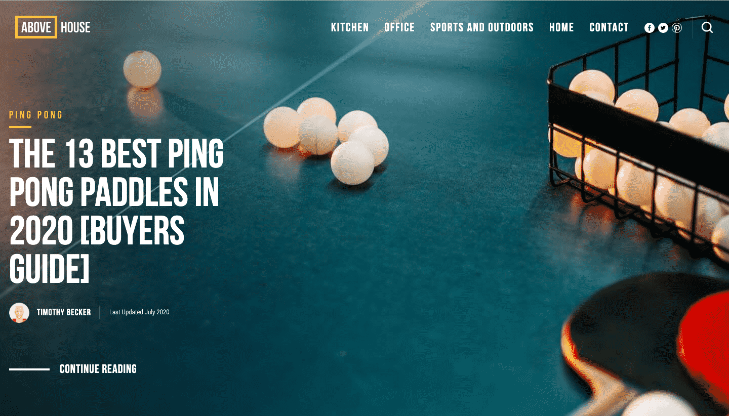
Image source: abovehouse.com
2. Use Images to Emphasize Your Story
And now for the actual design elements.
The first element of design we’re going to discuss is perhaps most obvious one: images.
One of the first things every post about publishing blog posts and earning money from your blog will tell you is to use quality images. They help break down the monotony of black text on a white background, and they serve to deliver your message better.
When you are trying to improve your affiliate sales, the images you use should serve this specific goal. They should showcase every product you mention (if you are writing a list or a review), or help someone visualize a certain solution (if you are, for example, talking about bedroom decoration and listing different styling options).
Make sure the images match what you’re talking about – if it’s a specific kind of chair, don’t use an image of a different chair. If someone clicks on your affiliate link and is greeted by a completely different product, they won’t be able to help feeling disappointed.
Here is a nice example of a post listing wedding gift ideas. What makes it even more vibrant is the featured images – colorful and imaginative. Each item listed has its own image, and the different sizes of these images help make the post less uniform and more exciting to scroll down. You’ll also notice you don’t even have to read the copy – you can just look at the images and get the inspiration you’re looking for.
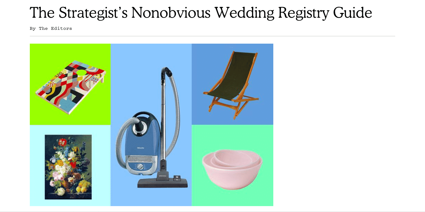
Image source: nymag.com
3. Make it More Personal
Speaking of images, the ones you use should serve to do more than just show a product and fill in some empty space.
Since humans are such visual beings, they react much more readily and much more profoundly to visuals, as opposed to words. Some of your visitors might not even read what you have written – they’ll just skim through a post and miss all the funny puns and clever word games you’ve come up with.
To establish a better connection with your audience and help them see more of you, try to use your own images whenever you can. It won’t make sense with every post, but there will definitely be some that can showcase your personality.
You can use your own images on your homepage, about page and contact page. Or, you can add a neat little “about me” widget to all of your posts, as you can see in posts by Jar of Lemons. It instantly adds a face to the name behind the blog, helping you present yourself more like a real person and less like another page on the internet.
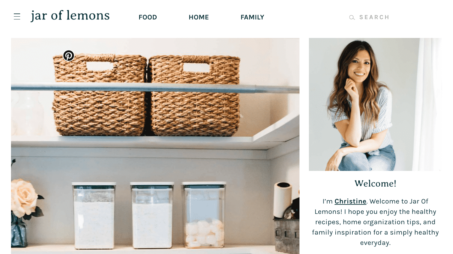
Image source: jaroflemons.com
If you can add an image like this to most of your posts (i.e. showing yourself using a product or performing an action you talk about in the text), it will be much easier to associate the website with someone who is recommending a certain product (thus increasing your chances of making a sale), as opposed to a faceless website just looking to make money.
4. Break Down Your Information
So, we’ve just established that humans are visual beings and that they don’t like to read very long blog posts. They prefer to get right to the point, and only then read the parts that they are really interested in. Naturally, this means that you need to find a way to provide this specific experience.
Your visitors are simply not likely to read an entire post detailing 10+ different products. They would like to be shown the most important features of each, and then go back to the full descriptions of the specific products they found interesting.
One of the ways you can do this is to create a specific section that only lists notable features. That way, you’ll help cut down on someone’s research time and enable them to tell at a glance which products will fit their needs and which won’t.
This post on adjustable beds does the job nicely. They first feature two of the top products they would recommend, and then go a bit into detail about the things to consider when purchasing an adjustable bed. And then, just near the middle of the page, they have a very useful table that lists all the important stuff.
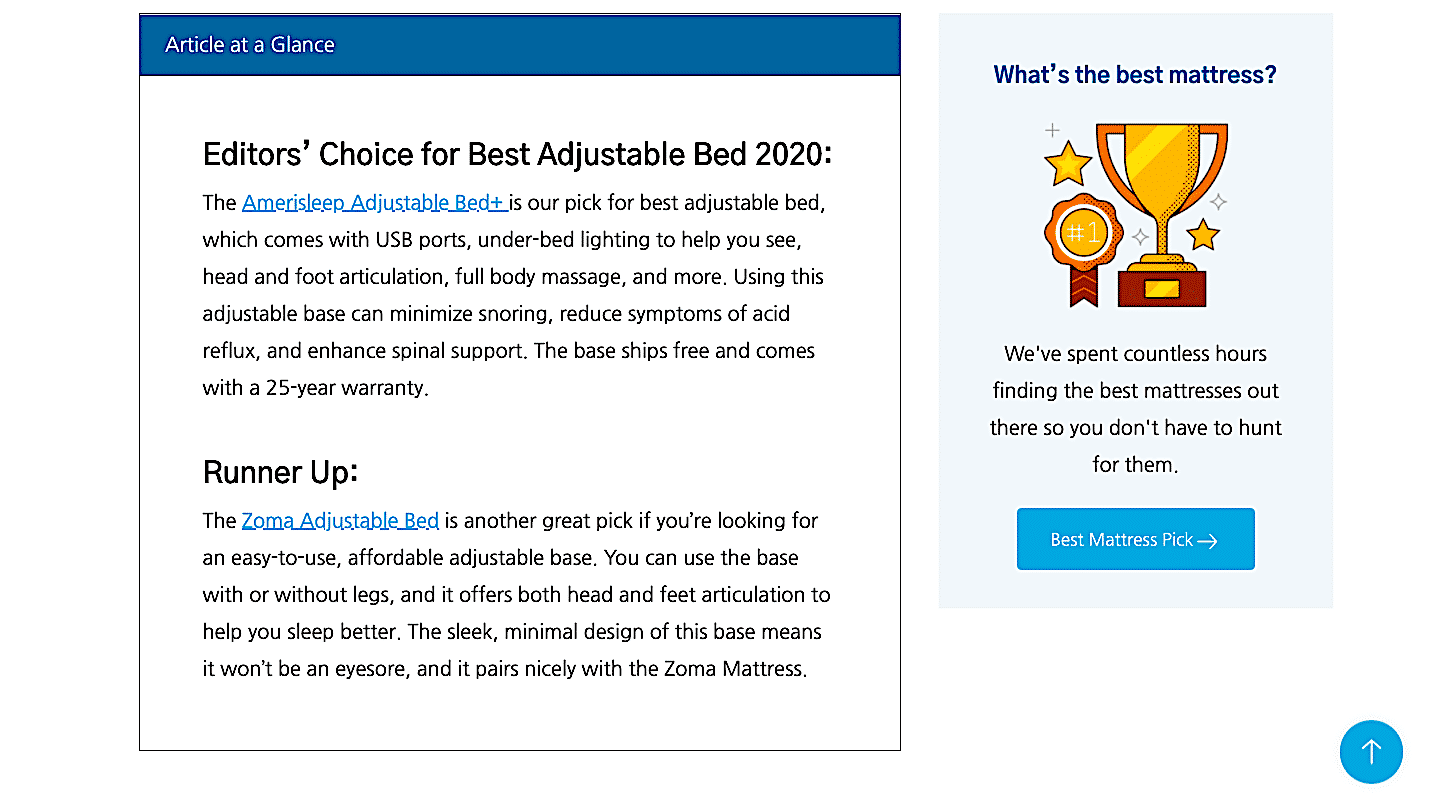
Image source: savvysleeper.org
Pay special attention to the clever placement of this table. It’s not featured at the very top because that might mean many readers just take a look at the table and then leave the page, having gotten what they were looking for. It’s placed at a point where visitors are likely to find it and stay, but where it will also improve the time someone spends on the page.
5. Offer a Comparison Table
There is another way to achieve the same effect – provide information at a glance, enabling someone to make a purchasing decision quickly.
You will often see this kind of comparison table on blogs that work with affiliates. It is easy to set up (there are plenty of plugins that can do it for you), and it is a very nice visual element to add to the page.
This post on table saws has chosen to feature a comparison table at the top of the page. While this may mean that part of the audience leaves after having checked out the information listed there, this website is still clever in its use of the table.
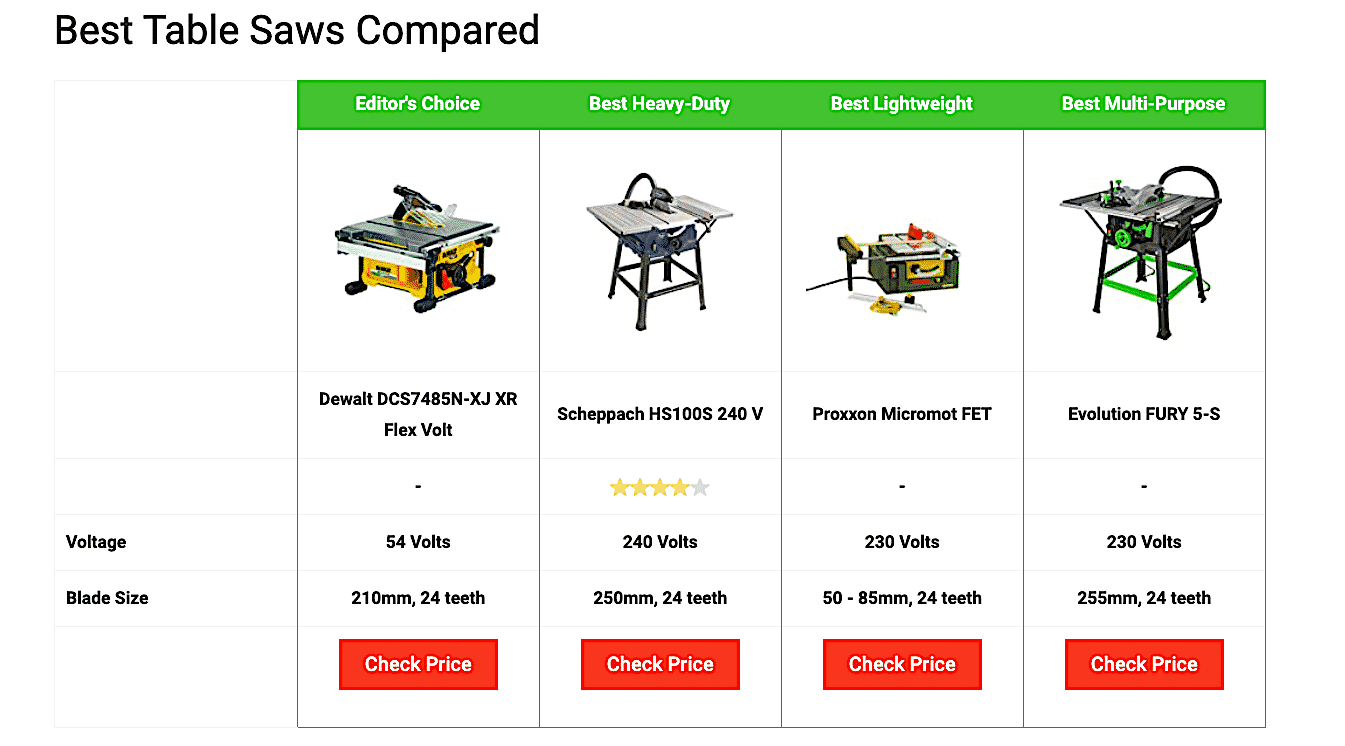
Image source: bestspy.co.uk
The table features only four out of the seven products they’re reviewing, meaning that there is more to be unveiled if you choose to read the entire post. Also, the table is short and to the point, not revealing all the details.
What it does feature is a direct link to the sale page (in this case, Amazon) – so if someone spots a product they do like instantly, the easiest way to get to it is through that link. And that’s a sale right there.
By being a little bit selective about the placement of comparison tables and what kind of information they offer, you can easily boost time on page and make more sales. You just have to figure out what works best for your specific audience.
6. Make Your CTA Pop
Another very important element of sales page design is the Call To Action. Your blog post may not technically be a sales page, but since you’re trying to inspire someone to click and make a purchase, we’ll treat it as such for the time being.
Just like most bloggers know they need to include images, most also know CTAs are important, and most even add them in. Unfortunately, some of the CTAs you come across don’t actually serve the purpose they were meant to serve.
CTAs are supposed to attract attention, stand out, and make it perfectly clear to a user what they are about to do. CTAs are there to help drive the user towards a specific action you want them to take – in this case, click on your affiliate link.
Depending on the kind of blog you run, you may not want to have CTAs at all. All you will want to do is include links in the text itself, and let readers choose whether or not to click.
On the other hand, if you choose to include CTAs, and if you have a page that is clearly meant to direct traffic towards an affiliate sales page, try to do it right.
Here is an example in this post about best friend gifts – each suggested item comes with a CTA, and this is where the affiliate link is placed. The CTA is easy to spot, and it also happens to contribute to the page, making it more colorful and much less monotonous. Not to mention, it makes shopping easier – a visitor doesn’t have to search for an item they liked, as it’s already right there.
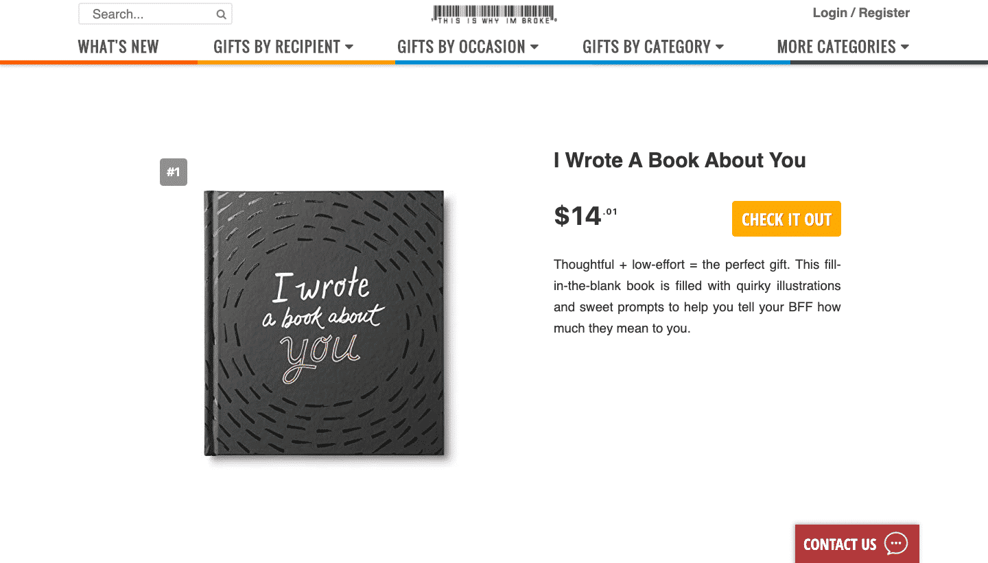
Image source: thisiswhyimbroke.com
7. Use a Table of Contents
Finally, let’s touch upon one last piece of advice – use a table of contents.
If your posts are long (as they can definitely be, especially if you’re writing complex reviews or comparison posts), adding a table of contents to the page can make it much easier for your readers to spot what it is they might want to be reading.
Scrolling down a page that has over 2000 words can take a fair while (as you very well know, having just scrolled down 1800+ words) – and anything you can do to save a reader time and energy will be very welcome.
Knowing where to place the table of contents can be a bit tricky. You can go for the very top of the page, but since that will be the first thing someone sees, you might want to stick to a space a bit lower. Placing the table of contents under the introduction and featured images usually works well, as you can see on this post on home gym essentials. You can also add a widget to the side of the post that will keep moving as you scroll, making it easy to return anywhere on the page at any time. However, this might be a bit distracting, so check to see if your readers interact with it, or if it’s just taking up space and demanding attention.
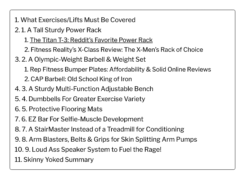
Image source: skinnyyoked.com
Wrap Up
Now that you have these seven design suggestions in mind, make sure you consider your own content and target audience before you implement any of them. Yes, the images are a given, but maybe you don’t need to have CTAs or a table of contents.
It will all depend on your own style and what your audience wants to read – so give the ideas a consideration, but don’t feel obliged to implement them if you feel they’re not a match for your blog.
_
About the author: Nick Kanter from nickkanter.com is relentlessly focused on SEO and analyzing the search results. He is an operations connoisseur and has never seen a mountain he didn’t want to hike.