This article has been contributed by Dave Schneider.
Colors are one of the most impactful ways that we perceive the world. Because of that, it’s not surprising that colors are an essential consideration when it comes to marketing as well.

In fact, over 90% of people cite color as one of the primary influencing factors in their buying decisions. That’s a number that no company can ignore, especially at a time when even the slightest advantage can be the difference between success and failure.
With the help of color psychology, you can form strong connections in your prospect’s mind from the moment they first interact with your brand. Colors are perceived on a very deep, even subconscious level, which means that knowing the reactions that they evoke is crucial if you don’t want to put off people without even understanding what happened.
But what is the psychology of color, and how can you use it to your advantage?
Let’s dive deep into the subject and explore numerous examples of how you could employ different colors when creating a website.
What is the Psychology of Color?
Psychology of color is a scientific field that looks into how colors affect human behavior. But while the history of color psychology dates back to as early as the 16th century, it is still surrounded by controversy.
Some even doubt that something as subjective as color perception, and its relation to human behavior, can be measured at all.
However, since marketers have noticed the powerful effects that colors can have on the success of advertising campaigns, there has been an abundance of data showing just how much of a difference the right color can make.
Therefore, while some may consider colors of their websites an afterthought, savvy marketers know that choosing the color theme for a site can become a crucial factor that ultimately decides how the users respond.
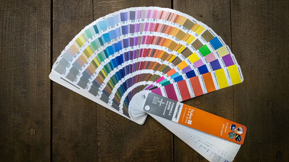
Color Wheel: The Basics

The color wheel is one of the simplest and most straightforward ways to look at how colors relate to one another. Today, there are powerful color wheel picker tools that allow blending of various colors, experimenting with combinations, and finding the perfect balance of colors for your website.
The reason why the color wheel is such a useful tool is that it’s very helpful in aligning your website with the color psychology principles.
You can mix and match various colors, analyzing their behavioral response, and make sure that there are no color clashes that could cause confusion or irritation among your site’s visitors.
You can combine various primary, secondary and tertiary colors, as well as use multiple techniques for discovering new ideas for which colors you could combine. For instance, you can use the complementary color technique to find which colors are naturally aligned to fit together or use triadic colors by mixing three colors at once.
The color wheel can help people with little to no experience in color psychology gain much more control over how their site turns out. But to take full advantage of what it can offer, you must also have a solid understanding of what each of the colors represents.
Color Psychology: Examples
Now that we understand what color psychology is and how you can use a color wheel to come up with various combinations, we must analyze some of the most common colors and their associations in the human mind.
While most people understand color associations on an intuitive level, having a more in-depth understanding is crucial when you’re creating a website and want to remove as much guesswork as possible.
Below, we’ll go through each color, discussing its traits and how you can use it in your design.
White
White has become one of the most popular colors to use in web design because of its clean and sleek traits that are naturally appealing to the human eye.
There’s a wide range of possible uses for white, and it could (and probably should) be used at least in part on most web designs, no matter the industry.
However, white is especially useful for fields like medicine and dentistry, as well as sites selling luxurious or high-end items. Recently, more and more tech companies have started using white more prominently as well, which has coincided with the trend of many designs becoming more minimalistic and uncluttered.
Some of the best pairing options for white are various shades of gray and silver since these neutral tones can create a beautiful color ensemble. But, since white is so universal, you could probably successfully combine it with almost any color.

Image source: shortlist.io
Black
If you want to make a statement, choosing black as your primary color is certainly a bold way of doing it. While there are risks around accessibility by potentially making your site more difficult to read, daring designers have had massive success with going heavy on black, as it’s a color that will never fail to capture an audience’s attention.
When you want your brand to seem elegant, sleek and timeless, black elements will help you put those associations at the very forefront of your design.
However, be very careful not to overwhelm your audience, as a pitch-black website might have the opposite effect to what you’re looking to achieve.
In some cases, black can even have negative subconscious associations, as it can also be a symbol of darkness, evil or uncertainty. Make sure that the advantages that black offers outweighs the potential risks, and carefully analyze your audience to figure out whether the sleekness factor is the look that you should be going for.
If you’re in a field where making a statement is mandatory, such as fashion or high-end consulting, you might find that black is just the right choice to resonate with the very best prospective customers you could possibly attract.
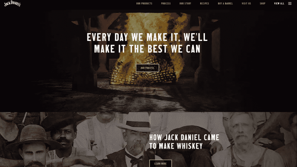
Image source: jackdaniels.com
Red
Red might actually be the most powerful color on this entire list. Its vivid association with blood can get the heart to pump just a little faster, but not necessarily out of fear.
In the human mind, red is also the color of lust, passion, urgency and sexual energy. And that is the perfect combination for when you want to instantly jolt the visitor out of their current state of mind and get them fully focused on what you have to say.
There’s a reason why red is the color of choice to emphasize promotional messages. When you have a great deal that’s only available for a limited time, red is perfect for making the reader feel the urgency on a visceral level.
Red is also a popular choice for sports websites because it generates excitement around the fast-paced world of competition. Naturally, advertising and marketing websites can also benefit from combinations of red, but it’s essential to maintain a healthy balance not to make the site seem too pushy.
In the end, red is a color that can have both a positive and a negative effect on your website’s effectiveness, so you should make sure not to overuse it and think of how to combine it with other colors.
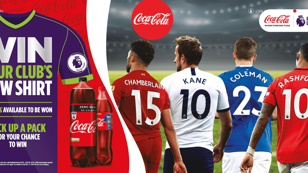
Image source: cocacola.co.uk
Blue
If you’re looking for a color that immediately instills confidence and gets people to trust your brand, you can’t go wrong with blue. Its soothing effects can quickly put your site’s visitor in the right mood and make them much more likely to trust the claims that you make.
Many surveys even place blue as the world’s most popular color, especially among men, which is why so many brands use it as a primary color on their websites.
Unlike red, which causes excitement and sometimes even agitation, the soothing qualities of blue are ideal for organizations that want to seem dependable, like banks, health institutions and government agencies.
However, when using blue, be careful not to make your website seem cold or distant, as using too much might not work in some industries. For instance, blue has been shown to reduce appetite, so if you operate in the food industry, that could cause an unwanted reaction from your audience.
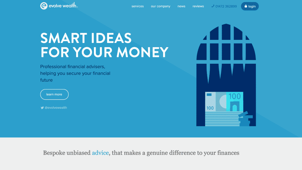
Image source: evolvewealth.co.uk
Green
The health industry is full of websites using green as their primary color, and for good reason. It’s one of the most soothing colors in the spectrum, and it has strong associations with nature, which makes it ideal for products that are related to alternative health, beauty and even tourism.
But that’s not all that green is associated with. Many have found success using green to symbolize wealth, peacefulness, or even masculinity – the color’s universal qualities make it a relatively safe bet to work in a wide range of situations.
However, at the same time, there are situations when green might not work well. For instance, luxury items are usually better suited with black, blue, or gray shades of color, since green doesn’t have the sleekness that those colors can offer.

Image source: evernote.com
Orange
Orange is a high-energy color that’s suitable in a wide range of situations, especially when you feel that red might be too intense but still want a color that’s associated with happiness, enthusiasm and overall positive vibes.
Many marketers use orange for their sales materials as well, since it’s a color that draws attention and stands out in almost any color scheme. Being not as direct as red, it can be the perfect color for the automotive industry, various eCommerce stores or even for food-related websites.
However, an important thing to remember when working with orange is that you shouldn’t overdo it, since it’s a dominant color and can become overwhelming when used without restraint in your web design.
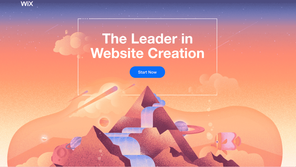
Image source: wix.com
Gray
When you need a neutral color to complement your design, gray is an ideal choice. While pure white can be a bit overwhelming in itself, various shades of gray don’t produce any response on their own, making it perfect for augmenting other colors and making them stand out.
It’s a perfect choice for tech industries that want to remain sleek while not seeming too pushy, especially when combined with white and black.
One thing to remember, though, is that too much gray can make your website seem grim. So, unless you’re aiming for that, avoid using too many different shades of gray, and consider adding some sharper colors to bring your site to life.

Image source: myownbike.de
Yellow
If you want your website to be bright and cheerful, yellow might be the perfect choice as a primary color. Designers that manage to incorporate a yellow-centric color scheme have achieved excellent results in websites that want to present themselves as positive and youthful.
When you want to showcase your positivity and energize your visitors, yellow works really well. However, yellow can sometimes have a negative effect as well, especially if you want to position yourself as a high-end company.
Ideally, you should avoid using too much yellow in your design, and instead add it in touches that can help bring your design to life without overwhelming it.

Image source: thinkmoto.de
Final Words
The science behind color psychology is still evolving, but we already have plenty of insights that can help savvy web designers match the right colors with the goals of the website and the brand.
Analyzing the qualities of different colors can help you get a better idea of what colors might best suit your brand. And if you use the color wheel to look for combinations, you will never run out of different options to consider and will come up with the colors that your audience will absolutely love.
_
About the author: David Schneider is the cofounder of NinjaOutreach, an all in one Prospecting and Outreach tool, which was created to streamline the process of connecting with influencers. He can also be found via his business blog, SelfMadeBusinessman.