This article has been contributed by Juned Ghanchi.
Typography will always be a key element of graphic design. It has also become a critical factor in the success of app development and design.
The use of typography can make or break a design, determine the readability of app contents and directly impact business conversion. When it comes to typography, there are certain ground rules that remain constant. On the other hand, certain principles evolve with new typefaces and design contexts.
Typography and App Design
Besides forming part of the visual look and feel, typography performs the crucial role of looking after the functional aspect of an app. This is why typography in app design is a lot more than just choosing a font.
Typography refers to the art and science of organizing text to boost readability and legibility of the conveyed message.
It is an art in the sense of the subtle aesthetic role that it plays, and it is science in the way it improves usability aspects of an app.
Let’s now have a quick look at the key reasons why app designers consider typography so important for their design scheme.
Readability of the Text
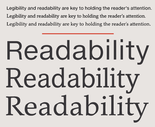
Image source: fonts.net
Readability of text content is the top reason that app designers give typography the utmost importance. By choosing easily readable fonts, designers ensure that readers can read text content, text-based links and menus effortlessly.
Now when it comes to addressing the challenges associated with readability and usability of text, there are several key considerations. Certain media and news establishments catering to very diverse demographics and a variety of preferences find it hard to use one font that is suitable for every type of reader. If your app has a very specific audience belonging to one particular age group or demographic, choosing a font becomes easier.
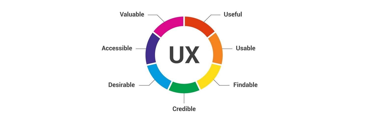
The Impact on User Experience

Image source: interaction-design. net
The font and the overall typography design have a great impact on the user experience of an app. Maintaining consistency is key because users, first of all, want to understand what the app is all about and make up their minds accordingly. So, instead of drawing their attention to the typefaces or fonts, your use of typography should rather focus on making the content more legible and readable. The typography should only work as a boost to the general UX design focused on ease of use.
Professional Look and Feel

Image source: business2community.com
Lastly, just as your attire quickly makes an impression on people meeting you, the typography and its role in the overall design should help people form an accurate impression of your app’s brand identity and purpose. For instance, for a banking app, it would be out of place and unprofessional to opt for funky typography drawing too much attention to the fonts instead of the content and functions. Use typography in a way that makes your design appear professional.
Key Principles of Typography in App Design
Design trends will come and go, and so does typography. However, certain design element and typography uses will remain constant as they have been tested and tried across multitudes of successful apps. Based on all findings, we will explain the nine laws of typography in app design.
1. Know How the Font Communicates
Image source: gcfglobal
First of all, no experienced designer chooses typeface randomly. The choice is a conscious decision, and it represents a mindset. Every typeface bears psychology, and the designers need to choose it based upon context. What you want to communicate to your user should help you choose a font.
Naturally, every business niche has a particularly effective group of typefaces. For example, a finance app will rarely have a multicolored, funky typeface. Likewise, a movie app may look too dull with a font used in professional communication.
2. Mix and Match
No app just uses a single typeface all over the app. Multiple typefaces are used to present content and functions with visual clarity and usability. Naturally, while using various typefaces, mixing them with the right balance to create a sense of priority is essential.
A balanced and visually appealing combination of fonts can uplift your design to a great extent. A good mix of fonts with different sizes, textures and color options can quickly give your design a facelift. When mixing fonts, always remember to choose each font to play a definitive role.
3. Focus on Creating a Hierarchy
The heading of text content enjoys the highest priority, followed by the sub-heading and then the content body. This hierarchy is explained in the way different fonts with varying sizes and boldness are used in these sections of text content. Similarly, in app design, the use of typography should allow for creating a hierarchy. The good use of hierarchy through typography will help users easily navigate and convey the importance of messages in the right order.
For creating a hierarchy with the use of typography, the following aspects are necessary.
- Use the right text size to give priority to information as per their importance.
- Use the right amount of spacing to allow easy scanning of content.
- Organize all related items in a meaningful way.
- Incorporate headings and subheadings to create a sense of structure and priority.
4. Font Size
We all know that typefaces come with different looks, feels and sizes. While some are thin and lean, there are others with fat and wide looks, and there are still others in between these two extremes. Naturally, designers, while choosing fonts, need to consider the size requirements for their design.
It is advisable to use different typefaces with a similar height to maintain conformity and balance. The font width is another point of serious consideration. Proper width can ensure the right space between letters and thus can enhance readability.
5. Using Correct Leading
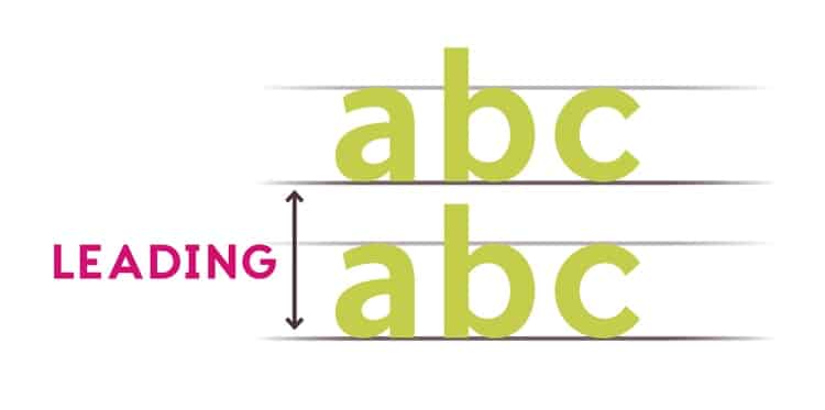
Image source: indesignskills.com
Leading in typefaces refers to the vertical space between each text line. This space has a lot of impact on the readability of content on screen. To ensure optimum legibility of the on-screen text, you must ensure a leading value ranging from 1.25 to 1.5 times the size of the font used.
6. Proper Kerning
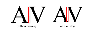
Image source: tutsplus.com
Kerning refers to another aspect of using space in the on-screen text content. It is an essential aspect of any design. Kerning basically refers to the space between two letters.
Designers, by using the right proportion of kerning in the text of an app, ensure optimum legibility of the design and readability of the on-screen text. Effective kerning ensures letters in text sit more closely, creating a neat look.
App designers follow a detailed kerning table to determine the optimal space between letters. Kerning is mostly needed for fonts not optimized with the right kerning space.
7. Ensure Perfect Alignment
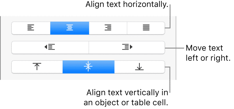
Image source: apple.com
Alignment choice of the on-screen text content is something that varies as per the design. While some designers prefer either justified alignment or center alignment, other designers still use right or left alignment options based upon the design context.
Left alignment, which is also called flushed left, is considered the easiest and most natural for readers to consume, hence most websites with loads of text content prefer this alignment option. On the other hand, right alignment or flushed right is only used sparingly or in a befitting context.
Justified alignment often becomes problematic due to unequal space distribution between words. On the other hand, designers, when choosing other alignment options, need to ensure that ragged lines don’t stick out, creating an incoherent look and feel.
8. Use the Minimum Number of Fonts
Many designers in their initial career experiment a lot with too many different font types and styles. Using too many fonts ultimately risks their interfaces to lose consistency and coherence. This is why it advisable to use a limited number of fonts to give a cohesive look and feel when paired with each other. Never pair two very different fonts as this can make the copy look rough-edged and incoherent.
9. Maintain Correct Contrast and Color
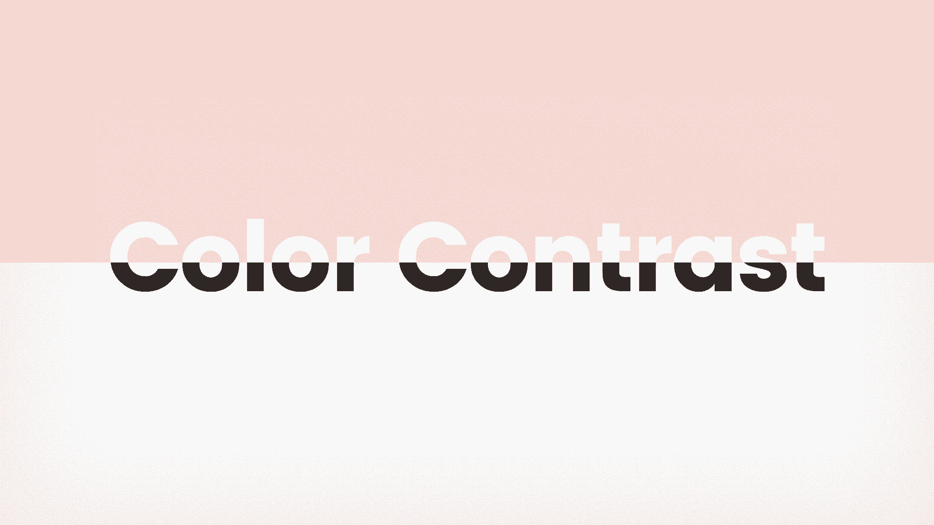
Image source: miro.medium
Using the right contrast and color is a key aspect of good typography design. Since mobile screens are smaller in size and mobile users are likely to look at screens on the go, maintaining at-a-glance visibility with the use of right contrast and proper color scheme is crucial.
Typography design should have the proper contrast with the right color scheme, that’s suitable for the audience.
Leading Typography Trends of Our Time
Like evolving app design trends, typography elements also tend to evolve and transform over time. In recent months we have seen mobile apps across niches incorporate innovative typography elements in their design scheme. Here we have picked a few of these trending typography designs.
Hand Drawing Typeface
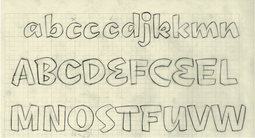
Image source: googleusercontent.com
Handwritten or hand-drawn typefaces are increasingly popular and are being widely used by apps across the niches. In particular, some e-Commerce brands targeting generation Z are using this typography element in full force. These fonts are known to emotionally connect with their users.
Glyphs or Icons

Designers are increasingly favoring the use of glyphs or non-alphanumeric symbols or icons in their design to convey design elements. It all started with the hamburger sign for the menu button and instantly became popular. Now the same trend is continuing across apps of all niches.
Diverse Font Pairing
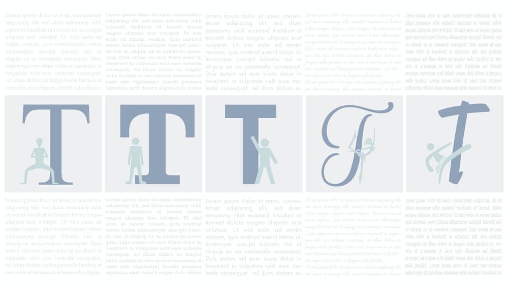
Image source: 99designs-blog
Pairing two or more different fonts in a design to create a sense of surprise or shock is the new in-thing in typography design for apps. The user’s attention can be easily drawn with a visual shock by utilizing two or more fonts in the app design.
Geometric Fonts
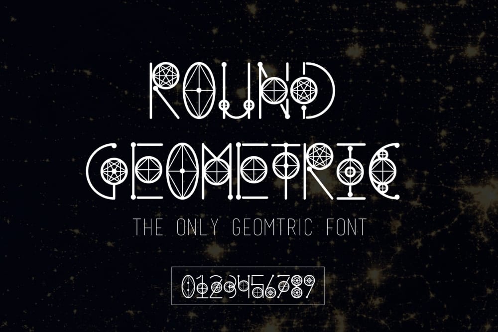
Image source: fbcd.co
Suddenly many apps and websites are using geometric fonts using straight lines and round forms. Such fonts boast a creative vibe besides helping readability with better clarity. Such fonts are also gaining popularity in all sorts of logo design and brand-specific header contents.
System and Custom Fonts of iOS and Android
Finally, we must spare a few words for the system fonts provided by the iOS and Android platforms. Both Android and iOS platforms come with their own default fonts known as system fonts. When used in app design, these fonts convey consistency and therefore, a connection to, the operating system. Thus, it is important to know about these default typefaces.
On the Android platform, there are two different typefaces for desktop and mobile devices: Roboto and Noto, respectively. Roboto comes as the primary and default font of the platform. Noto refers to the secondary font option for main websites not ready to display Roboto fonts. For designers, the Roboto font family offers a wide variety of fonts. Roboto fonts are designed to deliver a clean look to the Android app design. It is not very stylized, so does not draw a lot of attention to the font itself.
Apple iOS platform has its own default font known as San Francisco. It is optimized for simplicity and ease in design. This font perfectly addresses the long-held iOS tradition of delivering everything on screen as legibly as possible with the least cognitive load on the viewers.
White Space in App Design
Finally, we must say that the white space in app design is not just vacant or empty. So, it must be utilised appropriately to ensure optimum visibility, clarity and the least amount of distraction. Balanced use of white space around on-screen elements will boost readability, traction and user engagement. White space works as the silent determinant factor for your design legibility.
_
About the author: Juned Ghanchi is a co-founder and CMO at IndianAppDevelopers Company, recognized as one of the most prominent team of app developers in India for iOS and Android platforms.