
This article has been contributed by Vincent Sevilla.
Web design is a key contributor to online conversion rates. People are visual beings, so it’s only natural that their decisions can be driven by what they see on your site – from colors and fonts, to how your content is laid out on the page.
The idea here is to strike the perfect balance between form and function – good design is not just about aesthetics alone, it’s also about understanding user experience.
Here are 12 tips that can help boost your site’s conversion without sacrificing good web design.
1. Make Your Call-to-Action Easily Distinguishable
The goal of many pages on your site is for a visitor to take action by clicking on your CTA. Content is a supporting element that should serve as a guide to why they should “Add to cart,” “Book an Appointment,” “Get a Free Consultation,” “Sign Up” or whatever your page’s objective is.
The CTA should be treated as one of the most important elements of the site, so make it stand out by placing it inside a container and picking a color that pops, but at the same time, complements the background. To get an idea if your CTA pops out, you can do the squint test and see how conspicuous your CTA is.
Take a look at Mailchimp’s home page below.
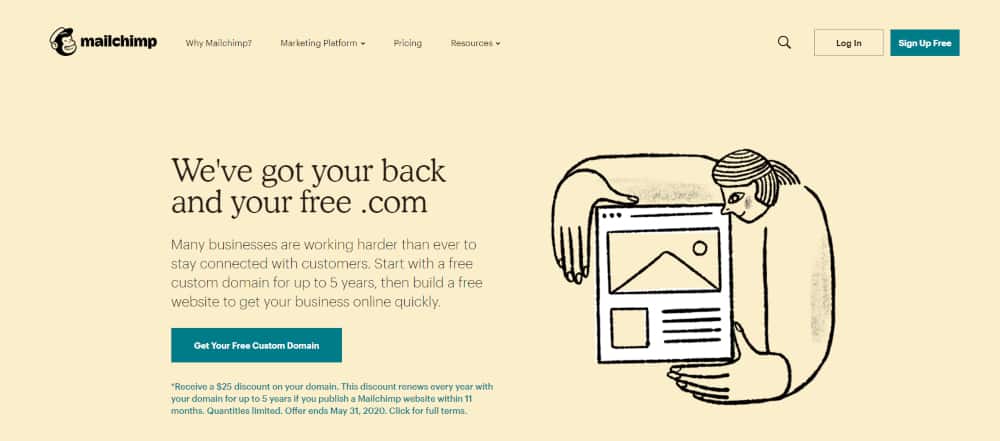
As you can see, the teal CTA quickly stands out from the neutral color of the entire page. As such, users can immediately see it and will be inclined to click on it. That’s a simple, yet effective way to boost conversion.
2. Implement the Rule of Thirds
You might think The Rule of Thirds is only applicable to photography, but it’s actually one of the core principles in web design.
Use The Rule of Thirds to visually divide a website page into thirds both horizontally and vertically – this will basically leave you with nine equally sized rectangles.
Now, once you do that, focus your energy on the four intersections at each point of the middle rectangle, and the four dividing lines themselves. The Rule of Thirds dictates that these are strategic places of interest, where you should place the most important elements of your site – be it the CTA button, the best features of your product or service, or the most impactful image you have.
Check out how Hubspot places their CTA right on one of the intersections.
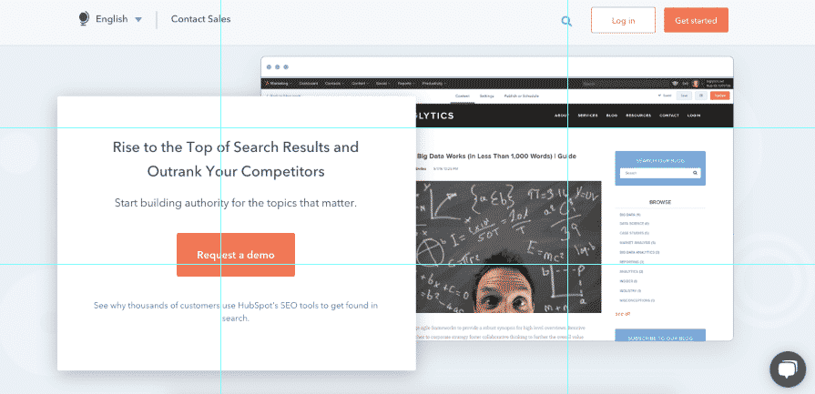
That sweet spot where their CTA is placed is where users’ attention is drawn after an initial scan of the page, making it the perfect place for your CTA.
3. Use Directional Visual Cues
Directional cues are designed to serve as guideposts to what you want your site visitor to focus on. To improve conversion, place visual aids like arrows to point toward what you consider most important elements of your site such as call-to-action buttons or your site’s lead capture form.
Now, one thing you have to know is that directional cues come in both explicit and implicit types. Explicit cues are direct to the point like arrows, lines, or human line of sight. Implicit visual cues, on the other hand, are subtle, almost unnoticeable. This is usually done through the use of negative space and color contrast.
Check out how Codify Academy uses color contrast to direct a user’s attention to both the form and CTA.

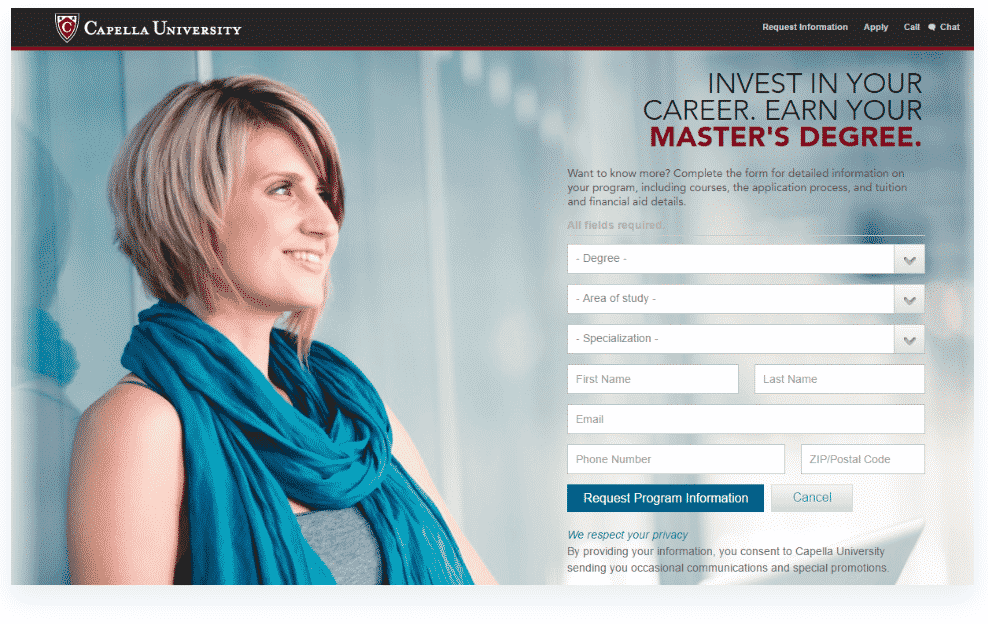
Meanwhile, see how Capella University uses the person’s eye gaze in the image as a directional cue. This is especially effective for post-click landing pages. People have a tendency to look at what others are looking at, so use this innate instinct to your advantage whenever you can.
4. Design For Optimum Speed
It’s common knowledge that the digital age and all the instantaneous convenience it affords has fueled people’s impatience. In fact, just a 2-second delay in a page’s loading speed has been known to contribute to a 103% increase in bounce rates. Every second counts, so make sure that you build your business website for optimum speed.
There are a lot of ways to do this – minimizing HTTP requests, minifying and combining files, doing a compression audit, and enabling browser caching are just a few of the things you can do to speed up loading site. There are a lot of web accessibility resources and tools you can use to evaluate your site’s speed performance such as Google Pagespeed Insights and GTmetrix. These can help identify issues, so you know exactly what and how to troubleshoot.
5. Utilize Your White Space Effectively
A white space or negative space, is the section of your site that is not used for any content element. Knowing how to use white space effectively can help your site look less crowded and more organized. The purpose of white space is to help the user distinguish supporting content from the actionable parts of your site. This will enable you to highlight CTA’s, increase content legibility, and create balance. See how the second image looks cleaner and easier on the eyes?
And below, check out how Percolate’s landing page uses white space to surround the heading, subheading and lead capture form.

The other benefits of using white space effectively include simplifying your page, improving the comprehension of your content and ultimately, improving user experience.
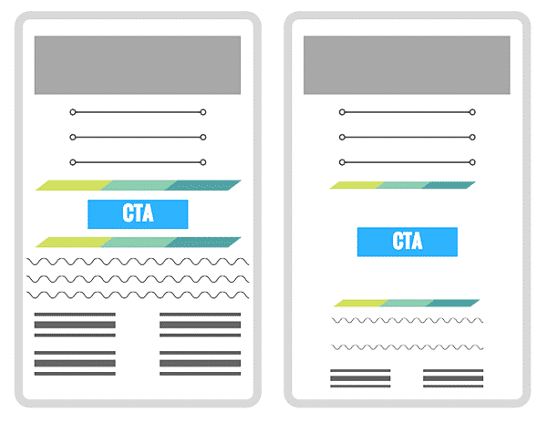
6. Consider The F-Layout
Based on research, the natural behavior of users when browsing a web page is in an F pattern. Basically, their first instinct is to look from left to right starting at the top of the screen, and as they go further down the page, they just scan their way through it. This means that the bottom part of the page gets the least amount of attention, so you want to place the most important message and elements along the F-shape lines. Here’s a quick wireframe to guide you:

Below, check out how Hootsuite uses this to highlight the most important elements they want users to focus on.
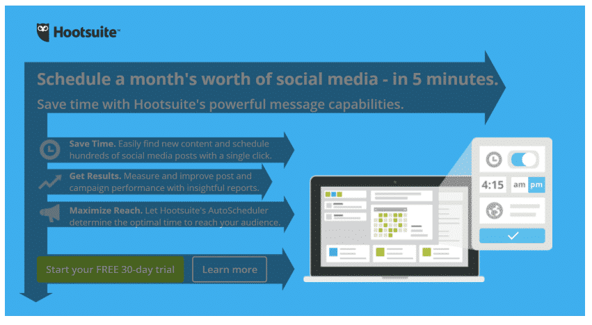
As you can see, users are first drawn to the heading and the subheading. Then, their natural instinct is to scan where the bullet-point benefits are. And finally, that’s when they’ll see the CTA – perfect use of the F-pattern.
7. Tell A Story Through Visual Hierarchy
Just like with the F-pattern, a clear visual hierarchy is based on how a user takes in information when they visit your site. It serves as another guide to their thought patterns by placing elements that naturally flow – telling a story before encouraging them to take action by clicking a CTA. It’s how content is positioned inside a page which often starts with a hero headline, a supporting content that is a mix of text and image, then a CTA.
Remember, every page of your website should tell a tale because people are all about brand stories now, not hard-sell statements. See the image below and you’ll be able to see the difference in visual hierarchy – this small change led to an online sale increase of 35.6%.
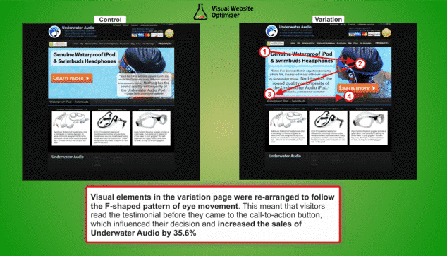
But beyond their use of visual hierarchy, this example also highlights the importance of A/B testing the effectiveness of your web design. While all the concepts on this list are sound, it still won’t beat real-world testing to see which one works best for you.
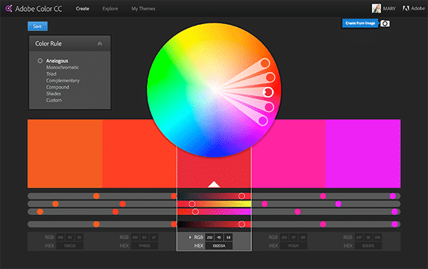
8. Leverage the Power of Color
There’s more to colors than an element of your site’s aesthetics. Color psychology plays a big role in terms of conveying a message – it affects how your brand is perceived not just online, but offline as well. It’s important to remember that certain color combinations can evoke different emotions, so make sure every color is well though-out and should reflect the message of your brand clearly.
One way to play around and come up with the right colors is to curate a Pinterest board with images that seem aligned with your brand vision. Once done, you can upload those to Adobe’s Color Wheel which will automatically provide a color scheme based on the photo set you uploaded. This will help you pick our colors you can use for elements like background and text, so they will all look complementary and easy to the eyes.
Related: Get 40-70% Off Adobe Creative Cloud
For example, red evokes powerful emotions and gets the heart racing. This is why ESPN and Netflix’s logo are in bold, striking red. Conversely, blue is often related to calm, wisdom, and trust. As such, companies like Facebook, Visa and Samsung use this hue.
9. Encourage Familiarity with Faces
People connect with other people and this is mainly the reason why you should use photos rather than vector images. It has been proven that sites that use people on their visual content tend to boost conversions as users feel more connected and understood. However, do try and steer away from stock photos if you can because consumers are more inclined to trust brands that are authentic and personal.
Look at how Airbnb deliberately uses people on the Experiences part of the site – it allows users to imagine themselves in that place. This, in turn, fosters a connection with the brand and the experiences it promises, triggering emotions in the audience.

10. Follow The 8-Second Rule
Did you know that the human attention span is even shorter than that of a goldfish? With only 6 to 8 seconds to capture and engage with your market, it is pivotal to make those seconds count the moment they land on your site. Here are some things you can do to grab their attention on the first 8 seconds:
- Your hero image should be eye-catching and partnered with a headline that is benefit-driven. Don’t sell them a product. Tell customers how it will help make their lives better.
- Your CTA buttons should be distinguishable, clear and direct-to-the-point.
- Your content should be concise, so use power words to make it more engaging.
11. Abide By Hick’s Law
Hick’s Law is named after British Psychologist William Edmund Hick. According to him, the more choices you provide a person, the longer it will take for them to decide. This is a popular theory in web design, which is why more and more businesses are limiting the contents of their navigation bar.
See how Intercom is able to categorize what they do in three options. This makes it easier for the consumer to find a solution to their specific problem, therefore minimizing friction that could lead them to exit your site.
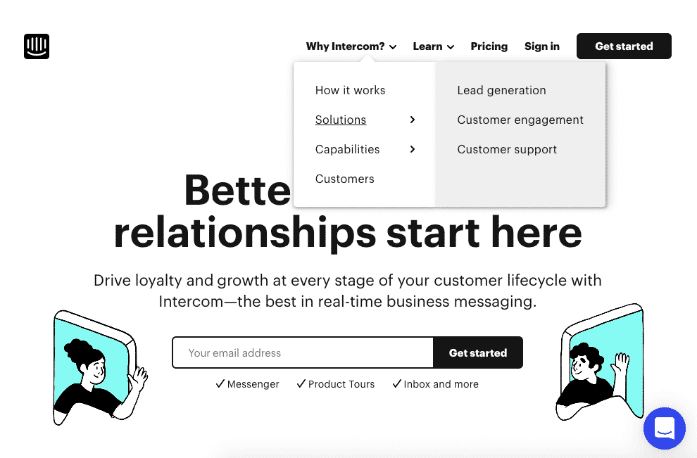
Providing just the essential options not only makes it easier for users to see what they can work with, it can actually help you lead users to what you want them to do in the first place.
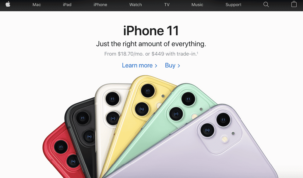
12. Always K.I.S.S.
K.I.S.S. is a popular acronym for the mantra “Keep it simple, stupid” and is widely considered as one of the most popular principles of web design. Just like Hick’s Law, simplicity is key to driving conversions. The more information you cram on a page, the more confusing it gets for the consumer. Simple is not only direct-to-the-point, but also visually more appealing.
It’s important to note that a user can only handle so much information at a time, so when it comes to user experience, keeping it simple is key to not make them overwhelmed. See how Apple keeps it minimal.
Apple has long been a master of minimalist design – be it on their products or their digital content. Everything on this page just works perfectly. You get to see all the different colors of the iPhone 11, how much it costs, followed immediately by two CTAs. Brilliant.
Final words
While all these 12 web design principles are great for improving your site’s conversion rate, it’s also imperative to know that design evolves together with user experience. The key to guaranteeing conversion is really in understanding how your market perceives your brand, how they behave online, and how the information you convey through your site provides them value. As long as you continuously serve your market’s needs, then everything else will follow.
_
About the author: Vincent Sevilla is a professional web designer and inbound marketing strategist. His goal? To innovate ideas, create good art and to travel all the best places in the Philippines.
Hey Jacob, Thanks for sharing this and Thanks Vincent to contribute this great article. I’m a professional web designer and your article is very informative. Two things I always keep in mind while designing a website. 1- Clear call to action buttons and 2- Mobile responsive layout.
Loved Design For Optimum Speed, especially I love the Leverage the Power of Color… thanks for sharing Jacob… and I’m not even finished reading this post yet and I wanted to bookmark it to say thank you for all of these great tips!
You’re welcome Lisa!