
This article has been contributed by Aaron Chichioco.
As of January 2020, there were about 1.74 billion websites worldwide and active internet users numbered almost 4.43 billion.

This year, you can expect more businesses and institutions to strengthen their online presence. As the world embraces inclusivity and accessibility, one can expect that internet penetration rates will go even higher.
Given the huge number of websites and the diversity of internet users, developers are in for some exciting challenges. To be able to stand out, web designs need to be more than just pretty. They must meet the expectations of web users and be able to hold their attention. At the same time, they also must support their clients’ goals of increasing visitor engagement and conversions.
Here are some key statistics web designers must factor in.
- The global internet penetration rate has increased from 35% in 2013 to 58% in 2019.
- As of 2019, the regions with the highest internet penetration rates were Northern America (95%), Northern Europe (95%), and Western Europe (94%).
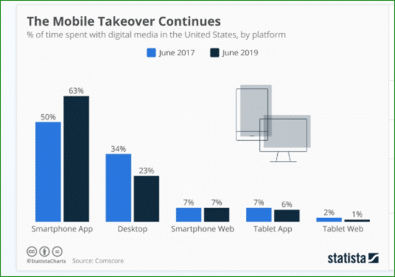
- In the U.S., people are spending more of their time on smartphone apps, from 50% in 2017 to 63% in 2019.
- Mobile spending accounts for about 30% of digital purchases.
- The share of mobile purchases on Cyber Monday was over 40%, up from 35% in 2018.

- About 48% of individuals consider a website’s design as a key factor in determining a company’s credibility.
- Users can evaluate a website’s visual appeal within 50 milliseconds.
- If site loading time is too slow, 44% of users switch devices and 39% stop engaging with the site.
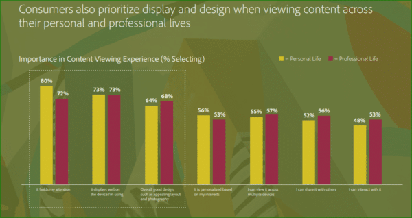
- Display and design play key roles in content viewing experience. In Adobe’s The State of Content report, 80% of users selected the content’s capacity to hold their attention as important in their personal life, while 72% said it’s important in their professional life. In terms of how well the content is displayed on their device, 73% of users consider this as vital when viewing content for personal and professional use.
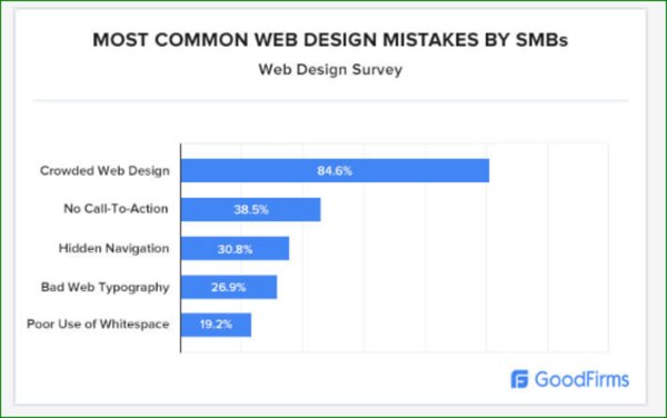
- In a study by GoodFirms, 85% of web designers named crowded website designs as the most common web design mistake of small businesses. Other concerns mentioned were the absence of call-to-actions (38%), hidden navigation (31%), bad web typography (27%) and poor use of white space (19%).
- After UXPin added white space between gDiaper’s homepage banner and the two callouts underneath it, desktop visitors used the callouts 150% more often and the site’s overall conversion rate jumped almost 20%.

Given how much web design affects web users’ behaviors, web developers must continue to explore ways to hook audiences with unique and intuitive designs without losing sight of accessibility, function, and conversion considerations.
Thankfully, continued technological advances have given web designers more resources and tools to create immersive experiences and build web pages that delight as much as they inform. Below are the top web design trends developers can use to boost audience engagement and conversion this year.
2020 Web Design Trends & Predictions To Boost Engagement and Impact
1. Hero Video Headers
In previous years, many websites started using banner or hero images to deliver a powerful visual impact. A full-size static image greets visitors once they land on a website.
Instead of finding multiple options and elements on the site, this design leads visitors’ eyes to focus on a carefully chosen image and crafted copy.
More recently, designers have begun replacing static images with short video clips or loops, thanks to faster internet speeds. If a photo can say a thousand words, brands can pack so much more in these videos (1.8 million words per one-minute video, according to Forrester researcher Dr. James McQuivey).
Videos rank high in terms of user engagement and is actually a preferred content form. According to ComScore, 64% of users who watched a video are “more likely to buy a product online.” By using hero video headers, companies can make their web pages more dynamic, improve audience engagement and encourage visitors to stay longer on their pages.
Like banner images, you can use hero video headers in many ways. Your clips can focus on your brand, product or content.
Landing on the Google Arts & Culture site, viewers are treated to video clips of national parks, bringing them underwater, on land, and through the air with shots of lush forests, majestic landscapes, caves, ice and wildlife.

Elium uses a video background that focuses on the company’s work.

2. Immersive Interactivity
Another design trend you’d want to consider to increase audience interactions are interactive designs and content.
Apart from being more interesting and fun, interactive designs and content equip your audience with tools to personalize their experience of your site. Similar to videos, they allow you to engage your visitors’ senses to better show what your brand, product or company has to offer. Equally important, interactive designs allow your visitors to go directly to the content they want to see.
Take for example the virtual tours on Mt. Cuba Center’s website. Visitors can choose which section they want to see and in which season (summer, spring or fall).
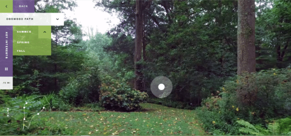
The video is taken from along the pathwalk, making audiences feel like they are actually taking a stroll amidst lush greenery. A white dot hovers on screen to indicate some interesting vegetation. Users can click it to view the plant’s name and other information.
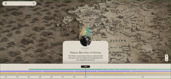
The Witcher’s website features a map of the continent and an interactive timeline of key events. It helps audiences visually grasp where and when these events happened.
There are many ways to incorporate interactivity in your site. Here are just a few:
- Infographics like The Geek’s Guide to London
- Surveys, polls and calculators
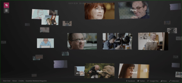
- Videos like the Seven Digital Deadly Sins. Instead of having to watch an entire video, audiences can choose from among seven shorter clips what they want to watch and in what order.
- Assessments where people fill in a form then receive an analysis or feedback. One example is Neil Patel’s blog, where users can enter a competitor’s domain to receive SEO tips on how to “outrank” them.

3. Illustrations as Differentiation
The use of illustrations is another trend we’ve seen in previous years, from logos to header images, videos, landing pages and entire sites using them almost exclusively for their graphics. It’s a versatile way to make your site more entertaining, express more emotions, or give your site a playful mood.
As more companies joined the bandwagon, it seemed like illustrations have begun losing their appeal. Designers are now finding other ways to make their illustrations standout. Here are just a few:
- Abstract illustrations. While these can give a page an intriguingly unique look, designers need to ensure that visitors will still be able to grasp their meaning.
- Collages that combine illustrations with photos or other graphics create a unique, playful effect.
This collage on The Neverland’s homepage creates a 3D effect. The site also uses micro-animations and a unique navigation style, seemingly taking their visitors through a dreamy journey.

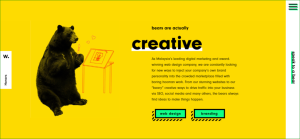
- Bike Bear combines illustrations, bear images, and micro animations to create a fun site that’s quite hard to forget.
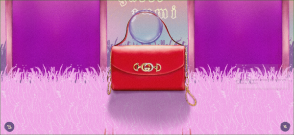
- Interactive, animated illustrations. Gucci Zumi uses animated illustrations, vibrant colors, and sounds.
4. 3D
Thanks to developments in 3D technology and its more affordable price tag, more designers are now experimenting with 3D visuals.
Using 3D elements in web design makes for attention-grabbing pages. Coupled with other features like sound, interactive elements or popping colors, it can immerse your audience into a wholly different world. In a sense, it tests the boundaries between what’s right in front of your user and what’s simply in their screens.
With 3D graphics, audiences are more likely to stay longer on your site. Plus, they don’t just “see” your company on their devices. By interacting with your web design, they get to “experience” your brand too.
A-0.Design’s homepage fuses 3D visuals with background music, animations, and interactive elements to delight visitors and pique their curiosity.

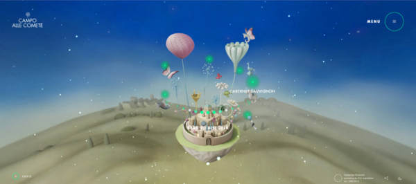
Campo Alle Comete enchants visitors with 3D visuals with a soothing, fairytale-like background music to match. By dragging their mouse, users can view the floating city from different angles or zoom in to see the elements closely. Animated green dots indicate where viewers can click and view more details about the company’s wine products.
5. Parallax Scrolling
Another way to create an immersive experience for your audience is through parallax scrolling. Often used in video games, this scrolling technique uses a background that moves slower than foreground graphics. Made popular many years ago, this trend is still going strong.
Parallax scrolling creates a faux-3D effect that pulls viewers in. Used correctly, this technique can be a perfect blend of words and visuals that evoke viewers’ emotions, lend more clarity to your message, and leave a lasting impression of your brand.
Rainforest Foods uses images and videos of different landscapes to seemingly lead audiences through a nature trail. The hero text inspires, the snippets of information fascinates, all the while educating web visitors about their products.

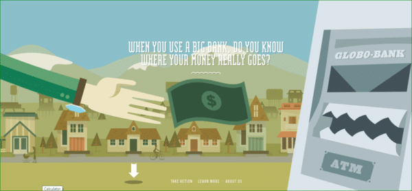
Make Your Money Matter uses illustration and parallax scrolling to create a “money trail.” The effect is an engaging content broken down into bite-sized, easy-to-follow sections. It helps users understand where their money goes once deposited in big banks, as well as the benefits of putting their money in credit unions.
6. White Space
In an age when many users have shorter attention spans and they are constantly bombarded with marketing messages, companies need to ensure their target customers pick up their main message. In terms of web design, this can be achieved through the use of white space.
White space – also called negative space – refers to the empty spaces between elements like text, images, menus, and videos. While many designers often go for white, negative space can come in other colors too.
Some consider the use of white space – especially a lot of it – as a waste of space. Especially if you’ve spent a lot on marketing just to bring visitors to your site, you want to offer them as much information as you can.
But far from squandering precious areas on your website, white space actually allows your visitors to focus on the most important sections of the page. Instead of drowning in a sea of information or products, for instance, you focus their attention on your key offer or a specific call-to-action.
In terms of aesthetics, white space gives websites a clean, elegant look. It gives users a “visual breathing room,” allowing them to better appreciate the elements of your site instead of feeling overwhelmed by the clutter or confused with all the elements begging for their attention.
As graphic designer and curator Ellen Lupton said, “Design is as much an act of spacing as an act of marking.”
We can expect more websites to increase their use of this design principle in their sites. Others are even moving away from full-bleed backgrounds and using white space framing to let their graphics stand out and neatly divide web pages into different sections.
To effectively use negative space, you also need to consider other design elements like typography and contrast. If you want viewers to focus on the copy that’s in a large, bold font, you must minimize using other texts or elements on the same page. Also, make the copy stand out by using contrasting colors.
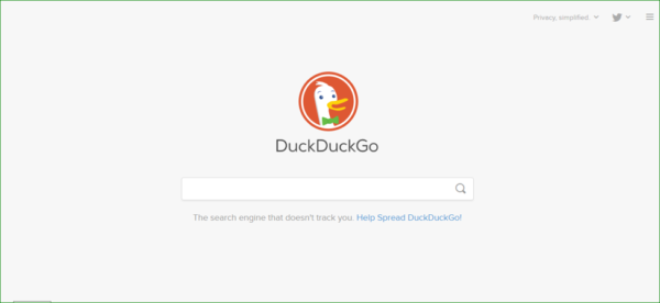
For instance, search engine DuckDuckGo has an orange logo against a white background and keeps its home page clean.
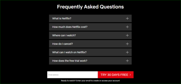
Netflix has a simple FAQ section utilizing a dark background and white text. Notice that the CTA button pops out in red background.
7. Geometric Shapes
Another way to create captivating designs and convey more meaning and emotions is to utilize geometric forms like circles, triangles, and other polygons.
There are so many ways to incorporate these elements into your site:
- Create geometric patterns using one or a few shapes
- Use individual shapes with vibrant colors
- Create asymmetrical designs.
- Use the geometric forms as background or as navigation and framing elements.
When designing with geometric forms, keep in mind that each shape conveys a specific meaning. For instance, squares are associated with formality and rationality. Circles reflect harmony, connection and femininity. Hexagons can be used to show balance and cooperation.
Pick forms that support the meaning you want to express or the mood you want to create.
PageCloud also points out the importance of going for shapes that say something about your brand.
“At PageCloud, we use circles for two reasons: 1. We don’t believe in being locked into a grid, typically represented by ‘squares’. 2. Circles represent the collaboration between designers, developers, and business owners.”

Andrei Gorohov’s site uses hexagons as navigation menus.

The Art Center creates a playful, child-like vibe by using imperfect, colorful shapes popping out of a white background.

8. Accessibility
Web accessibility takes into account web users who:
- Can’t see or have poor eyesight.
- Have physical disability, such as those who struggle grasping objects and have a hard time using a mouse or keyboard.
- Have learning disabilities like dyslexia.
- Unable to hear.
- Have slow internet connections.
- Don’t have much time to consume long content.
Some may think differently abled individuals who are also web users comprise only a small percentage of the population. But the statistics reveal otherwise.
In 2017, it is estimated that over 285 million individuals, reported a visual disability and over 360 million have a hearing impairment worldwide.
These figures may include your elderly customers who may be struggling to navigate your product pages or read your content, clients who are color blind, and audiences who can’t hear but wanted to learn more about your services through your videos.
If you are marketing to an international audience, you may also want to consider that users in specific countries may find it difficult to view your site if you are using heavy graphics.
In previous years, lawsuits have been filed in the U.S. against corporations due to web inaccessibility for visually or hearing-impaired individuals.
With more people demanding web accessibility, you wouldn’t want your client or business to be facing similar legal action. You also wouldn’t want prospective customers moving to your competition’s site because their pages are more accessible than yours.
There are many ways to ensure that your site is accessible. Here are just a few:
- Ensure that your users can navigate your site and enjoy using the interactive elements even when using keyboards alone.
- Use free and paid accessibility tools online.
- Use accessible content management system templates.
- If you’re using images to convey your message, include an alt text.
- Pick colors carefully. Keep in mind that some individuals have a red-green color deficiency. Instead of relying on colors alone, include other visual cues or signs so those suffering from color deficiency can still grasp your message.
- Include captions on your videos.
- For podcasts or interviews, provide a transcript.
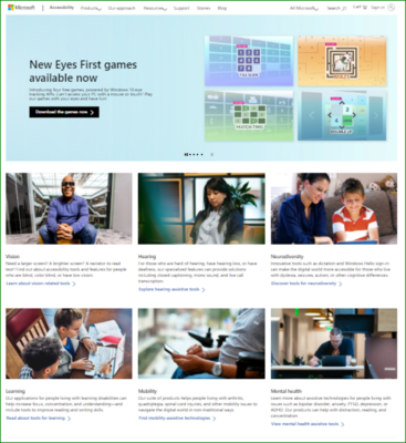
Microsoft offers accessibility tools for differently abled individuals. They also introduce games which users can play using their eyes.
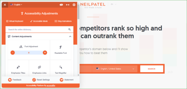
Neil Patel’s website allows visitors to make accessibility adjustments.
Takeaway
The featured sites above reveal another key factor in creating stunning and effective web pages. You don’t need to focus on just one design trend. You can mix and match, combining different elements until you can build a site that delights, informs and converts.
What other web design trends are you picking up this 2020? Share your thoughts below.
_
About the author: Aaron Chichioco is the chief content officer (CCO) and one of the web designers of Design Doxa.
yeah, the geometric shapes is a good point, seeing this a lot 🙂