This is a guest article contributed by Stuart from FreeDesignClub.
Can’t find the right typeface for your latest project or design? Why not create your own completely free font? Here in this following tutorial, we will give you a step-by-step guide on exactly how to begin creating your own font.

We have included detailed instructions on everything from setting up your workspace (to ensure creating your letters is as straightforward as possible) to exporting and installing your finished font or fonts.
In this particular tutorial we will be creating two separate fonts that will be used in conjunction with each other to create a complementing duo. A base font (shown in pink below) and an outline font (shown in black below).
For ease we have broken down this tutorial into three easy to follow sections –
- Designing the base font
- Designing the outline font
- Converting your letters into an actual font file
For this particular tutorial, we will be using Adobe Illustrator (free trial) to create the initial letter shapes and Glyphs (free trial) to convert them into font based formats.
You can also use Corel Draw or other similar programs, so long as they are vector based. This ensures the letters can be expanded to any size without any loss of quality.
You can also use a range of other font-based programs, like Font Lab or Type Tool, which also offer very similar functionality to Glyphs.
So, without any further ado let’s get started!
1. Designing the base font
Setting up your workspace
– Open up Adobe Illustrator
– Create a workspace 10000 px wide and 10000 px high. This is to allow enough room for your entire alphabet, punctuation and numbers. When you begin to create 50+ glyphs, it’s much easier having everything on a single sheet for reference.
– Now with your workspace open, click View (found at the very top) and “Show Grid”. Ignore this step if your grid is already set to showing.
– Next, click the view option again followed by “Snap to Grid”. This will ensure any anchor points or lines you create are plotted along a grid line, making glyph creation much easier.
– Next we need to edit our grid spacing to a size that is suitable for our purpose. To do this, click “Illustrator” > “Preferences” > “Guides & Grid”. You should now see this window pop up.

– In the “Gridline every” field, insert 50 pt. This will show you a gridline every 50 pixels in height and width. In sans and serif font designing, uppercase letters are traditionally 700 pixels in height, with lowercase being 500 pixels in height. There is no set width; this truly depends on the designer’s style and personal preference. Once completed, click Ok.
– You should now see a workspace which looks something like this
– Next we need to lay down some rulers, to show us the upper and lower boundaries of our letters. To do this, click View > Rulers > Show Rulers. If your rulers are already showing, you can ignore this step.
– Your ruler should appear just below the thin grey bar at the top of your workspace. Click and hold on your ruler and drag the cursor down to somewhere near the top of your workspace, no need to exact. This will set your upper letter boundary.
– Next, repeat this process and drag a second ruler line down, placing it 14 grid squares below the upper line. This will act as your lower boundary for the uppercase letters. Each grid square is 50 pixels high, so 14 squares equals 700 pixels in total, which is the exact size we need to create our uppercase characters.
Creating your letters
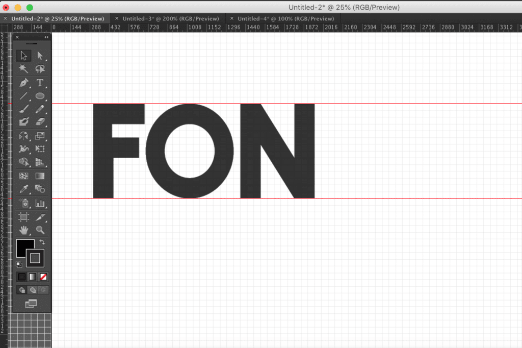
For the purpose of this tutorial, we will be creating the uppercase letters F, O, N and T to show you all the necessary skills needed to create an entire font. Let’s start with the letter F.
The Letter F
– Firstly, you need to click on the Pen Tool, which can be found in your toolbar area. If you cannot find your tool bar click Window > Tools. Alternatively you can press P on your keyboard.
– Next you need to select an outline colour, I use black as it stands out best over the grid. In your color menu (Window > Color) you can select a fill and outline color. Ensure you only select an outline color, with the fill color empty. It should look like this, if done correctly.
Now we are ready to begin creating.
a) Starting in the top left corner of your workspace, click on the upper ruler you laid down a little earlier. This places what is known as an anchor point. Each time your shape or glyph changes direction, you will use an anchor point. For example, in a triangle there are 3 anchor points, one in each corner. For a square there are 4 and so on.
b) Now, holding shift, click on the bottom ruler, this will create a straight line for the left edge of our F shape. By holding shift you are ensuring the line is perfectly straight.
c) Next go three grid squares to your right and click again. If you are looking for a thicker font, 4 squares are fine. Equally for a thinner font, move two squares. There is no perfect rule for character width, as long as it’s consistent within your font. For example, if one character is 3 grid squares wide, they all should be.
d) Next go up five grid squares, holding shift and click to add another anchor point.
e) Now go right four squares to place your fifth anchor point. If done correctly you should have something like this
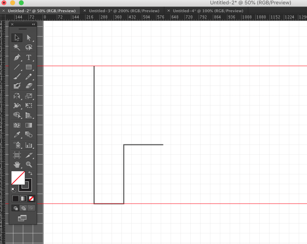
f) Now going up three squares, place another anchor point. Here it is important to ensure you use 3 spaces, so the height of our first horizontal extender (the bit that comes out on the F character) matches the width of the vertical block from sections a-e.
g) Next go left four spaces, to finish off the lower extender of our F.
h) Next go back up another 3 spaces and place another anchor.
i) Next go right four spaces and place another anchor point.
j) Next go up three spaces
k) Then finish the shape off by placing an anchor point back over the very first start mark, this ensures the shape becomes connected in full.
Here is our finished shape:

Truthfully, I am not in love with it. But we now have our basic F outline completed, let’s edit it a little to see if we can improve the finished look. Editing a completed shape is far easier than creating a masterpiece from scratch. My view is always to complete a shape, then perfect it.
The two features I want to improve are –
1) The upper extender is too short, it needs to be wider than the secondary lower extender below.
2) The secondary extender is too low down. I want to perhaps bring it up one grid space.
To edit anchor points, you simply need to select the “Direct Selection Tool” which looks like a white cursor. You can also press the A key on your keyboard to bring it up.
Now black out the anchor points you wish to move. Starting with my first change, I want to select the upper extender’s far right anchor points. Shown below in the red circle.

Simply black these two anchor points out and with your right arrow key, nudge them as far right as you wish to go. For me one grid space looks perfect.
Now for my second point, I need to select all four anchor points that make up the second extender, these are shown in the image below.
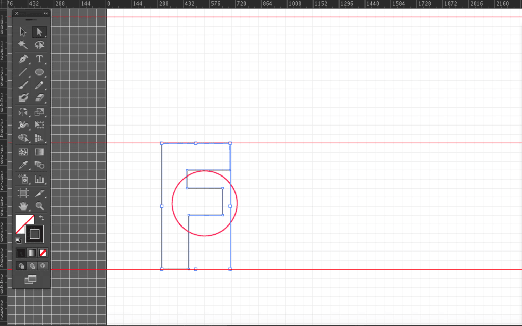
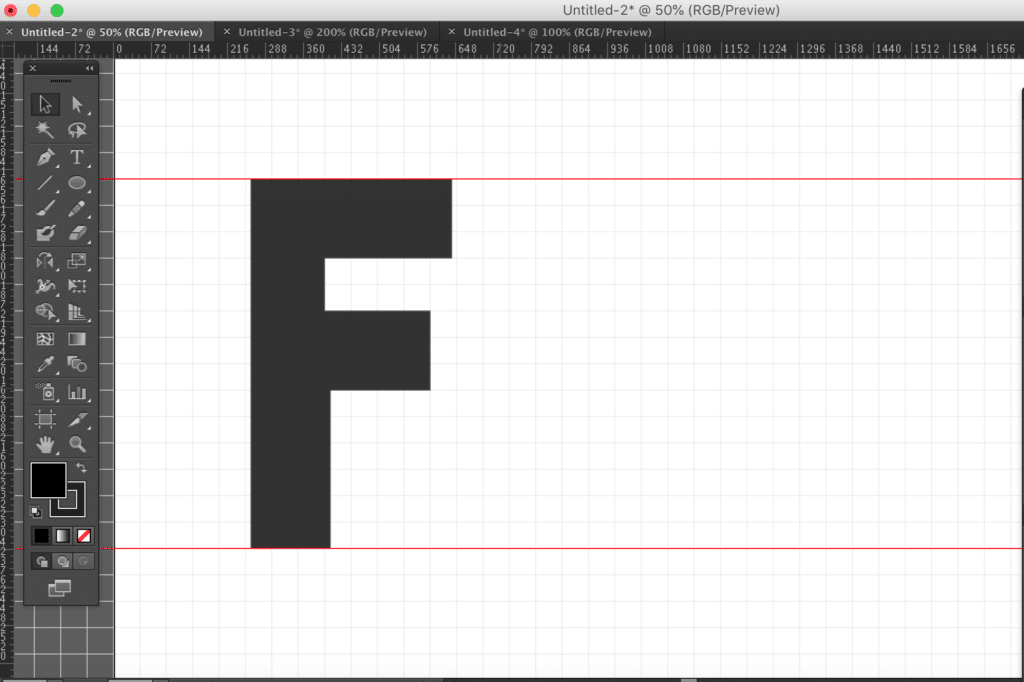
Now once again using your arrow key, nudge all four anchor points upward, again one grid space greatly improves the design. Here is our finished F.

If you now select the design and go back to your color toolbar you can switch the color format from stroke to fill, to get a finished letter.
The Letter O
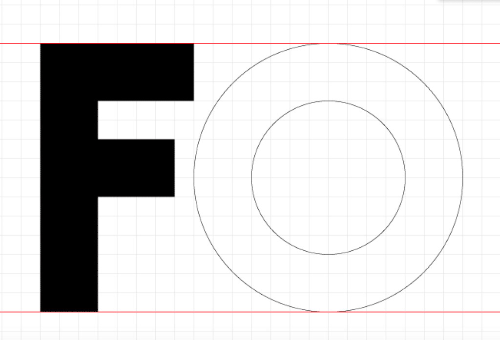
Okay, so I am pleased to tell you our O shape is a little easier than the F. For this we are going to use the Ellipse tool to create a circular shape. Firstly, do ensure you convert your color selection back to stroke, not fill.
Next in your toolbar go ahead and select the Ellipse tool, or press L on your keyboard.
Now line your cursor up on the top ruler, to the right of our F character, hold shift and drag down to the bottom ruler. Holding shift will guarantee we create a perfectly symmetrical circle. You want to create a perfect circle from the upper to the lower ruler.
Next, again with the Ellipse tool, draw a perfect circle, but this time start from three rows below your upper ruler and finish three rows above your lower ruler. This will create the inner circle we need for the O shape. If it helps, drag down two new rulers from the top to assist you with this shape creation. If done correctly, you should have something like this.
However, these two circles are currently separate shapes, which when filled in with color will just show one large black circle. See below
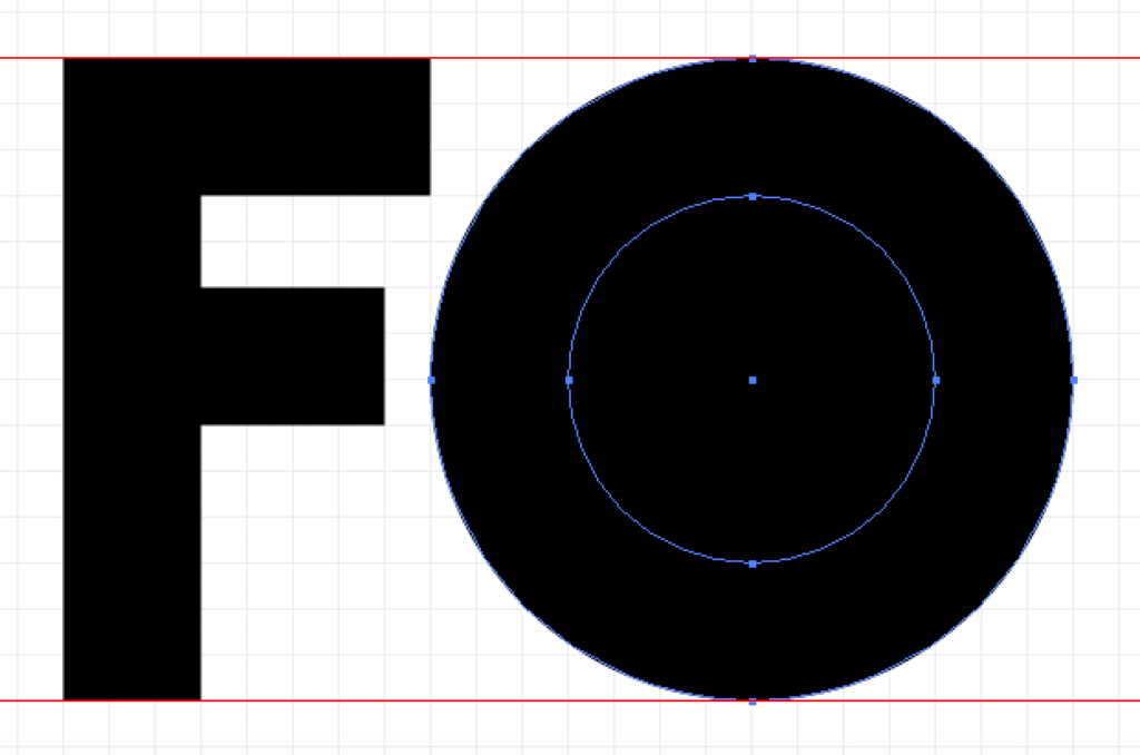
One of the reasons we selected the word “Font”, aside from being relevant to our tutorial, was so we could explain another useful skill required to create a typeface. This is how to separate alternate paths.
Now we need to bring up the Pathfinder toolbar, to do this click Window > Pathfinder. Next (using the selection tool – Shortcut V) black out both circles, and click on the second option in top row “Minus Front” of the pathfinder window.
By doing this you are quite literally removing the smaller circle shape from the back, larger circle to create a singular object. This creates the hole we need for our O shape. It should now look like this.
Again if you feel the shape is a little too wide (or not wide enough) you can select the entire shape and stretch it right and left by one or two grid squares.
The Letter N
We are now half way there, it’s easy right? Two letters down, two to go. Now let’s create the N.
a) Firstly, select the pen tool from your tool bar area. Create your first anchor point on the top ruler, somewhere to the right of your O letter.
b) Hold shift and go straight down to the lower ruler, and add your second anchor point. This is the left edge of our N shape.
c) Next go right 3 squares, and put down another anchor point. Still on the lower ruler
d) Next, again holding shift go up 8 grid spaces and place an anchor. This may need editing afterwards, but will allow us to create the basic N shape.
e) Now going five spaces to the right, but also 8 spaces down to the bottom ruler place your fifth anchor point. This should look something like this
- f) Next go three spaces to the right and place another anchor.
- g) Before going back straight up to the top, creating the right side of our N shape.
- h) Now going three spaces left, place another anchor point
- i) Before going 8 squares straight down. You can see how this space is beginning to mirror itself.
- j) Now similarly to point e, take the next anchor five spaces to the left back up to the upper ruler.
- k) Finally complete the shape by joining the last anchor point to the very first.
Here is our finished shape:
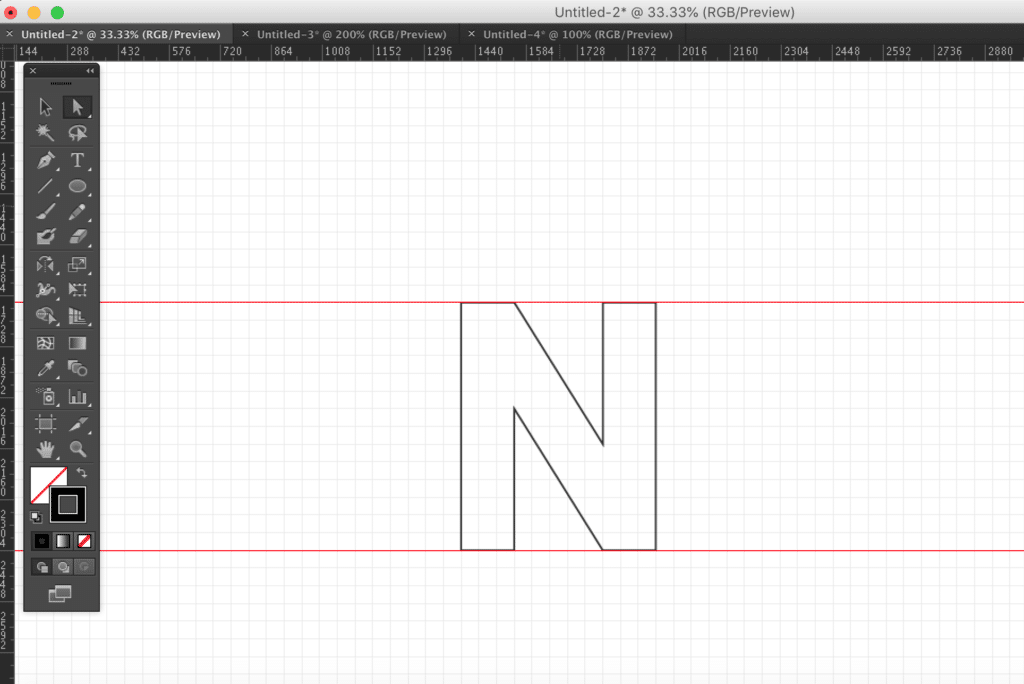
Again edit the shape as you please. Though the two sides ideally need to remain three grid spaces wide to remain consistent with the rest of the font.
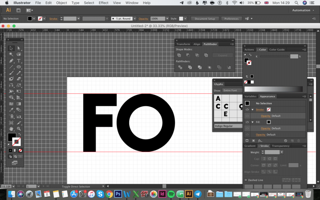
Here are our three letters so far:
The Letter T
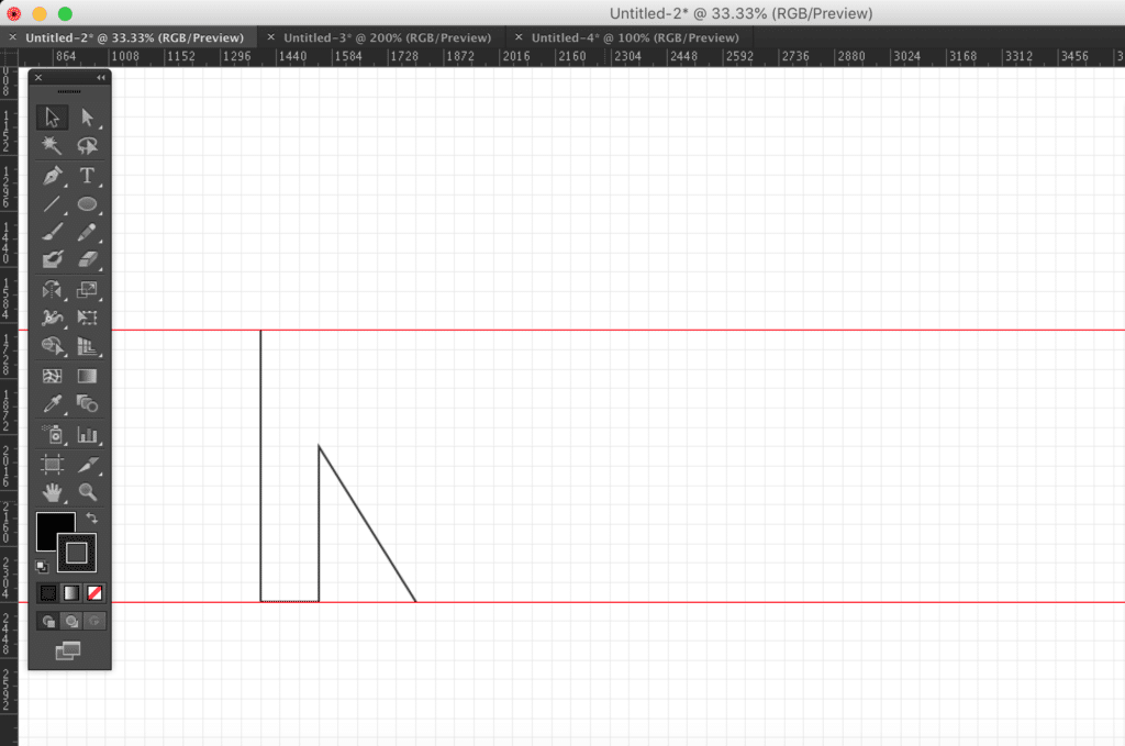
One letter to go and the T is by far the easiest of the 4 letters we are going to explain how to create today.
a) Once again, select the pen tool and start somewhere to the right of your N letter, along the top ruler. Create our first anchor point.
b) Now go down three spaces (retaining the golden rule of three squares to maintain the width ratio of our font) and add another anchor point.
c) Now move three squares right and add our third anchor point
d) Holding shift go straight down to the bottom, in line with the lower ruler and add our fourth anchor point.
e) Move three squares right and add another anchor point.
f) From here you can already start to see the T take shape. Mirroring the left side of the design, go back up 11 grid spaces and insert another anchor
g) Right three spaces, and add another anchor
h) Then up three more spaces with another anchor
i) And finally join the shape to complete the T shape.
You may wish to increase the width of the horizontal extenders out left and right, by one grid space each. This again is completely up to you. Just ensure what you do to the right is mirrored to the left of the design.
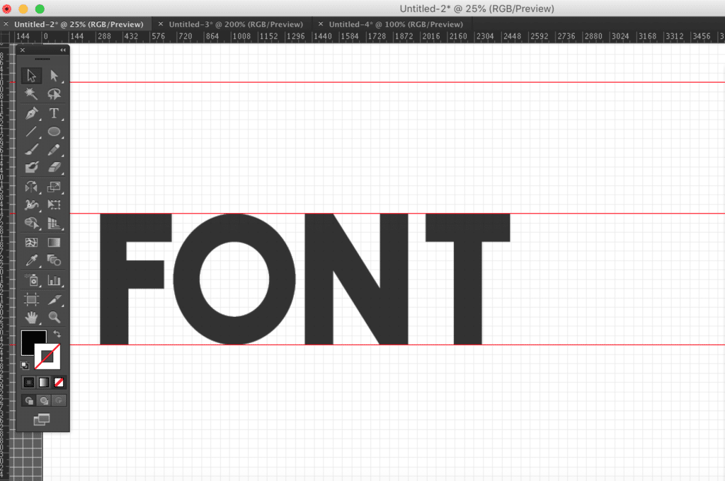
Here is our finished font:
Part Two – Designing the Outline Font
In this part we are going to look at creating the secondary font, which is an outline version of the base font. It’s incredibly easy to create in just a few steps
1) Copy and paste the entire set of four characters further down the page
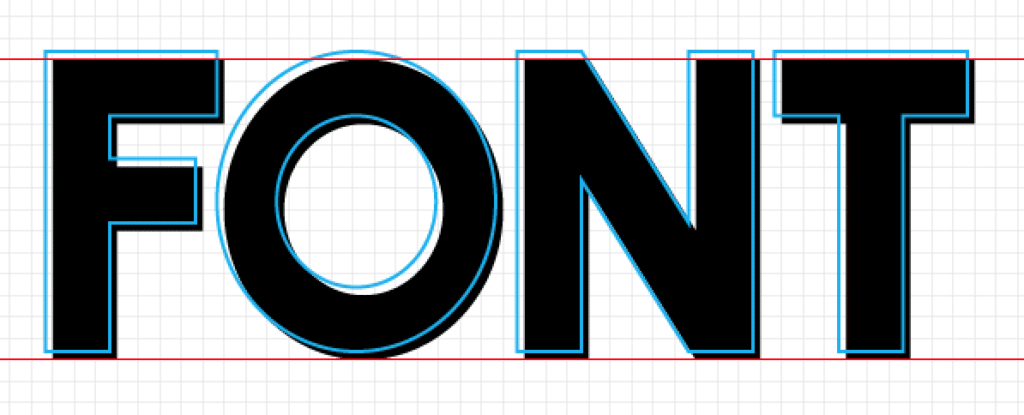
2) Convert the color from fill to stroke. Meaning the font is now just an outline. Change the colour to something other than black or white, I like bright pink or blue so it stands out. The color is purely for testing purposes.
3) Next open up your Stroke panel (Window > Stroke) and set the stroke to 8pt. It should be set to 1pt by default. You should notice your font outline stroke become thicker as a result. You can increase more or less, depending on your own preference.
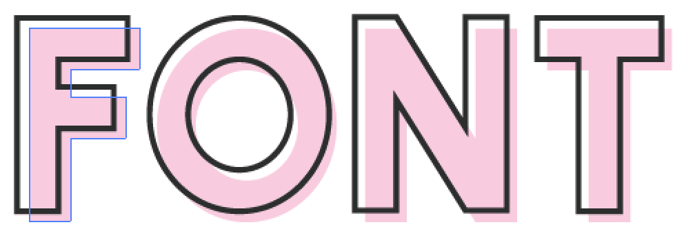
You may wish to overlay the outline shape over your base shape to see if the design suits your style. Here is our example
4) Once your happy select all four characters, and click Object > Path > Outline Stroke.
Your outline characters are now complete.
Part 3 – Converting your letters into an actual font file
With both fonts now ready, we can begin converting them from vector graphics to actual glyphs in a font file. Let’s start with the base font. The process for the outline font is identical, so should be repeated as a new font after the base font is complete.
1) Open Glyphs
2) Click File > New
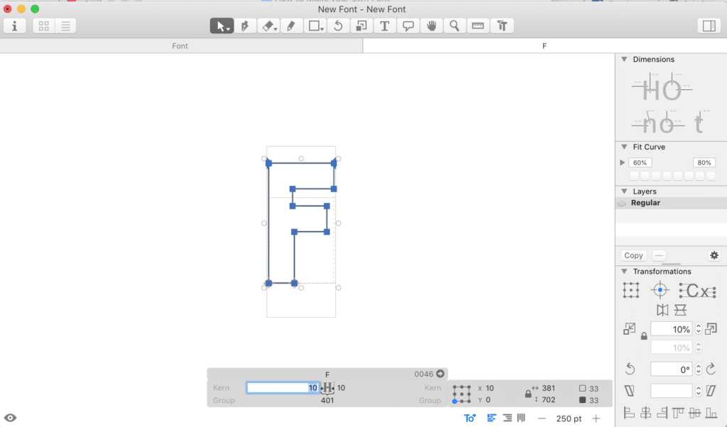
3) Let’s start with the F character. Open up the F glyph window in Glyphs. Shown below

4) Now simply copy and paste your base F character into glyphs. We have already sized the character perfectly, so no altering should be required. If the character is not already aligned, simply drag and drop it between the upper and lower lines, shown in the example above and in our image below.

1) You will see the character sits perfectly within the character space.
2) All that is left to do is to set the character spacing.
Character Spacing is the space values given to a character to determine how many pixels should be shown as space either side of each specific character. For the purpose of this tutorial, we will choose 30px each side. You can edit this, via the menu below. This means that when typed out, each character will have a default spacing of 30 pixels either side attributed as space.
3) Repeat the process for the remaining letters, altering the character spacing values to 30 pixels either side of each character.
4) Using the T tool in Glyphs you can test out your new font. It should look something like this:
The value to the left (highlighted above) is the pixel spacing attributed to the left of this F character, with the option on the right.
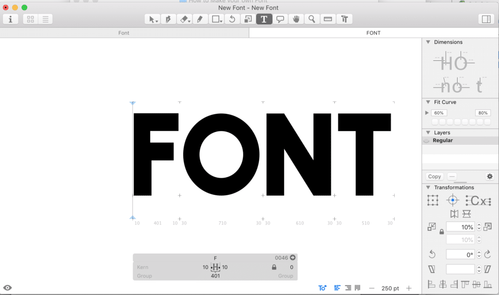
If you feel the spacing between the characters is too low or high, you can adjust the values, as you desire. For me, they look perfect, apart from the space between the F and the O that is. It looks a little wide right? This is because character spacing is displayed from the widest point of each character. For the F the widest point is on the upper extender that comes out of the top right side. For the O it is in the centre of the O, so it gives the illusion the spacing is too wide.
Thankfully we can adjust this. This is known as relationship kerning, which is defined as “the space between specific pairs of characters”. In this case the F and O characters.
To edit this, simply put your T cursor (within glyphs) between the F and O characters and edit the box marked as “kern” on the left. I have edited the value to -40 pixels, which seems to have resolved the wide space. You can set this to whatever value you wish, based on your own preferences. Simply enter the number and hit enter, and the preview mode will adjust to show you the completed spacing.
Use a minus number to reduce space and a positive number to increase spacing.

Once you have completed inserting the characters, adding character spacing and kerned any characters, which have over generous spacing, you are finished and ready to export.
- Firstly, click File > Font Info and insert a suitable name for your font.
- Then click File > Export and begin exporting your OTF/TTF files.
Repeat the process for your outline/stroke font, install them both and begin designing.
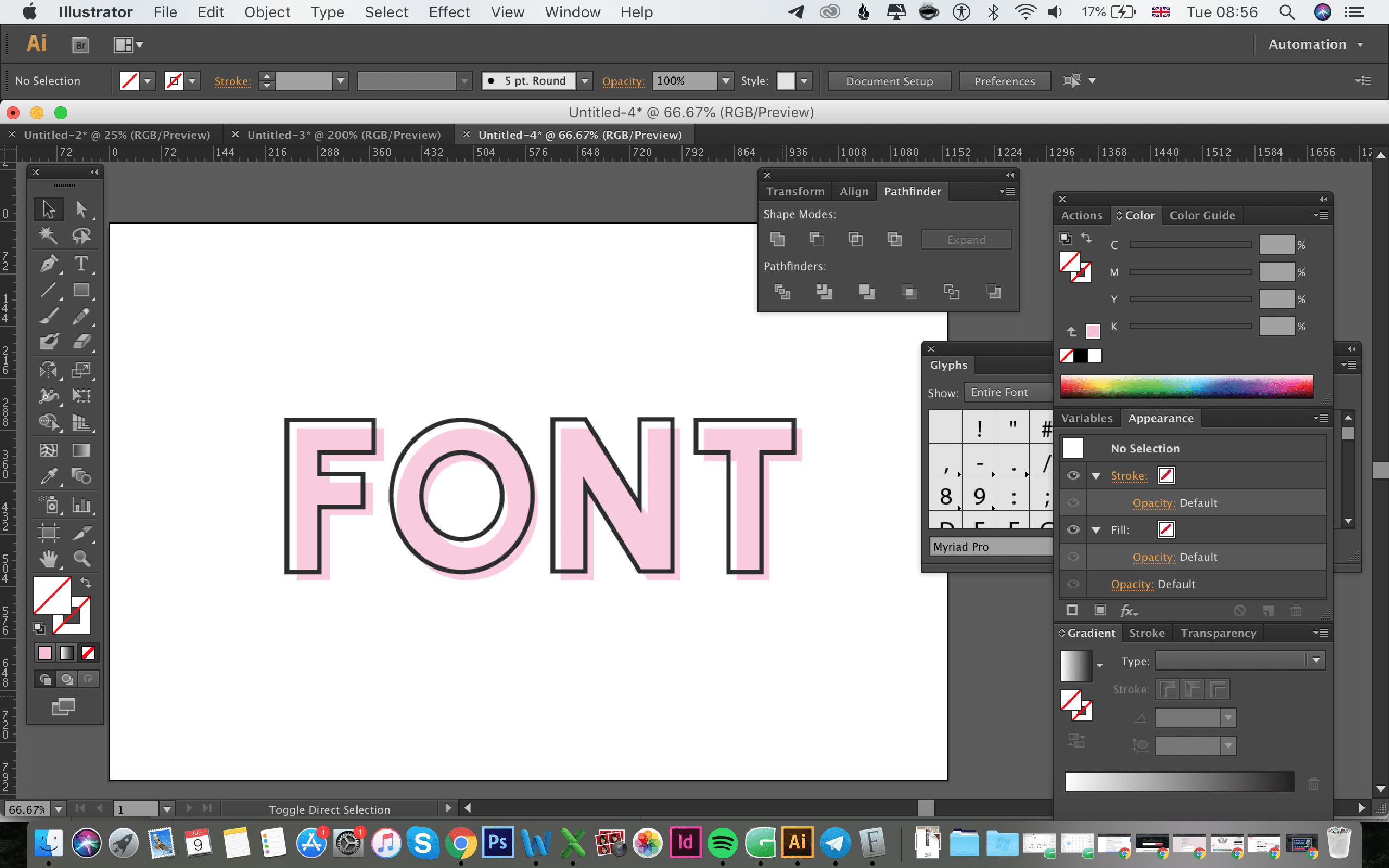
Now reopen Illustrator, (it may require a restart to ensure your newly installed fonts appear). Select the base font and type out FONT, use a bright color that stands out against a white background and the black outline font.
Then with a new layer, select the outline font (color black or dark grey) and type out FONT again. Then take your quick selection tool and drag your outline layer over your base layer, to create something that looks like this

I hope you have enjoyed reading our font tutorial, be sure to let us know if you have any questions, issues or queries in the comments area below. Thanks for reading!
—
Stuart is one of the head designers and content creators at FreeDesignClub.com. Stuart found a love for graphic design after doodling all day every day in class from the age of 12.