
This article was contributed by Manish Dudharejia.
Today’s digital consumer is pickier than ever about which brands they choose to buy from. Since there are virtually limitless options in terms of brands and online retailers selling the products they are searching for, any annoyance, interference, or negative experience is enough to send them looking for other options.

If a website is not working correctly or simply not offering an excellent user experience (UX), visitors will often leave a website in a matter of seconds with no intention to return. As an online e-commerce brand, this could mean certain death for the success of your business.
Consumers need to find a clear value proposition to hold their attention and convince them to stick around. This is why intuitive web design is critical for an online business that wants to offer an exceptional UX design that keeps customers engaged from start to finish.
What Is Intuitive Web Design?
There is no clear definition of what an “intuitive” website looks like. There is no set list of factors and features that you can check off a list and -voila- you now have an intuitive site. Instead, this type of web design is more about how it makes your customers feel and the kind of experience it offers to them.
Say for example that you are launching a new online clothing store. Any typical retail website will include common features like organizational tabs for customers to browse through the shirts, pants, dresses, shoes, and so on. It may include a search bar for specific items or even a few special features, but this does not necessarily make it intuitive.
An intuitive clothing store is going to make the experience truly exceptional for the customer. More than just being well designed and easily navigable, their website may offer a style quiz for the shopper to participate in and use this to guide them to the sorts of items they would enjoy best. They may offer shopping recommendations based on their viewed items or previous purchases. And above all, they will create an outstanding UX that pleases their customers.
Why Build an Intuitive E-Commerce Site?
Obviously, your competition in the e-commerce industry is extremely fierce, so your brand’s website needs to offer a UX that pleases customers. This requires understanding what your customers want, knowing how they are going to interact with your site, and eliminating any obstacles that stand in the way of an optimized experience.
While there are nearly endless benefits that an intuitive UX offers, there are four major reasons an intuitive design can increase your website’s conversion rates.
1. Enhances Engagement
Keeping your customers engaged with your website is crucial if they are going to move through the buyer’s journey. After their initial introduction to your brand, there needs to be a clear reason that a customer not only stays on your website, but conducts their research, compares your products, and decides to purchase.
If they encounter any disruptive UX challenge, it could lead to disengagement. But if your website can anticipate what that customer is looking for next, they will be more likely to stick around.
2. Keeps Visitors Glued
Intuitive website design is all about how it makes the user feel. When you use a website that seems to know exactly what you’re looking for or what you want to see, it creates an innate experience that keeps you locked in.
This gives you a strong competitive advantage over your competitors, especially considering the fact that customers are even willing to pay more if a website offers a more targeted shopping experience.
3. Reduces Bounce Rates
If a website has a high bounce rate, there could be several culprits that are causing people to exit soon after they arrive. First of all, it could be an accidental click, which is unfortunately not fixable. Another reason is that the web page does not work properly. If it has slow loading speeds, 404 errors, or the layout is not optimized to the device, a customer will quickly exit. And finally, the webpage could simply not offer what the user is looking for.
Obviously, an intuitive site will not have any errors and will adjust its formatting based on the device the user is viewing it on. Plus, an intuitive website will be clearly laid out and descriptive so that users are able to navigate easily and find the information they are looking for, eliminating these two common bounce rate triggers.
4. Improved SEO
Just like your business, Google’s search engine wants to offer people the best experience possible. They seek to provide users with the answers they are looking for so they keep using Google’s services. Therefore, their algorithms will look for signals that a website not only matches up to a customer’s query, but will also offer them an excellent experience.
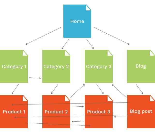
An intuitive website will include the kind of e-commerce SEO factors that Google picks up on when determining its search results. While the placement of keywords throughout the webpage is obviously important, Google does take other features into consideration, including the internal linking signals which indicate good site navigation, as well as better behavioral signals from users, like click-through rates and personalized options.
Examples of Intuitive Websites
Again, there is no set way to create an intuitive website. There are thousands of little ways that your site can offer an intuitive experience, but these examples can give your team inspiration and ideas for your own strategies.
The Mountain is an online retailer that sells items like t-shirts, mugs, and hats while being incredibly committed to creating a sustainable, environmentally-friendly business. They use recycled materials and water-saving strategies during production while simultaneously raising awareness for issues such as endangered species and social issues through their product designs. What makes their website truly intuitive is how personalization is woven throughout the shopping process. Even their CTA buttons are phrased in ways that make it personal, inviting customers to “Shop Spring Arrivals” or even create your own product on the “My Mountain” page. On the back end, The Mountain segments their audiences and offers customized promotions depending on that customer’s behavior, such as sending out loyalty perks.

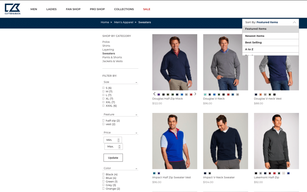
Cutter and Buck uses intense data analysis to provide a personalized and intuitive shopping experience for sports and outdoors gear. Everything about the website is straightforward and simple; it is easy to navigate and the check-out process is super quick. Its unique “choose-your-own-adventure” layout with numerous filtering options and collections is smart and allows customers to find exactly what they are looking for.
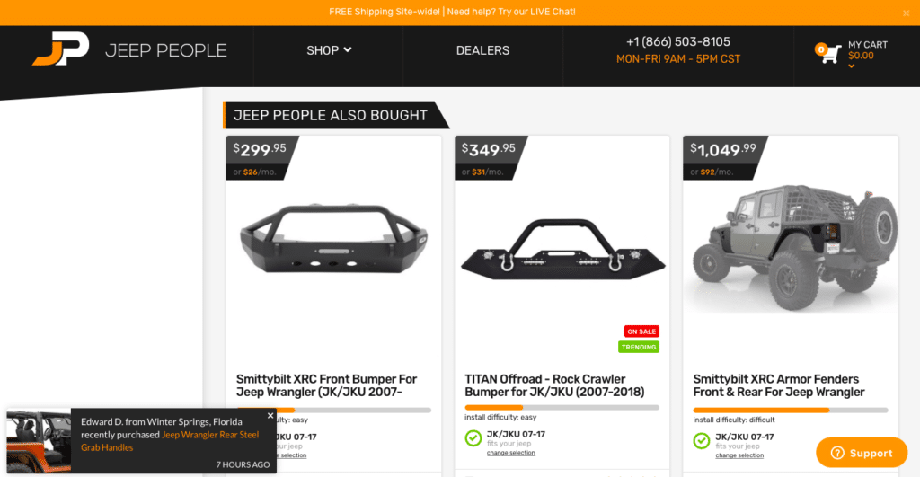
Another key factor of an intuitive website is transparency and trustworthiness. Your customers want to know as much information about your products and business before they make a purchase, and the car part e-commerce company, JeepPeople does this perfectly with their website. The shopping experience is customized right off the bat by selecting your exact make and model of Jeep before browsing any parts. From there, each piece is rated in terms of install difficulty and star rating. They also offer some great additional features like monthly payment plans, live chat, and product recommendations based on other customer’s purchases.
5 Tips for Creating an Intuitive E-Commerce Website
In order to create a better website that is intuitive and optimized, there are some features that will support an overall experience that pleases customers, keeps them engaged, and urges them towards a purchase.
1. Include a Visible Search Bar and Shopping Cart
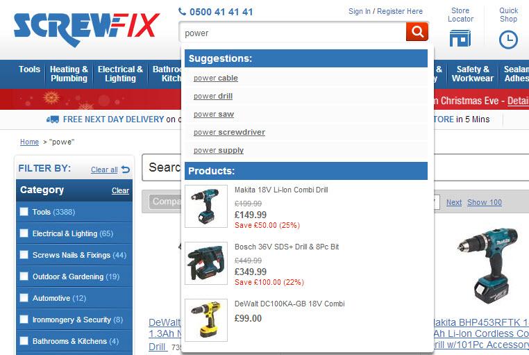
It is extremely frustrating to encounter a website that requires you to dig through all of its content to find what you want. While some of your customers may come to your website to browse through your selection, in general, most have a specific item or product in mind that they are looking for. Adding in a highly visible search bar (typically at the top of the page) is almost a required feature to include these days. Make sure that it still offers a pleasant experience by not only showing exact results, but also displays related keywords or suggestions to help customers find what they’re looking for.
Make sure that the shopping cart is clear and accessible at all times, no matter where your customers are on your site. A good design rule here is to make sure that the top bar remains immoveable as your visitors scroll down the page so they are always a simple click away from checking out.
2. Maintain Uniform Navigation
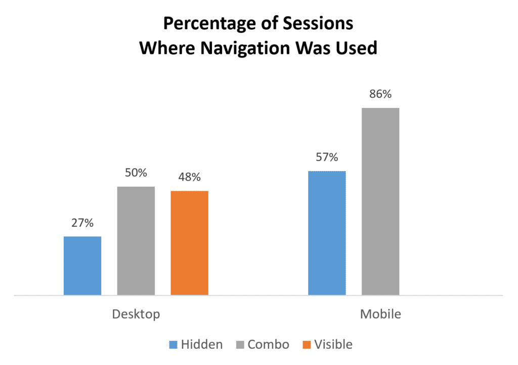
One of the top reasons why a customer will immediately leave a site is if the navigation is unclear or confusing. Furthermore, having a hidden or partially visible navigation bar can hurt your website’s UX, too – since according to NNGroup’s study, if it takes a longer time for customers to locate, it’s more difficult to discover content, and it is considered far less effective. However, this study did find that having a combination of hidden and visible navigation was used more often, especially by mobile shoppers.
One of the keys to intuitive web design is simplification. It should be as easy as possible for people to make their way through your website, so your navigational tabs should support their journey. Be sure that your mobile website matches up, too, as many shoppers may interact with both formats.
3. Streamline the Mobile Interface
Half of customers are now shopping from their phones, but only about 20% are converting. One of the reasons that this number is so low is due to the fact that many are experiencing terrible UXs from e-commerce retailers when it comes to the small screen.
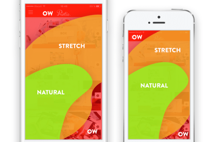
Obviously, a mobile optimized site will not be able to include all of the bells and whistles that a desktop version can, at least not in the same layout. On mobile screens, a combination of navigation bars is acceptable so that it does not take up a majority of the screen. Visuals need to be simplified with CTA buttons that are large and highly visible throughout the process. Simplify the shopping process and make sure that the majority of important content is within the natural or slight stretch zone on a phone screen for easy scrolling.
4. Use Visuals for Easier Decision Making
You want your customers to be compelled to make a speed decision to purchase, so one of the best ways to capture their interest and convince them to convert is by focusing on visual elements. The more visual content that your product page features, the better. Including 360 views or even videos of each item will give your customers a better experience because it allows them to “interact” with the product virtually. Adding in user-generated content, like customer reviews with photos or social posts, can be beneficial here too, because these visuals can build trust and answer product questions that the visitor may have.
5. Give Users What They Want
In the end, intuitive design boils down to giving your customers the experience that they want. Following generalizations and looking at studies and reports is certainly a good start, but in order to create a truly unique experience for your specific customers, you will need to listen to them.
Go over your business’s data metrics on visitor behavior thoroughly and often. See how your customers are interacting with your website, what is causing them to disengage, and what their common complaints are. If you are still unclear of what your audience is looking for, don’t be afraid to ask. Conducting market research through surveys or questionnaires can get your design team on the right path.
Conclusion
Building your own website is a huge under-taking, but creating an intuitive one is another challenge all-together. If you want to learn more consider to take a website design course online. See our top web design courses here. Every detail must be scrutinized and each feature needs to be optimized in order to create a better UX that will please your customers.
—
Manish Dudharejia is the President and Co-Founder of E2M Solutions Inc, a San Diego Based Digital Agency that specializes in Website Design & Development and eCommerce SEO.