This article was contributed by Fazreen Razeek.
Let’s take this moment to pause and recall Google’s home page.

What do you see? A white background and the Google Search function. That’s all. This design has been embraced by Google ever since its beta offering, but it has been used by other companies as well. What we see in Google and Apple’s web designs is called minimalism. From the term itself, we can assume that this particular design emphasizes the use of fewer elements.
In other words, minimalism highlights the simplification of form.
Timeless, practical, and less complicated, the minimalist web design style is unsurprisingly a trend that is always popular. Most web designers are fond of using this design because it offers a better user experience, is easy to use, is simple and clean, and it loads faster. However, this design philosophy is not easy to pull off, especially for inexperienced designers. Despite its simplicity at first glance, designing a minimalist web page takes a whole lot of planning since every element to be included should be considered and organized.
Brief History of Minimalist Web Design
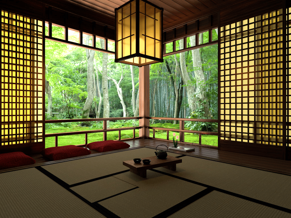
Minimalism is a new trend in web design, but it has long been present as a concept in architecture, interior design, art, and graphic design. The minimalist design is credited to the Japanese, who we know are fond of making decorations as simple as possible. The Japanese have the values of balance and simplicity embedded into their traditional culture. You will notice it in the way they design their homes and communities.
Parallel to the Japanese concept of minimalism, the Western movement of the use of this design started in the early 20th century when Ludwig Mies Van der Rohe, a German-American architect, together with other pioneer artists and designers, applied the “less is more” attitude to their works. Then, the concept reached print design and eventually the web and digital platforms.
The minimalist web design started as a response to the visual complexity of websites. Since more elements, buttons, and bright colors on the page did not really lure the audience, designers tried to simplify the sites. After all, a complex design would leave the users more confused and overwhelmed. Today, more and more designers appreciate the use of minimalism to achieve their objectives.
Principles of Minimalist Web Design

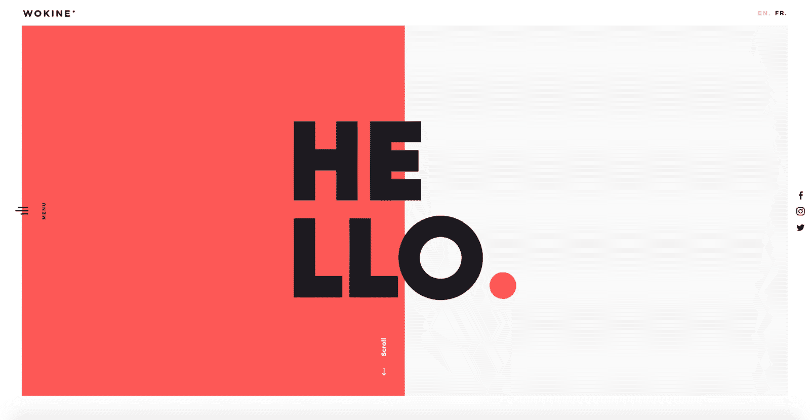
Minimalism in web design is essentially removing unnecessary elements and retaining those significant ones in an organized and clean fashion. As a web designer who wants to incorporate the minimalist design philosophy, you need to keep in mind the following principles of minimalism:
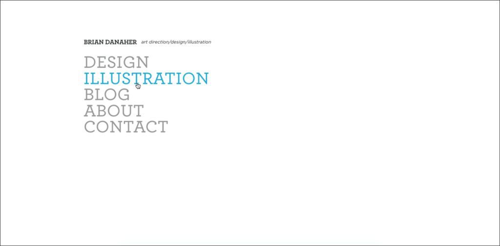
- A minimalist web design has a user-friendly interface.
- A minimalist web design uses no more than three colors at once.
- A minimalist web design is characterized by a lot of empty space.
- A minimalist web design has no excess details (i.e. color transitions, textures, and shadows).
- A minimalist web design does not include extra buttons
- A minimalist web design experiments on font style.
To simplify these principles, you need to remember that a minimalist web design uses less elements but does more with them.
Advantages of Using a Minimalist Web Design
Embracing a minimalist design for the website you are developing is recommended by most designers. Why so? The minimalism concept has its advantages both for the designers and the users. Below are some of the most evident benefits of using this web design:
-
Minimalist websites are easier to use
Since minimalist websites have a simple interface, users can easily navigate them. Take for instance Google Search. When we want to search for something, we’ll be directly taken to the search bar with the search button just beside it. Then poof, the results come out in an organized style. There are no buttons which you don’t need. The fonts are easy to read and big enough to see. There are no dancing letters or complicated colors to distract.
-
Minimalist websites are always on trend
Designs come and go. With minimalist web designs, you’re sure to stay on trend.
-
Minimalist websites take less time to load
This is one of the most enticing benefits of minimalism. Because there are fewer elements on the page, loading is faster. Thus, users get more engaged rather than annoyed.
-
Minimalist websites allow for brand highlighting
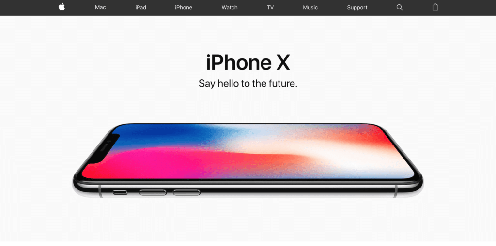
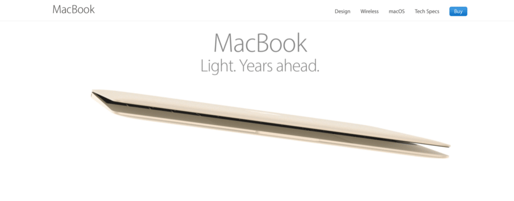
Let us once again consider Google Search with its minimalist web design. Since it only shows the search function and of course the logo, there is focus on the company. Take Apple as another example. Its minimalist design for phones and laptops emphasizes the brand.
10 Tips for How to Design a Minimalist Web Design
So how do you design a minimalist website? There are ways which you have to understand before you start with your project.
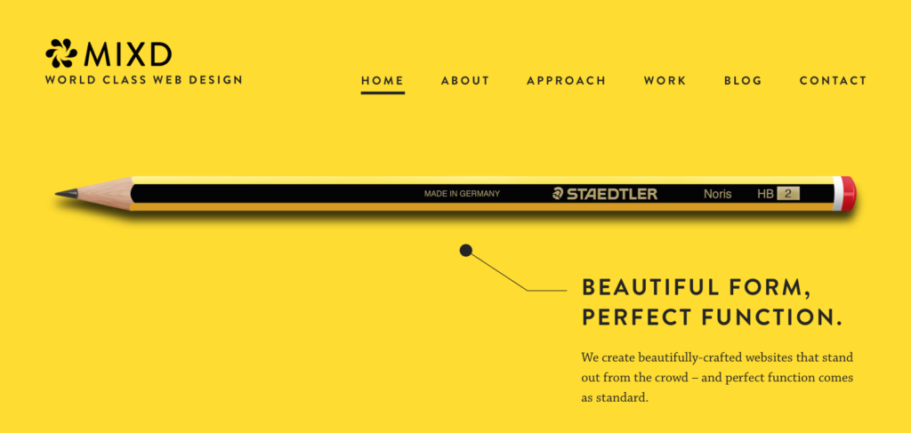
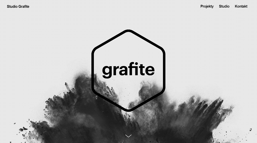
1. Include a lot of white space
One of the primary features of a minimalist web design is the use of lots of whitespace or negative space. This refers to the space between elements in a composition. Whitespace helps to focus the users’ attention on the webpage content, so they will be captivated and persuaded to stay on the page. Likewise, whitespaces help to achieve balance in a design.
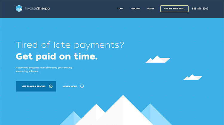
2. Use bright and limited colors
Minimalism is the art of less, which justifies the use of a lot of whitespace plus a few other elements. This is where the importance of choosing your color scheme comes into play. Using bright colors is recommended as they make a website visually appealing. If you use bright colors (choose one or two hues), try to combine them with complementary and soothing ones plus smooth and simple animations (if any). You may also want to use black or white typography to achieve the best effect.
3. Concentrate on creative fonts & graphics
Minimalism uses very few images and animations. So, in order for your website not to look too dull or boring, make use of creative font and typography. You can use beautiful bold fonts which create hierarchy on the page, thus, guiding your users on what buttons and functions are more important. Additionally, you have to consider the appearance of your fonts in mobile screens as they will most likely be the platform for your website. Most designers would recommend the use of Sans Serif fonts because they look clean which is best for a minimalist web design. In the end, you get to choose what you think would best represent the product or brand.
4. Use a flat texture
When we say flat textures, we mean the absence of shadows and gradients in the web design. The 3D or glossy website trend is already out of date and can’t be helpful in a minimalist design.
5. Focus on the top area
When a user goes into a website, they automatically glance at the top area of the screen. Hence, in a minimalist design, you have to include high-level content on this part coupled with sufficient whitespaces. This way, you can encourage the users to further explore the site.
6. Be selective about images

Images make or break your minimalist web design. You have to select a photo or an illustration that is bright, simple, and non-distracting. In short, it has to be consistent with the other elements you’ve placed on the page.
7. Add small details
If you struggle with choosing the elements you need to retain to achieve minimalism, you can add small details on the page to balance, separate, or highlight the main content. You can include geometric objects, fragments, pointers, decorative signs, and underlining.
8. Assign a single focal point
The objective of minimalism is to emphasize the important content using fewer elements. To do this, you must have a single focal point per screen so as to avoid distractions. Google Search is the best example that will explain this trick for you.
9. Use text blocks

A minimalist design entices users to stay on the page because they don’t find it difficult to navigate. Minimalism requires the use of text blocks or division or textual contents into blocks. This is easy to do: you just have to organize information into categories. This is a common tactic with blogs, sorting articles or portfolio items into smaller categories.
As you go along in designing your own minimalist website or blog, you will discover other tricks I might have failed to mention here.
What’s in store for the minimalist design trend?
I’ve mentioned it earlier and will do so again: Minimalism is a timeless concept. Rooted in Japanese traditional culture and started as a web design concept in the 20th century, minimalist design is sure to stick around. Its classic design and the pragmatic benefits it provides both users and designers are what will make minimalism widely embraced for a long time. Of course, there will be some improvements we should expect, but overall we need to think of the minimalist web design trend as one to stand the test of time.
—
About the author: Fazreen Razeek from Grafdom has served the digital industry for over 5 years. He collaborates and works alongside agencies, event organizers, and suppliers to develop and execute their marketing strategies.