
This article was contributed by Daniela McVicker.
Bloggers are always looking for effective ways to engage leads viewing their content. But, even quality content often gets overlooked if bloggers don’t encourage readers to participate in the form of mentions on social media, blog comments, likes, etc. Achieving this level of engagement requires some serious effort.

According to Brafton’s 2017 Content Marketing Benchmark Report, the average blog bounce rate was 76.47 percent. This high rate means one thing: bloggers are struggling to make their audiences stick around for any significant length of time.

Besides creating useful content for your visitors, have you explored other ways to increase engagement on your blog and reduce the bounce rate?
If you haven’t, let’s talk design. Yes, you read it right. You see, writing great content alone will not ensure that your blog’s readers are actively engaged. To achieve that, you need have to adopt a holistic approach that also involves making your blog aesthetically pleasing.
Sounds good? Let’s see how to make it happen!
1. Follow Hick’s Law
Have you heard about Hick’s law? It’s a popular theory named after American and British psychologists Ray Hyman and William Edmund Hick which states that the time for a person to make the final decision is directly proportionate to the possible choices they have.
Simply explained, the more choices you give to your visitors, the more time they’ll take to make decisions. If they perceive the number of options presented to them as overwhelming, they won’t make any decision at all. They’ll leave.
In terms of web design, it means that you should limit the number of options for visitors in order to keep them focused on the most important tasks.

In other words, avoid doing this:

To put this into context of a blog, ensure that your navigation is easy to use, with minimal options. Same goes for calls to actions.
2. Increase the Speed of Your Blog
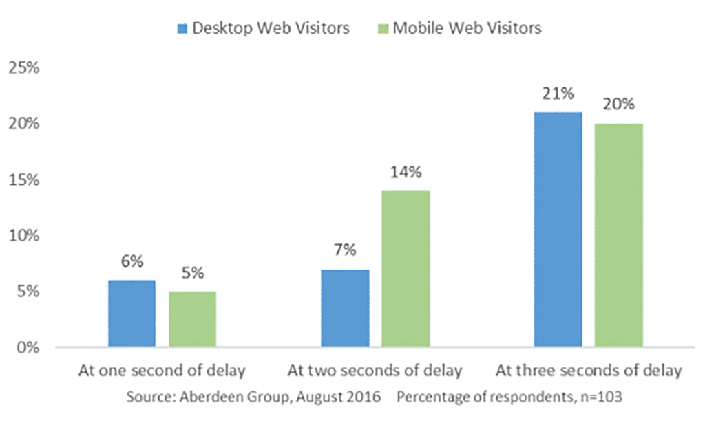
Speed is another critical consideration for bloggers. Audiences are getting more and more impatient with slow loading times. According to a 2016 research report by the Aberdeen Group, people are so impatient when browsing the web for information or products, that even a one-second delay in page load results in a six percent reduction in conversions. Delays of two or three seconds bring even more catastrophic decreases of the conversion rate. To put it simply, page speed matters.
To check how your blog performs and troubleshoot any issues, use the following free speed tools:
- Mobile-Friendly Test: Responsive design can affect the speed of a website. Use this tool from Google to find out whether your blog loads quickly on mobile devices.
- Google PageSpeed Insights: Official page speed test from Google.
- Sucuri: Another reliable tool to test load time.
3. Use a Blog Card Layout
If you add at least two posts to your blog on a daily basis, you’ll have 300+ posts in just six months. Organizing them in an efficient way allows your visitors to see the wide variety of content that you offer without overloading them with too much information.
One method is card-style design. You’ve definitely seen this one on many other blogs. The essence of this design lies in displaying the information in the form of cards. The result is an efficient and simple card architecture that allows you to read and recognize information easily.
Many blogs are using this design, including the well-known blog Mashable. This example uses a two-column card layout:

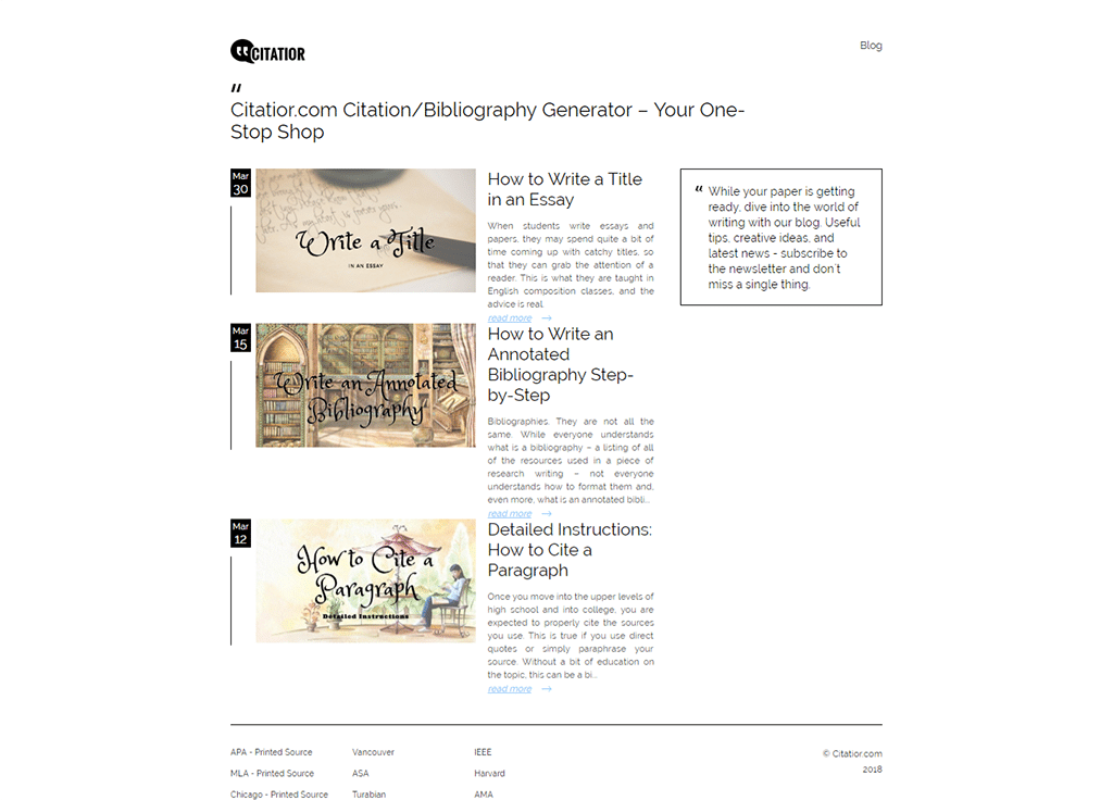
Many bloggers choose to go with a one-column card layout, which is also a good option. For example, here’s how Citarior approaches it:
If you want to adopt the same design, remember to make it simple and include the following elements into the card:
- Featured image
- Article title
- Post date
- Article author
- Article category
- Read More button
4. Display Your Best Content
Some articles on your blog will perform better than others because readers will find them more useful. An excellent example of such content is so-called “evergreen content.” It’s defined as content that delivers traffic for months and even years after the publish date because it doesn’t date too quickly.
For example, an article about how to dribble a basketball is an example of evergreen content because it doesn’t lose its relevancy over a long period of time.
If you have articles that do a great job at attracting clicks and conversions over a long time, then consider showcasing them somewhere at the home page to increase the chance that the visitors will click on them.
The best content is error-free, easy-to-scan, and helpful. To ensure that your content has the chance to get popular, consider using online tools to make it perfect. Here are some great options:
5. Use F-Layout
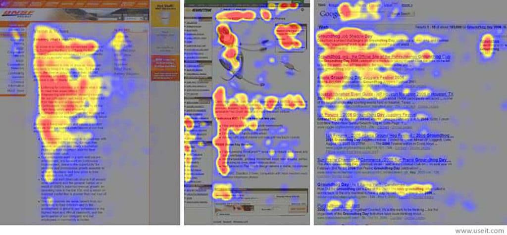
As it turns out, many web readers read the screens of their computers/mobile devices in an “F” pattern. This phenomenon was discovered in 2006 in a study by Nielsen Norman group and changed the way we look at web design forever. According to this concept, web readers mostly focus on the top, upper left corner, and left sides of the screen as the heatmaps below demonstrate.
Tips for implementing the F-layout
- If you want to say something important, say it at the top
- Place the most important information – benefits for readers, etc. – in the first two paragraphs
- Use subheadings to make the content scannable
- Bold essential words and phrases.
6. Make CTA Buttons Clean and Clear
CTAs (call-to-action) buttons are the prompts that convince your blog visitors to take the action you want them to take (e.g. subscribe to your newsletter). Simply said, a CTA is where your blog makes money.
There are many places where you can place CTAs, including the body content of your articles, landing pages and various places throughout the blog’s sections. Regardless of their location, here are some important qualities they should have to achieve maximum effectiveness.
Prominence
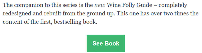
A CTA button should stand out to attract the attention of your blog’s visitors in order to get noticed by as many of them as possible. For example, take a look at the CTA from Wine Folly blog below. It’s great because it uses a different color than the background, has an additional support in the form of a textual call to action above it, and uses actionable language.
Relevance
A CTA works best if it’s relevant to the blog post in which it’s located. Generic pop-up CTAs may also be fine as long as they’re unobtrusive, but you should always try to keep them relevant to the title of the article.
For example, take a look at the textual call to action used in the previous example. It describes that the article is a part of a series, which is also accompanied by the new guide. That’s relevant!
Diversity
In terms of design, your CTAs should be diverse. Your readers will quickly grow tired of your continued effort to get more people to subscribe, so make them look and read differently.
For example, in addition to the typical CTA example above, you could also design sidebar CTAs, pop-up CTAs, end-of-content CTAs, and persistent heading CTAs.
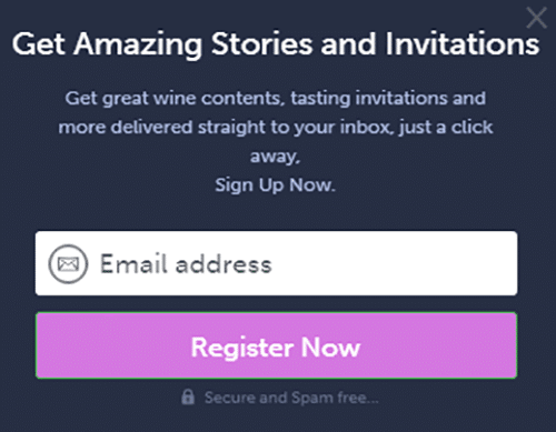
For example, here’s a pop-up CTA (“Register Now”) from The Italian Wine Girl blog that shares many of the qualities described so far.
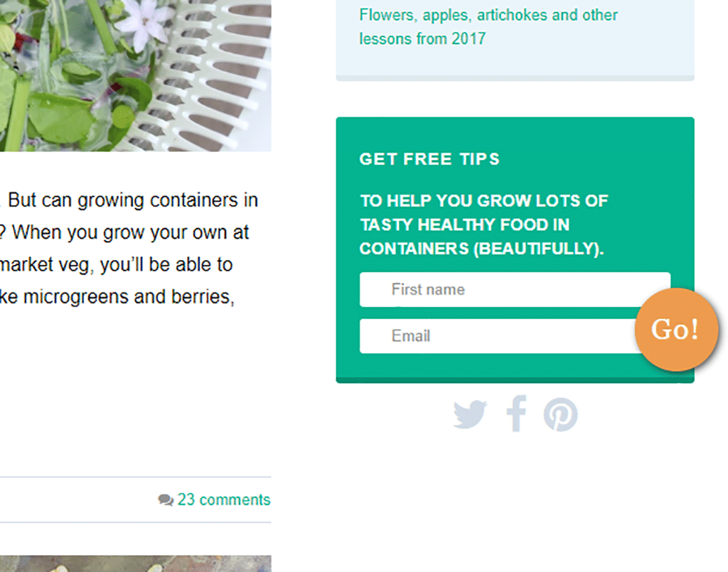
And here’s a sidebar CTA, which doesn’t overpower the user’s experience:
7. Include Prominent Social Media Buttons
Social media is critical to increasing engagement and interaction with your visitors, so you should make it easy for them to connect with you. Let them know that you’re accessible on social media by placing social media handles on your blog’s pages.
Make them prominent and include them on every page. For example, here’s how Fork & Beans blog does it:

The blog makes it easy for readers to stay connected by including social media icons with links to profiles. As the result, you’ll also be in their news feeds, which is also great for convincing them to visit the website more often.
So in Conclusion
Now that you know these seven successful design practices, feel free to put them to good use by incorporating them into your blog design. You can look forward to decreasing your bounce rate, increasing visitor engagement, and getting ahead of the competition.
—
About the author: Daniela McVicker is a blogger with a rich experience in writing about UX design, content planning, and digital marketing. Currently she is the chief contributor at Rated by Students and Top Writers Review where she helps individuals and organizations improve their web content writing, design, and planning skills. Her posts are always packed with examples and actionable content that readers can put straight into action. Top image by theskaman306 on Shutterstock.