
This article was contributed by Dean Mackenzie.
When you look at a web or landing page, you might not even notice the microcopy hanging around the call-to-action. But these small sticks of copy can have a HUGE impact on conversion. In this ultimate guide, we’re diving deep into how to write microcopy, looking at different examples and talking about how you can use them to “clickstart” conversions.

—
Do you know what the smallest printed image in the world is?
It’s an image of clownfish emerging from a sea anemone. At a resolution of 25,000 DPI, the inkjet-printed image is small enough to fit in the cross-section of a human hair, and you can only make it out with a microscope.

Microcopy isn’t quite as minuscule as that image, even if it is on the smaller side. It gets its name from its short, seemingly insignificant nature as it sits innocuously on a web, landing or sales page.
What is Microcopy?
Microcopy is the text that help users do things a touch easier. It is short, targeted & extremely contextual.
Some pages use it liberally, while others don’t bother at all. Microcopy can pop up almost anywhere such as as in:
- Error messages
- Placeholder text in forms
- Menu and navigation options
- Copy in and around high visibility areas (e.g. buttons)
Designer or copywriter, you’ll sometimes be responsible for this microcopy. And from a conversion point-of-view, the last form — copy in and around things like calls-to-action — is something we should be very interested in.
Why?
Because tiny tweaks or additions around this part of a page can mean gigantic jumps in conversion (even if it’s not quite a $300 million button change).
Now, it’s important to differentiate between microcopy IN a call-to-action (i.e. button or link copy) and microcopy AROUND a call-to-action. What we’re zeroing in on today is that microcopy placed around a CTA..
Why Microcopy is a Big Deal
Buyer friction is a thing.
On any web, landing or sales page, different design and optimization aspects can make visiting (and interacting) an easy, painless experience. Or, it can make the visit something that has your visitors arriving… then taking off moments later.
Microcopy Mistakes
These grimace-inducing gaffs can make up a long list.
- Multiple offers or goals… on the one page
- The wrong voice for your copy
- Distracting images or videos
- Your offer badly or incorrectly presented
- Poorly organized content or copy
- Page or website performance (e.g. how quickly it loads)
- The size of the forms your prospects have to fill in
You can add generic or just plain bad calls-to-action to the list too. This part of your page — small though it is — has to shine. As the $300 million button highlighted, incredible amounts of resistance can build up before visitors hit this critical part, and for three main reasons.
1. Visitors may feel nervous or not trust you (yet)
This lack of trust or “anxiety” is one of the biggest friction-builders. But it’s also perfectly normal. In some cases, visitors are about to spend their hard-earned cash on what you’re offering. Other times, they’re sharing precious information, like an email address and name.
And they don’t know if they can trust you.
Trust and credibility are cornerstones of any business, site or page. Where there’s trust, there’s action. Where there isn’t, even the best copy or design in the world won’t make a difference.
2. Visitors are happy to sit on the fence
Your headline may be good. The copy pretty compelling. Appealing images and design to make the page easy to read. And still… visitors just don’t click.
A lot of people land on your page with a built-in level of friction from the get-go. So they might like everything they see. They might nod with every point you make. But they’re happy to sit on the fence, and without a final nudge, leave your page thinking “yes, I’ll get to that later”. They rarely do.
3. Visitors have unanswered questions
The page should have everything a visitor needs to decide on whether to act. That usually means more than just product info. What are their payment options? Why do you need to take their phone number? These “little things” that sometimes feel secondary on the selling side can cause huge amounts of friction on the buying side if not explained up-front.
And with all that in mind, how does a small piece of copy hope to take on the might of these show-stoppers?
Just as your prospects have 3 reasons that keep their fingers from clicking, your microcopy can take on 3 different forms to combat friction-filled hesitation.
Risk Reducing: Is it Safe?
For older moviegoers, the phrase “Is it safe?” might bring back classic memories.
Jaw-clenching scenes aside, your customers-to-be ask variations of that question long before they click your call-to-action.
- Are they going to try to charge me?
- What are they going to use my email for?
- Why do they need my phone number?
- How long is this going to take?
These are all examples of one characteristic: anxiety.
If they don’t think it’s safe to trust you, they won’t click. Therefore, it’s your job (and the job of your risk-reducing microcopy) to answer those questions and quiet the anxiety.
Because anxiety and trust are such huge obstacles to buying, risk-reducing microcopy is the most frequent type you’ll see around calls-to-action (my unscientific estimate would be well over 50%).
Take Wrike’s landing page, for example. It’s “triple” microcopy around the sign-up form is all about reducing risk for people.

- “No credit card”: removes the anxiety of having to pay anything
- “No commitment”: removes the anxiety of having to join for any set period
- “No downloads”: removes the anxiety of having to download or install software
Caspio also uses “No credit card needed” microcopy. Fear of having to pay is a major friction factor, especially around SaaS products or trials. The “Takes only 30 seconds” copy works on the “this will take too long?” question that pops up when thinking about signing up to things like online software.

Benefit & Informational Microcopy
A lot of microcopy aims to reduce the perception of risk from the prospect’s side, but its purpose isn’t limited to just risk-reducing.
Benefit-driven
You’ve crafted your messaging on the page. Readers take it in and are ready to go. But even if the offer is compelling and the copy is persuasive, there’ll be a few who sit there thinking “well… I like what I’m reading, but I don’t know if I like it enough to act right now”.
Sometimes it takes a final nudge to get those prospects to click.
Microcopy doesn’t have to include a ground-breaking or new benefit. It can be a small convenience or handy benefit, and something already mentioned that’s worth repeating.
Pipedrive combines benefit-driven microcopy with a risk reducer. Along with the oft-seen “No credit card required”, “Immediate access” tells prospects they can dive straight into the software.
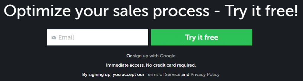
(The microcopy immediately below that is something we’ll get to in just a moment.)
Informational
When visitors land on your page, they usually have questions. These can come in 101 different forms, but if you can, anticipate the strongest or most frequent ones and answer them… with microcopy.
Some of those questions will be around trusting you.
Others will focus on benefits.
Others still will be just small, informational issues. They might not even be about the product directly, but some element of the purchase or sign up process.
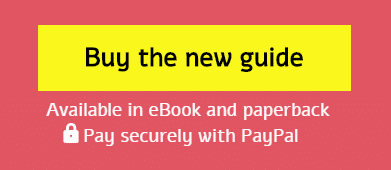
This microcopy — found on a sales page for the book “Microcopy: The Complete Guide”, funnily enough — has the typical payment-based, risk-reducing microcopy. But the informational snippet “Available in eBook & paperback” answers an early question some customers might have: what format it comes in.
On a side note, you might have noticed that microcopy can blur the lines a little. For example, risk-reducing microcopy can also be informational. By answering questions – whether prospects consciously ask them or not – you help to reduce the friction-building “mystery” around what lies beyond the click of your call-to-action.
Flock uses a great mix of risk-reducing, benefit-driven and informational microcopy around their final call-to-action.

Administrative Microcopy: the “Evil” Microcopy
Not all microcopy is conversion-boosting. There’s a type of microcopy that can actually have the opposite effect.
This is “administrative” microcopy, and it often breaks the spell your prospect is under as they edge closer and closer to that click.
You might see it as having to agree to a privacy policy, as Asana states on one of its landing pages…

…or it might be a combo of links and legalese that dry up clicks on your call-to-action.
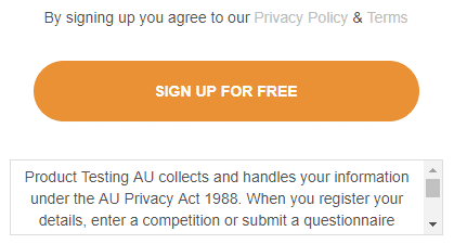
It’s obvious I’m not a fan of this kind of microcopy, but there are legal necessities you have to cover from time to time. If that’s the case, why not turn a potential weakness into a strength or benefit, like this survey site did.
It takes what would be at best a boring, non-compelling Privacy Policy link (and at worst, an anxiety-INCREASING stick of copy) and turns it into a risk-reducing claim.
Note: even then, use admin microcopy with caution. Michael Aagard of Unbounce found adding some privacy-based microcopy intended to reduce anxiety actually reduced click through by almost 20%.
Two Steps to Bake Marvellous Microcopy into Your Pages
Convinced that microcopy is a perfect addition to your sales page, landing page, squeeze page, web page… or pretty much any page you’ve got that you want users to click through on?
Great!
While microcopy is a skill in its own right, adding some click-compelling copy around your call-to-action is something almost anyone can do.
Step 1: Ask the right question
This is the key to good microcopy. It might be easy to come up with ideas of what you could add around your call-to-action, but if it’s not reducing the right risk or friction your buyers feel, it won’t have any impact to your conversions.
Ask yourself this question:
What might be holding your visitors back from clicking?
Are they worried about the payment options? Are they worried about having to pay at all? Do they wonder what happens after they click?
Taking an educated guess is the easiest way to come up with something. However, if you want the most accurate (and sometimes unexpected) answer to what to add, just ask your customers directly. A pop-up poll or quick survey can tell you exactly what to put in those 3 to 5 words around your call-to-action.
Find the top answer that prospects and visitors talk about and focus on that one specific objection or fear… or, just tackle a whole bunch of potential friction-builders.
Step 2: Test variations of your microcopy
Now that you’ve got your microcopy, it’s relatively simple to add it to your page.
But you’re not quite finished.
Like any good conversion rate optimization activity, you should test variations to discover the best versions. There are always a few ways to say the same thing, and one often has a more powerful effect than others.
Testing may be difficult if you’re not getting enough traffic. But whether you test or not, you can at least track performance in a “before and after” way. Microcopy around your call-to-action should improve conversions in theory, but knowing how much it improved can help you try other variations over time to compare. It can also help you spot any unintended down-turns in conversion.
Best Microcopy Examples – Inspiration to Get You Started
The ideas driving your microcopy should be coming from your prospects, visitors or customers. But if you need ideas to inspire your microcopy wording, here’s a list of examples to get you going. Some of them are sales-focused, while others aim at improving opt in, so focus on those more relevant to what you’re trying to do.
- Start free trial / Start your XX-day free trial
- No credit card required / No credit card needed
- No strings attached / No obligation
- Takes only XX seconds
- No set-up needed / Easy to set-up
- Unlimited users & channels
- 100% free to join / Free to use
- We’ll never send you spam
- Unsubscribe at any time / Cancel at any time
- Your data is 100% safe / Your email is safe
- Join over XX,XXX people using <your service/app/software etc>
- No downloads / No download needed
- Available in/on <list details e.g. software platform, media format>
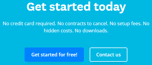
- No hidden costs
- No contracts to cancel
- Instant Sign-up
Microcopy Tips – A Lot of Ground on a “Little” Subject

Phew! We’ve covered a lot this often overlooked but effective conversion element.
- Buyer friction is a thing. Microcopy is a great counter-thing.
- Visitors may not click your call-to-action if they feel they can’t trust you yet, have friction from the rest of the page or have unanswered questions.
- Use risk-reducing microcopy to answer questions around credibility or build trust.
- Use benefit-driven microcopy to give a nudge with a final benefit.
- Use informational microcopy to anticipate other questions visitors might have.
- If you have to include administrative microcopy, try to frame it in a positive way.
- To get ideas for the most effective microcopy, ask your visitors what holds them back from clicking.
Are you using microcopy on your pages? If not, give it a try — you might be surprised at the big results you can get from so little copy.
—
Author bio: Dean Mackenzie is a conversion copywriter who helps businesses do more with their copy, especially around landing pages, sales funnels and websites. He also enjoys a good cup of tea and speaking about himself in the third person. You can track him down on LinkedIn or Twitter. Eye glass image by igorstevanovic on Shutterstock.
Nice article, Microcopy can make or break a user’s experience. In just a few words, a user can establish enough trust with you to make a purchase, for example, or they could be driven away from your interface entirely, leaving their cart empty or abandoned.
Though it isn’t a new term, the role microcopy plays in a user experience is something many UX designers need to become more aware of — whether it is you writing the copy, a marketing team, or otherwise.
When writing microcopy, really think about the elements you want to include in your UX poem and the user who will be reading it.
They don’t have a lot of time, so be concise (brevity).
They want to know exactly what they’re/you’re doing and why, so be transparent (context).
They are there for a reason, whether it’s to learn more or buy something, so help them do it.
They want to engage with brands that they trust and that they feel understand them, so show them how you do this.
Thanks for sharing your insights Nathan!