This article was contributed by Michelle Deery.
Your landing pages are one of the most important parts of your website. That’s because they are essential in driving conversions. Getting them wrong will mean your efforts are in vain. Optimizing them should, therefore, be one of the crucial pillars of your sales and marketing strategies.

Remember, the sole purpose of a landing page is to convert web visitors into leads and eventually sales. Therefore, the design and content of each landing page needs to be carefully considered.
Unfortunately, it’s not as easy as it sounds. There is an art to optimizing your landing pages and reducing bounce rates.
On a related note, you may be interested in our feature on the best free web design courses online.
What is Bounce Rate?

The term ‘bounce rate’ refers to the percentage of website visitors that decide to leave your site before viewing a second web page.
The higher the rate, the more visitors who are simply clicking away from your site. You can find your bounce rates in your analytics.
Landing page examples and tips
When designing brilliant landing pages, there are a few basic rules to follow. Here are some of the most important ones, as well as some examples of brilliant landing pages, and tools you can use for creating them.
1. Match expectation and experience
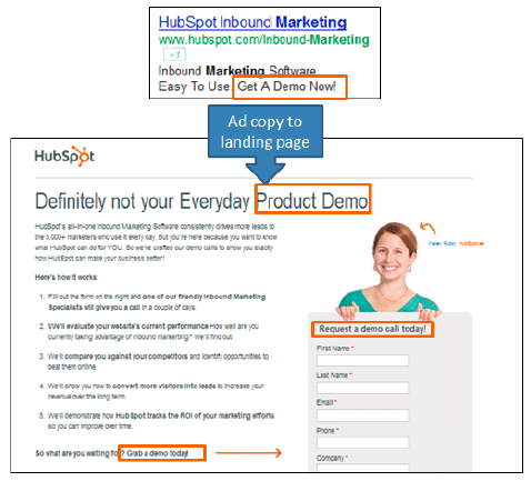
Particularly when visitors arrive on your website coming from a PPC ad, you need to make sure your landing page is actually offering what you promised in your ad copy.
Having left your marker in the ad copy you need to follow through in the landing page messaging. Mismatching messaging is a quick reason for visitors to immediately click away.
2. Make your value proposition crystal clear

- How does your offer satisfy the needs of your audience?
- Does is address their specific pain points or current needs?
You need to spell that out as clearly as possible or else risk losing their trade.
3. Have a clear & bold CTA
Making sure your visitors know what you expect them to do is key. Far too many landing pages make the mistake of forgetting it’s all about their call to action. If your visitors don’t immediately get a sense of what you can offer them and what you want them to do, they’ll leave.
Time is short so make sure your call to action is very clear and bold.
A mistake which people make surprisingly often is to bury the main call to action too far down on the landing page. By the time website visitors get to this section you might already have lost their attention and therefore a precious opportunity.
Additionally, the wording of your call to action can make a substantial difference. Try to be as descriptive as possible and do not shy away from longer CTAs.
For example, if you offer a guide on the benefits of cycling, you could say “Download our guide to on the benefits of cycling” rather than a generic “Download Now”.
4. Your form is intrusive
You don’t want to get the reputation of being a ‘formzilla’. What this means is a business who has an intrusive, extensive form to fill in before giving visitors the offer.
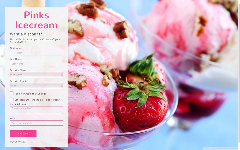
Here’s an example of a form that’s simply too long:
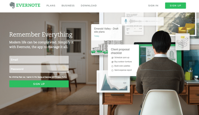
You should only ask for the information you need. Each optional field you add decreases your odds of converting visitors and increases the chances of a bounce. Opt for something simple and easy, like this:

5. Make it simple, don’t distract
Landing pages are built for the specific purpose of achieving a conversion, so in this case tunnel vision is a good thing – do not distract visitors with any redundant information and omit your website menu.
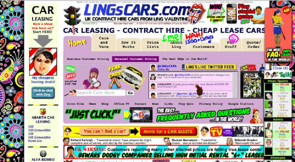
For example, this landing page has far too much going on.
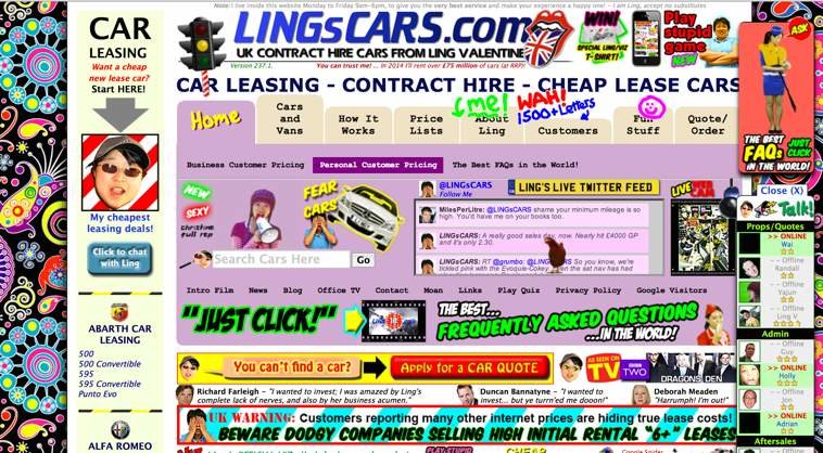
Instead, when it comes to landing pages, less is more. Check out these two examples to compare:
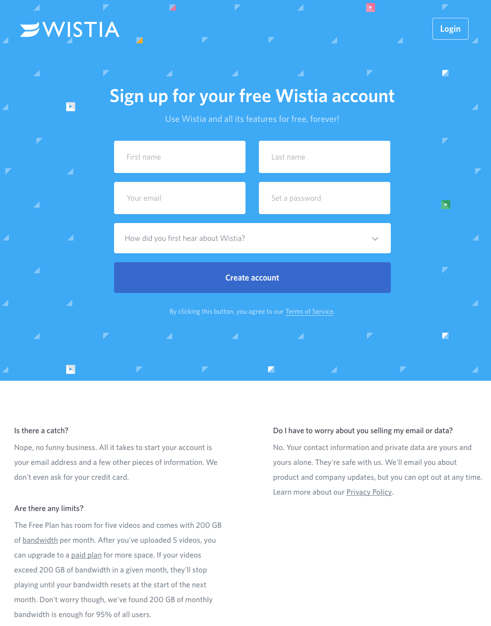

And Wistia, although the button could have more contrast, such as orange.

6. Page loading time matters
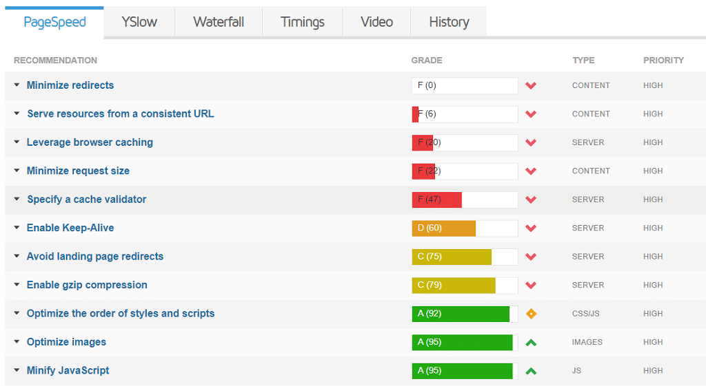
As more and more web traffic is coming from mobile devices, fast page loading times is becoming a make or break factor in landing page performance. You can use Google’s PageSpeed Insights tool for practical recommendations on how to improve your website’s load speed.
Your visitors expect your pages to load within 2 seconds or less. Anything slower quickly increases the chances of them abandoning your site.
See here for how to speed up your website.
7. Test, Test, Test

You should rigorously test all of these elements and thus continuously improve the performance of your landing page and reduce your bounce rate.
There are a number of landing page testing tools on the market, the most popular ones include:
- HubSpot’s landing pages and website pages: available to HubSpot Marketing Hub Professional and Enterprise customers
- Visual Website Optimizer (VWO): pricier but with a much wider feature set compared to Optimizely
- HotJar – See how your visitors really use your site. Free trail included.
When testing your landing pages, make sure that you allow a sufficient amount of time for enough data to accrue so that your results are actually statistically significant. It is only too easy to underestimate this time under the daily pressure to deliver results.
8. Use a landing page builder
You could also use a page builder to build professional-looking landing pages such as Elementor. A landing page builder can provide templates to make the design process incredibly easy.
Using a page builder for your landing pages essentially allows you to fully design your web pages and content quickly, without coding. The result? A high-end design, optimized for all devices.
What makes a good landing page?
Here are the key factors that make a good landing page and reduce bounce rates:
- Match expectation and landing page experience
- Spell out your value proposition
- Make sure your CTA is prominent
- Don’t ask for too much needless information
- Omit any unnecessary distractions
- Optimise your page for speed
- Test, test, test!
- Use a page builder to simplify your design
If you improve your landing pages you’ll see a significant improvement to your conversion rate and a noticeable growth spurt for your business.
—
About the author: Michelle Deery is part of the superhero team at Heroic Search in Tulsa. She specializes in writing about eCommerce and content marketing. See what she is up to on Twitter @MichWriting. Submarine image by Walid Beno. Top header image by DMI T on Shutterstock.