
This article was contributed by Meaghan Yorke.
So you’ve decided to go for a single page web design. While this approach has its limitations, it can be very useful for certain purposes. Usually, these websites are used as a sort of a presentation for a company, a product or an independent artist or entrepreneur. So it’s not uncommon to see product sites, specified business offerings, portfolio pages or even some business websites laid out as a single page. Before turning to tips on how to improve your single page design, let’s briefly check out some of its advantages and drawbacks.

Pros and cons of single page design
Pros
One of the most obvious benefits of single page web design springs to mind immediately: it’s simple to design, update and maintain. Moreover, making a mobile version of the website is quite easy, as it can remain basically the same yet perfectly apt for mobile devices.
Depending on the purpose of the website, it can be very simple and convenient to use as well. If there’s a sort of uniformity of purpose or message behind the site, then this might be the best way to go. When presenting a single idea or a product, a single page design offers a chance to organize the info in a way that can be very handy for users or even for yourself. Namely, you can arrange the information in such a way that the visitors discover them in the exact order you wish them to.
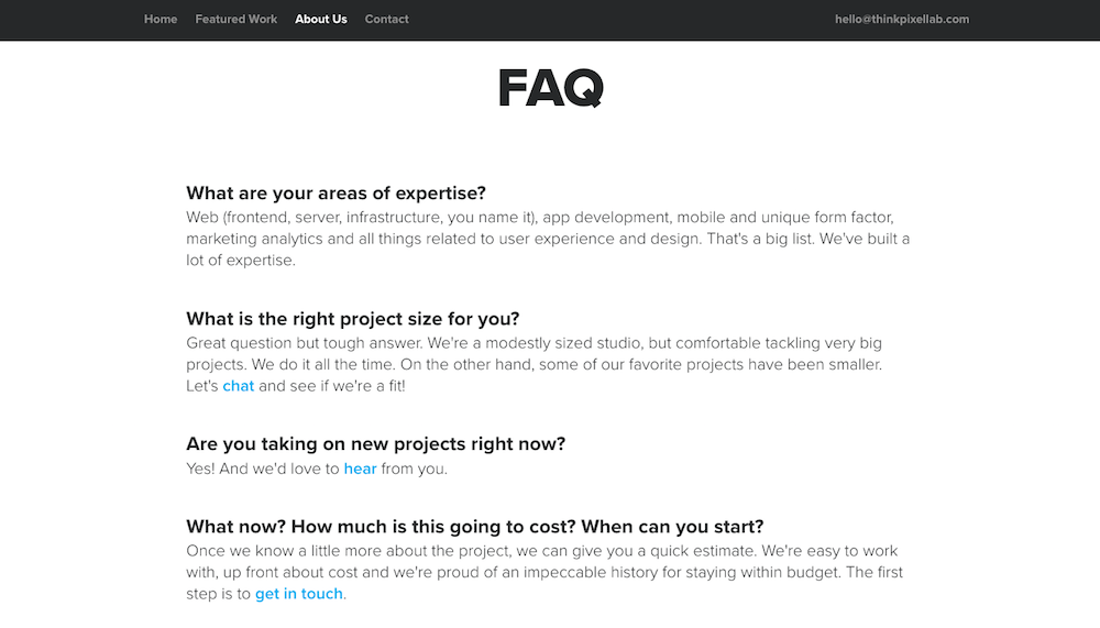
Furthermore, if you just want to make a brief presentation of your company or your project to the audience, single page design is a great choice. Check how Pixel Lab did it in a simple, charming way, answering the most common questions and displaying their most important work.
A more concrete business benefit is that, if used properly, it can increase conversions. The entire conversion funnel is placed on the same page, making the conversion process quick and simple.
Cons
As much as it’s suitable for single-product presentation, single page design doesn’t go that well if you want to display multiple products or services. Having all these on the same page can end up looking messy and confusing. On the same token, scalability is an issue as well. If you’d like to significantly expand your business or your offers, it may be impossible to do it in a reasonable way without adding more pages, in which case… well, in which case it obviously stops being a single page website.
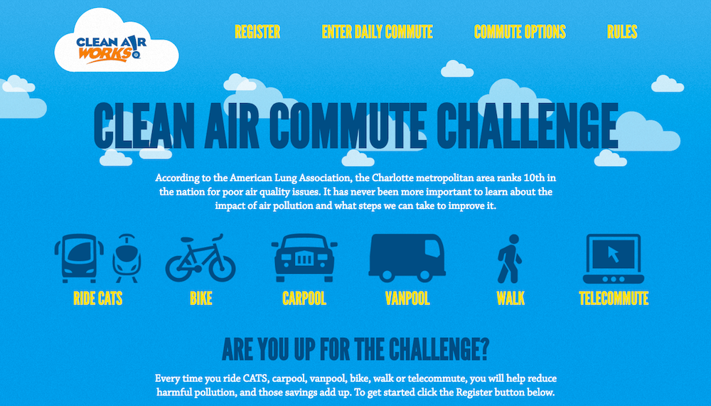
Sometimes people try to cram too much information into one page and end up being forced to leave a bunch of external links on the website. This is not the best way to go since it complicates the idea and violates the whole concept. Especially if people don’t know they’re going to end up at another website. This is exactly what Clean Air Commute Challenge did and it’s definitely not the best of strategies. Simplicity should be one of the main characteristics of single page sites and you should have that in mind at all times.
Furthermore, the fact that you have all the content under the same URL can create more issues. Namely, it’s not just harder for visitors to share a specific part of the content they like, but it’s also harder to analyze which exact content performs best.
Finally, there are SEO troubles. If you decide to upload too much content your website will take ages to load and this can ruin your rankings. It’s also harder to optimize the website for a large number of keywords, as there’s a limitation on this number.
All in all, going for this type of design is an excellent idea, but only if there’s a firm logical connection unifying products or ideas presented. Here are a few tips on how to make it more appealing and user-friendly.
Useful tips
Divide the page into sections
Naturally, finding your way around a single page website can be very difficult if there’s just one big homogenous pile of content. Thus breaking up the page into clearly distinguished segments is an absolute must. Otherwise, the visitors could feel overwhelmed as soon as they start roaming around your website.
There are all kinds of techniques you can use in order to make these divisions. Using different styles, background colours, fonts or separating them with headings or blank space are all reasonable ideas. Nevertheless, a blank space is not enough sometimes, especially without proper navigation. Your website can look confusing and there’s no way to quickly and effortlessly distinguish between different sections. Take Varsity’s website, for example.
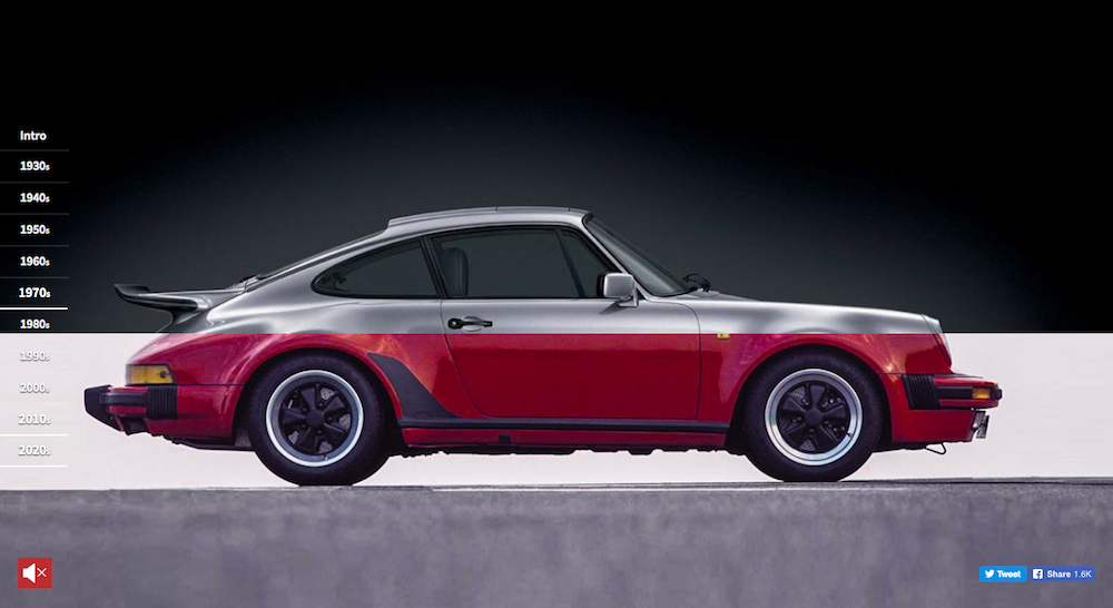
On the other hand, being creative and playing with these division-creating options can result in some top-notch web design. Check how Porsche did it.
The order of sections should be logical and continuous, and so should be the content itself. If it’s a business page, you could even include all the sections that traditional multi-page business websites have (content, bio, products and so on), but integrated into a single, well-divided and neatly organized page.
Easy navigation
Obviously, making a clear separation between different segments is important for solving navigation issues as well. Again, wandering around a single page website can be a nightmare, especially ones with a large amount of content.
In any event, when it comes to navigation, you have to have an alternative to mere scrolling, otherwise, you’ll definitely have a hard time keeping people on your website. Most people simply won’t have the patience. That’s why you’ll need a sticky navigation bar on the top or at the side. It’s crucial that your visitors know which section they’re reading at any point, as well as where it’s positioned compared to other sections.
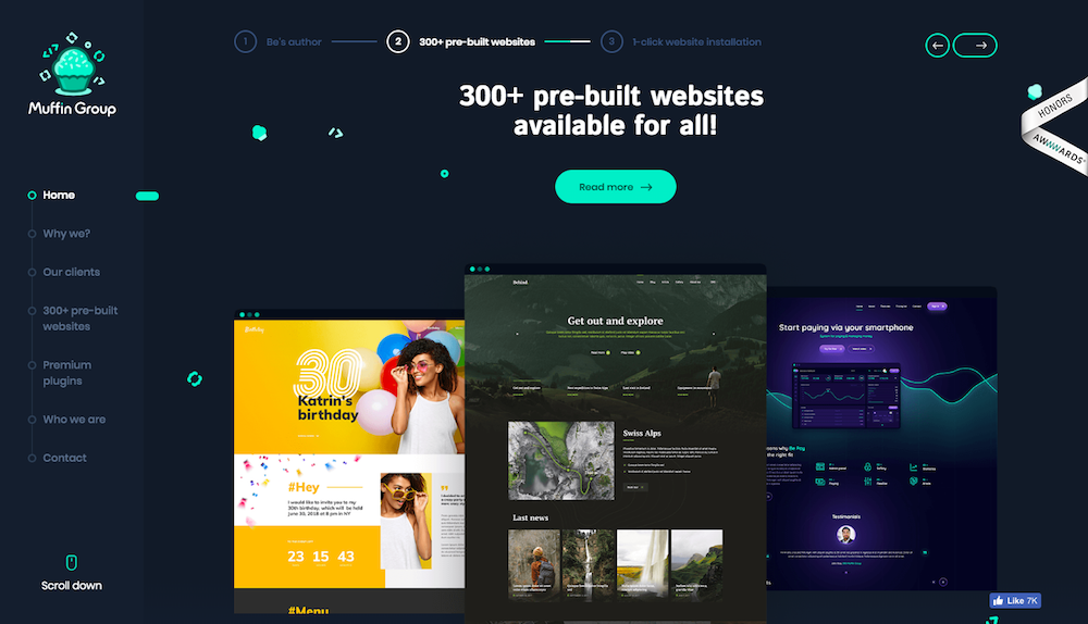
A great example of how to do it right is Muffin Group’s solution to this problem – a clear, legible and interactive navigation bar on the left side is all you need to avoid getting lost.
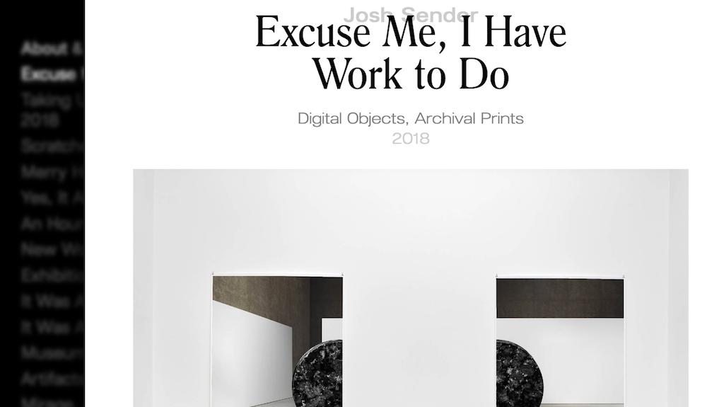
It’s very important that the bar is clear, unobtrusive and always on screen as it could seriously disrupt UX otherwise, just like in the case of this artist’s personal website.
For those who choose to scroll anyway, you can include some scroll-on animations in order to make the experience more dynamic and amusing. Just make sure they don’t affect the performance of your website, in which case it may be more sensible to avoid them.
Importance of hierarchy
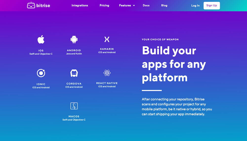
Determining the hierarchy on your website is important not only for UX, but it also serves another purpose. Namely, this way you can direct the users to focus primarily on the elements you find the most significant. The fact that you (hopefully) have a very limited amount of content on the site doesn’t mean it’s all equally important. Bitrise did a great job here with neatly organized content that’s very informative, easy to scan, and has the perfect flow.
Of course, visual hierarchy is necessary for any website, but what’s specific about single-page ones is that you can’t make a hierarchy between different pages, but only between different sections. Finally, highlighting the most important info in every single section is essential in order to catch the eye of all those who tend to quickly scan through the page and move on.
It seems like Make Your Money Matter didn’t do so well in this respect.
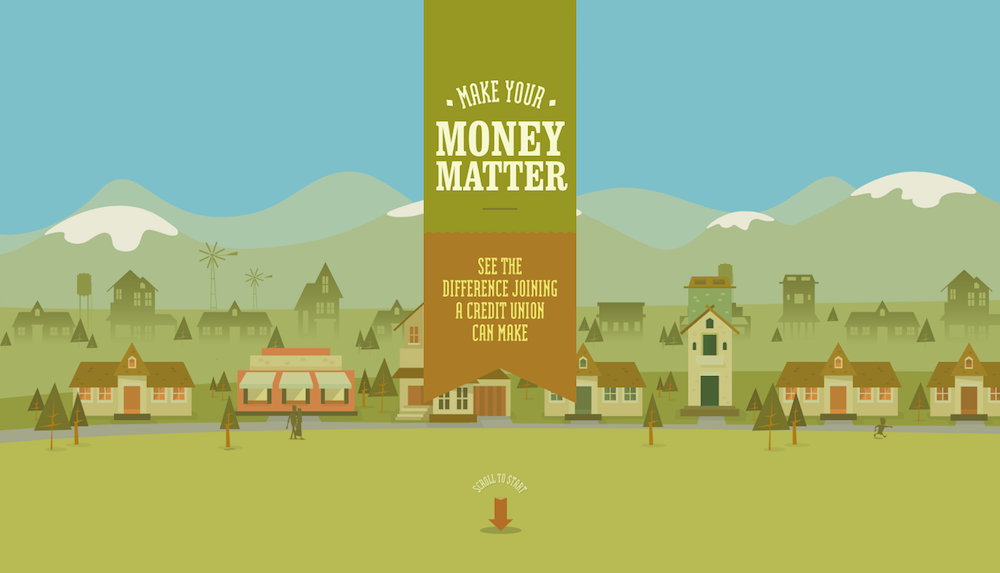
This website features some great story-telling, but it’s impossible to pick a few slides that would make the visitor familiar with the basics of this story. Lack of hierarchy makes the users read through the whole thing if they want to understand what it’s about, and most of them aren’t going to be patient enough for that.
Keep it light
The fact that your entire website comes down to just a single page might lead you to think that it’s smart to compensate for it by experimenting with complex and flamboyant design elements. This is probably not the smartest option as these elements can easily make the website heavy and slow. And slowing down a single page, in this case, means slowing down your entire website. With a three-second rule of page loading in effect, this may cause a lot of people to leave immediately.
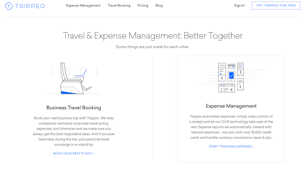
Surely, this doesn’t mean you shouldn’t learn from the latest web designs and employ some of the newest trends. Just try choosing those that won’t make your site unbearably inefficient. For instance, using a clean and simple design can look very professional and appealing, yet the lack of unnecessary elements will make the website light enough, just like in the case of Trippeo.
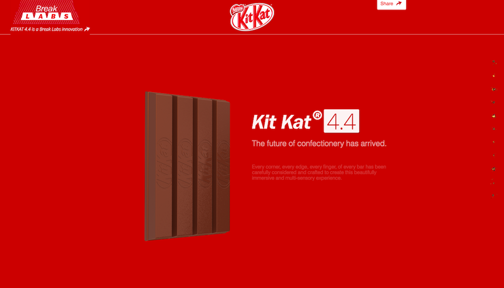
On the other hand, even the most prominent brands like KitKat will sometimes go for the heavy solution. Although the website itself is well-designed, an additional few seconds that you have to wait for it to load is definitely a significant drawback.
Pay attention to CTA buttons
Most probably, the point of setting up your website is to induce some sort of user action. Even non-profit organizations have a goal to make people join, subscribe or simply support their cause. And both them and companies who actually sell something have a good opportunity to convert, as the entire conversion process takes place at a single page.
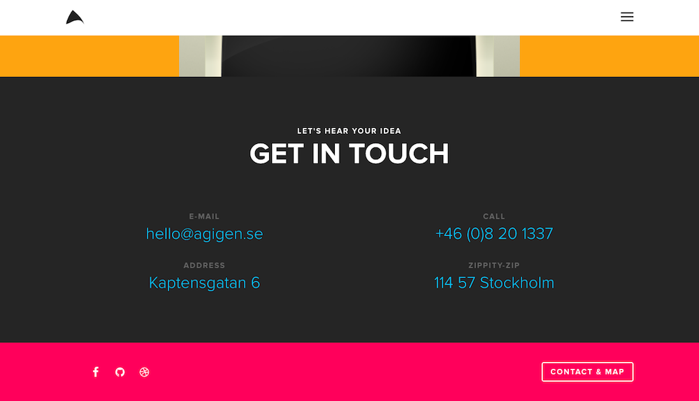
Optimizing CTA buttons is thus of vital importance. They should be visible and it’s perfectly fine to place them above the fold. There are examples of CTAs or contact info that are way below the fold and thus too far away from the visitor’s eyes – take Agigen’s website, for instance. There are no call-to-action buttons and in order to find out how to get in touch with them, you have to scroll all the way to the bottom of the page.
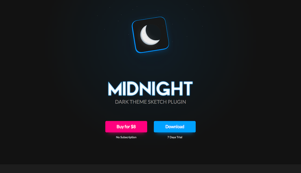
You need to make it easy for your potential clients and customers to reach you, buy from you or sign up. In this respect, Midnight Sketch did a great job. CTA is above the fold and clearly visible due to the contrast with the rest of the page.
However, you shouldn’t make the CTAs too obtrusive and you need to make sure they’re not in your users’ way to check other content on your website. How exactly CTA buttons will look like depends on your overall design, but in any event, conducting A/B tests to see what works best for you may be helpful.
Takeaways
All in all, you should be very careful with single page design. It can be a great way to develop your website if it’s supposed to serve a simple, single, and uniform purpose. Otherwise, it can be very inconvenient and cause a lot of troubles, in terms of content, looks and functionality. Therefore, think twice before going for single page web design and make sure you follow the described tips and tricks in order to make the most of it.