This article was contributed by Les Kollegian.
In today’s digital market, customers have more options than ever when it comes to buying online. Nearly every product or service imaginable is available at their fingertips, which means that every online business must find a way to convince consumers to choose them over the other guys.

One of the best ways to do this is by offering an intuitive and positive user experience (UX). In fact, 71% of successful businesses believe that their superior UX is their top competitive differentiator that attracts customers.
What is even more incredible to note is the fact that customers are incredibly influenced by even the smallest of details, just one of the many UX challenges that web designers face.
With these facts in mind, you’ve probably understood why you need a kickass UX design for your website. Here are a few tips to keep in mind.
1) Perform A/B Testing Frequently
The key to creating a better UX is constant improvement, and that kind of innovation can only be supported by thorough testing and experimentation. A/B testing tactics are the best way to determine which adjustments are best for your website specifically. Even the smallest of changes can have a heavy impact on conversion rates, so be sure that your design team is constantly experimenting and comparing new concepts and ideas.
2) Reduce the Number of Website Pages
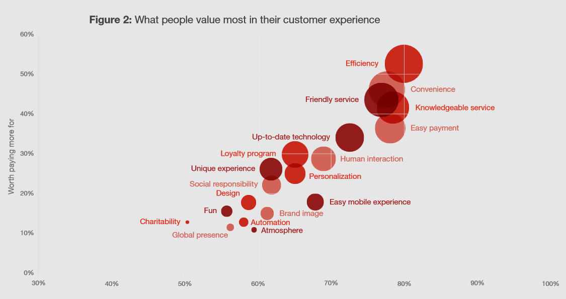
Efficiency and convenience are the two factors that customers value the most in a website’s UX – beating out service, technology, and even personalization. A website with dozens of pages for each and every bit of content is certainly not efficient, especially when someone is in the initial stages of the customer journey and is simply researching your organization. Simplify things by eliminating unnecessary tabs and always be sure that they never lead your customers to a dead end with no CTA.
3) Include Attractive CTAs
CTA buttons are fussy creatures. A few little tweaks here and there can boost or impact the click-through rate significantly. One case study found that when a website made their CTA button a contrasting color from the rest of the webpage, it had 122% higher click rates.
The placement is also very important to keep in mind. In general, the closer to the top of the page, the better the button will perform. Of course, your team should do some experimentation here to see what design changes perform best with your visitors, but keep in mind that even a little change (i.e. font, color, moving graphics, etc.) can have a big impact.
4) Pay Attention to Website Security
One of the main reasons that a customer will abandon their cart or leave a webpage is because something scared them off. And for good reason; the number of data breaches continues to rise every year, so consumers are especially skeptical and concerned with the safety of their personal information.
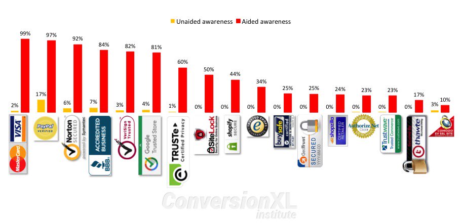
Obviously, the safety and security of your website should be a top concern to your business as well. If you don’t have a security system in place yet, get one. Then be sure to clearly display your security features with trust badges throughout your website – especially on the checkout page. When customers see a security badge on an ecommerce site, they are more likely to buy.
5) Beware of 404 Errors
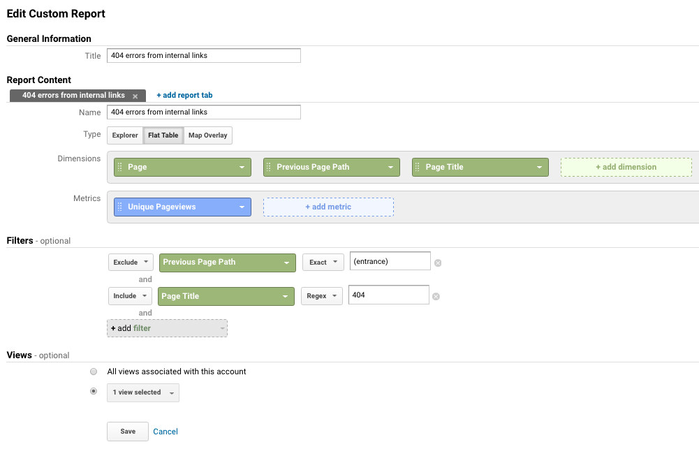
Want to know the best way to get rid of your customers? Lead them to an error page. 74% of customers who run into a 404 error will immediately leave your website without a second thought. There are plenty of monitoring tools out there, but just a simple check with Google Analytics data can show which internal and external links are broken.
6) Use Adequate Images and Videos, but Provide Ample Whitespace
There is no debate when it comes to visuals on your webpage. Including a video on a landing page can increase conversions by 80%. Product images have been statistically proven to increase engagement and conversion rates, but balance is definitely key when it comes to a smooth UX.
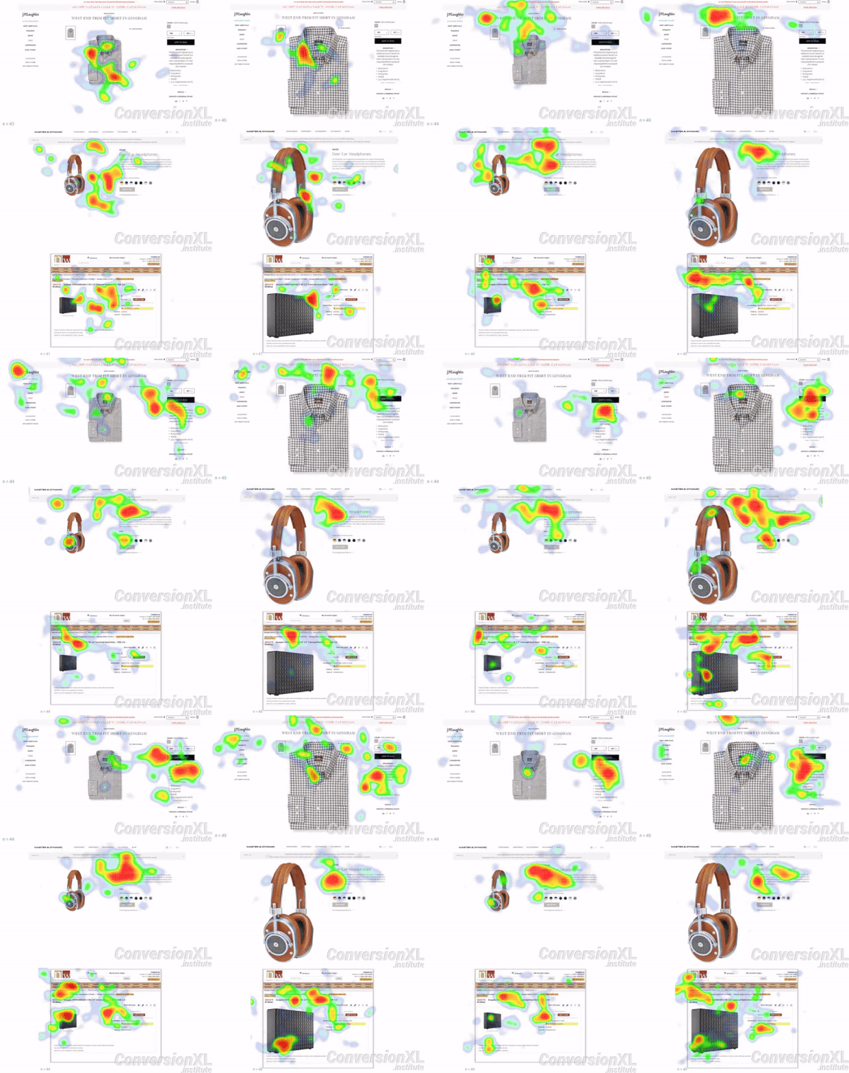
A little bit of whitespace goes a long way, and remember it doesn’t necessarily have to be white. Business and text-heavy landing pages can be overwhelming to a visitor’s eye and they don’t know where to focus their attention. Instead, cleverly-used whitespace can be very powerful in guiding eyes along the page right to the CTA button for better conversions, as you can see from this heatmap study. The page on the left has far more whitespace usage, and as a result, customers are naturally drawn to the contrasting black CTA button.
7) Focus on the Flow
Your website is there to take your customers through the buyer’s journey, hopefully ending in a conversion. Therefore, every piece of it must have a flow that makes sense. Interestingly, one study found that 46% of customers found it incredibly annoying when a website “lacked a message” – and this was the most common reason that they exited the platform altogether.
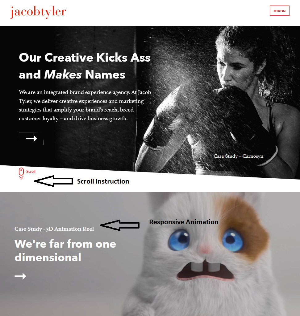
Again, proper usage and placement of CTA buttons is incredibly important here. Take the homepage for this San Diego website design company as a perfect example. It literally spells out how to interact with the website, and each tab offers responsive animation when the mouse hovers over the CTA.
Your customers shouldn’t land on a page and wonder what to do next; create clear steps towards their next move and include content that supports each stage of the customer journey for a smoother UX.
8) Colors Matter
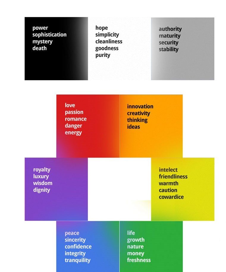
Colors carry a whole lot of meaning when it comes to branding. A recognizable color scheme can increase brand recognition by up to 80%. According to psychological studies, customers associate various meanings to colors when they are used by a brand. For example, lots of blue evokes confidence and honesty while orange is viewed as innovative and creative. Be sure to use the colors that support the type of branding message you want to communicate to your audience.
9) Make It Responsive and Easy to Navigate
Over half of your website traffic is most likely from a mobile device these days, so smartphone compatibility is critical. An unresponsive website design will turn away as much as 80% of organic searches if it doesn’t adjust to their screen size or support mobile-friendly navigation. The key here is to simplify and enlarge.
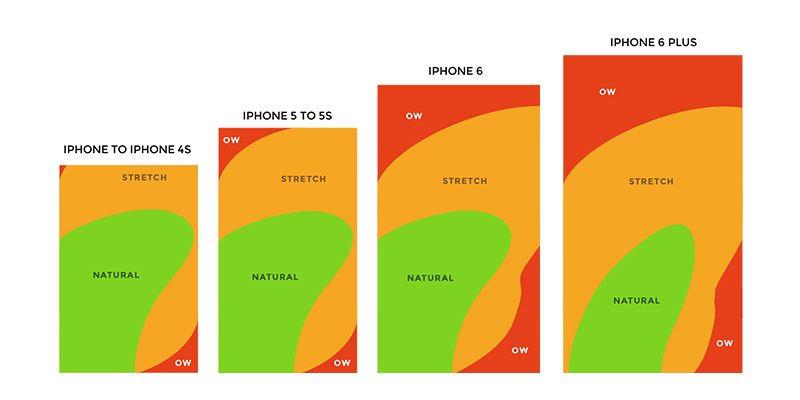
While your website may have a lot of navigational options clearly displayed at the top of the page, this design is not so great on a small phone screen. Instead, opt for larger CTAs, fold down navigation, and be aware of the natural use patterns for phone screens for optimized placement.
10) Faster Loading Times Are a Must
According to findings by the Nielsen Norman Group, website visitors typically leave it within 10 to 20 seconds.
What’s more?
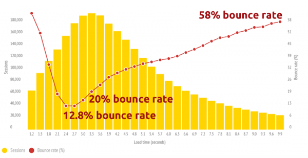
If Statisticbrain.com is to be believed, the average person’s attention span is just 8 seconds and only 28 percent of words are read on an average web page. Therefore, quick loading speeds are a necessity. Every single second that it takes to load your site matters, and anything over 3 seconds could be enough to send them searching elsewhere. Stay on top of your website’s loading speeds and optimize the graphics and pages that could be slowing it down.
11) Conduct Site and Usability Audits
Your business’s website will never truly be “finished.” There will always be room for improvement, especially as new trends emerge. There are several ways that your team can conduct UX & SEO audits regularly to ensure that your customers are constantly satisfied with their experience. Be sure to stay on top of your customer reviews and look for patterns regarding the UX of your website, or send out surveys to customers asking them to rate the usability. For a more technical approach, you can try a UX auditing tool that will gather analytical data to identify the areas that need improvement.
Conclusion
According to PwC’s research, nearly one-third of customers will abandon a brand after a single bad experience. Furthermore, 54% of consumers are unsatisfied with the UX from the majority of online brands.
Your customer’s happiness should be a top priority, especially once you realize how much rides on their online experience. Keep these tips in mind and see what areas of your website could use a little improvement.
(Image credit: 1, 2, 3, 4, 5, 6, 7, 8, 9 & 10)
—
Les Kollegian is CEO of Jacob Tyler, San Diego’s Top Web Design & Branding Agency specialized in Web design, user experience, brand development, marketing strategy, and digital marketing.


I totally concur with your approach. Many people believe that a “stuffed” website with bells and whistles is attractive to visitors. It’s so far from being the truth. As you pointed out, a simple and easy flow along limited number of levels is much more effective at retaining a visitor on your site. Thanks for your great post!