This article was contributed by Ashish Kumar.
On the 8th anniversary of Responsive Web Design, Jen Simmons, Designer Advocate at Mozilla, introduced a new concept in web design, Intrinsic Web Design.
Delivering her presentation at An Event Apart Seattle 2018, she suggested that we’re now at yet another inflection point in the evolution of web design where creativity matters more than the growth.

According to Jen, Intrinsic Web Design could be the sixth such point in the history of web design where everything changes and where we exchange our knowledge, experience, and techniques to strike a perfect balance between clean code and complex design. While we have tried the same five times in the last 25 years, she realizes that it is the perfect time to switch to a completely new approach, Intrinsic Web Design.
In this blog post, we’ll explore what this new concept is all about, but let’s first get acquainted with five notable changes in the history of web design!
The 5 Major Changes in the History of Web Design
1. Flow & Table Layout
As far as we know, the birth of web browsers having the ability to display images was the starting point of web design. At that time, there was only one kind of layout, Flow. No fancy CSS or JavaScript – HTML was the only way to design a web page in 1995.
Content used to flow from left to right line by line, taking up as much space as it inherently required. Images also used to take up as much space as their original size and you were not able to do much more until the concept of tables came into existence. This was also the time when the terms like slicing, dicing, and chopping became tremendously popular among designers and developers. Designers used to make a fancy layout and it was up to developers to break it into a lot of pieces and put them into HTML tables to create a visual layout.
2. Flash
Then soon we landed in the golden era of freedom! Since it was quite difficult to get HTML tables to work in multiple browsers, a new technology ‘Flash’ was born in 1996 to break the limitations of HTML, animated GIFs and JavaScript – giving designers a freedom like never seen before. Leveraging the power of Flash, designers were able to use any font, design any shapes or layouts, and incorporate animations and interactions into their designs.
However, just like everything has its own set of limitations, Flash also had a few. The main downside of Flash was the lack of accessibility: it required users to have the latest flash plug-in installed on their browser, wasn’t search engine friendly and also consumed a lot of processing power. Consequently, a large number of web developers avoided using it and reverted to HTML, JavaScript and GIF animations along with CSS, which was introduced in 1998.
3. Fluid (Liquid) Layouts:
Fluid layouts got tremendous popularity around 2000 and emerged as a great alternative to HTML tables and grid-based design. This was essentially a return to as what the web used to be in the beginning – text and images take up as much room as they need to.
This time, however, developers had certain control over how things should be rendered in the browser. The majority of the components inside a Fluid layout has their size defined in percentages instead of pixels, and thus adjusts to the width of the browser window aka viewport.
4. Fixed-Width Layouts:
The previous method, fluid layouts, gradually led us to the era of fixed-width page layouts as designers wanted a bit more control over how things were being laid out. Presuming that there’s no screen smaller than 640 pixels and bigger than 1024 pixels, developers started defining the sizes of the elements in pixels, instead of percentages.
Consequently, websites built with this methodology were center-aligned in the viewport to deal with the aesthetics issues on larger screen devices. As fixed-width designs used to be rigid, they did not change their size based on the width of the browser window. Hope you still remember the phrase “This site best viewed with a resolution of…” shown those days in the footer of a website!
5. Responsive Web Design:
Then came a whole new era of smart phones! A brilliant guy named Ethan Marcotte shook up the history of web by coining the term Responsive Web Design (RWD) at An Event Apart 2010. It was essentially a return to fluid layouts along with the use of CSS media queries to give developers more control over how a website renders across a wide range of mobile and desktop devices. RWD is actually the combination of three things:
- Fluid Grids: A concept web designers were already familiar with.
- Flexible Images: An image must not be larger than its pixel value and should resize itself based on the size of its containing element.
- Media Queries: Use CSS media queries to define different layouts for different breakpoints.
The main advantage of RWD is consistency across all devices – the same website works everywhere. Over the last eight years, while the industry has been talking about RWD, Jen thinks we’ve come a long way since the inception of RWD and it’s time to think about what’s next!
What is Intrinsic Web Design?
Since the inception of the web, we have been using a ton of hacks to get all layout-related things done. Whether it is using the float property to get things placed wherever we want them on a web page or incorporating outside CSS frameworks and libraries into our design, almost entire web is built on hacky front-end code.
However, the emergence of CSS modules such as Flexbox and CSS Grid Layout has today made it possible for us to properly lay out our designs exactly the way we want them to be laid out – absolutely without any hacks, tricks, third-party frameworks or help from JavaScript. Essentially, being capable of creating whatever you want with the least use of hacks and tricks is what Intrinsic Web Design is all about.
In other words, instead of constraining both designers and developers to ‘predefined rules’ of the web, Intrinsic Web Design gives them the flexibility to combine traditional, tried-and-true layout techniques with modern layout methods and tools, such as CSS Grid and Flexbox, in order to create unique layout based on a website’s intrinsic content.
Encouraging designers and developers to put the content first and allowing them to leverage all of the available layout tools and methods, the new web design approach helps them display content on a web page in the best possible way while also keeping the code clean, minimal and more efficient. In the simplest terms, instead of making the content design-driven, Intrinsic Web Design focuses solely on making the design content-driven.
Key Principles of Intrinsic Web Design
You might be thinking that why Jen came up with a completely new name, Intrinsic Web Design? Well, the answer is simple: it was helpful to debate between fluid and fixed-width web design or table-based layouts. Over the past few years, Jen was on the quest for a term for “Responsive Web Design +”.
The “+” here is about the intrinsic nature of the web. It is indeed about what’s beyond fluid grids, flexible images, and media queries – the three key principles of Responsive Web Design. If we compare both, Intrinsic Web Design is significantly different than the Responsive Web Design in several ways, like:
- RWD has flexible images while depending on the situation, IWD allows you to use both flexible and fixed images.
- Where RWD uses fluid columns, on the other hand, IWD makes use of fluid columns and rows.
- RWD leverages the power of media queries to make a web page responsive while IWD doesn’t necessarily need media queries.
Every web design approach has its own principles and so does the Intrinsic Web Design. The new approach is based on six key principles:
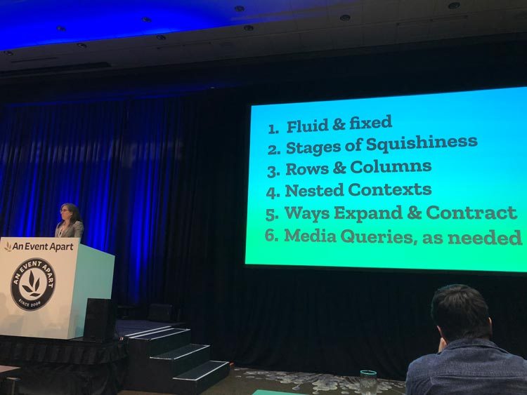
Mix Fluid and Fixed:
Prior to responsive web design, we used to use fixed images that sometimes overflow outside their container. To resolve this issue, we then started using fluid (flexible) images which shrink or grow in accordance with the size of their container.
Instead of just using flexible images, Intrinsic Web Design advocates the use of both fixed and fluid approaches simultaneously depending on the context. Moreover, taking advantage of the CSS object-fit property, you can now resize your images both vertically and horizontally without distorting the aspect ratio. Just set the image to object-fit: cover and you’re good to go!
Stages of Squishiness:
The biggest CSS capability developers have today is undoubtedly the CSS Grid Layout Module, which introduces new ways for how the layout should respond to the intrinsic context of a web page. There are four stages of squishiness:
- fixed
- fr units – fluid
- minmax (min, max) – fluid until fixed
- auto – a return to flow
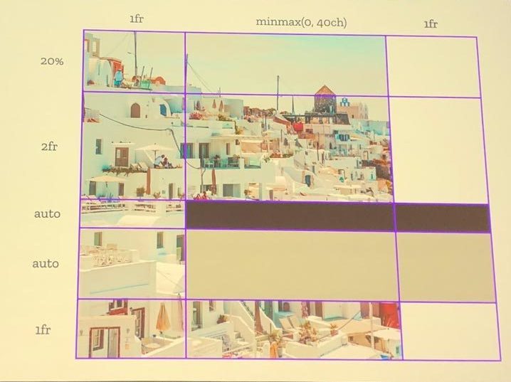
Intrinsic web design recommends you using a combination of these different options to let the elements of a web page better interact and cooperate with each other.
Truly Two-dimensional Layouts:
With the help of CSS Grid, Intrinsic Web Design empowers you with the ability to develop truly two-dimensional layouts. Instead of just flexible columns, you can now have flexible rows too. Every stage of squishiness works well for both rows and columns. You can define both heights and widths. In other words, you now have the ability to create intentional white space – both vertically and horizontally.
Nested Contexts:
With Intrinsic Web Design, you can now have nested contexts:
- Flow
- Flexbox (formatting context)
- Grid (formatting context)
- Multicolumn (formatting context)
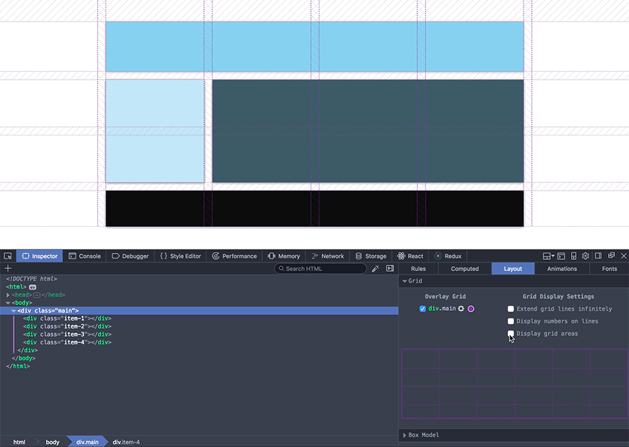
When you’re using Flow, Floats can never create a new formatting context, which is why you use the clearfix hack. Now there is no need for such hacks. Rather, you can choose and mix the best layout tools to design your own ‘flexibility model’ for your website. For example, you can now use a grid layout containing flexbox elements within it. The Firefox Nightly’s grid inspector can help you inspect each layout type separately.
Expand and Contract Content:
Intrinsic web design introduces several new interesting ways to contract and expand the content of a web page. We now have more options than ever, such as:
- Squish and grow – for example, fluid images
- Wrap and reflow – like we can do with text
- Add and remove whitespace – Instead of content, the whitespace shrinks and grows
- Overlap – slide one thing behind another
Needless to say, you can do a lot of things now to adjust page elements according to the screen size without the use of media queries.
Media Queries, As Needed:
Where Responsive Web Design requires the use of CSS Media Queries, on the other hand, you don’t necessarily need to use media queries to make a layout responsive in Intrinsic Web Design. You can instead use a combination of various tools and technologies to achieve a responsive layout. That’s the beauty and power of Intrinsic Web Design!
—
Ashish Kumar is an experienced web developer working with XHTMLJunction – PSD to HTML Service Provider. In his spare time, he loves to write articles related to WordPress, Web Design, App Development, and eCommerce.
This is a really cool article. I’m a front end developer myself and this was a real good read.
Well explained Ashish, Good to see your post again. Thanks for sharing continuously with us.
Keep on sharing.
Hello Jacob, this is amazing topic you have covered here, much thanks for this awesome ideas on intrinsic web design, 🙂