The Web is an ever-changing industry. Every year, we see new tools, new frameworks, new technologies and of course, new trends.
Some stayed with us, while some didn’t. This goes particularly for trends. We all saw the rise and downfall of trends like, Flash based web animation, sliders on first fold and stock images.

When it comes to user experience of a website, we are always in pursuit of improving it. This is mostly because improving UX means improving metrics, like conversion and bounce rate, which are important for a business.
For this purpose, we don’t hesitate to test new UX trends on our website. For this reason we need to keep an eye on some recent UX trends and decide which to follow in 2017.
Estimated Read Time to Improve Readership
When online readers come across an article they scroll up and down to see how long it will take for them to completely read it. If it’s too long and looks uninteresting they will either just scan it or leave the page. To prevent this, it is best to state the estimated time it will take to read an article. This will give user an idea whether they should spend time on reading this article or not.
According to New Yorker…
“The more we know about something – including precisely how much time it will consume – the greater the chance we will commit to it.”
Medium.com has been using this feature for a year or so. Some articles on Medium.com seem long, but actually it is just because of their formatting. In reality, such an article takes only a few minutes to read because word count is not as many as it seems.

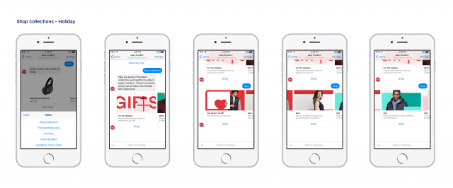
Chatbots for Better Conversational Experience
When you go to some big store and have trouble finding a section for the item you want, you often ask the store clerk for help. When it comes to online store, you either browse through relevant categories or enter your query in the search. A better option that companies have is chatbot. Chatbots are a new way of striking a conversation with your users.
According to Juniper Research “merchant integration of technologies such as bots and natural language interfaces will lead to remote goods purchases by mobile totalling $2.1 trillion by 2021”.
Thanks to recent developments in machine learning, chatbots are already being employed by many big names, like Google Now and ShopBot from eBay. ShopBot improves the shopping experience of users on eBay by answering their queries better than a simple search engine.
Gesture and Voice based Experience
Things have moved on from graphical user interfaces. Now we have gesture and voice based interface as well. You must have already used it at least once or twice. Google Assistance, Apple Siri and Microsoft Cortana are personal assistants that can take voice inputs on Android, iOS, and Windows respectively.
On Google Search you can use voice recognition to speak and search your query on Google. It saves you the trouble of typing the whole query.
For example, on iOS you can ask Siri about today’s weather. This can improve the UX by making it convenient for users to search something on a website or app, for example.

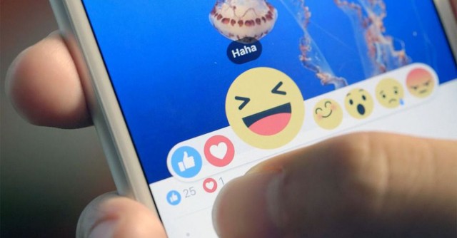
Meaningful Micro Interactions
Micro interactions are minor visual cues that happen when user performs some action. These visual cues, can be an animation or simply a CSS transition, like when you hover an outlined button on a website, it is filled with solid color. Such minor visual cues give a sense of control to users or indicate that their action has returned a reaction. This is how micro interaction can enhance the UX of your website or app.
Without micro-interaction, users might not feel they are in control or they might feel that they are not getting a response from the website when they perform an action. Let’s take an example of Facebook Reactions. These new emojis provided a new way for Facebook users to communicate their emotions better.
Wasn’t it frustrating to Like a sad image on Facebook, because there were no other option? Just don’t use micro-interaction visual cues for the sake of aesthetics. And, it must have some function as well.
Scroll Triggered Animations
Some websites employ unique kind of animations. As you scroll down the page, the visual elements start to form. This is called scroll triggered animations. This is a great way of storytelling or showing a demo of a product. Instead of having users to read how a product works, isn’t it better to show them through visual elements?
Scroll triggered animation also works on a one page website with multiple sections. As the user scrolls down, the animation is used to show which section they are looking at. Let’s take a look at Apple Mac Pro website. They use scroll based animations to demonstrate their product from inside out, rather than giving long text based information.

Less is More
Clutter a website with visual and text based information is the best way of causing users to close the page. This will not just increase your bounce rate, but will decrease your conversion rate as well. What you need is a space, a negative space. Negative space or white space puts the focus on the content, eliminating the unnecessary elements, like stock images and useless sidebars.
Medium.com has a negative space on left and right, making content the main focus. This way reader can easily read the content with no distractions. However, don’t eliminate necessary website elements, like navigation on footer, just for the sake of increasing the negative space on the page.
gDiapers.com also increased conversion by 20%, when they added some negative space between the banner and two callout images.

Conclusion
Trends will come and go, but whatever new trends we see in 2017, remember to first test them on a single web page instead of rolling out on entire website.
This way you can ensure whether a UX trend you are following has any affect on your key performance indicators or not. This will also prevent you from following trends that later turn out to be a fad.
It is not necessary to follow all the trends that are discussed above. For example, you have a single page website and so there is no need to implement gesture or voice based interface as it won’t serve any purpose here.
Web Design & UX Trends to follow in 2017 Infographic

Infographic by Dubai Monsters.
More Web Design, UX and UI Trend Reports
- Popular Design Trends for Interfaces
- 12 UX rules every designer should know
- Some new year resolutions for UX designers
- Design Trends in 2016 & What to Expect in 2017
- What’s the Best #UX Design Advice You Received in 2016 by Adobe
—
Mohsin Qadir, an online marketer and SEO Consultant at Go-Globe Hong Kong, one of the leading web design and web application development company in Hong Kong.
Very informative post. Search engines love websites that provide the best user experience. So, we designers must keep these UX design trends in mind when designing websites for their clients.