This article was contributed by Robert Mening.
There’s no doubt about it. People judge books by their covers. According to survey results from The Book Smugglers, 79 percent of people say that a book cover plays a role in their decision to buy a book.

A book cover is oftentimes an author’s first interaction with a reader, so the cover has to be particularly eye-striking to get readers to move down the sales funnel and purchase the book.
As a designer, there are several things you can do to help the author reach their full marketing potential with a single image. Start by keeping these tips in mind if you’re thinking about working with fiction authors on their cover design.
Research the Genre
One of the most important aspects of a good cover design is the tone the cover sets for the book. You want a reader to know with just a single glance where that book is going to take them. It’s not just about the image and whether or not it represents the book’s characters or shows a scene from the book. It’s also about the font choices and color schemes.
Take a look at what other designers are creating in the genre. This does several things for you:
1. It helps you get an idea of what type of cover will fit in the genre.
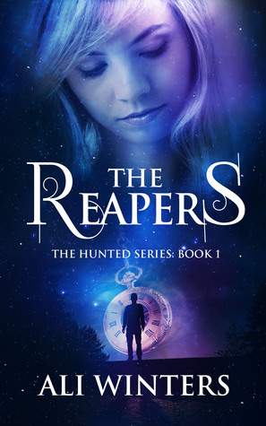
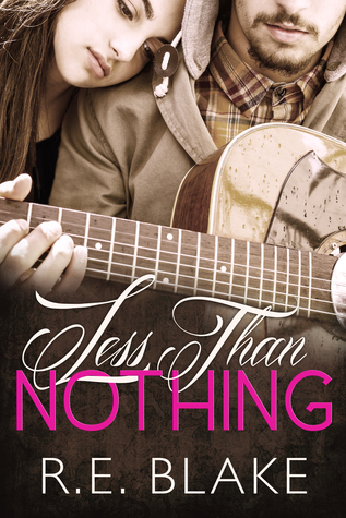
Readers should be able to look at a cover and know if it’s contemporary romance or if it’s young adult fantasy. Think about the type of lighting, colors, font choices, title treatment, etc. that other designers use for similar stories. For example, the color and font choices for The Reapers suggests it’s a fantasy/paranormal book while the cover for Less Than Nothing gives off a contemporary/romance vibe.
2. It gives you an idea of what the target audience wants.
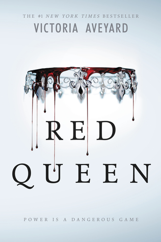
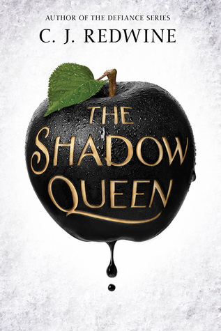
A cover may look great, but if it doesn’t appeal to the audience the book was written for, it won’t sell. Alternatively, the book could sell to the wrong audience. Take a look at the best sellers in the author’s genre to see what they’re doing to appeal to the target audience. For example, notice how bestsellers in the young adult genre, such as Red Queen and The Shadow Queen, use symbols instead of people on the cover.
3. It shows you what NOT to do.
In The Book Smugglers’ survey, they found that 58 percent of people were bothered by cover “clichés.” For example, they don’t want to see the same bare-chested guy on every romance cover. They certainly don’t want to see the same stock photo used over and over again. Here, the cover designers have used the same stock photo, and it keeps each cover from standing out on its own.

While there should be some similarities in the genre, your research will also show you what’s overdone, helping you come up with a unique concept.
Design Parallel to the Author’s Brand
Sixty-five percent of people are visual learners, and we process images quicker than we process words on a page. When you tie your design into an author’s other book covers, readers who have seen the others before will immediately understand the connection. This helps boost sales with readers who have read and liked the author’s books before, but it also attracts new readers who may recognize the covers from multiple places.
If you’re working with a new author, you have the unique challenge of kicking off their branding. If you’re working with an established author, aim to match your design with their existing brand, especially if the books are written in the same genre. The book covers should be particularly similar, either in color or layout as well as by using the same fonts, if they’re part of the same series.

Designing for the author’s brand may be as simple as using the same fonts for their name across all covers. Notice here how bestselling author Melissa Foster’s designs all use the same placement for her name. It’s easy to spot which books are hers at first glance, which helps attract readers and boost sales.
Think About the Format
Many cover designers today make the mistake of designing for eBook and then slapping the same cover on a print version or vice versa. In reality, different designs may work better for one format than the other.
For example, an eBook cover is often viewed in thumbnail format. That means that certain elements, such as the image or the title, should be easily visible. Not everything has to be visible in thumbnail size, and one genre might emphasize certain aspects more than others, but there should be a main focus that browsers can easily make out when they view the cover on a small-scale.
Print book covers, on the other hand, might take a more delicate approach to the image or text because viewers will be up close to the design.
That doesn’t mean you should have one image for print and another for eBook. The covers should remain consistent for effective branding. However, you may have to tweak elements here and there to suit the format. Notice how The Keepsake uses delicate type. This makes for an effective print cover, but the image and text get somewhat lost on the eBook’s thumbnail.
It’s also a good idea to talk with the author and see where they’ll do most of their marketing. If they sell primarily through digital formats, then a more eBook-friendly cover is the way to go.
Treat Your Text With Care
One of the biggest mistakes authors and designers make with fiction book covers is slapping on the text as an afterthought to an image. Unfortunately, your font choices and title treatment can make or break a cover; it doesn’t matter how good the background art is.
Some tips to keep in mind include:
- Avoid the free fonts that came on your computer. Everyone recognizes Monotype Corsiva, and it’s going to look cheap on your book cover. Instead, search sites like My Fonts to purchase premium options that will give your covers a more professional feel.
- Don’t get too fancy. Using overly fancy fonts or effects like beveling or drop shadows can make the cover look amateurish. You want the words to be clean and legible.
- Don’t use a fancy font for the author’s name. The focus of the book cover should rarely be on the author’s name. (This is usually only done when the author is extremely well-known.) Using fancy fonts for the author name will make it stand out, and not in a good way.
- Avoid using too many fonts. As a general rule, you shouldn’t be using more than two fonts on a book cover, says Writer’s Digest.
Here’s an example of two book covers variations that use the same image but different fonts. Notice how much of a difference the text makes in how the cover design comes together.
Keep these tips in mind if you’re an author or designer gearing up to create a new cover.
Have any more book cover design tips, example or best practices to add? Let us know!





Hi, Jacob
Awesome, Great idea. Good Jobs. Your design make the book more better.
Somebody says, don’t jugde the book by the cover…. Now, they speechless…LOL
Good article..i like it