This article was contributed by Sean Huang
In a study where British researchers asked participants what elements of a health-related website influenced the amount of trust they had in the site, 94 percent of the feedback was design-related.


Elements that helped these people form their opinions included:
- The site’s overall complexity
- A busy layout
- The lack of navigation aids
- The use of color
- Loading time
- Small print
- Too much text
- A corporate look and feel
We all know that design is important; after all, no one wants a site that is just ‘good enough.’ You want a first class site for your business, and in order for it to be first class, it really has to stand out to capture the attention of your visitors.
Here are some powerful tweaks that can help:
1. Reduce the clutter
This is one of the more difficult tweaks to make because it does take some planning. Think about each page on your website, and determine what the focus of that page should be. Once you have that, get rid of everything else that distracts from that focus. There should be no competing calls to action or any graphics, images, or buttons that could distract the visitor from the most important parts of the page.
2. Embrace the space
Designers refer to the space between elements as ‘white space’ from the print days, and now in the digital days, it represents any blank or negative space on your website. Aside from being easy on the eyes, using white space gives your design two benefits. For one, it helps break up content and elements on your page, giving a natural pause as the visitor views your content. Second, it makes it easier for a person to find the important stuff, like your call to action or that piece of highlighted content.
3. Use the psychology of color
Colors influence our behavior, which is why so much thought goes into corporate logos and the color scheme used on your web site. For call-to-action buttons, text, and other elements that you need visitors to engage with, make sure you are using colors that convey the emotion you want them to have. If you need a bit of guidance, check out this infographic on how colors affect purchases.

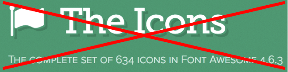
4. Make your icons unique
Font Awesome icons are great because they look good and are free, but this also means that everyone is using them. So instead of being like everyone else, try to find an icon set that makes your design look less generic.
5. Forget the stock photos
“Website visitors can sniff out generic photos in a second–and they’ll be left with a generic impression of your company,” warns Zane Schwarzlose, community relations director of Fahrenheit Marketing. Like common icon sets, stock photos also make your site look generic. And if you use the same images as your competitors, it just looks tacky. Instead, invest in professional photography. Not only will it help keep things unique, but it also helps establish a stronger feeling of trust among your visitors when they know that those images are yours.

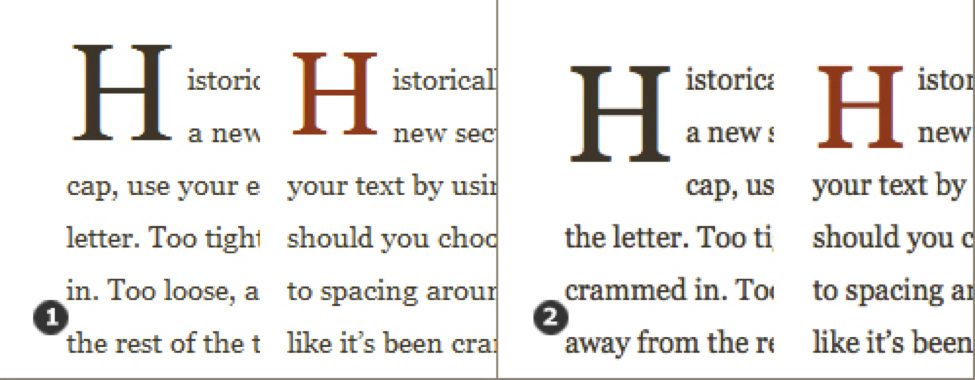
6. Use drop caps
Maria Veloso reports in her book Web Copy That Sells that a company who used a drop cap on 11 major paragraphs for one website saw a 251% increase in sales. Not only does the large letter at the beginning of a paragraph help your sales, but it also looks really good, even on different devices or browsers – and drop caps have been used for centuries.
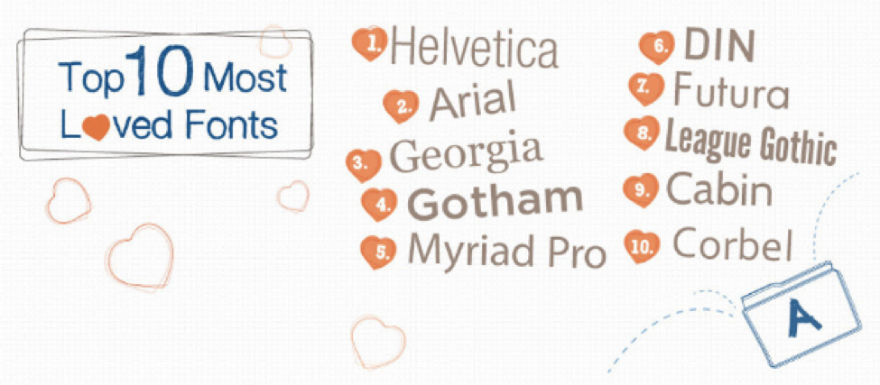
7. Choose the right fonts
Typography is so important when it comes to conveying the right message and giving your site personality. Unfortunately, too many designers are hung up on using Helvetica for everything, and they are afraid to step outside that box. Experiment with different fonts; just make sure that you choose something universal, that it is readable at 11px, and that you don’t use more than two different font families.
8. Provide enough contrast
We’ve talked about using colors and white space to help draw attention to important elements on your web pages, but this needs to be complimented with the right amount of contrast. For example, a rule of thumb is to use dark type on a light background (or vice versa) so people can read what you have to say on different screen sizes without having to squint.
If you have to design according to accessibility guidelines, having the right contrast is extremely important; but even if you aren’t required to comply with 508 or WCAG, it still benefits your visitors to put this into practice.
9. Make your navigation intuitive
Forget about drop-down or accordion-style navigation elements. They are a nightmare for mobile users, and they just confuse people. They were originally developed when it was common practice that every page on your website have a link to every other page on your site.
Nowadays, your sitemap is all you need for the search engine crawlers. Primary navigation for your most important pages should be at the top of your website, and secondary navigation can go underneath the primary navigation bar, in the sidebar, or even in the footer.
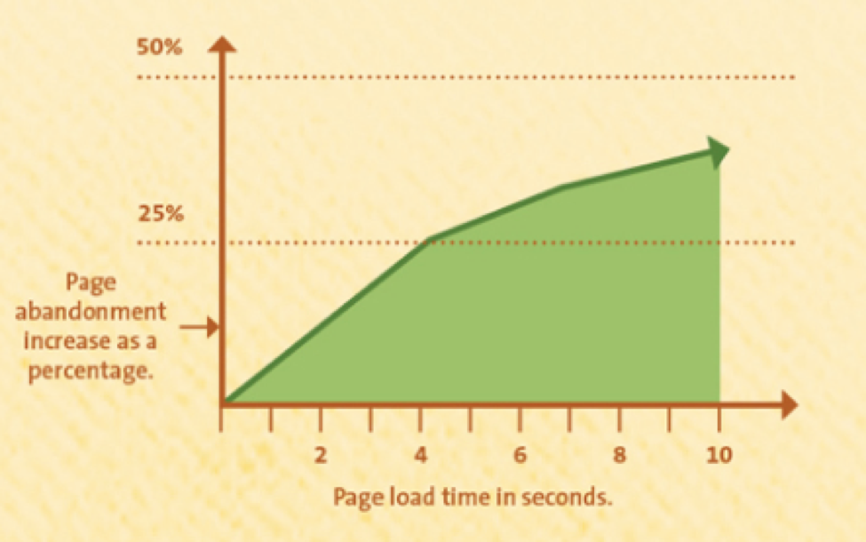
10. Improve page load time
People don’t wait around for web sites to load anymore. This went out the window with Flash animations. Nowadays, they expect a page to load quickly; and if it doesn’t, they are off to another site. So what can you do to improve page load times? Try these quick fixes:
- Optimize your images by scaling them appropriately
- Enable browser caching on the server
- Compress your pages to reduce their size, and do this on the server as well
- Cleanup and optimize the site’s cascading style sheets to remove erroneous or duplicate code
- Place external scripts just above the closing </body> tag so they load last
Any one of these tweaks will assist in making your website’s design better, but employing as many of them as you can, will really help things out. What’s nice about these tweaks is that they are not trendy or stylish changes that will be outdated by the time you make them. They are all practical pieces of advice that should help you give your visitors a better experience when they are on your site.
—
Sean Huang is a Business Analyst at Clutch responsible for research and analysis of web design agencies. He is a lifelong native of Maryland and earned his BS in Foreign Service from Georgetown University.
Color psychology and use of negative space if used beautifully can make a design look great!
Exactly color psychology and fonts are very important