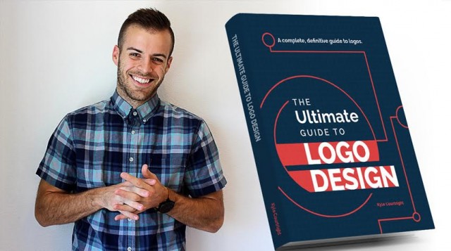
Last month, I introduced you to Kyle Courtright’s Ultimate Guide to Logo Design eBook, which is the “definitive guide to logo design”. It was one of the most popular deals I’ve ever shared here on Just Creative.
The good news is that Kyle has just released v2.0 of this eBook, which has been updated based on all of your feedback. It’s in portrait now (yay!), the visuals have been updated and more content added.

Browse inside and/or download Chapter 1 for free.
35% Off Discount for Just Creative Readers
Even more good news… you can still get the discount! Normally, the eBook would go for $29 however Just Creative readers can get $10 (35% off) the book, making it just $19. This is your chance to up your logo & branding game – there really is no other resource like this.
Click here for The Ultimate Guide to Logo Design eBook »
Use coupon code ‘JUST10OFF’ at checkout.
Interview with Kyle Courtright
1) What are your top 3 favorite logos and why?
I actually don’t have 3 favorite logos, but here are a few that top the list of designs I’m drawn to (all from award-winning freelancers).
As a way to highlight “the underdogs”, I will stay away from some of the big brand logos.
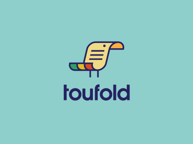
A. Toufold by Sean Heisler
Sean has made a dent in the logo design industry for some time now. His knack for grabbing the essence of a brand is bar-none.
His logo for Toufold landed straight into LogoLounge Book 9, and the recognition is well-deserved.
What if a client asked you to effectively merge a toucan with the term “twofold” into a logo? It would be a challenge, to say the least.
But Sean brought his A-game on this one…
He talks to the logo on Dribbble:
“A logo proposal for a company renaming and rebranding itself who offers both digital and analog document duplication services. The concept behind this name was a play on “Toucan” (the bird) and the term “Twofold” which means duplication, hence Toufold. One color and reverse options in the attachment.”
The equal repetition of the document/paper turning both in and away, while having a seamless representation of both the beak and the colorful feathers is on-point. The document lines and simple dot for the eye bring in both the idea of the letter and bird in such a minimal, effective way.
Most of all, the bird and document have equal representation. There isn’t too much bird or too much document—the weight of these elements, in my opinion, are spot on.
B. Inquirly by Nadir Balcikli
The Inquirly logo is a smart, iconic solution for the company represented.
Here is Nadir’s description of the company:
“Inquirly is a simple web app that helps companies get measurable, actionable feedback from their audience on social networks.”
My mind automatically starts fitting the puzzle pieces of this logo together. Moving from top to bottom, using the speech bubble to align perfectly with the body and feet maintains a fitted, grid-like structure.
The similarity of icon to type takes the cake. The slab serif “i” in “inquiry” would seem to fit nicely if turned 90 degrees clockwise and placed into the notch between the foot and shirt. Even the x-height of the “i” aligns nicely with the top and bottom of the shirt.
In the end, Nadir gave Inquirly a gem of a logo that will stand the test of time.
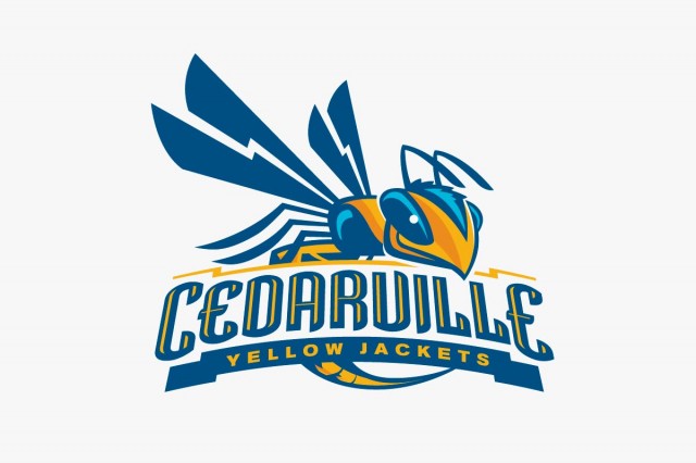
C. Cedarville Athletics by Jeremy Slagle
I have been mesmerized by this logo for some time now.
This one has it all. Depth, balance, perspective, repetition, similarity, contrast…
For designers looking to learn more about sports logos, just sitting down and studying this logo will get you on the right track.
Jeremy brings in color really well. The lighter blue is perfectly represented as it spans four similar elements from eye, to head, to eye, to body. You may notice there are several parts of the yellow jacket that almost act as mini arrows to keep our eye pointing back to the text. Great stuff!
It’s also worth mentioning that the entire concept caters well to a circle/square layout making it even more versatile for smaller-scale applications, social media, etc.
2) What makes a great logo?
Relevancy: Does it align with the business or entity represented? Do elements of the logo run in step with the target audience? A logo may have the aesthetics to be great, but if the great design has no relevance to what it’s representing, then it quickly loses its greatness.
Recognizability: Does the logo effectively size up or down? Is it identifiable on a small scale? From a distance?
Versatility: Can the design incorporate nicely into marketing and branded collateral? Can it work on a circle/square format? Different color backgrounds?
Innovation: When the logo reaches a certain level of creativity, it has the makings of a logo I call “great”. Does it make you do a double take? Is it thought provoking? Inspiring?
Minimalism: Simplicity has to be at the forefront. There’s no place for an overly busy logo. To take a multi-faceted company/entity and deliver a minimalist visual solution is a beautiful thing.
3) You’ve created an incredible guide to logo design. How long did it take to put together and what did you learn along the way?
The guide took about a year and a half complete.
One of the main things I learned was to block out the self-doubt. Those times where I would tell myself that I was in over my head. There were late nights where I remember wanting to throw in the towel all together.
There were positives too!
I’m uber passionate about logo design, so centering the entire book around logos was key. Choosing a subject you can talk about for hours on end is a great litmus test if you think about writing a book.
From the beginning, it was my aim to save people both time and money with actionable, valuable insights, tips and resources about logo design. Having this foundation and focus from the onset kept me on track from start to finish.
4) Your top 3 pieces of advice for beginner logo & brand identity designers.
Deliver your best work. Mediocrity is an empty feeling—fight to create design you can hang your hat on.
Stay hungry to learn. I’ve found when I’m consistently learning more about design, creativity and innovative thoughts come much easier.
For the love…not the cash. Don’t let that payday overshadow your love for design.
Check out Kyle’s The Ultimate Guide to Logo Design eBook »


Jacob, thanks so much for the interview opportunity and the eBook feature! Much appreciated!
Thanks Jacob!