This article was contributed by Wes McDowell.
A big part of being a web designer is knowing what works. Everything you design on a client’s site should be there for a specific purpose, and should follow the most current best practices. Unfortunately, sometimes we get stuck in a rut, and add certain site elements out of habit, blissfully unaware that there might be a newer, better way.


Now that we are officially half way through 2016, it’s time to take a look at some of the most common offenders of web design’s past. Some are simply out-dated, while others are actually harmful to the success and security of a website. We will see why each should be permanently retired, and what you can do instead to make sure you’re designing with the most current tools at your disposal.
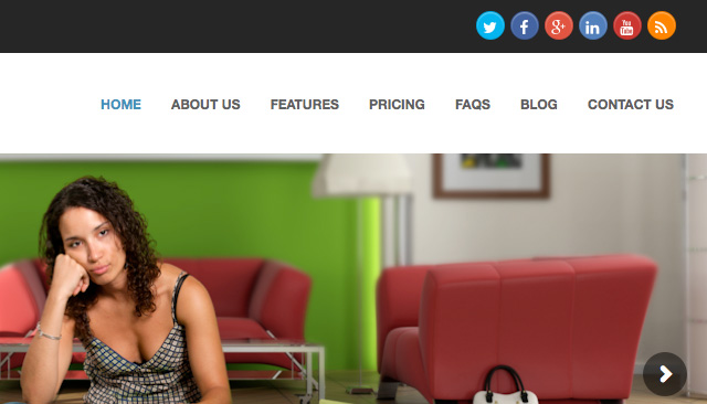
Social Media Icons in the Header
Anytime your client get a visitor to their site, that’s a small win. So why would you want to give them brightly colored little exit signs?
Usually, the point of a social media campaign is to drive visitors from the various social networks to your client’s site, not the other way around. Even if a visitor follows the link with the specific purpose of following your client, odds are pretty good that they will get distracted along the way, and not make it back.

What You Should Do Instead
Your best bet here is to start using social media plugins rather than simple linked buttons. These allow your site visitors to like your Facebook page, or add you on other social channels without bouncing them off the page. The magic all happens on-site, keeping your client’s visitors where you want them.
Otherwise, simply try taking the emphasis off by moving them down the page, to either the footer or a sidebar. Also, it is advisable to style them in a less eye-catching way. They should be visible for those who are looking for them, but by making them too colorful, they will only entice visitors to bounce.
Obvious Stock Photos
Large, full-width images are a huge trend in web design, and they have actually been shown to increase conversions. Unfortunately, photos that are obviously of the cliché stock variety can have the opposite effect. People are turned off by anything they deem to be inauthentic, causing trust to drop, taking conversion rates down with it.

What You Should Do Instead
You have many choices here, which will be largely determined by your client’s budget.
The first choice would be to go custom. People respond very well to authenticity, so if your client’s actual staff, products, and offices can be professionally captured, it will go a long way in the trust department. Custom photography can fall into every price range, so it can usually be doable. These days, even smartphones take very decent photos if you put a little effort into it.
Another option is to stick with stock, but choose much more carefully. I have actually designed many sites using stock photos, but the trick is to find high quality images that don’t look cheap, and/or staged.
Even a lesser quality image that is authentic will connect better than a high quality one that reads as fake.
There are now even stock photo companies that specialize in “authentic” looking images. The kind that look like you would find scrolling through your Instagram feed. Alternatively, check out this list of stock photo alternatives.
Email Links
If part of the website you’re designing includes some type of staff bio page, the question of email links will inevitably come up. It’s a very easy way of letting people get in touch with staff members directly, but it comes at a cost.
First off, when you click an email link, it will trigger your computer’s native email client, which you may or may not use. For me, the Apple Mail app opens up, which I don’t have set up, so I then have to quit out of that. Then, I must right-click the email address to save it, and paste it into my gmail.
Needless to say, this is textbook bad user experience.
As annoying as that process is, an even worse problem might creep up. Email links are crawled by robots, making your client’s site a sitting duck for email spam.

What You Should Do Instead
You probably already design with email forms on other areas of the site, (such as the contact page,) so just use this technique everywhere on the site that requires an email address. In the case of individual staff contact pages, just design one template you can use for each staff member, each with his or her own mini-contact form that will send to their email address. There are several advantages to this approach:
- Form emails are easily tracked
- Emails sent through forms can be filtered through apps such as Google’s mail app
- You can set up specific fields for emailers to complete
If you must include email addresses on the site for whatever reason, just make sure they are not linked if you’d like to sidestep email spam. Your clients would certainly appreciate that.
Client-Centric Copy
One of the best non-design elements you can bring to any web project is finely-honed marketing copy. All too often, clients use their websites as a brag-board, shouting to the world what makes them so amazing. The thing is, their customers could not care less.
Site visitors need to be enticed in order to make a conversion. And what entices users? Benefits. Specifically, how will this product or service benefit me?
By taking up valuable headline space to brag about your client, you really aren’t addressing what matters most. Take a look at the following example:

Site visitors don’t care nearly as much about the fact that they have been innovating since 1949 as the company does.
What You Should Do Instead
Whether the site’s copy is coming from your end, or directly from your client, it needs to address the benefits for the end user. A benefit isn’t a feature, and it isn’t a brag. It should address a pain point, a fear or an objection that a customer might have, and specifically say how they as a company can alleviate it.
So rather than “Packaging Quality, Service, and Innovation Since 1949,” you might use “Tired of Paying for More Than You Need? High Quality Offset Packaging With No Minimum Orders.”
This addresses a specific pain point, and solves the problem.
Call-to-Action Ghost Buttons
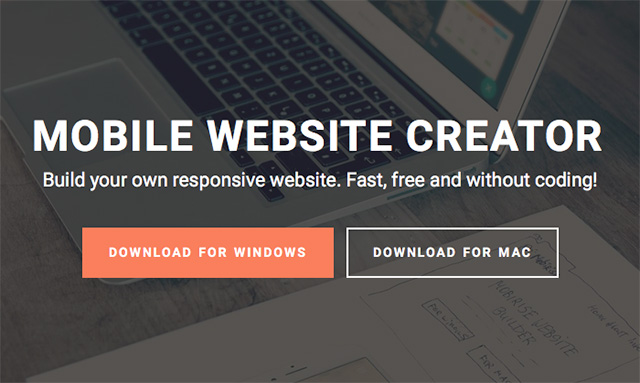
Ghost buttons are a perfect example of form over function. While not technically old-school, (It’s actually a huge trend from just last year,) it takes the visual weight out of a button, by simply surrounding the text with a rectangular stroke. It actually makes for a nice looking element, but it comes with a major drawback: it dramatically decreases click-throughs.
The trouble with ghost buttons is that they don’t always read as buttons. Good user experience dictates that buttons should be obviously clickable, and ghost buttons just don’t hit that mark.
What You Should Do Instead
Simply put, stick with the basics. Your buttons (especially your main CTA) should be styled to look like a traditional button. Here are a few tips in designing the perfect CTA button:
- Color – The color you use for the button should be a contrast with the background and the rest of the page. Don’t go for subtlety; You want your CTA to pop out at your users.
- Shape – It has been said that rounded rectangles work best. Web buttons have always been associated with rectangles, and the rounded corners draw the eye inward toward the CTA text.
- Copy – Use action words whenever possible that highlight what the user is getting, not what they are giving up. For example, “Get” is a much better word to use than “Buy.”
While you should avoid ghost buttons for your main CTA, it can often be an acceptable way to style your secondary CTA, particularly when it is in close proximity to your primary one. Its minimal styling gives it less visual weight than your main CTA, and keeping it close to a more obvious button helps it read as a button as well.

In other words, people will recognize it as a button, but it is obviously meant as the “side dish” rather than the main course.
Final Thoughts
Every now and then it’s good to take a step back to see what time honored techniques and features are adding to the success of our projects, as well as which ones are only getting in the way. We learn more about user behavior and best practices every day, and we should constantly be evolving our methods in order to deliver the best possible projects to our clients.
What do you think? Are there any other common outdated features you’d like to see tossed aside in 2016? Leave your comments below and keep the conversation going!
—
Wes McDowell is a creative director and avvid web design/user experience blogger for a Chicago web design agency. In addition, Wes co-hosts a podcast for graphic and web designers called The Deeply Graphic DesignCast.
Jacob,
link for social media plugins is coming with “page not found 404”
Thanks for letting me know, I have had to remove the link.
Good Content. I want use your idea about social buttons on my website! Thanks Jacob.
These are very simple things but they can prove themselves harmful for the website. This article is very good because the article not only describes the problem but also gives solution of those problems. Thanks for sharing this important article. It will surely help web designers.
Awesome article Wes!
Great… I m very Affected. You have done an outstanding job. I learned a lot from this remarkable article. Thanks
A very interesting read – particularly on the CTA’s. I have never looked at it in that way but when you see the two buttons side by side, it’s obvious which one looks more like a button. Thanks Wes.