This article was contributed by Alice Jackson & Patrick Cole.
First impressions matter! This is why it is important to know the latest landing page design trends. Let’s take a look at where we are at in 2016.

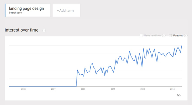
Take a look at the Google trends graph that clearly shows how interest for ‘creative landing pages’ has been steadily growing since 2009. You can also see some landing page software reviews here that compares different services for building successful landing pages.
This is because marketers and professionals are aware that a creative and unique landing page can boost conversation rate dramatically. (Tweet this)
An eye-catching landing page is something every business craves, as it is the best way to convert strangers on your site into paying consumers.
Given the ever-increasing competition on the web, optimization of your landing page is crucial for capturing a visitor’s attention, as well as increasing traffic. Having a well-designed and intuitive landing page is a must for any business.
You could also offer various services such as free trials or coupons for your product or service through your landing page to your customers, and gather information such as their name and email. This is, of course, just one of the many features you can add on your landing page to increase leads.
Below we take a look at 7 landing page design trends for 2016, that you need to know to stay ahead of the curve.
1. Auto Play Full-Screen Video Background
This trend of having full screen videos or images as background is already being used widely by many businesses. Having such a landing page is a treat for the eyes, as videos pack in enough punch to entertain, and engage your visitors. More and more marketers are using this technique for drawing visitors deeper into their websites since it gives them an opportunity to convey their message about the product or service much more easily. If you have an entertaining video, there is little chance the user will hit the back button. For instance, check out the landing page of Walabot.
2. 3D Parallax Storytelling
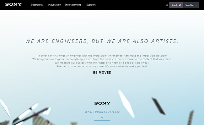
Parallax scrolling is one of the biggest design trends at the moment and has been for a quite some time. It gives the user a 3D effect as they scroll down the page. According to Hubspot, a parallax effect on a website is when content scrolls at different speeds, creating a sense of perspective and depth. If done in the right way, it can engage and entertain your users and help convey your message step-by-step. Tech giant, Sony used parallax scrolling to excite its users, while providing them information about the brand in their now removed ‘Be Moved’ campaign. Here, you can see a video of how the site reacted to scrolling.
Navigation should always be user-friendly but there is no harm in trying out a different method from the usual scrolling. See this post for more sites with unusual navigation. You can have a standard navigation bar on the top or you can try a unique style. For example, have a look at the landing page of Kurka Wolna. It mesmerizes the users with its unique style of providing information while the user scrolls anyway. It is actually engaging!
3. Branded Illustrations
Your aim should be to create a landing page which stands out from the crowd. Instead of using images or videos, you can use illustrations to tell something about, or related to, your product or service. With a unique illustration style, it will give site visitors the feeling of you being different from other websites.
4. No Navigation Bar
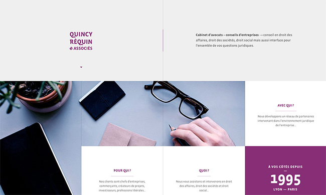
Navigation bars no doubt make things easy for users to find what they are looking for, but removing the navigation bar or trying a different navigation method on your landing page may make your audience spend some more time on your site.
They won’t get distracted by looking at different navigation icons and can focus on what information you have provided them with. This is exactly what Quincy Réquin & Associés legal site have done on the landing page of their site. Each link connects you to a page which provides specific, targeted information. It is their logo design which catches the eye of site visitors when they first land on the page.
5. Super Simplification
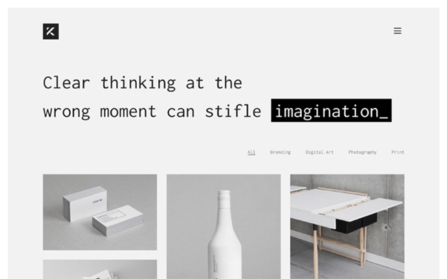
This trend is here to stay. Simplicity is the key to success, right? Though there are a lot of options available, as discussed above, a simplistic design can often communicate much better as it allows the user to focus on the content at hand. For instance, take a glance at this simple yet elegant landing page: Kalium. The focus is on the work, with a simple clear statement at the header of the page, free of other words or clutter. Take a look at your designs and see what can be taken away.
6. Split Screens
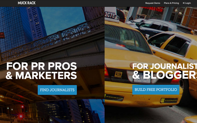
Often a website has multiple target audiences and what better way to split an audience than have a split screen? A good example of this Muck Rack‘s landing page which splits the page between marketers and bloggers. CoSchedule goes even further and has a pop up when you scroll down the page with 3 choices which then loads the next section of the page.
7. Social Proof

Before people make the decision to purchase something or even to subscribe to a mailing list, they usually want to vet out the business that they are dealing with. One of the most common ways to do this is to read about the experiences that others have had. In most cases, this is done by reading product review websites, and by asking peers on social media.
The only problem with this is that when a customer is on your landing page, the last thing you want is for them to be clicking on another tab and diverting their attention to another website. This is why including social proof directly on the landing page is a trend that will increase in popularity in 2016.
Social proof can be added to a landing page using many different options these include:
- Adding badges and ratings from professional and regulatory organizations such as the BBB
- Quotes from satisfied customers
- Endorsements from influencers
- Subscriber and social media counts
- Logos of well known clients
- Media Logos
Each of these items provides proof of quality of products and services and can significantly increase the level of trust that visitors have.
8. Hamburger Menus

Ah, the much debated hamburger menu! More designers are opting to include a hamburger menu on their landing pages as a way to include more information and navigation options without cluttering the page with too much information, or including elements that many find irritating such as a carousel which are admittedly commonplace, but widely maligned. Do see their best practices to ensure a good UX.
9. The Double Opt-In

The double opt-in is simply a method that is used to get customers to perform some sort of verification that they truly do want to receive whatever it is they just signed up for. There are many reasons to use the double opt-in as opposed to the single opt-in.
The first is simply good customer service. If somebody visiting a landing page inadvertently clicks on a button to be contacted by sales representative, for example, designing the page for double opt-in will give them the chance to reverse that decision. As a result, customers do not receive contact that they would find bothersome, and data collected through analytics will show true conversion numbers.
Another example would be a customer who unintentionally signed up for an email subscription. With single opt-in, analytics would simply show that the customer answered the CTA. However, if the customer immediately unsubscribes, or hits the spam button, that number is going to skew high.
2016 Landing Page Design Trends Wrap Up!
In the end, we would just like to say that you shouldn’t simply follow these trends because they’re the “in” thing to do at the moment, but rather utilize trends that are best for your users. It is not essential to use all of these to have a great landing page. Try out any number of these 7 design trends and see how 2016 turns out for you.
2016 Design Trends Infographic

See past web design trends here. Thanks to Coastal Creative for the above infographic.
—
This post was written by DesignHill who offer logo design services.
Really true.A landing page is an essential feature to enhance your web page.You have discussed most of the chararter of a landing page one must build to get great response.
Hello Guys.After reading this new designing themes i want to make my future in this line..
Not a big fan of video landing pages. They make everything run sooo sloowly. And if you’re going to use them, please put a pause button somewhere near. 🙂
Great article. The first one “Auto Play Full-Screen Video Background” is my favorite. A perfect eye catching video in background is the most beautiful thing that can happen in web design perspective. I will try to use most of these. Thanks for posting this article.
Hi,
Landing page is one of the main factor when you are looking to convert your visitors into customers. 70% companies are failed to win from there.
I have enjoyed your article that might be helpful to me somehow to make it my landing page even more creative and useful with full on customer centric informations.
Keep sharing…
I have recently visited these website lalest articles,tips and tricks visit it is usefull for us.
Nice collection. THis kind of collection not only inspires, but also gives us an idea what should we change and learn new to make our own work as per the latest trends.
Super Simplification! That’s right! On my opinion, this one of the most popular mistakes web designers can make. You should always keep the simplicity and functionality in the website design! And avoid a common mistakes.