This article has been contributed by James Richman.
Design trends change every year, and it seems like most of them get hyped up to the point that all the chatter actually hinders the acceptance on some of the trends.

There comes a point where, as a web designer, you start to settle into your own personal preferences, and the idea of expanding outside your comfort zone seems costly and maybe even detrimental to your job security.
The Awwwards Website Trends and Design recognition program is proof that the outliers are the ones that typically get recognition. Awards and big paychecks go to those who stretch the boundaries and try out new, brave and often even re-emerging designs concepts.
You hear about new design trends just about every single year, but this time we wanted to cover some of the re-emerging trends, which have some use, but maybe not the adaptation that they deserve. Let’s have a look.
Split Screens

The split screen is actually one of the most recent design trends on this list, but it deserves a mention since we are seeing a wave of websites that implement gigantic headers, filling full pages and pushing the rest of the content to the bottom of the site.
Split screens, however, take advantage of the space given and promote multiple messages without diminishing the overall look and feel of the website. Split screens also work fairly well in terms of mobile optimization, since one of the components just slides underneath to make for a pleasant viewing experience.
This works particularly well for online stores built with the help of an ecommerce software, where the pricing components, products or features are stacked next to each other. Think about how you can implement split screens in your next design, since it’s one of the less risky approaches you can take in terms of unique designs.
The Ghost Button
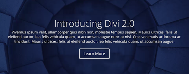
If you take a look at the popular Divi WordPress theme you’ll notice a plethora of ghost buttons. This trend is picking up steam, but we’re finding that many web designers simply revert back to solid buttons because that makes them feel a little more comfortable, or they are concerned about how well the ghost button is going to look or even perform when it comes to CTA (call to action).
The thing is, ghost buttons actually pair better with background images compared to solid colored buttons. Why? The solid colors are more difficult to overlay and predict how well they look with varying backgrounds. Not to mention, ghost buttons have such a sleek and minimalist feel to them, calling out for people to click, yet not causing the website to look cluttered or overpowering. Some do argue they don’t perform as well if your site is there to convert.
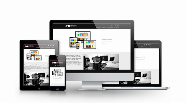
The Grid-based Design

The grid-based design isn’t exactly a new approach, but it’s a somewhat re-emerging tactic for those who are just transitioning to a fully responsive design strategy. The purpose behind grid-based designs is for the grid components to slide around depending on what size screen the user is working on.
Adoption of the grid-based design is essential in order to efficiently put together websites that run well on tablets and smartphones. No, the grid-based design isn’t going to seem that foreign in a year or two, but transition to an approach that focuses solely on grids is relatively new to everyone.
Micro Interactions
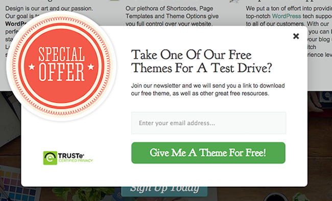
The micro interaction is a small animation or effect that improves the experience for a user. Sure, your email subscription popups are nice ways to build an email list and improve conversions for your clients, but can you improve on that?
Think about a slight shaking effect or moving component on the subscription form that incorporates fun and engagement into the subscription process. A simple micro interaction is known to improve conversions, yet most web designers forget that these minimal changes make a difference.
Mobile-Only Design
Forget mobile responsiveness. Consider the idea of building an interface only for mobile use. China is leading the way in this front, since the vast majority of their consumers are making purchases and browsing the web from mobile devices.
It’s a little far out to tell just how soon we are going to be living in a completely mobile world, but it’s not unfathomable to assume that one day we laugh at the idea of desktop computers.
Ultra-Personalization of the User Experience
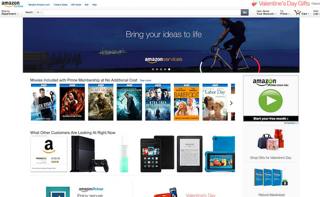
Amazon is known for personalizing every moment on their site, and many other websites make it easy for you to view relevant products that relate to the items you have purchased in the past.
Amazon takes it a step further because they have so much content to offer like movies and books, but there are many sites out there that neglect the idea of personalized content.
When you go to a magazine or blog is there any way that the website logs what articles you have read in the past to serve up relevant content? Sure, you receive related articles at the bottom, but we are still working towards the idea of a completely personalized experience.
The QR Code

Although QR codes had a rather rough time finding the limelight, they are back for their time to shine, and it seems like many countries are adopting them in full force.
In fact, the people of China are all too familiar with the QR code, since websites, magazines, advertising posters and even product pricing tags in stores are including QR codes for people to scan and bring up additional content through a mobile interface.
QR codes are generally known for being used in print ads and magazines, where they bring together the offline and online world.
However, Chinese companies are known for using QR codes on websites, emails and other online content so that customers can simply scan their own computer screen to lock in mobile-based content like songs and wallpapers.
Other countries, like the United States, are lagging behind on this front, but it’s very possible that adoption in China will bleed over to other parts of the world.
Re-emerging 2016 Design Trends
How often would you say you use these unique web design trends? Some of them are extremely popular in other countries outside the US, so that begs the question – when are they going to receive full acceptance around the globe?
Regardless, drop a line in the comments section below if you have any other suggestions on some re-emerging design trends.
Good points and I personally liked the split screen design trend. Ghost button is not any more new, they are into use since long time. But yes these design trends will go further in 2016. I run a local web design institute and I am going to share this post with our students to make them more aware of recent web design trends.
Hi!
Awesome post!
Also, there are popular web design trends of 2016 such as “Card design”, “Material design”, “Minimalism”, “Flat design”. Hope it’ll bring us great user experience!
the design will the people to more attractive if you will add blue color like Facebook.. thanks to share this tele sale
you can create the design to Bootstrap this will help you to Protect Your Time tele sale
Really this is a nice web design trends of 2016.I will try to follow this design. And i thing everyone need to follow this design.