This article was contributed by James Richman.
First impressions are important. Here are 15 that top the list. When looking at any business branding, specifically their web presence, the first thing you notice is the splash page. It is absolutely critical for any website to have an attractive splash page that draws the viewer into the site.

If you you don’t devote a good amount of time for the development and aesthetics of the splash page, users will presume that the rest of the site is equally poor. To make sure you don’t fall victim to the same fate, here are 15 fresh splash screens of 2016, with explanations as to why they make for effective branding.
1. Blue Dolphin Charters
The reason that Blue Dolphin’s splash page makes it onto the list is obvious: its imagery. The splash screen tells a beautiful “swimming with dolphins” story through the use of the dolphins and the diver. The text has been carefully considered to accent the imagery, but is not the dominant feature.
2. Pollen
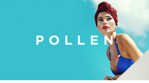
There is something very 50’s about the photography and composition of the Pollen splash screen. Yet, at the same time, there is a clear modernization of the model. The right aligned composition helps to draw the viewer across the entirety of the page, where the angled ledge hints that there is more content below (or to come).
Color has been limited to keep the focus on the brand name, and the white on blue has done well to build a strong contrast.
Overall, the splash screen resembles the marketing and branding of the iconic We can do it! campaign, from the blue outfit to the red bandana. It is this clear and well thought out association with iconic branding that makes this part of the top 15.
3. The Charles
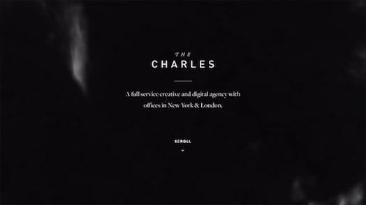
This splash page epitomizes the concept that less is often more. The beauty of this splash screen is that the image relies solely on the text choices and the black and white contrasts.
True, there are a few smoke accents on the screen to help draw the eye up and down, but these are so subtle that they tend to blend into the background.
Businesses should take note that there does not have to be a ton of images and an overextension of fonts and graphics in a design. The Charles has achieved a dramatic presentation using standard fonts and simplicity.
4. Sailing Collective
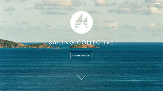
Icon and logo meet photography in this splash screen. Interestingly enough, the splash screen does not have a single sailboat on the page. The logo has a very abstracted image which may constitute as the sails of a boat, but it is left up to the viewer to decide. Or is it?
The blue water and open space make the viewer want to see a boat on the water, especially since the brand is sailing collective. Since there is no vessel on the water, the only association can be with their icon. The viewer is therefore forced to associate the logo / icon with sailing.
5. Heck House
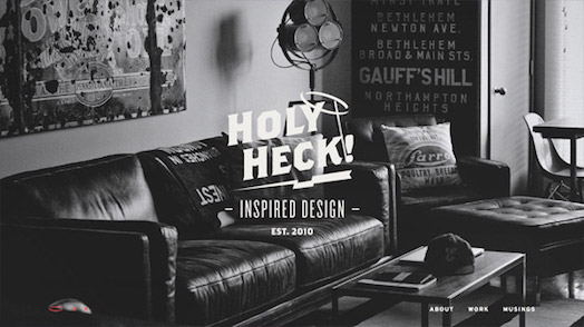
The splash page for Heck House is based on television series of the 60’s, when BLAM and POW were used to accent action points. If you look at the composition of the splash screen, you will see that there is a very distinctive layout that resembles that of the detective and office settings found in shows such as Perry Mason orRacket Squad.
The result of this imagery on the design is a beautifully constructed splash page which gives the business more credibility and history than it actually has, given that Holy Heck was established in 2010. However, if you look at the splash page, you immediately associate it with being around since the 50’s and 60’s based on the image and font choices.
6. Let’s Wander
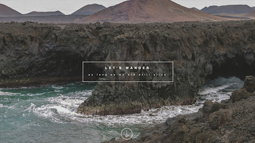
One of the primary reasons that this company makes it onto the list is that their content is multiplied depending on which page you seek.
Yes, there is a main splash page which draws you in and houses an image that just screams “let us go exploring”, but the website also uses other splash screens which encourage exploration and “wandering” as well.
I really enjoy the use of open spaces and the vast expanse of territories not yet charted. Even the cities have an infinite appearance with the use of bird’s eye perspective, 3 point perspective, and the never-ending road.

7. Yttrium
Aurelio Costarella has presented a splash screen with Yttrium that accents the concept of the fashion being presented. In the 2015 splash, the viewer sees that the concept is more to the urban rather than the upscale, luxurious, catwalk style of fashion.
Currently, the splash screen merges an industrial look with a high fashion model. The use of models for the splash screen is not new to the fashion industry.
However, the composition and the beauty captured by Yttrium leans more to the artistic and less to the “buy my product” side of things, which makes this a superb and beautiful page.
8. Garrison
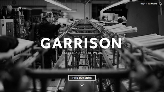
As the clothing and textile industry is a large market, it is essential that companies present a visage that relates quality and dedication to the craft. Garrison has used the image of a worker perfecting the process of making shoes. Opting for a black and white image over a colorized splash screen gives the viewer a sense of tradition and history.
What makes the splash page so ideal for a footwear business is that the machine is just vague enough to keep anyone outside the industry from saying it is modern or classical in its design. All you see is a dedicated worker.
9. Schmoll Creative
Generally, I avert away from pages that overuse the graphics of computers and laptops, as they are cliché. However, when you’ve hired a web designer who can tie in the functionality of their non-digital skills with a computer image and do so artistically, I am impressed.
Schmoll Creative has accomplished a very beautiful and modern page by incorporating not only the laptop (with coding on the screen which is a nice touch) but also with a grid sketchbook.
The image is monotone, and is then reduced in its dominance to give the splash screen a more artistic feel over the digital media feel. The bright blue and modern logo only helps to accent and draw attention to the brand.

10. Lab Case
At a first glance, the splash screen does not appear to have much thought, but when you notice what the company is about, the splash screen becomes ingenious. Digital labs and equipment are sophisticated and often complicated devices.
The use of a simple image and simple text on the page makes the view feel as if the product they are offering is not as complex as it really is.
11. Acne Studios
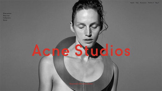
The design and imagery used on this splash page are great prequels to the product, making this a top 15 page. The models are presented in highly dynamic compositions that showcase the fashion.
As the line tends to lean on more non-traditional fashions, it would make sense that the splash page shy away from the traditional poses and capture the models in a more lively and emotionally centered pose.
12. Bacchica
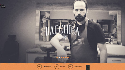
The beauty of the Bacchica splash screen is the use of the slideshow and the antiqued look of the photographic images. The images are specifically placed in a progressive layout, so that the viewer is introduced to the business and then goes on a journey with the barber through the process of a shave and cut.
The blurred background keeps the attention on the close up shots, while the focused images invite the viewer to see more. Unlike many other sites, the font is a focal point of the splash page, and a selection that is both traditional and modern has been used.
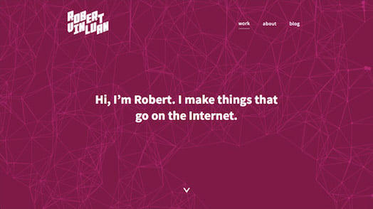
13. Robert Vinluan
If you are going to use bold colors in your splash page, you need work with designers who are user experience-oriented. Bold colors make the user anticipate an action. Whilst there are many companies that have jumped on the Windows 10 simplistic image wagon, many companies have not made their own branding, but have merely copied the theme with the hopes of achieving success by riding the coattail.
Yet, Robert Vinluan has added his own touch to the bold colors that is not only stylish but engaging. Upon opening the site, you are introduced to a geodesic design over the simple but bold color.
Whereas the font does cater a bit to the Cortana software in Windows 10, the engaging mouse and the animation on the page make this a beautifully constructed and executed design.
14. Failsworth
A truly beautiful splash page has been created by merging the old and the new. The use of the caps worn during the industrial revolution combined with women’s style from the 1920s gives tribute to an older fashion.
However, showing the tattoos on the arm as well as the arm warmers give the site a modern appearance. Neither element is overpowering the other, as the images work together and the hues have been dulled to give a calm effect overall.
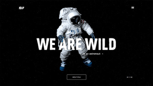
15. Wild
Nothing says that you are a bit on the extreme side like a giant astronaut and some dynamic font. The interactive web company is known for going to the extremes and their splash pages convey that. Even while their site is being updated, they provide viewers with images, quips, and music.
Your Splash Screen
These are just a few of the sites that have used the splash page effectively to create a beautiful design. Remember, a beautiful design is not just images, but how you use the images and branding to relate your company to the public.



Nice article except in the #14 Failsworth commentary the second paragraph references things which are not in the image presented.
Example: arm and tattoos. In my image neither image is there.
Hey James,
You have a great and inpirational list of landing pages for 2016, I like the way you describe each of them. Great content. Cheers!
Think either Pollen or Lab Case are my favourites.
Really great pages but can’t help to think that all those websites are not a big deal without the beautiful pics.
Having a website is crucial in promoting a business and increasing sales. Website is an efficient marketing tool that helps you reach out to your target consumers and get the word out about your apps, software, products or services. You can also use a website as an instrument in establishing credibility in your industry. And one way to make the most of your website is to create a striking landing page for your business. Landing pages of a website serves as a sales page that helps you acquire higher sales and conversions. As an entrepreneur it is necessary that you pick the appropriate theme that will effectively promote your products and services and boost your sales and profit. Here’s collection of Landing Page WordPress themes that are specially built with online business owners in mind.
nice article thank you for sharing..
Great article ,thank you for sharing your info……