This post was contributed by Gabe Vogt.
Between smartphones, TVs, laptops and PCs, the global 4K market will grow from $18 billion this year to $52 billion by 2020, IHS projects. Meanwhile, Apple’s latest iMac models have started using Retina 5K display, and Sharp is selling TVs with 8K resolution.

For web developers and designers, this means that now is the time to make sure their websites are optimized for high-resolution display.
Understand High-Resolution Technology
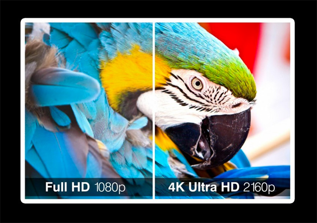
What is the difference between 4K, Retina 5K and 8K? Well, it boils down to pixels. An HDTV with a widescreen aspect ratio typically has a resolution of 1920×1080 pixels, which is equivalent to over 2 million pixels or 2 megapixels per frame. This format is known as 1080p.

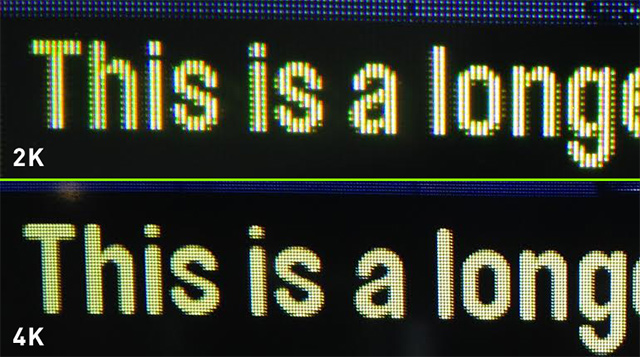
Ultra HDTV, or 4K, increases its resolution to 3840×2160, which is equivalent to four times the number of pixels of HDTV or twice the resolution. Apple’s Retina 5K for the iMac, which is currently the most powerful resolution in the company’s Retina series, bumps up the resolution to 5120×2880.
Retina resolutions for smaller-screened devices, such as the iPhone and Apple Watch, have lower resolutions. Sharp’s 8K TV raises the bar to 7680×4320, or 16 times the resolution of an HDTV.

Use Scalable Vector Graphics for Images
When creating images for high-resolution displays, designers should use the scalable vector graphics (SVG) format whenever possible and avoid raster graphics unless absolutely necessary. Raster formats, such as JPEG, GIF, and PNG, are based on bitmaps or pixmaps where each on-screen pixel corresponds to an underlying memory bit or bits. This means that each image consists of a fixed set of pixels and that as images gain size, they lose clarity. In contrast, SVG images are stored as XML text files that define geometric shapes and paths. This means that SVG images can be scaled to different sizes while preserving their shape and retaining their clarity. SVG images can be created and edited in programs like Adobe Illustrator, CorelDraw and Inkscape.
When designing images for responsive sites, doing a little math ahead of time will save you a lot of editing later. Designer Murdoch Carpenter provides some details for using density-independent pixels (DP) to perform the necessary calculations.

For photos, designers can’t use SVG. One solution is to include both higher and lower resolutions of the photos and use JavaScript to dynamically serve up the correct resolution for the site’s visitor. A drawback of this is that it adds load time to the page. A less elegant alternative is to use HTML to define the image size, with an alternative supplied for high-resolution display.
To better manage your alternate images, use different directories and naming conventions for high-resolution images. For example:
- /images/
- /images/retina
- /images/my-background.jpg
- /images/my-background_2x.jpg
Use a Responsive Front-End Framework
Building on a responsive front-end framework is one of the big keys to successfully designing a site to display in high resolution. Responsive front-end frameworks are prepackaged web design kits that designers can modify to quickly develop sites that adapt to both mobile and desktop displays.

Responsive frameworks come with files and folders of standard code. They typically include CSS source code for creating a positioning grid, HTML typography definitions, solutions for resolving browser incompatibility issues to display correctly in all browsers and standard CSS classes for advanced styling of user interfaces. Leading responsive front-end frameworks include Bootstrap and Foundation.
Use CSS UI Rendering, Font Face and Media Queries

Using CSS strategically can also help designers adapt to high-resolution displays. Just as SVG helps designers scale graphics to look correct, CSS helps scale user interface elements so they display clearly no matter what resolution the viewer uses. The CSS @font-face property performs a similar function for adjusting fonts.
CSS can also help you reduce the graphics load on your site. Many graphics effects can be duplicated in CSS, which is scalable. For example, rather than using a button graphic from Photoshop, you can use CSS to create the same effect. Similarly, CSS can be used to create scalable gradients and other effects.
Designers can also use the CSS Media Queries’ @media rule to detect the user’s device and then adapt the display accordingly. Another major use of media queries is controlling which non-vector images will be loaded based on their resolution, which is a technique to save bandwidth, increase download speed, and improve user experience.
Structure your media queries by using a “mobile first” methodology which covers all major device and display options and also includes a high-resolution query. Display options you should cover include:
- Portrait and smaller
- Tablet portrait: small desktop
- Desktop
- Wide width format screens
- Retina
Here is a sample of what a media query CSS script might look like:
// retina tablet portrait
@ media only screen and (-webkit-min-device-pixel-ratio: 2),
only screen and (min–moz-device-pixel-ratio: 2),
only screen and (-o-min-device-pixel-ratio: 1/2),
only screen and (min-device-pixel-ratio: 2),
only screen and (min-resolution: 192dpi),
only screen and (min-resolution: 2dppx) { body { background-image: url(../images/bg-body_2x.jpg);
}
}
CSS
Ensure you take these measures so that your website optimized for a 4K or 5K display, as that’s where displays today and are increasing. And beyond!

Great article.. I have just finished a website for a client and he has one of those large IMac screens.. it was a bit difficult to manage the work flow initially but everything worked out in the end.. Keep up the good work!
Really unique article and useful too because it is very important to optimize our blogs for modern devices i.e, 4k displays. Thanks for the article.
very pleased to be read helpful articles where a lot of creative people will be helped , thank you
I will share this information with my friends and they will certainly love to read thisVery informative, I’ll definitely give these 5 stars.I enjoyed reading each and every line of your post.
http://www.blitz3ddesign.com/3d-walkthrough-animation-services.html
With the ongrowing advance technology today, as we are focusing on making or developing site both mobile and PC friendly, we should also mind to create sites that seamlessly compatible on modern devices with 4K and Retina 5K display.
The constant increase of computer monitors can’t leave web designers untouched. We have to keep in mind what looks good to the end user (visitor). Designing scaleable graphics is the only way to achieve a wonderful website that looks good on any device. Technology is always evolving and so must a designer do.