The art and science of logo design is continuously changing as businesses can now engage consumers in an increasing number of digital channels. The frequency of engagement is increasing at a rapid rate, while the quality of engagement has become more inclusive, more personal.
New: 2016 Logo Design Trends Report
Released on May 23, the official 2016 Logo Design Trends report is here. Click the link above.


Considering everything else that is happening, the way in which business logos are designed is changing as well. The “rules” that worked before the turn of the century no longer count today. In fact, what has held true for the last five years no longer has the same authority. The art and science of logo design is changing as fast as the “opportunity to engage consumers” grows. And again, this “opportunity,” is changing as fast as technology develops.
Fortunately, there are many people who have dedicated themselves to closely studying these changes, establishing patterns and forecasting trends in logo design. Bill Gardner of the LogoLounge (read the interview here) remains one of the most credible sources for such forecasts. His observant eye and attention to detail, as well as his innate “radar” to detect design approaches fast becoming “trends”, is what sets him apart from the other forecasters.
So what will logo design be like in coming months, or in the near future? Here are six logo design trends that are forecast to strong in 2016.
2016 Logo Design Forecast 1: Flat
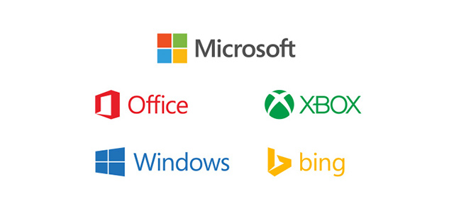
Flat designs will continue to dominate and not because they look clean and forthright, but because they register well in any browsing device, especially due to SVG. They load a lot faster too. Patterns, textures, shadows, gradients will give way to simpler lines and colours. These register better in print or online, in black, grey or colour, and on any browsing device. Companies will lessen or simplify their design elements making them easily identifiable, almost iconic.
2016 Logo Design Forecast 2: Handmade
Handmade logos speak of honesty. They somehow convey an effort to be intimate or personal. This trend has been slowly gaining ground for several years now. It is not something new. A small sketch of an arrow, or one or two scribbled letters prominently combined with some other design elements have been evident in a growing number of company logos. Some look like “hybrids.” They’re the ones that don’t look “truly” handmade but they don’t feel digital either. Such designs suggest the idea of being handmade and yes, they also do seem to register the same charm, though not on the same level.
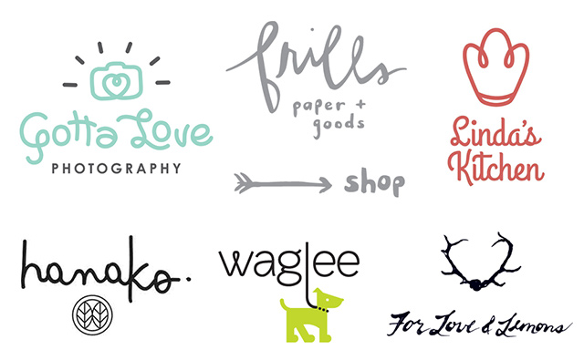
Handmade elements and font sets, or a suggestion of such, will be more evident in logo design as the year progresses. Bespoke font sets will be a valuable design asset.
It is important to emphasize that typography is no longer just the style of text you add to the design to spell out something. It is, and will always be, a great contributor to communicating the brand’s personality.
2016 Logo Design Forecast 3: Kinetic Logos
Dynamic logos, kinetic logos or logos that change-but-remain-the-same will find greater appeal. Perhaps because the style offers freshness, or it could be because the decision of what is attractive becomes even more personal, while the need to connect to as many people as possible becomes the priority.
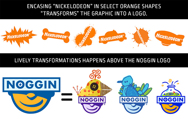
It has also become a great way of breaking down information and communicating it in “byte-sized” pieces.
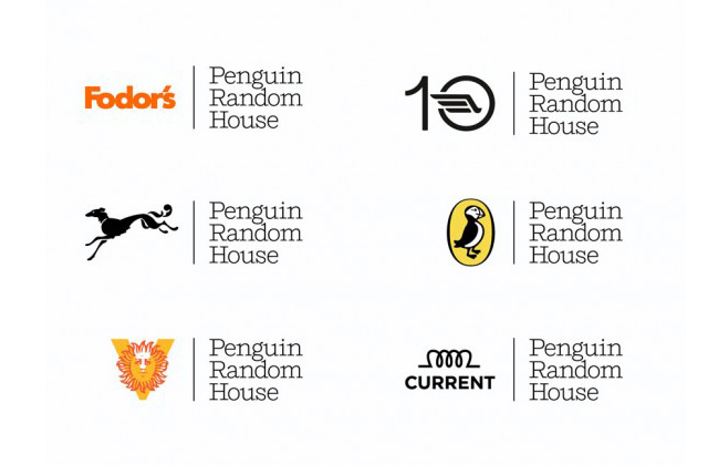
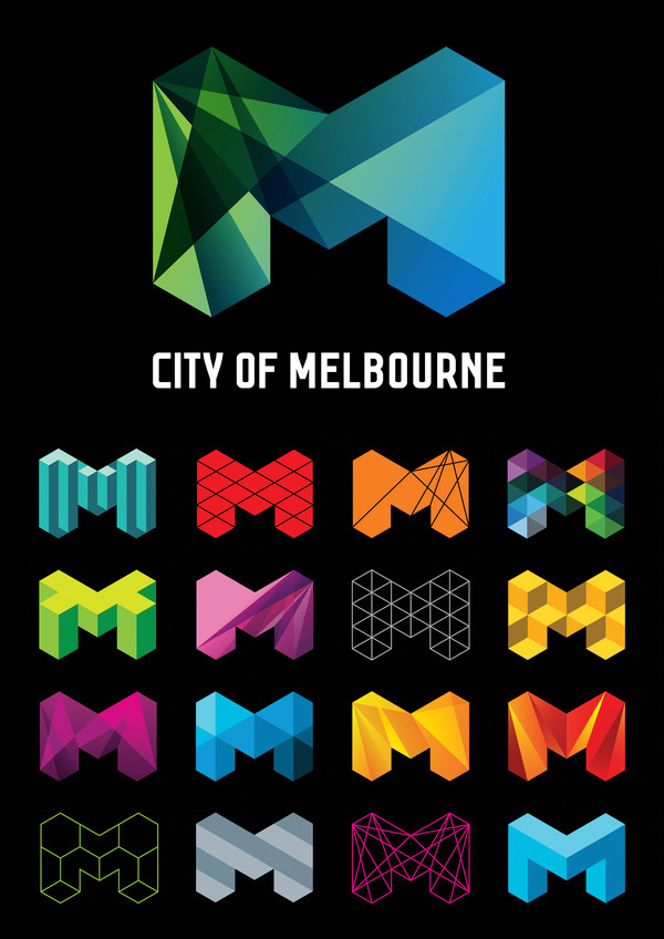
This type of logo has the ability to make consumers unconsciously aware of the direction and diversification the company and brand is pursuing in real-time. The danger lies when the “kinetic” change does not “rhyme” with the core values the company has effectively communicated and has established for itself.
Think of the daily changes in the Google Doodle and you will get the idea of how this growing trend both fascinates the consumer and answers the need to present something fresh on a regular basis.
2016 Logo Design Forecast 4: Negative Space
Negative space will continue to amaze. A design is something you see first, but then it speaks to you and you understand what it is saying. That is what makes a design work. If it is able to convey more than this, and the consumer is able to pick up on a deeper message, it becomes much more special. This is why negative space will continue to lure many to explore its strengths.

The ability to communicate “more” to the consumer without adding extra elements is a challenge to a designer. To the public, it’s a welcome visual “egg hunt.”
2016 Logo Design Forecast 5: Letterstacking
Letterstacking will continue to hold ground. This trend has been around for quite a while but is it not losing popularity. Perhaps it is because it draws in the consumer and challenges them to make sense out of it.
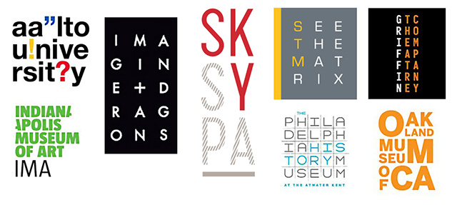
There’s a nagging suspicion that our tendency to break down things and discover how we can rearrange them better is not the reason for this continuing trend. It may be because it offers a creative solution for logo designers to be able to present long “text” in visual bytes. It offers them a creative way to break down long messages. Whatever the reason may be, the style seems to work and has gained a foothold in logo design.
2016 Logo Design Forecast 6: MonoLines
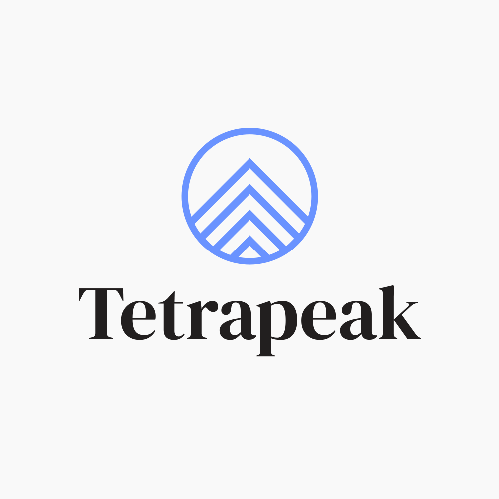
Thin Lines/Mono Weight will present itself as “the fresh, clean look”. This is the use of a line, unchanging in thickness, to design and compose the entire logo in something akin to “wire”. At first glance, this logo design style seems to run against the idea of “simplification” because of the “intricacy” of the execution.

A deeper look, however, will result in an appreciation of its ability to present something clean, clear and outrightly “honest”, with a hint of craft (handmade). This makes it more in line with the above mentioned forecasts rather than against them.
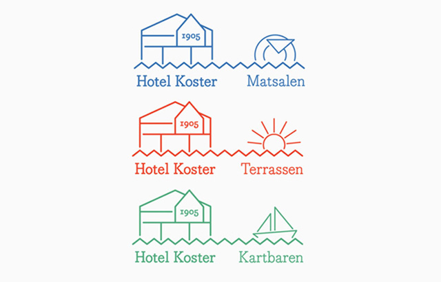
True, it offers so much, and yet, the clean thin lines do strike you with an “honesty” that is quite refreshing. It presents a welcome break from seeing so many gradients and colours in the last few months, if not years. The use of thin lines, or lines with a consistent thickness in mono scripts, mono icons and mono crests, is a lively progression of just how strong this design style has been growing over the past few years.
Trends for Toppings

The frequent and more personal interaction between brands and their markets has resulted in greater challenges on the part of the companies behind them to continuously and effectively communicate their messages uniquely and creatively.
Changes in the design of logos are common. As the company grows, as its interests diversify, as its personality and values change, so too must its logo. It is for that purpose it was created – to visually communicate the company and its values.
Trends are like the sprinkles you put on top of an ice cream sundae. You already know how your ice cream will taste like because you picked the flavour. You can opt to add sprinkles. These will make it more exciting to the eye and probably add a bit of texture or crunch, but they will not change the flavor of your ice cream. If your ice cream is Vanilla, it will still taste of Vanilla. If it’s Rocky Road, it will still have the chocolate flavour and the nuts. Adding sprinkles on top does not change the ice cream. It will simply make consuming it a bit more “interesting”.
That is how it is with trends. They can add a touch of visual excitement, of freshness, or “now” in your logo. It must still have something to say. Something about the company that must ring true. Adding a trendy design element is like topping your ice cream with sprinkles. It simply won’t make a difference if you happen to choose a flavour you don’t like. It’s the same with design trends. Adding something trendy to your logo will not help if your logo is poorly designed, if the message your logo must convey is not well communicated or understood, or simply and sadly, does not exist.
But wouldn’t it be great though, if you could have the perfect ice cream flavour and have everything on it?!
New: 2016 Logo Design Trends Report
Released on May 23, the official 2016 Logo Design Trends report is here. Click the link above.
—
Shout out to Chandra, a graphic designer and content writer at welogodesigner – a creative logo and graphic design team. Connect with him via Twitter.




Kinetic logo desing should be intended for different enterprise departments of companies who have a solid position on the market. New companies shouldn’t be doing this. The negative space examples you showed here are as you mentioned – amazing.
Superb, Thanks a lot for sharing 🙂
Creative
Great share, thank you! Especially a fan of the dynamic and letterstacking styles.
thanks for sharing this type of helpful articles,
Wow its nice, seriously loved it and creative !
Logo design is definitely all around us. To the public, logos serve as an instantaneous reminder of a company or a product/service, with that, it’s vital that the image stands out from the rest. You have to be unique and clever in creating one.
It’s a great forecast about logo design 2016. Obviously it help us to providing business service. Thanks for trust able forecast.
Great insight! I think truly, “dynamic logos, kinetic logos or logos that change-but-remain-the-same will find greater appeal” indeed — and probably, we may be even underestimating it effectiveness in communicating specific idea (or service/product) at a time while still maintaining the uniqueness of the brand.
I love it!
I Like design logo bing, Microsoft.. 😀
Shark tours – sinking boat and shark 🙂
In your article you quote “…the way in which business logos are designed is changing as well. The “rules” that worked before the turn of the century no longer count today. In fact, what has held true for the last five years no longer has the same authority.”…yet in your first forecast you say that ‘Flat’ will be the number one forecast.
Flat – the most basic form and best way to design a logo since forever.
Sorry but this is nothing new and its the same ground that was trodden 20 years ago. The only logo I see on that whole presentation that was is game changer is the Melbourne logo.
Really nice source of inspiration, thanks for posting! I think flat design is more than just a trend. It’s timeless. A good logo doesn’t need gradients or drop shadows.
What a fantastic post! Thanks a lot for sharing with us.
I love flat design 😀
Logo design is a design where a creativity is needed. So creative work such as logo design is my choice.
Super Logo!
I love graphics world and designing…
Thanks for share
Hello Chandra,
Thanks for sharing this logo design trends list. Great experience of visiting your blog. It is a very creative & helpful blog about logo design trends .
Thanks for sharing these designs. Negative Space and Kinetic Logos are really capturing the internet nowadays. I have seen many top brands and businesses having these logos. Also the new startups are going for them.
Excellent recommendation for designing logos.
I love flat and minimal concept. its very professional and neat.
A good logo doesn’t need gradients or drop shadows.
Nice post coverd everything about the forcast. Negative Space concept is the most i like.nice share of info
Nice post covered everything about the forecast. Negative Space concept is the most i like.nice share of info
The new Zune browser is surprisingly good, but not as good as the iPod’s. It works well, but isn’t as fast as Safari, and has a clunkier interface. If you occasionally plan on using the web browser that’s not an issue, but if you’re planning to browse the web alot from your PMP then the iPod’s larger screen and better browser may be important.
Fantastic post… In love with “Letter Stacking” and “monolines” logo forms… Looking forward to try them this year…
Thanks for sharing this great post! It is totally about 2016 latest logo trends. I love this post very much. Various types of logos are described here. As well, many important things are required to keep in the mind for the selection of a logo design. Really, I am enjoying this post for selecting the logo designs. Great post!
Hi! We’re an independent band with very little means of earning as of the moment. We would like to take on new challenges, but we lack the most important thing: a logo. We are currently completing applications but without it, our profiles seem to be missing something and tends to be ignored. If you happen to be able to help us, we will be forever grateful. You could reach me at [email protected] , or you could leave your email so I could reach you.
There are some really great notes in the post and I would like to give special thanks to the writers for the post. thanks for the post about 2016 latest logo trends.
well thank you for the article, nice work I like
Worthwhile, Because detailed and informative. Some idea brings me here to catch them perfectly. Thanks Jacob, Again.
Awesome informative blog post on logo design!
My favorite logos are the ones that incorporate negative space. I feel like these type of designs have more than one message and really connect to people more than a flat design. Unlike a flat design, those that use negative space also tell you more about what they are all about and so there is no guessing at the company behind the logo’s purpose.
Outstanding! Thanks for sharing this. Definitely gave me further insights and inspirations on logo design.
Very good
Flat logo designs also loads faster!
Outstanding! Awesome informative blog post on logo design! 🙂 ?
Checkout this link for best logo designs:
https://www.fiverr.com/oyeratz/design-an-outstanding-logo
Nice forecast about logo designs. This is Awesome! Thumbs Up for you 🙂
nice logos ideas. This will help me in making my logo. Thanks for sharing.
Nice! Thanks for Sharing.
I liked negative space design.