It’s been a long time since Joe Harrison showed us how a truly responsive logo should behave. Yet despite the continued rise of mobile, the logo itself still seems to be having problems adapting.
Let’s try to get to the bottom of just what is the problem of the logo in a responsive design world.


The irresistible rise of mobile
Here’s something you already know. Mobile usage has overtaken desktop and only the foolhardy now fail to provide mobile-friendly sites.
Google has forced some of these recalcitrant few to up their game as fear of its Mobilegeddon forced around 5% more sites to take the mobile-friendly plunge.
The favoured route is responsive design.
The challenge for logos
Yet looking at responsive sites there remains one element on the page that often jars. This is something that many of us have forgotten about or are forbidden to touch.
It’s the logo itself.
The brand symbol simply often does not, or cannot, respond well to changes in how it is displayed. And this is a very real problem.
The demands of responsive web design are placing more and more pressure on logos to adapt to smaller screen sizes. But so far they just aren’t responding responsively.
Let’s take a look at a couple of examples.
Some sore thumb logos
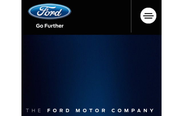
Ford’s tagline may be Go Further but the oval shape of its logo does not allow it to adapt well to smaller sizes: there simply is no further it can go. As a result it has to sit uncomfortably and conspicuously large on the mobile display.
It looks like a clumsy footed dancer at a ballerina’s party.
The Ford logo has been discussed by Econsultancy’s Christopher Ratcliff in his review of the problems some logos face in a responsive design world.
He has the candour to include the unresolved issues that Econsultancy faces with its own logo.
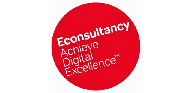
That long name and that tagline combined with a circular shape make responsive reduction in size a challenge.
The solution adopted by Econsultancy strikes me as both brave and, perhaps, foolish in equal measures.
On its blog pages a new square logo is used, with the tag line dropped. (Square, of course, being a much more easy shape to scale.)
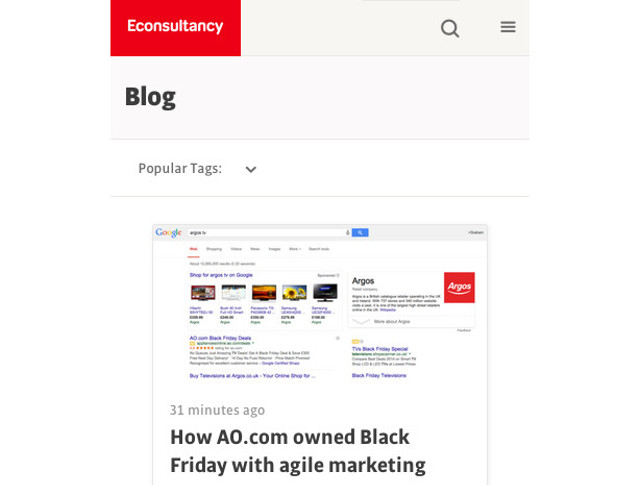
But on the homepage, in an apparent desire to have their responsive cake yet still enjoy their former livery, the ‘new’ logo is used alongside the ‘old’ logo.
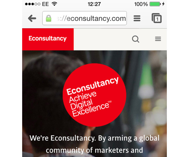
Christopher Ratcliff explains this rather defensively:
“We’re not just a blog, we have an entire portfolio of training courses, research and reports to offer our customers, so our homepage needs to reflect this.”
Here lies the problem of the logo as it shrinks responsively.
It can say less and less. It begins to act as a visual identifier rather than a brand value carrier. And this is something many are uncomfortable with.
Responsive Logos
We’re going to need to get used to it however.
Designers have always allowed logos to be displayed in different ways depending on context. A quick flick through any brand guidelines will reveal different iterations of a logo according to its usage.
In the responsive design age this has never been more important.
Yet so many brands continue to simply shrink their logo rather than have it behave truly responsively.
Joe Harrison famously experimented with what this may mean a few years back. He took the iconic logos of big brands and put them through their responsive paces.
If you haven’t seen his refreshing approach on the Responsive Logos website take a look now. It makes logos behave like every other element in a responsive design space as they adapt to different screen sizes.
These logos don’t just get smaller: they change shape, simplify and lose words. In short, they respond.

The overburdened logo
Part of the problem, as we noted above, is the weight of expectations placed on logos.
It is anathema for many to see logos as just a visual hook. We want them to be the bearer of brand values and organisational tradition.
With so much burden placed on the logo it’s no wonder it struggles to respond lithely.
Perhaps when designing logos for the responsive age we should try and bear the following in mind:
1. A logo is not a brand
2. A brand is not a logo
3. A logo is the same as other elements of the identity system, such as colour, slogans, and emblems.
4. Logos should be simple and clear memory hooks. Nothing more, nothing less.
Once we accept this the logo can start to respond responsively.
At last.
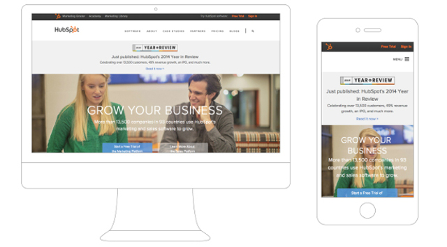
Look how Hubspot simply drop their wording and opt for a simple, recognisable and scalable icon.
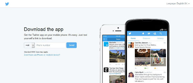
Or how Twitter drop their wording on both desktop and mobile.
Forget the problem! What’s the solution?
We need to approach logos differently. Here’s how.
We can revise our logos so they become simple and scalable. Or we can just relax a bit and be much more flexible in what can and can’t be done with our logos.
The only other alternative is to waste valuable screen space on an unscalable logo or to allow it to render as an indistinct fuzz.
And that is a real no go, rather than a logo.
So what will it be?
—
Matthew Fidge adapts responsively to any given design and marketing challenge at Brighton’s Keystone Copy. Follow his erratic – but occasionally wonderful – thoughts on Twitter.
Definitely an important concept to keep in mind when designing an identity. Aside from the standard single-line and stacked versions, I always think ahead as to what sort of abbreviated logos we can create for use on social media, as an avatar, for example. The ability to incorporate multiple versions that still feel part of a whole is a challenge, but one that rewards a brand in its extended use.
Thanks for post responsive logo for website design.
Hi Jacob,
This is an excellent post. I would like to reference it at some point in a blog. I will definitely share it with my clients. Its very important and obvious thinking that people (including designers) don’t think about! I didn’t see a Linkedin share button on your post. I really think this is an important topic that should be shared.
Thanks for bringing this to the forefront!
Karen
Great post! All of this information was helpful. Thanks for sharing.
It is pretty important to pay attention to all design aspects because of responsiveness. We had done a logo for our business a few years back and now had to go back to redesign it, so that it fits in with the responsive site.
Cheers,
Mark
Your subscription link is dead.
Sorry what do you mean Caleb?
I tried to subscribe for the free ebook, and I landed on a blank page, that’s what I mean.
Great post!
Thanks Jacob, I found this article very useful and informative! I am new to online marketing and this is something I am working on now, as I look at branding. I found as well several of your related articles to be great pieces and very informative. I have added your blog and site to my list. Much appreciated!
This article is very helpful, especially for a web designing company like me. It is really very important to pay attention even to the smallest details when it comes to creating a logo for your company. Website logo is your identity and is very important most especially for starting up businesses.
This post has helped me a lot in improving my business MR Logo Designs. The little details to pay attention to is very crucial and important in developing a web logo perfectly suited for a particular company or business.