Have you ever wondered what web sites look like in different geographic parts of the world?
Check out these 17 great WordPress powered websites from all over the world and see what makes them work.

Bonus: See the bottom of this post to get 30% off WordPress Themes and your chance to win some awesome prizes!
* * *
Dagobert (France)
Try out website’s navigation it’s really something. There are drastic animated effects, sliders and transitions. The website is as spectacular as the country itself.

* * *
Veltenmedia (Netherlands)
This bright and trendy website is the handiwork of Netherlands developers. It’s modern, bright and cheerful, with a video background on the home page. The guys definitely follow the latest web design trends.

* * *
Inventid (UK)
What can we say about this website? It’s bright and flat. The chaotically placed elements looks rather interesting, especially in combination with the various hover effects. They have two types of menus: the regular horizontal and the hidden one which appears on click of the relevant icon in the right top corner of the page. Not bad.

* * *
Juergen Knoth (Austria)
The most outstanding features of this website are the full screen beautiful background photos and the uncommon navigation placed at the bottom of the page together with the logo. Also check out the “Stories” section which is fairly unique with its UX.

* * *
Bluecadet (USA)
This website features a video instead of a slider, smooth hover effects, large responsive images, ghost buttons and lots of other terrific features. The website is really content-rich, but still minimal.

* * *
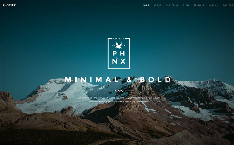
Phoenix (Romania)
You can use main menu or just scroll down to navigate through the website’s pages. Have you noticed that designer’s made each next page title in the form of the huge ghost button framed with thick borders? Rather creative, uncommon and minimalist, isn’t it?
* * *
Meson (Canada)
The designers perfectly rendered the atmosphere of a cozy restaurant where you can relax, drink coffee or a cocktail and think on your own, invite your beloved person for a romantic date, have a tasty dinner with friends or family and much more.

* * *
Ander Shede (Denmark)
This wonderful website features a trendy blurry video background and is a great example of minimalist design as videos tell much more than words. The menu is also hidden and when touched, appears large on full screen.

* * *
David Hellmann (Germany)
A humorous approach to design is always perceived well by the visitors and this designer seems to have found the way to customers’ hearts. The combination of grey and pink colors is rather unexpected here. David’s close-up photo decorates the home page and stirs trust in his work. The feeling is similar to the one when you meet personally. The impressions after such meetings are always deeper and much more positive. The website is packed full with visual effects as well, which add interest to its browsing.

* * *
Tomasz Stolz (Poland)
This photographer’s website is adorable & very unique. It perfectly reflects the creativity of its owner. There a lot of unique elements including the logo, huge HD photos, frames at the screen corners, noise applied to some elements, fly-out menu, hover effects & the violet buttons. It really differentiates this particular website from other photographers’ portfolios.

* * *
Dynamo (New Zealand)
A clean, serious website for a modern business company offering IT solutions. The blurred video background gives the brand a dynamic look but doesn’t distract the visitors from reading its main message. The home page could feature more information though.

* * *
Art Walk (Mexico)
A very creative website that really walks us through its pages, and we enjoy the trip. The site owners show us not only the day view but also a night view with the glowing neon title. We instinctively follow the moving lines, circles and squares on the home page and they enchant us. The colors present onsite are bright, but balanced. They gradually change each other and hover effects respond from our actions.

* * *
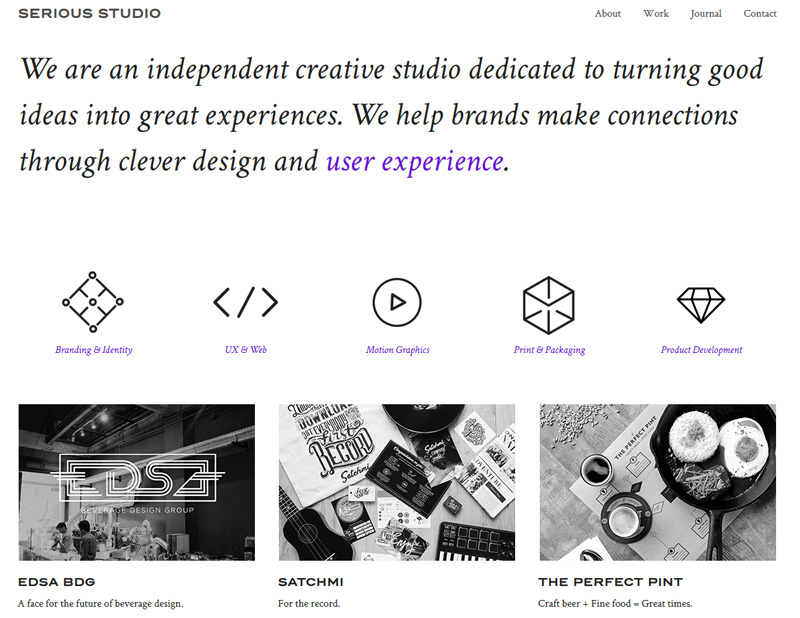
Serious Studio (Philippines)
Black and white layout is definitely the spice of this website. But that’s not all, far from it. The animated sketchy icons of the main menu are super creative and each project featured on the home page has hover effect which prompts that it can be enlarged for better viewing. There is also an embedded video under the content area. Just look at the cute retro phone at the contact section. Have you ever seen anything similar?
* * *
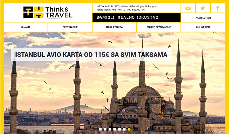
Think and Travel (Serbia)
All design elements are placed into a grid which makes the site simple and easy to navigate. Again we can observe a nice blend of contemporary styles and love it.
* * *
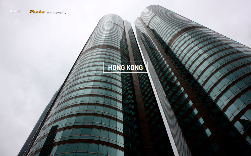
Pecha Photography (Czech Republic)
This website draws the visitors’ attention by its impressive full screen slideshow, showcasing the company’s best works. The fly-out menu is placed on the semi-transparent text block and is easily accessible without being distracting. The contact page is also unusual, showing behind the scenes.
* * *
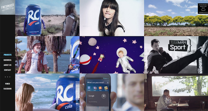
Fineshmaker (Israel)
This makes film grain / noise a consistent branded element and the retro logo at the center of the home page is superb. The copy on the site is kept concise which helps focus the visitors’ attention on the most important information.
* * *
Bulgari (Italy)
The most outstanding feature of this website / lookbook is surely its glossy-magazine style design. But the developers moved even further than just incredible HD images, they embedded videos into “magazine pages”. Stunning photography makes this site stand out.

* * *
Same Same, But Different
Even after viewing these websites from around the world, you will notice that they all follow similar trends and styles, although they still are vastly different from Japanese, Chinese and Arabic style web designs.
Do you have a website from another country you would like to share? Please do in the comments.
* * *
BONUS: Get 30% off WordPress Themes + Win Awesome Prizes
Grab any one of TemplateMonster’s wordpress themes to automatically be entered in their end-of-the-year lottery which has one awesome prize every week, until December 27!
Get 30% off only for JustCreative readers. Simply type “justcreative” as the promo code before you checkout! The promo code is valid till the end of 2014.
* * *
About the Author: Helga Moreno is one of the devoted members of friendly copywriters’ society. Visit her Google+ account, she will be happy to add you to her circles.
Just how incredibly the world exhibits web design prowess!! Thank you! I was just researching on design trends of 2k14 and how far have we reached and your insights made things a lot easier for me! Great!
Seems Quite Similar! Maybe following the design trends. Lets see what New year 2015 will bring some changes in design trends.
Nice collection
The Dagobert menu is really something.
It’s weird that background video on The Veltenmedia homepage is not working for me even though they really do have a video implemented.
One thing I have noticed, the trend of big high-res images on homepage could be the mostly used and most popular one among other web design trends.
Great collection.
Awesome collection.
The Phoenix website looks amazing .. However the Jurgen Knoth site looked very nice on the front cover but when I went to the site it is showing up as blocked… is anyone else having the same problem?