This article has been contributed by Ajeet.
With the torrid growth in the usage of mobile devices, it has become quite crucial to accommodate responsive design in your email marketing strategy. That’s because when an email newsletter, which looks look superb on desktop, fails to render properly on a mobile device, respondents either hit delete or unsubscribe.


With responsive email design, you will not only be able to stay ahead in the email marketing game, but also can take the full advantage of the mobile revolution – an unstoppable change.
This article is written with the intention of making you expose to the exceptional benefits of implementing responsive design in your emails and teaching you the fundamentals of building responsive emails. Hopefully, it will help you make your email communications more effective, delivering your recipients an optimal viewing experience.
Why You Should Adopt Responsive Email Design
According to a recent study by Litmus, a reputed email analytic provider, over 51% of emails opens occur on mobile devices and people check their phones an average of 150 times a day. A survey conducted by BlueHornet, a leading email marketing solutions provider, has revealed that if an email is not optimized for mobile; over 80% of recipients delete it and another 30% unsubscribe it. Additionally, over 63% of consumers are interested to make a purchase, if they find an email look good on their mobile devices.
These all statistics not only demonstrate the rapid adoption of mobile devices, but also make you aware of how comfortable people have become reading emails on the go. Following are the key reasons why you should optimize your email for mobile devices :
1. Enhanced User Experience
When you incorporate responsive design in your email, your readers are able to access it while they’re on the move. They can navigate with ease and don’t have to pinch or zoom to read the content of your email. Bigger and better-spaced CTAs clearly tell them where they should click to make a purchase without having to worry about imprecise clicking. If they find your email look perfect on the receiving device, they can be interested in reading rest of your emails.
2. Increased Conversion Rate
If your emails and landing pages are well-optimized for mobile viewing, you don’t need to worry about low conversion rates which caused due to a non-responsive/faulty design. Responsive emails enable you match how you sell with how your consumers shop your products or services, hence you could get unlimited orders regardless of where your emails are consumed. No matter your customers are on the go or seated relaxed in office; they’re always ready to make a purchase.
3. Bigger Sales
Once you’ve got success in capturing the interest of your readers, chances are they will prefer to make the purchase on a mobile device rather than on a desktop or laptop. Responsive emails render perfectly on all types of devices, creating a great first impression with your customers. Think, if your customers take the decision to purchase your product/service while seated and relaxed, are you not likely to sell even more?
4. Higher Click-to-open Rate
Responsive design is more powerful and effective design technique than fluid and scalable design. Though it is little bit difficult to implement, but is the best mobile email design strategy to boost your email open rates. A recent study by MarketingProfs has revealed that responsive emails have a 21% higher click-to-open rate (11.9%) than non-responsive ones (9.8%). For this reason, it’s better to go 100% responsive than scalable or fluid.
5. Reduced Unsubscribe & Spam Complaint Rates
As we mentioned before, if an email doesn’t display well on mobile, 30% of recipients unsubscribe it. When your readers are not able to view your emails properly on their small screen devices, they can mark your messages as spam – an email reputation and deliverability killer. By adopting responsive email design, you can create a wining first impression and avoid frustrating your readers, resulting in lower unsubscribe or spam complaint rates.
How to Make Your E-mail Design Responsive
After understanding the importance of responsive email design, let’s learn how to incorporate responsive design in your emails.
Responsive emails make use of CSS media queries, also known as @media, which are the main part of responsive design. Media queries are a special set of CSS styles that work like dynamic CSS rules or conditional ‘if-then’ statements. They detect the screen size of a device and then apply different dynamic rules to render the content according to that screen size. Carefully implemented, they can optimize readability of your emails for different screen sizes.
Different types of mobile devices support different media queries. This means you need to target different devices according to their screen resolutions. For example :
|
1 2 3 4 5 6 7 8 9 10 11 12 |
<style type="text/css"> .standardCSS{ color:#5d5d5d; font-size:20px; } @media only screen and (max-width:480px){ .mediaQueryCSS{ color:#d9d9d9 !important; font-size:25px; !important; } } </style> |
This media query restricts the rendering of CSS styles to the screen size of 480px or less. Every style rule you write within the media tag should end with “!important”. So that, the media query CSS override any inline style once it’s triggered. Following is a list of CSS Media Queries for most popular devices :
- Smartphones: Portrait
@media only screen and (max-width : 320px) - Smartphones: Landscape
@media only screen and (min-width : 321px) - Smartphones: Portrait and Landscape
@media only screen and (min-device-width : 320px) and (max-device-width : 480px) - iPads: Portrait
@media only screen and (min-device-width : 768px) and (max-device-width : 1024px) and (orientation : portrait) - iPads: Landscape
@media only screen and (min-device-width : 768px) and (max-device-width : 1024px) and (orientation : landscape) - iPads: Portrait and Landscape
@media only screen and (min-device-width : 768px) and (max-device-width : 1024px) - iPhone4
@media only screen and (-webkit-min-device-pixel-ratio : 1.5), screen and (min-device-pixel-ratio : 1.5) - iPhone 5: Portrait
@media only screen and (min-device-width : 320px) and (max-device-width : 568px) and (orientation : portrait) - iPhone 5: Landscape
@media only screen and (min-device-width : 320px) and (max-device-width : 568px) and (orientation : landscape) - iPhone 5: Portrait and Landscape
@media only screen and (min-device-width : 320px) and (max-device-width : 568px) - Desktops and Laptops
@media only screen and (min-width : 1224px) - Large Screens
@media only screen and (min-width : 1824px)
Email Clients That Support Media Queries
Unfortunately, media queries are not supported by all email clients and mobile devices. That’s why, it’s very crucial to know which devices have support for responsive email. Unless you have a complete list of media-query supported devices, you’ll not be able to ensure your email will be responsive on all mobile devices.
Keeping this in mind, we present to you a list of email clients/mobile devices with their media query support.
|
Client |
Media Query Support |
|---|---|
|
Android 2.1 Eclair |
No |
|
Android 2.2+ |
Yes |
|
Android 4.0 (Gmail) |
No |
|
Android 4.0 (Email) |
Yes |
|
Microsoft Windows Mobile 6.1 |
No |
|
Microsoft Windows Mobile 7 |
No |
|
Microsoft Windows Mobile 7.5 |
Yes |
|
Microsoft Windows Mobile 8 |
No |
|
Microsoft Surface |
No |
|
Apple iPhone |
Yes |
|
iPhone Gmail, Mailbox app |
No |
|
Apple iPad |
Yes |
|
Apple iPod Touch |
Yes |
|
iOS 6 |
Yes |
|
BlackBerry OS 5 |
No |
|
BlackBerry OS 6/6+ |
Yes |
|
BlackBerry Playbook |
Yes |
|
Amazon Kindle Fire/Fire HD |
Yes |
|
Samsung Galaxy S3+ |
No |
|
Palm Web OS 4.5 |
Yes |
|
Yahoo! Mail mobile app (all platforms) |
No |
|
Microsoft Outlook Exchange android app |
No |
Responsive Email Design Examples
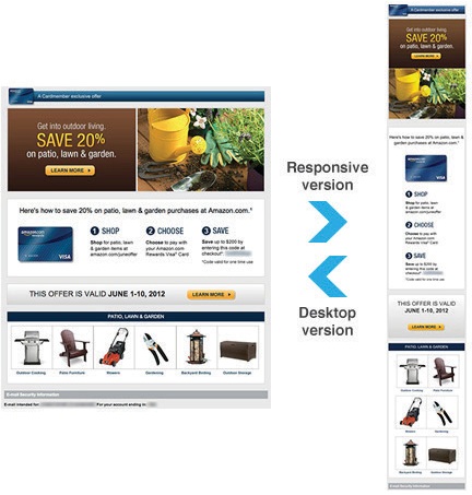
TOMS Newsletter
Amazon
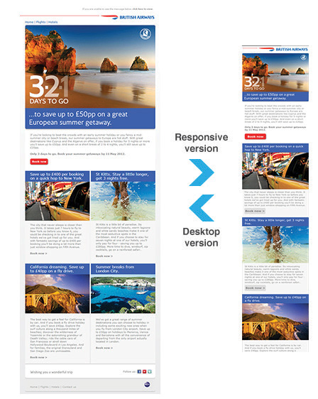
British Airways
Hilton HHONORS
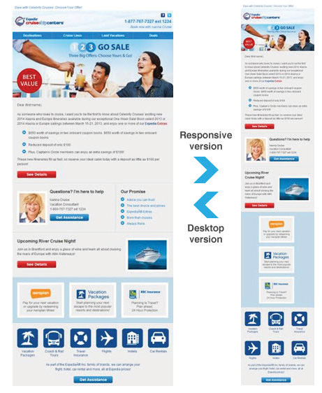
Cruise Help Center
Responsive Email Design Resources
- What 22 Billion Newsletters Tell Us About Designing For Mobile Email
- MailChimp Responsive Email
- 10 Handy Responsive Email Tips
- Email Design Lookbook
- Responsive Email Guide PDF
- From Monitor To Mobile: Optimizing Email Newsletters With CSS
- What is Responsive Email Design?
—
Ajeet is an experienced web developer at WordPressIntegration – PSD to WordPress Coders. You can follow wordpressintegration on Facebook .


Great read! Thanks Jacob. I work on emails an awful lot (probably too much for this graphic designers fancy) but I switched all our emails to responsive based on the direction that I could see how emails are being viewed now. It’s nice to see the facts. Nicely put!
Thanks Kaylee, yes I also just made my emails responsive and notice the better results!
Impressive article,
Helped me a lot to design my e-mails 😀
This is really awesome tips. Thank you very much Jacob. The most important thing that you’ve mentioned is the need of responsive email.
Wonderful article, thanks!
Forgive the rabbit trail, but how do I lay my hands on the logo book, since I am already subscribed? Thanks.
Great article – no idea where you found the time to write it 🙂
Thanks for sharing
Thanks for sharing the article, really liked it..Will surely use the parameters defined by you to make the E-Mails responsive..cheers