
“There are now about as many different varieties of letters as there are different kinds of fools.” Eric Gill
Choosing a font for a project isn’t always an easy task but this list of professional classic and elegant serif fonts will make the task a little easier. When it comes to design and aesthetics, your font can convey the overall tone of your message.
When it comes to typography, the beauty is in how well it expresses your voice. Serif fonts have a lot to offer in terms of simplicity and elegance. These fonts always add flair to your typography, really helping it stand out.

But before you dive in, you may want to consider this incredible offer below…
BEST ELEGANT SERIF FONTS: UNLIMITED DOWNLOADS: 50 Million+ Fonts & Design Assets
![]()
Download all the Elegant Serif Fonts you need and many other design elements, available for a monthly subscription by subscribing to Envato Elements. The subscription costs $16.50 per month and gives you unlimited access to a massive and growing library of over 50 million items that can be downloaded as often as you need (stock photos too)!
27 Classic & Elegant Serif Fonts
1. Nimbus Roman No 9
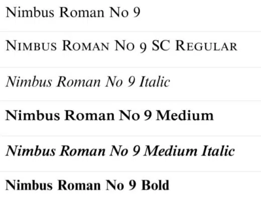
The Nimbus Roman No 9 is a classy and elegant font that can work really well for more sophisticated projects. Created by URW Studio in 1987, it looks very similar to the Times New Roman font and generally carries the same overall tone.
2. ITC Garamond Light

Created by Tony Stan in 1975, ITC Garamond Light has ITC’s signature house style. Much like most serif fonts, it works for serious and elegant messaging. As the name conveys, Claude Garamond’s typography work inspired this font.
3. Minion

Minion was created in 1990 by Adobe Systems inspired by the late-renaissance era. Designed by Robert Slimbach, it’s intended for body text, keeping legibility uppermost in mind. Minion is a balanced and clean font that can be great when used to convey more serious messaging.
4. URW Antiqua
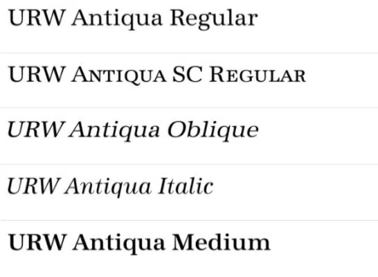
URW Antiqua was designed by Hermann Zapf in 1985, alongside URW Grotesk — a sans serif font that goes well with it. The font by itself is great for conveying more elegant themes.
5. Times
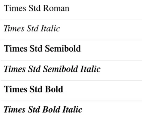
The Times font is from the same font family as the more popular Times New Roman font. This font is great for conveying a serious and academic voice. There are several variations of this font available, but the Times font is in a class all its own.
6. Baskerville

Baskerville, a typeface created by John Baskerville in the 1750s, and characterized by its more circular strokes, is used often for marketing messaging. Popularized presently by Microsoft, this font, like most serif fonts, is sophisticated and bold.
7. Baskerville No. 2
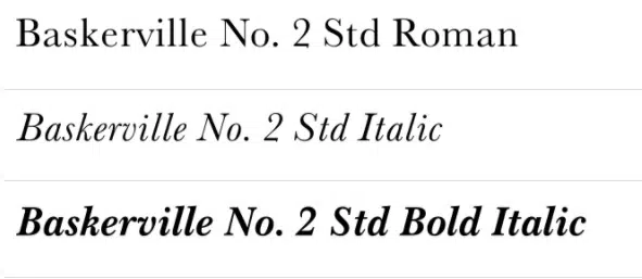
Created by the URW Design Staff in 1980, the above typeface served as the inspiration for this font. Characterized by its thin, more circular, and sophisticated strokes, the Baskerville No. 2 is an iteration of the popular Baskerville font.
8. Mrs Eaves

Mrs Eaves is a font designed by Zuzana Licko in 1996. It’s a transitional serif typeface that is used in display contexts such as book descriptions and titles. This font can convey elegant and fanciful messaging and titles.
9. Cheltenham Old Style No 2
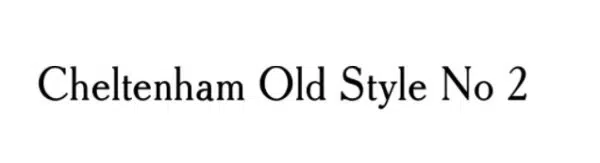
The Cheltenham Old Style No 2 was created by URW Type Foundry. This font is great for body copy in books and magazines. Based on the font Cheltenham designed by the architect Bertram Goodhue and Ingalls Kimball, for the Cheltenham press in 1896. This font is a bold and impressionable typeface.
10. Cushing Std-Book
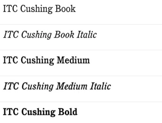
The Cushing Std-Book typeface was created by Vincent Pacella and is trademarked by the International Typeface Corporation. This is yet another great typeface for presswork and body copy that keeps things interesting and elegant.
11. Aldine 721
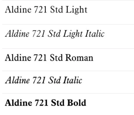
Originally designed by the font designer Frank Hinman Pierpont, this font was later adapted for digital printing and use by Bitstream. Aldine 721 is great for legibility and sophisticated overtones.
12. Plantin Std
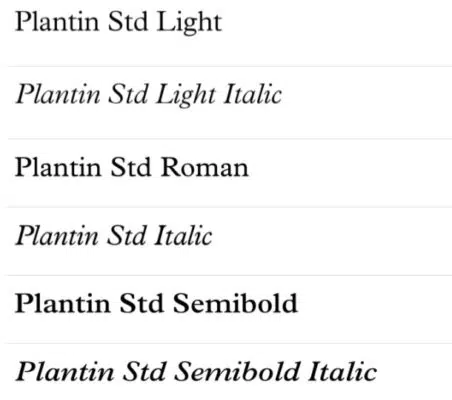
Named after the 16th Century printer Christophe Plantin, this typeface was the predecessor to the Times New Roman — and was the basis for this typeface. Plantain Std is a modern-day variation of this font. The font is great for magazine text and anything that requires substance and class.
13. Sabon
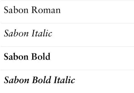
Originally designed by German-born designer Jan Tschichold, this old-style serif font was later digitized by Linotype. Sabon is a slender and legible typeface that is great for book covers, poetry, quotes, and even posters. Like most serif fonts, it conveys an overall sophisticated feel
14. Arno Pro
Arno Pro is a serif font created by Robert Slimbach from Adobe Type for professional use. Heavily inspired by Italian renaissance texts, this font is great for book design, even earning a winning entry in the 2007 Type Design Competition.
15. Palatino
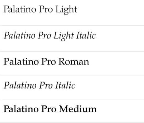
This old-type serif font was created by Hermann Zapf in 1949 and later published by Linotype. Palatino was later licensed to Adobe and Apple, which made it a pre-installed font, increasing the popularity of this elegant typeface. This font family has 20 styles and family package options.
16. Centaur MT Std
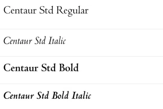
This serif typeface was created by Bruce Rogers and later released in 1929. Also known as Metropolitan, this font variation was digitized and licensed by Linotype. Inspired by renaissance printing in the 1470s, Centaur MT Std conveys a scholarly tone.
17. Bookman Light

This old-style serif font was inspired by Bookman Old Style that was created in the 1860s. It rose in popularity in the 1960s and 1970s for its legible and classy characteristics. Bookman Light can give an impression of reliability without the heaviness.
18. Perpetua Std
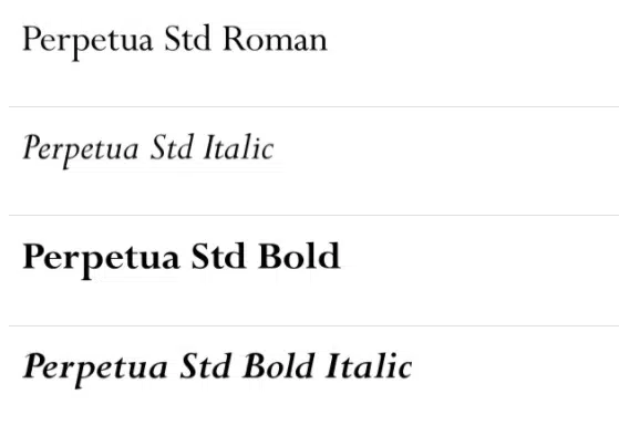
The Perpetua font was designed by Eric Gill in the 1920s. This font was published by Monotype and comes with 22 styles in this package. Perpetua has a delicate and crisp font structure and is very similar to 18th-century British fonts like Baskerville.
UNLIMITED DOWNLOADS: 400,000+ Fonts & 50+ Million Design Assets

All the Fonts you need and many other design elements are available for a monthly subscription by subscribing to Envato Elements. The subscription costs $16.50 per month and gives you unlimited access to a massive and growing library of 50 million items that can be downloaded as often as you need (stock photos too)!

19. New Century Schoolbook Roman
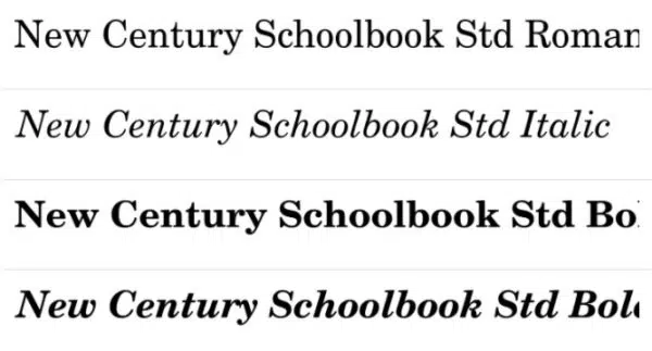
New Century Schoolbook Roman was designed by Morris Fuller Benton in 1919. The transitional serif typeface was created to improve textbook readability (from where it derives its name). Later published by Linotype, this font retains its sophisticated and informative aesthetic.
20. Berthold Baskerville Book Regular
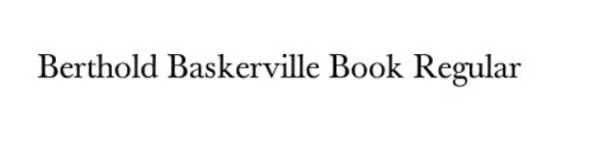
Developed by Berthold Type Foundry in the 1800s along with several other font iterations, Berthold Baskerville is a take on the old Baskerville typeface. This font retains most of the original characteristics of the Baskerville font. However, one of the most recognizable differences is that this font is bolder, with more defined lines.
21. Scala Pro-Regular
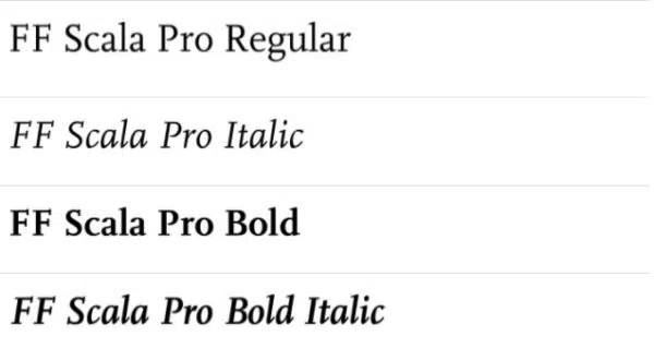
Created by Martin Majoor in 1991, this font is an old-type serif, published by the FontFont Foundry. This font has an emphasis on clarity and is also very calligraphic in italics. Generally, it conveys a clear and crisp overall tone.
22. Garamond Premier

This font was created by Robert Slimbach for Adobe and is described as a more restrained and modernized approach to the classic Garamond font. Garamond fonts were re-envisioned by Slimbach to meet the business requirements of the time. Garamond Premier has a sophisticated, minimalistic appearance.
23. Bembo
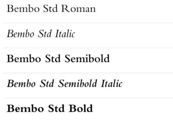
Created by Monotype, this font is based on one used by the Venetian printer, Aldus Manutius. Bembo is an old-type serif font that rose in popularity because of its overall sleek look and its ability to remain consistent in color. This font has an elegant and clean aesthetic.
24. Times New Roman MTStd
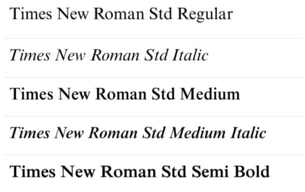
Times New Roman by Monotype was designed by Stanley Morison and Victor Lardent. To date, this font is for many the golden standard for academic writing and the publishing of important information. The font is bold, legible, and leaves an official impression.
25. Caslon

Adobe Caslon was created by Carol Twombly and William Caslon for Adobe. This font was inspired by the Caslon font, designed by William Caslon in the 1600s. This old-type serif font looks sophisticated and has an overall clean look.
26. Bodoni
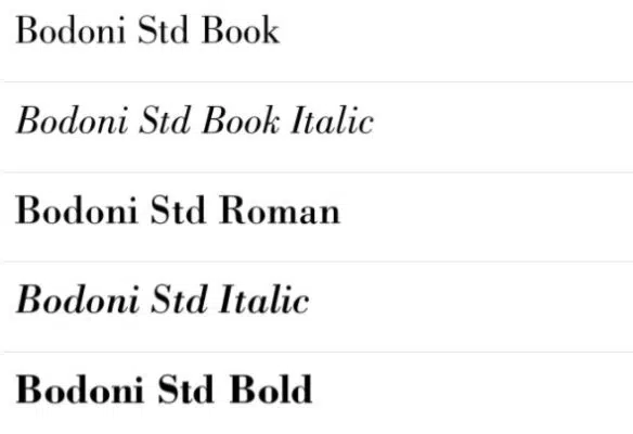
Bodoni is a typeface based on those designed by Giambattista Bodoni in the 1800s. Bodoni himself based a lot of his fonts on the same school of design as Robert Baskerville. Hence, you can see a small resemblance to Baskerville font. This font uses alternating thin and thick strokes, adding to its elegant appearance.
27. Goudy 38
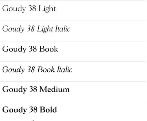
Goudy 38 is a typeface by Red Rooster Collection based on Goudy Old Style. Goudy Old Style was particularly famous in advertising circles for its overall boldness and eligibility. The Goudy 38 retains this quality and adds a slightly whimsical touch to it.
More Typography & Font Resources:
- 30 Fonts You Must Know & Should Own
- The Top 100 Best Fonts Of All Time
- Top 7 Fonts Used By Professionals In Design
- 20 Typefaces To Start A Designer’s Career
- FREE 27 Page Type Classification eBook
- Designer’s Favourite Fonts & Why
Have you got a favorite classic serif typeface that was missed in this list? Let us know in the comments below.
I consider TRAJAN PRO as the best & the most classical of them all and it should have been in the list.
I usually never use serif fonts, I’m not used to them because I don’t like serif. But when choosing a type of font, i include them and then discard them lol.
I like to add ‘Rotis Serif’ to the above list.
I particularly love Minion and I fell in love with Sabon having worked on some print from Booz&co. I don’t know about ITC Garamond…my all time favourite in the list will be Baskerville. It’s great for large type!
Oh! What a nice list. Also another good one that I refer to often if Plantagenet (referred to on my local machine as Plantagenet Cherokee)
Here’s more info on that one:
http://www.tiro.com/Plantagenet/plantagenet_index3.html
I think my favorite “rediscovered” classic font is New Century Schoolbook. I used it on a printable PDF of top fonts recently. Seeing it in a “teacherly” context, there was no question why it’s called “Schoolbook”. For some reason, it has the patience and upbeat temperament of a saintly 7th grade teacher, but does double-duty as a college prof…
It didn’t make my “Top 19 Fonts” post, but it was in the top 40, and my fondness for it has only grown. I love when something old becomes unexpectedly new again.
And you know, I never, ever, ever get sick of the lower-case “a” in Garamond. I think that has to be my favorite letter in any typeface. It’s a work of art 🙂
This is great list Jacob.
Arnhem, esp for body copy when well typeset. The primary typeface used in the book Modern Typography by Robin Kinross. Read about it here;
http://www.davidtorno.com/MacTex_Uploads/Button001.jpg
preview it here:
http://www.fontshop.com/search/?q=arnhem+normal
I’d add Hoefler Text to the list.
Very resourceful. Especially nice that you laid out examples and links. I find that using serif fonts in formal designs is very effective. When I say formal I mean things like press releases and websites or print marketing for formal businesses like accounting firms, law offices, and high profile businesses.
Jacob: thanks for the tweet and link! You are the Oprah Winfrey of Graphic Design. 🙂 Now I just need to complete my semi-biographical auto-biography.
Funny about the MEGs logo and it’s application in a University setting, with my comment about the college prof! How funny. I have another post in the works about “font personalities”, which might be like a Rorschach test for type-lovers :). It’s fascinating how fonts are chosen for their perceived persona, even to the average office worker setting a memo to print:
“I want this to be funny and light hearted” = Comic Sans
“I really need to grab their attention” = Impact
“We’re having a picnic!” = Brush Script
“I’m *very* professional” = Copperplate
Or how ’bout…
“I’m sophisticated” = any typeface, but all lower case
🙂
It might be because I’m easily influence by big ads and things like Macs, but I just have a really hard time getting into Serif fonts. I know this is something that I need to fix, but I just don’t like the way they look for most projects. Guess I just haven’t found the right client to fit them to.
I completely agree. I am always swayed by how clean sans serif fonts look on the web. However, the next time I need to get over myself and go with a serif font, this will be my resource! Thank you!
Thank you for your patience in waiting for my response, it’s been a busy week. Thank you to all those that have suggested more great serif fonts!
Saravana,
Thank you, Trajan is certainly a lovely typeface even if it is overused.
Ebi,
ITC Garamond is one of those ones that you either love or hate. In fact there was an essay on this topic that is worth reading. I hate ITC Garmond.
Douglas,
I recently used New Century Schoolbook in a logo of mine (MEGS) which is actually for a University program. Seemed like the perfect fit.
I forgot about your top 19 fonts list, I have added the link to your comment now.
Nice selection Jacob, I love a serif very tasty. Shame in this day and age we can’t use more fonts in our web design…DAMN THOSE LIMITED WEB FRIENDLY FONTS!! Baskerville, kerned, oh so good! Just read your ‘How To Choose A Font’ blog to nicely written bro….take it easy.
Great list and you’ve got my favorite in it, Caslon, it such a great font, old but wise as I always say.
I’ve reviewed all the fonts that you have mentioned but I personally love Helvetica. Is there anyone who is passionate of using “Helvetica”?
Looks like Brian Hoff got the jump on the “single letter” post idea – he focused on “g” in bunch. Great looking, interesting post:
http://www.thedesigncubicle.com/2009/10/same-ol-g-think-again-a-visual-study-of-the-lowercase-g/
Now I have to finish up my “a” post…
Graphics are a big deal on posts like these. I’m going back and revamping a few font posts with enhanced graphics like PDFs.
For instance, here is a link to my personal top 10 fonts list, but updated with a nicely laid out PDF to go with, and HUGE preview graphics. Now you can zoom in, etc…
http://bonfx.com/top-10-fonts-for-graphic-designers-with-pdf-chart/
I’ll get around to revamping my other font-related posts like this…much more fun…
Where is Trajan Pro, its web-safe and renders on most OS’s – unlike many of the fonts you have listed, However thats no longer a problem with the likes of Cufon and Sifr etc.
nice list though! thanks
First use of Palatino – added on my fave fonts!
Where is Trajan Pro, its web-safe and renders on most OS’s – unlike many of the fonts you have listed, However thats no longer a problem with the likes of Cufon and Sifr etc.
Where is Trajan Pro, its web-safe and renders on most OS’s – unlike many of the fonts you have listed, However thats no longer a problem with the likes of Cufon and Sifr etc.
I consider TRAJAN PRO as the best & the most classical of them all and it should have been in the list.
I particularly love Minion and I fell in love with Sabon having worked on some print from Booz&co. I don’t know about ITC Garamond…my all time favourite in the list will be Baskerville. It’s great for large type!