
Logo design is arguably one of the hardest parts of graphic design though with a little insider knowledge, you may find it’s not so difficult after all. By understanding what makes a “good” logo and the principles behind effective logo design you will be on the right track in no time. In this tutorial you will be guided through the logo design process, from initial brief right through to delivery while being given vital logo design tips along the way.
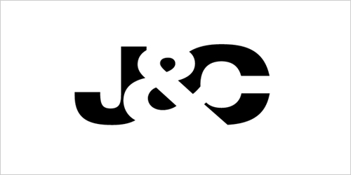
For the sake of this tutorial we will be creating a fictional logo – for now I’ve gone with a logo that reflects the first and last letters of my name – J & C. Through the use of negative space and a few nifty Illustrator tricks we will combine these characters (J & C) to create an iconic logo design. At the end of the tutorial, you may find that your own initials can be used too.
Skills you will learn by doing this logo design tutorial:
- How to use Adobe Illustrator to create a logo
- What makes a good logo
- Principles of effective logo design
- The logo design process
You will need:
- A copy Adobe Illustrator CS3+ or any another vector editing program
- 30 minutes of time
- This EPS File OR the Helvetica Neue 83 Extended typeface.
Logo design tutorial:

1. Before we head straight into creating the logo you must understand what a logo is, what it represents and what it is supposed to do. A logo is not just a mark – a logo reflects a business’s commercial brand via the use of shape, fonts, colour, and / or images. A logo is for inspiring trust, recognition and admiration for a company or product and it is our job as designers to create a logo that will do its job.

2. But what makes a good logo? A good logo is distinctive, appropriate, practical, graphic, simple in form and conveys an intended message. There are five principles that you should follow to ensure that this is so: In no particular order, an effective logo is simple, memorable, timeless, versatile and appropriate. An example of a logo that achieves all these things is the Apple logo.
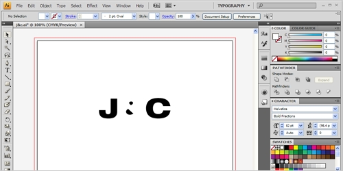
3. Now that we know the basic principles behind logo design, we should begin the logo design process. In the real world we would be given a brief, have to do research, brainstorming, etc. though for the sake of this tutorial we are creating a fictional logo design based on my initials, J & C. For now, open the jc.eps file that you can download here.
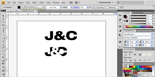
4. In this EPS, you will find the completed logo and also the outlined version of the J&C. I’ve used the typeface Helvetica Neue 83 Extended with 82pt type so if you have this typeface you will not need the EPS file. You will be needing the Pathfinder tool panel too, so go ahead and open this up. Go to Window > Pathfinder. I also find working in the Typography Workspace is the best for logo design. Go to Window > Workspace > Typography to set this up.

5. If you are using the font directly (not from the EPS), you will need to outline your text as this will turn your text into movable objects. To do this, right click on the text and click ‘Create Outlines’. After you have done this, you are up to where the CD users start off. Now you will have to ungroup your characters – to do this, select the text, right click, click ‘Ungroup’.
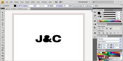
6. Now we are going to turn the ampersand into 3 objects rather than just one. To do this we must release the original path of the ampersand. To do this, select the ampersand, right click and then choose “Release Compound Path”. You will notice the two counters of the ampersand go black – this shows that it is now in 3 pieces.
7. From here we are going to turn the ampersand into negative space, ie. using the white space to create an object. To do this, select the ampersand and turn it to the colour white using the swatch panel. Take note not to turn the two inside counters white. Now select the two counters and the ampersand, right click and press “Group”.

8. Now that we have the logo all set up, it is time to position the ampersand. Using the select tool, select the ampersand. Position the ampersand over the J and it should look something like above. Align the left side of the ampersand with the left vertical side of the J, ensure that the J is not broken into two parts.

9. From here, using the select tool, select the C, right click on it, go to Arrange > Send To Back. This moves the letter C behind the other two letters and is necessary for the next step.
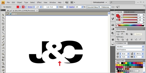
10. Select the letter ‘C’ with the move tool and position it underneath the white ampersand. I’ve positioned the ‘C’ just where it meets the middle of the ampersand as outlined with the red arrow above. Zoom in to 6400% and ensure that it is exactly in line, not just close, but exact. Precision is required in logo design.
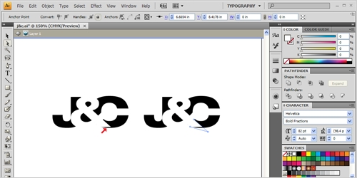
11. You will notice that the ampersand doesn’t cover all of the C and leaves an unsightly jagged edge at the bottom, as pointed to by the red arrow. To get rid of this you will have to select the Direct Selection tool, click once on the ampersand and then once one the bottom right node. Zoom in as much as you can and drag out the node in a diagonal straight line.
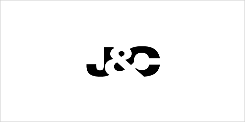
12. You may think that this is the completed logo design though it is not. Although it looks exactly like the finished logo, the ampersand is still white which means when placed on another background other than white, the ampersand shows as white, as shown in the example screenshot above.
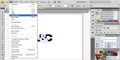
13. To counter this what we have to do is use the pathfinder tool to cut out the ampersand from the other letters. We need to make three ampersands to be able to do this. Select the ampersand and go to Edit > Copy and then Edit > Paste In Front. Repeat this twice. You will not be able to tell but there are now three ampersands there.
14. Grab the selection tool, select the top ampersand and then while holding shift, click the ‘J’. From here we want to use the Pathfinder window to cut it away. While they are selected choose the Minus Front option from the pathfinder palette. At this stage it looks like it has not done anything but it has.
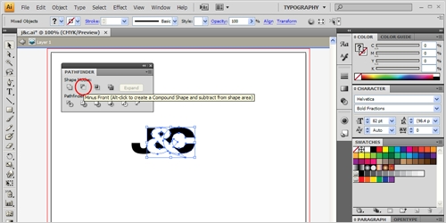
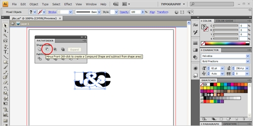
15. You will have to repeat the same steps as above but for the letter ‘C’. Select the ampersand, and while holding shift, click the letter ‘C’. Choose the “Minus Front” selection from the Pathfinder palette to cut away the ampersand from the ‘C’. It will still look nothing has changed but it has.
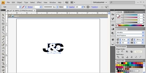
16. There is now one ampersand left. Click on this using the selection tool, right click and click ungroup. This will allow you to select the three parts of the ampersand. Click on the large part of the ampersand and press delete. The shape of the logo is now complete. Highlight the four parts of the logo, right click and click group. This will ensure the logo stays as is.
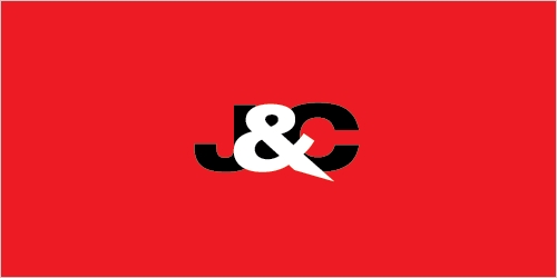
17. After the logo shape has been completed, you will want to fine tune it and experiment with colours and typefaces. I’ve shown some variations for you just to give you an idea of what you could do, though experimentation & comparison is the key here.
18. After you have finalised the logo design, you would essentially deliver it to the client in a variety of formats including eps, pdf, tiff, jpg, gif and if you’re feeling nice, you may want to include a FavIcon too. Now that you are done, try to see if you can do it for your own initials too.
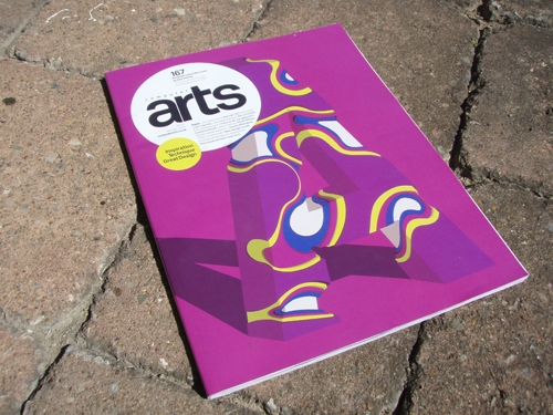
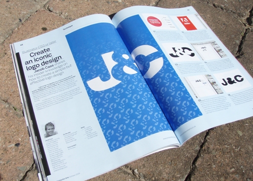
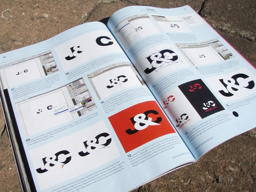
Computer Arts Photos
This logo design tutorial was originally written for Computer Arts, Issue 167. Below are some snap shots of the tutorial in print.
Update: 4/11/09
Computer Arts has just posted the PDF version of the tutorial to their website.

Recent articles I’ve written elsewhere:
- Vero logo design process from start to finish in Layers Magazine
- How to create a vector font monster using the glyph panel in Layers Magazine
- Get more subscribers with an email subscription box on Freelance Folder
For more logo tutorials visit this page of 70+ logo design tutorials.
If you have any questions or comments, please do leave them in the comments below.
Looks really awesome. The end result is really minimalist yet captivating. Thanks for the tutorial.
You’re a friggin’ rockstar, Jacob. I love Computer Arts magazine, but only get to read those awesome mags when we go to Barnes & Noble. thanks for writing the post so I could enjoy your work.
It seems you have skipped the steps that make a logo iconic & focused on the execution of the software stage.
I think its more important to show ‘Why’ things are done rather then ‘How’ in an iconic logo design, but this would be hard to wrap up in a tutorial that is suppoused to take 30 minutes 😛
Jesse,
Haha, thanks for the ego boost, but very far from a rockstar. You know you can subscribe to CA rather than sitting in B&N – it’s worth it in my opinion, been subscribed for nearly 2 years now.
Daniel,
I did link to some of my previously linked articles which outline the iconic part in more depth. Actually, now that I think about it, this was my first actual software tutorial for a logo.
Callum,
When you’re subscribed to Computer Arts, you receive a different cover than what is found in the stores which is why it looks different, but it is still Issue 167. This particular cover was done by the remarkable Alex Trochet.
Krimo,
Good to hear and glad to be of help! Thanks for your warm wishes – I’m sure the Americans will be fine 😛
Great tutorial!
Check http://twitpic.com/nzvq5 to see the outcome!
Greetings, S.
Great post Jacob, some great ideas
I’m just getting back into Illustrator after many years of not using it, good to be reminded on some of the steps. I’m just curious, do these rules apply to say a rock band? I’ve seen a lot of band logos that are definitely not simplistic. Keep up the good work by the way!!
Great tutorial, really like the finished logo.
simple, but so effective.
Thanks
Excellent tutorial! Congrats on being in Computer Arts – my fave mag! I think you mean issue 168 though? I have 167 and it doesn’t look like that..! 😉 Great work!
Hey Jacob thank you for the tutorial. Most of the time on such a matter blog posts tend to focus on the principles rather than the actual illustrator-wrestling part haha! For someone fairly new to Illustrator like myself, I enjoyed the detailed explanations (for instance I had no knowledge of the Compound Path, so I definitely learned something here)
Good luck in NYC with those American 🙂 (I’m French)
Trying to create those ingenious logos are the ones that give me major brain farts! haha.. Major kudos to those who actually pull it off..
Great tutorial jacob and once again – awesome stuff from you! congrats on the published in comm arts.. awesome 🙂
thanks for such wonderful tutorial
You are everywhere :]
thanks for tutorial
The concept of & symbol is similar to Fedex arrow. Nice but this is merged, so little different. I would try this out with similar concept of client profile.
Thanks for the idea and post.
-Austin
nice! this is fun to play around with 🙂
Awesome…simple and clear
Kiren,
Once you know the “rules” you can always break them. Each industry has different requirements of what is required in a logo design, especially in the music industry.
Hi Jacob,
it’s me again. No, I’m not a Stalker 😀
I just like this tutorial and so I decided to feature this on my blog which is a shared blog project between me and my brother.
Here’s the link:
http://hagerundhager.blogspot.com/2009/11/mit-meinem-ersten-post-mochte-ich-euch.html
Now I would like to know, if you can give me the permission to translate this tutorial to german? I already translated some tutorials, the last one I translated was for iconpaper.org and it was a tutorial about desktop customization.
It would be great if I get the permission.
have a nice day.
Hello Sebastian,
Yes, please feel free to translate the article, thank you for asking.
Myself and my friend have some issues with your statement regarding ‘iconic logo’ design. As my friend writes here http://tinyurl.com/yela6qj
While in a previous article you make a valid statement about “why logo design is not $5”, validating the respect designers should be given. However you contradict that entirely by that stating you have already made an iconic logo and if you replicate it, you can create an icon. An icon is not something that can be created instantly regardless of any great design intuition, talent or ability in the space of time that your tutorial takes. Much in the same way that you cannot replicate the taste of a 20 year old bottle of wine in a kitchen sink.
Yes, this is all fun and learning but you have a responsibility to this industry because of your fan base and those up and coming designers that you choose to share your knowledge with. I suggest you poise your statements with a little bit more consideration.
Yes, money can be made from Computer arts magazines and I’m sure plenty of similar designers would have reveled in the exposure. However, making dogmatic statements like ‘create an iconic logo’ is no more tactful then the print shops that sell logos for 5 dollars.
Sincerely.
Tim Phelan,
Dublin, Ireland.
Hi Tim,
Please see my reply to you and Youseff here.
The concept of & symbol is similar to Fedex arrow. Nice but this is merged, so little different. I would try this out with similar concept of client profile.
Thanks for the idea and post.
Very nice post. I keep learning new things about logo design every day from post like these. Good stuff!
woo thanks to share that amazing tutorial
hi awesome
I love Computer Arts magazine, but only get to read those awesome mags when we go to Barnes & Noble. thanks for writing the post so I could enjoy your work.
I used to make a design by corel.. Awesome tips for me 🙂
This article should be sharable. Graphic designers those who started their career recently should be think as a creative mind by reading like this type of posts and images. So that can develop the innovative ideas from the beginning.
Its been really easy to create the iconic logo with the help of this tutorial. Every successful logo designer always keep in mind these 5 Principles at the time of making logo.
Thanks for the post.
This blog is just fantastic, thanks for sharing it!
You’re an extremely useful internet site; couldn’t make it without ya!|
nba 2k16 mt pack simulator http://hempbook.com/blogs/665/1038/2k16-mt-coins-oddsmakers-give-the-miami-heat-the-nod-over